Trying to bent text with the blue dot. Is it possible to have it bent attached to the top of the text? I’ve tried every setting I can think of and it has the line attached to the bottom. I got around this using the text to shape but it was a pain to get it set up. I also didn’t see anything in the documents supporting this.
Please show us what you are after. A visual would help us “see” what you are trying to produce. 
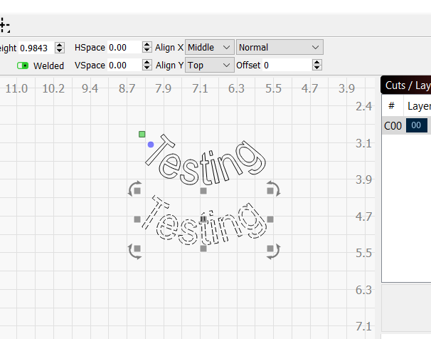
The text on the left is using the blue bend tool on both top and bottom text. The bend line is on the bottom of both. I have selected top, bottom, and middle for alignment but it still bends from the bottom.
The text on the right the top is bent with the blue bend tool and the text on the bottom is manipulated with text to path. I can flip the circle from top to bottom and then select align to top and have it bend attached to the top of the words. I left the circle there to show but it’s not attached to the top word.

Sorry, but maybe I need more coffee.  I am not understanding what final result you are trying to achieve. Can you show us an example?
This is worth review, if you haven’t already: Fonts and Text - LightBurn Software Documentation
I am trying to bend text upward without it squishing together.
Select the the text that you bent, change the V-Align value to “top”, so the top is what’s anchored to the imaginary circle.
Top text is align bottom. The bottom is align with top. they look almost the same to me. I also couldn’t find v-align so I figured you meant Y. If its not possible I’ll still use the text to path and drag the text from the top of the circle to the bottom. Its just a few steps more. I was just curious if I was missing something.
Align-Y is what I meant, yes. The text on path code doesn’t warp the letters at all, it just re-orients them. Bent text does warp the lettering, so it’s likely that you’re having the issue with.
That makes sense. The guy I was designing something for didn’t want the top of the words squished together. It doesn’t look like they warp the letters bending downward. We had both on his design and it looked funny with difference.
This topic was automatically closed 30 days after the last reply. New replies are no longer allowed.