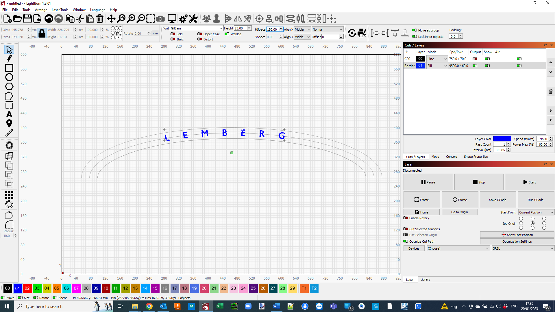
I have a job that involves putting some text around a curve and expanding it to fill a bigger portion of the sign. I have made the curves and using the centre one to place the text on as a guide. When the text has 0 horizontal expansion (HSpace) you can see that the “B” in LEMBURG is centred on the curve. When I apply 200 horizontal expansion the B moves left and I can’t find a way to move it back to the centre.
Any thoughts?
I am going to go with your choice of font.
Not all the letters are the same width. So while before expanding the spacing they look centred, they are probably not. Expanding them probably just enhances the reality.
Put a space before the “L” and it should help, but probably still off.
Thanks for the input Mike. The font does have to be Gil Sans, so I need to be able to work with that. I was hoping to not have to “guess” where the centre should be, but if that’s the only answer I will have to do that.
Then I think you need to move to software that is made for that.
Lightburn is great burning software and has some fantastic design tools.
But, if you are trying to design exact graphics you need a program made for that.
Hi Corey, that’s how I have done it. My process was to write the text above the curves, do a centre alignment between the text and the centre guide line, then select both the text and the guide line before selecting text on line. All looked ok until I needed to stretch the text.
Sorry for the late reply but I’ve been away for a few weeks.
I just tried again expanding the text before connecting the line and disappointingly it did the same thing.
I deleted the previous text and created again new above the curves.
With Hspace set to zero I placed the text on the centre curved line. I drew a vertical line from the centre of the base line just for reference. The B in LEMBURG was fractionally to the left of the ref line.
I deleted and created the text again this time adding an Hspace of 150. The text shifted to the left by quite a bit with respect to my vertical ref line. I selected the curves and the expanded text and did a centre vertical align. The text shifted back to the centre. Good so far…
I then applied the text to the line and sadly the B shifted again to the left:-(
So at the moment the only fix seems to be padding the original text with spaces. It works, but doesn’t it seem strange behaviour??