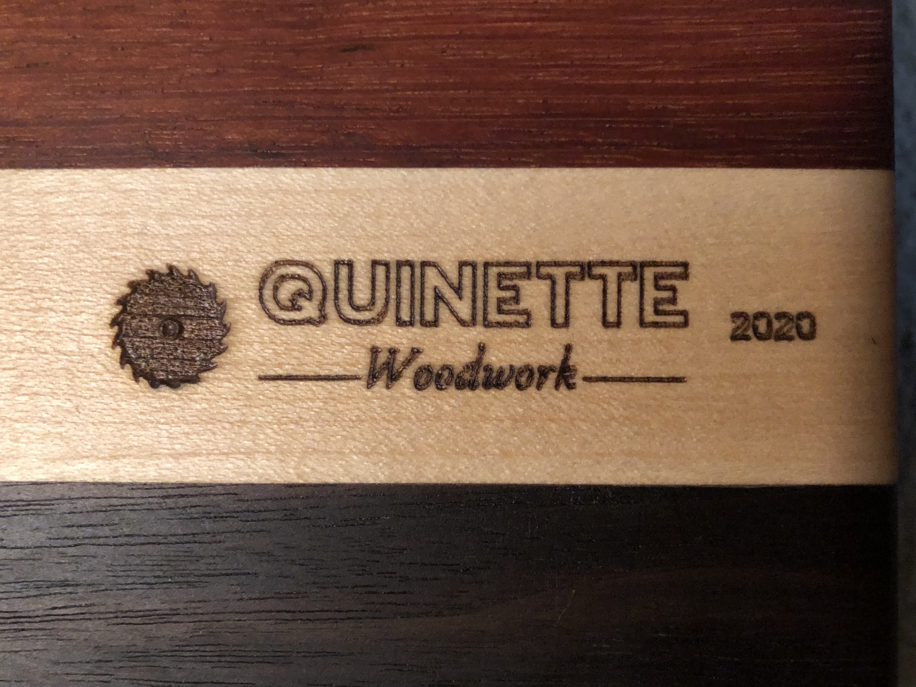
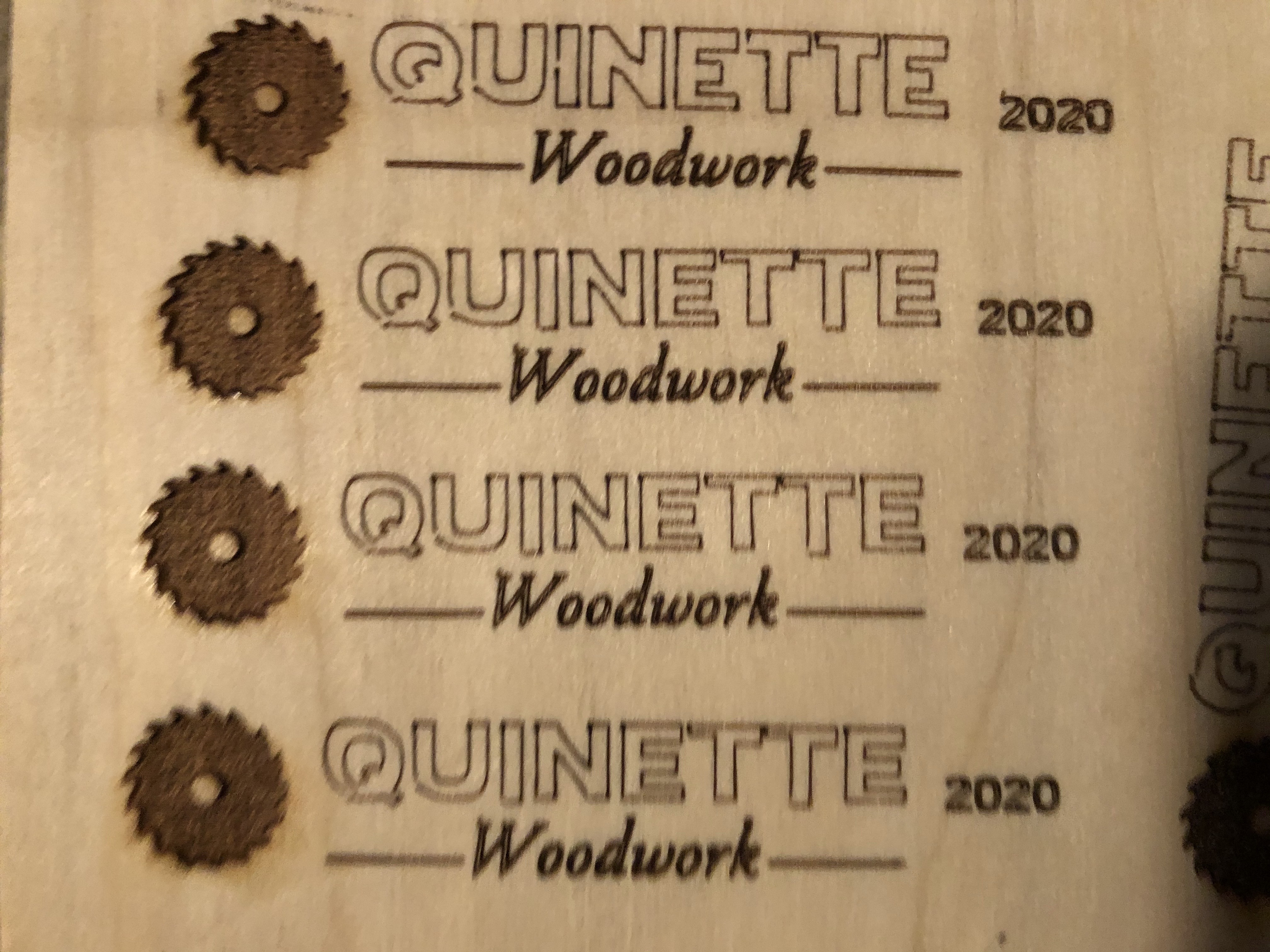
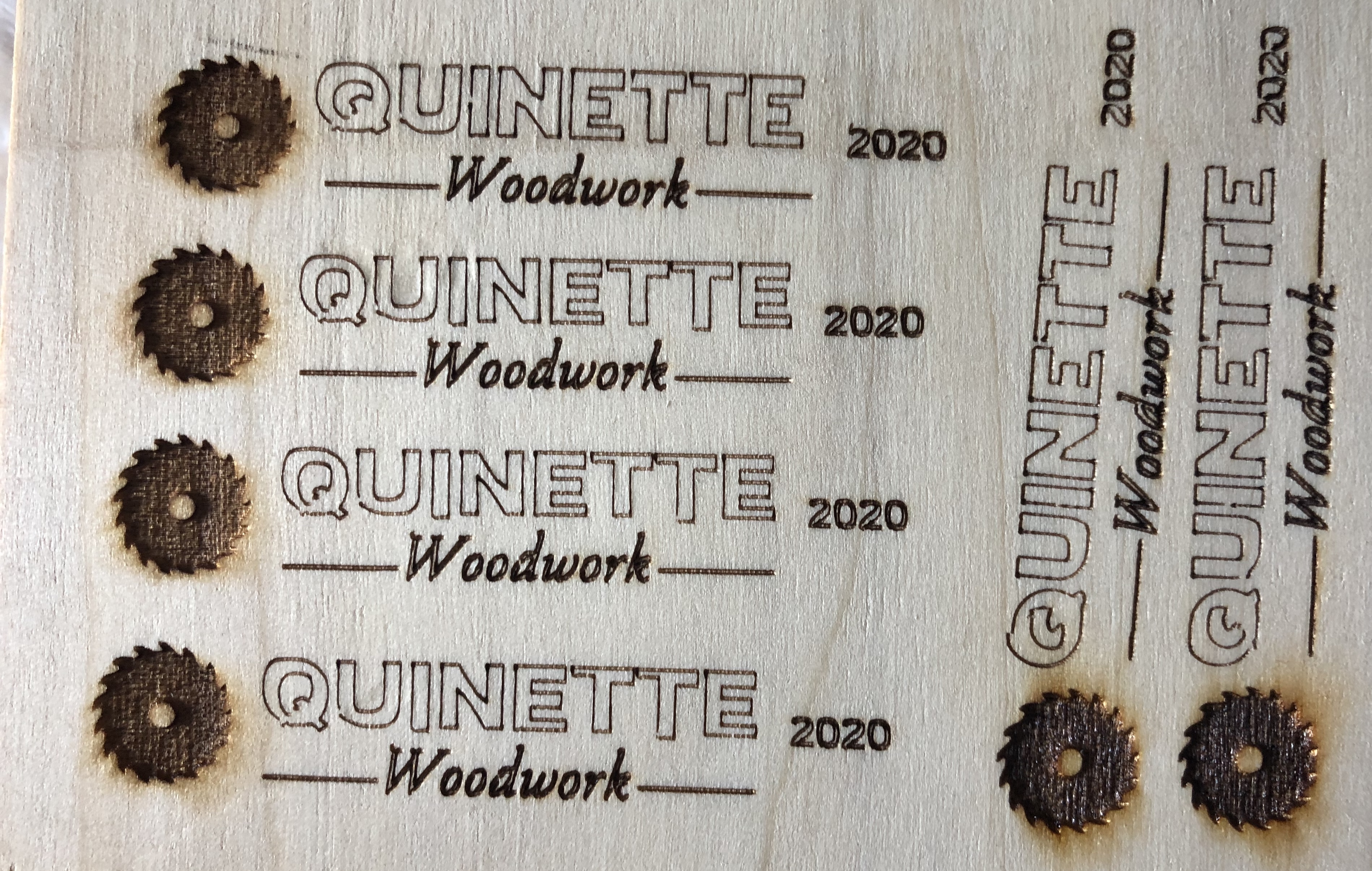
Today when I ran LightBurn to do my logo, the lettering came out weird, with some aspects of letters shorter than others and shorter than it is supposed to be. On the software, it looks like it normally does. I even tried creating new text, and was still having the same issue. I noticed it is particularly problematic with the letter T and Q. Any idea what’s going on? The first photo is what my logo normally looks like, the second photo is what it keeps doing today
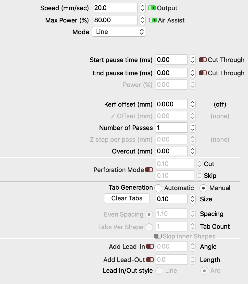
What cut settings do you have set for the text? This looks like you have the min power set low and the speed set high. As the laser slows at the start and end of these paths, the laser is ramping the power down to the point of it not marking at that speed. But these pictures are very out of focus and hard to see. Post your settings and we can go from there.
I have it set at a speed of 20 and power of 80. It had been working fine before. The top picture was cut with those exact same settings. The thing I am most confused with is why all of the sudden the shapes are all weird, namely the left side of the T’s and the top left aspect of the Q. I apologize for the poor quality photo