Machine: OMTech Polar 350
Mainboard: Ruida 6442S
Mainboard firmware: RDLC-V8.01.68
LightBurn version: 2.1.00
PC: Custom built Windows 10 desktop
Unfortunately, I have to just offer a complaint here because this can be only fixed on the developers’ side.
Stop making the UI encroach on the workspace viewport with wasted space that adds zero benefit. It got worse in version 2.0, and it got worse again in 2.1. Do the people who make this software not even use it? What were they thinking?
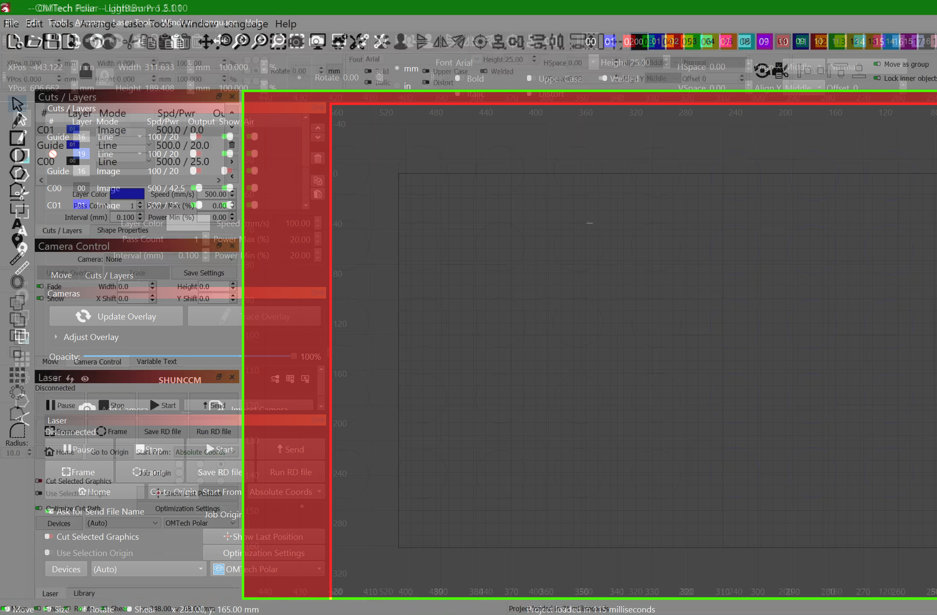
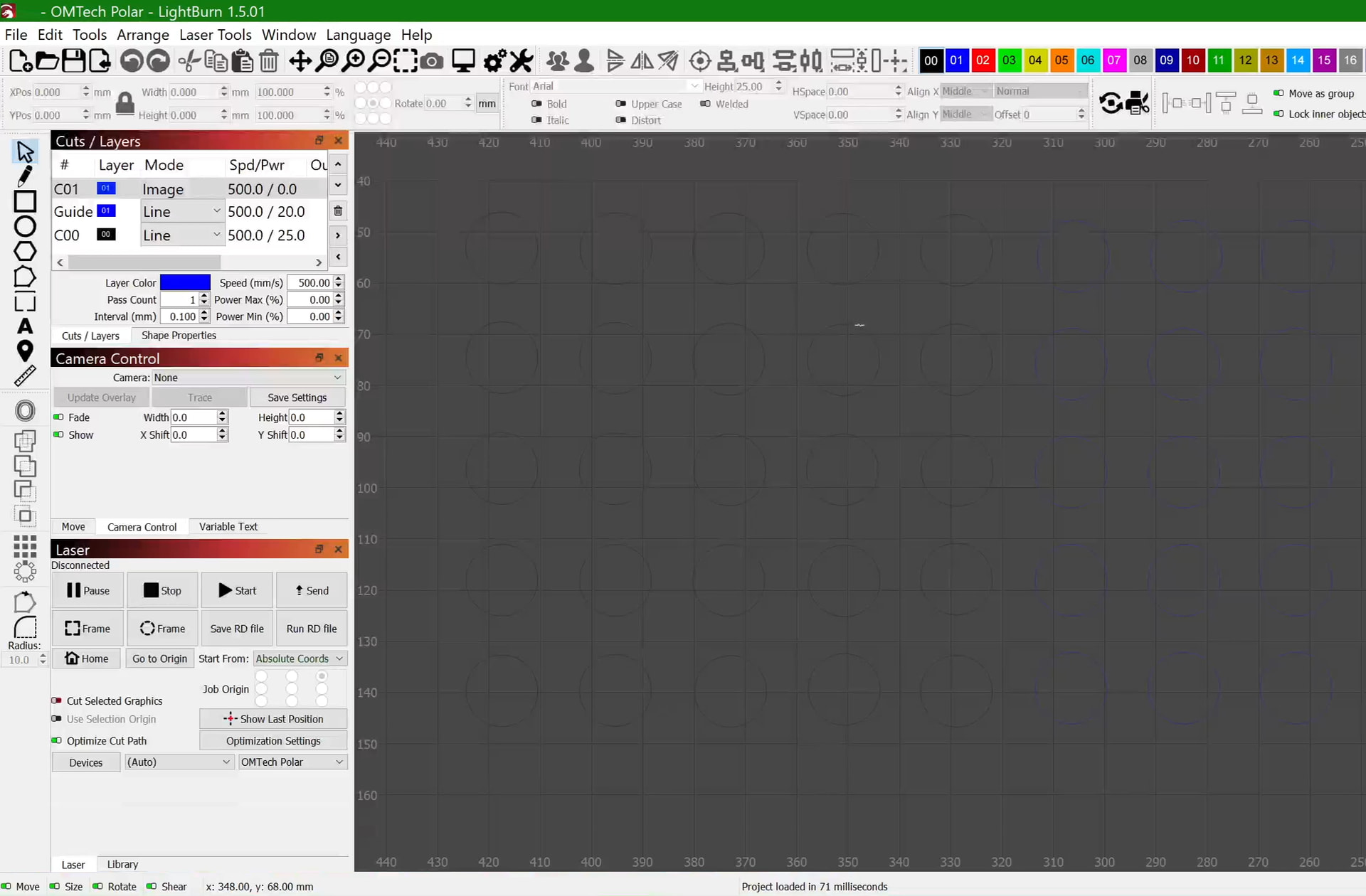
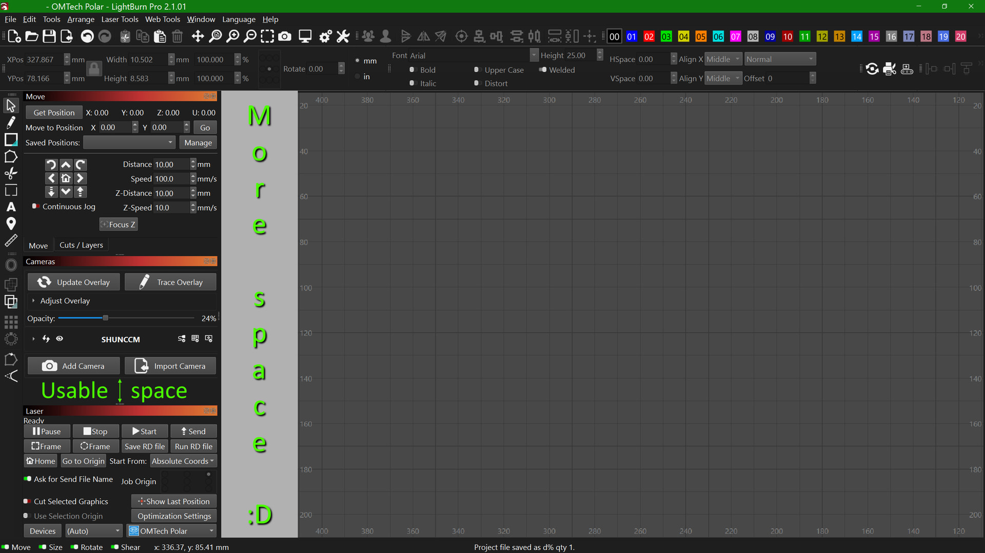
Here’s a comparison between how Lightburn looked in version 1.5.01 and how it looks now. My display scaling settings haven’t changed:
Look how much space was lost, for nothing! The new UI doesn’t do anything better, it doesn’t have any new features, the buttons are just forcing themselves to be bigger and hogging space with more margin! The minimum width of the application window is now 56% of my screen! And now that this has happened two major version updates in a row, it’s a trend! It might get worse!
And, before you say it, no, turning off high DPI scaling in settings doesn’t fix it. It barely makes the viewport encroachment any better; the margins are reduced to a reasonable amount, but the buttons still force themselves to be over twice as wide as they need to be, and the text becomes too small. Even if I use the slider to increase the size of the text, it doesn’t fix the button width problem!
As we add features, UI space also needs to be used to display those features. We absolutely do our best to give enough screen real estate for low-DPI use cases, but unfortunately we’re running out of screen real estate for those on the lowest-resolution monitors (Sub-1080P).
If your workspace is being reduced because your screen resolution is on that lowest end of the scale, we would recommend sticking with a pervious version of LightBurn, reducing the number of UI elements on screen at any one time, or increasing your screen resolution.
I remember the first Apples when they came out. They had a pull down menu that was intuitive, as they put it, to go along with a newfangled device called a mouse.
Since you only had three of four type of things you could do, it was pretty intuitive.
They also ran out of screen real estate, sound familiar?
When I look at your comparison, I note the screens are not set up the same. You have the tabbed windows opened wider in one view than the other. That can be adjusted to potentially recover much of this space.
Have you tried sliding the docking location window to be a little narrower? Let me show you how.
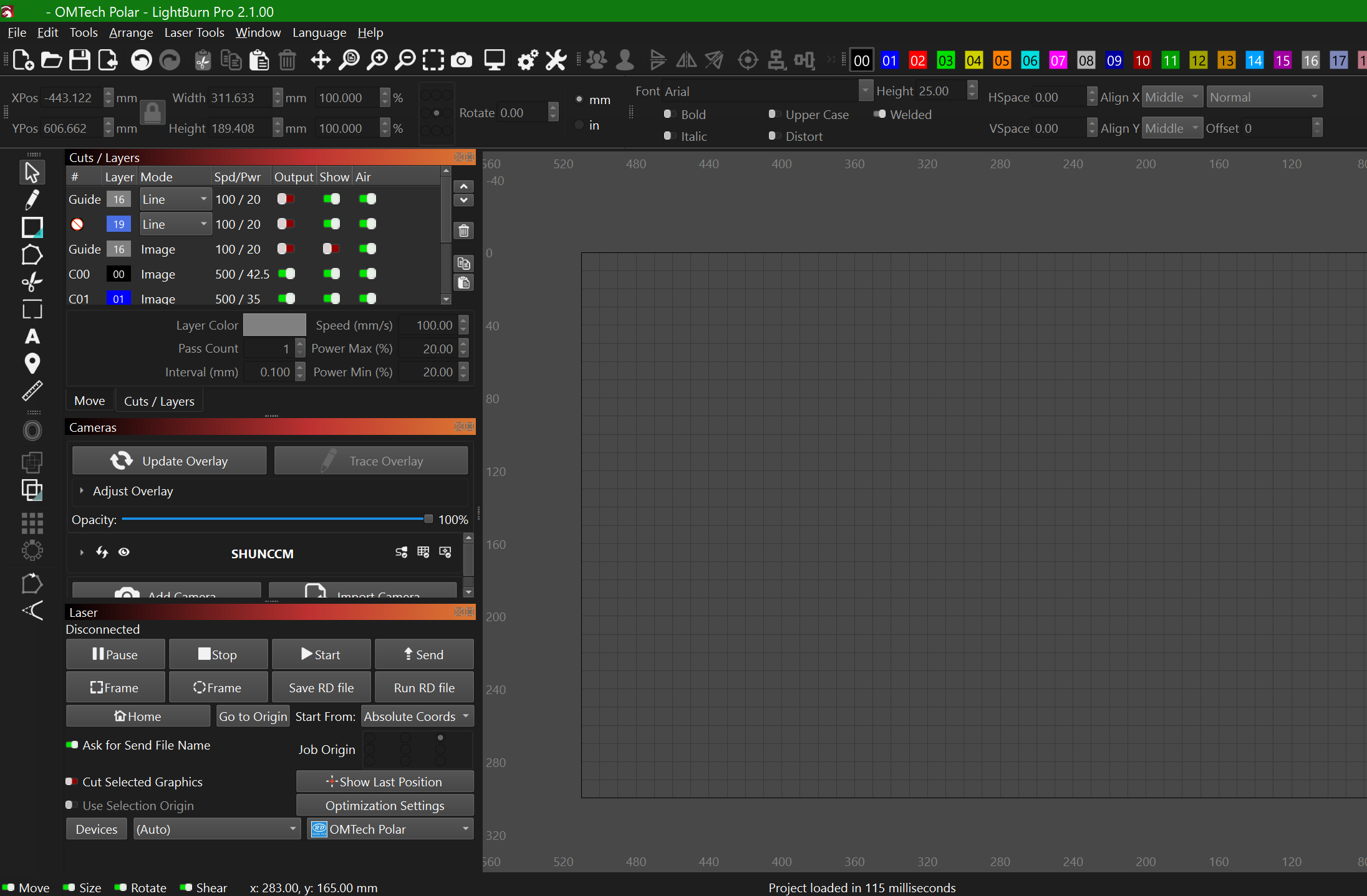
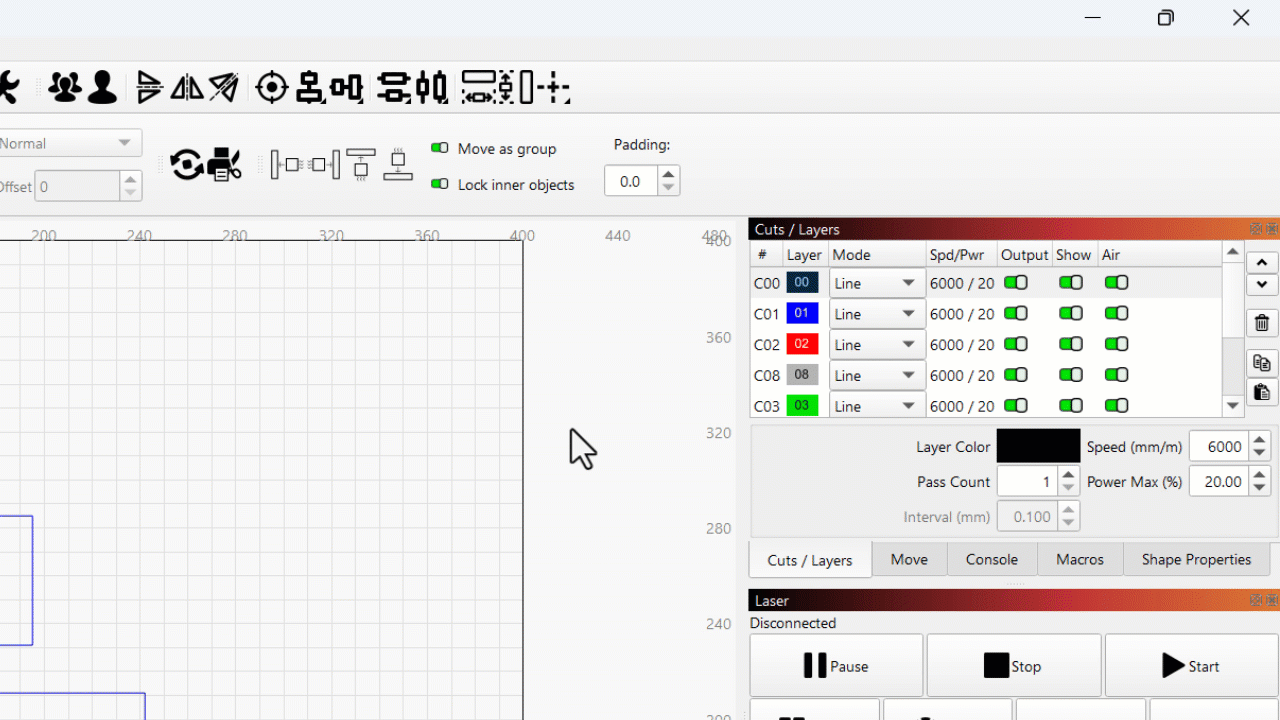
First, to prove that I’m capable of offering solutions instead of just complaining, I made a mockup to prove that there is ample room to decrease the minimum width of the docked windows panel. Even if you want to argue that there are more features visible now, there was still a lot of unnecessary horizontal margins that can be pared back to a much lower minimum. You can’t tell me that this example wouldn’t be usable, and even if you don’t like it, this is the whole point of giving users choice: If you want a bigger UI for the controls, that’s fine, you can drag it bigger for yourself. That preference shouldn’t prohibit mine.
Furthermore, here’s a video demonstrating that it’s not only possible to make UI buttons that scale horizontally, but it’s possible to even make the bounds of the buttons encroach on their labels instead of their labels forcing them to stay above a certain minimum size with huge margins. The former is preferable, and again, even if you don’t think so, enabling the former does not eliminate your option to choose the latter.
Trying to drag the docked windows panel narrower was the very first thing I tried when I noticed that each of the 2.0.00 and 2.1.00 updates made it wider. People usually tell me that I’m way too verbose, but apparently I need to step it up a notch because I’m still being perceived as a moron who doesn’t understand how to drag software UI edges around. Pertinacity! Salubriosity! Revolutionaries utilize floccinaucinihilipilification to deinstitutionalize antidisestablishmentarianism! Is that enough?
I’m going to be nice by refraining from giving the proportional, justified response to the suggestion of “whenever we update our software, you just have to buy a bigger monitor both during the worst consumer electronics affordability crisis and as we’re standing on the precipice of a global depression”. I already have a 1440p monitor; I’m not sub-1080, I’m super-. My Windows display scaling is at a perfectly reasonable 125%, which still puts my relative window sizing at 108.33% of what 1080p is at 100% scaling. My monitor is not the problem; this problem only started with version 2.0.00, and now I’ve demonstrated that it can be ameliorated.