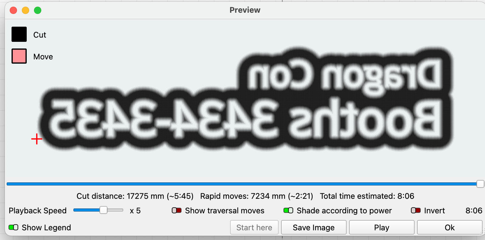
I’m getting a very different preview with 2.1+
I have a rubber stamp project. Ramp is on. The same file under 2.0.05 & 2.1.01 shows differently in the preview. I’m not sure whether there are other issues, as I haven’t tried to burn under 2.1 yet.
Good news and bad news. Good news is other than the chosen font (we will come back to this), it loaded fine in both LB versions.
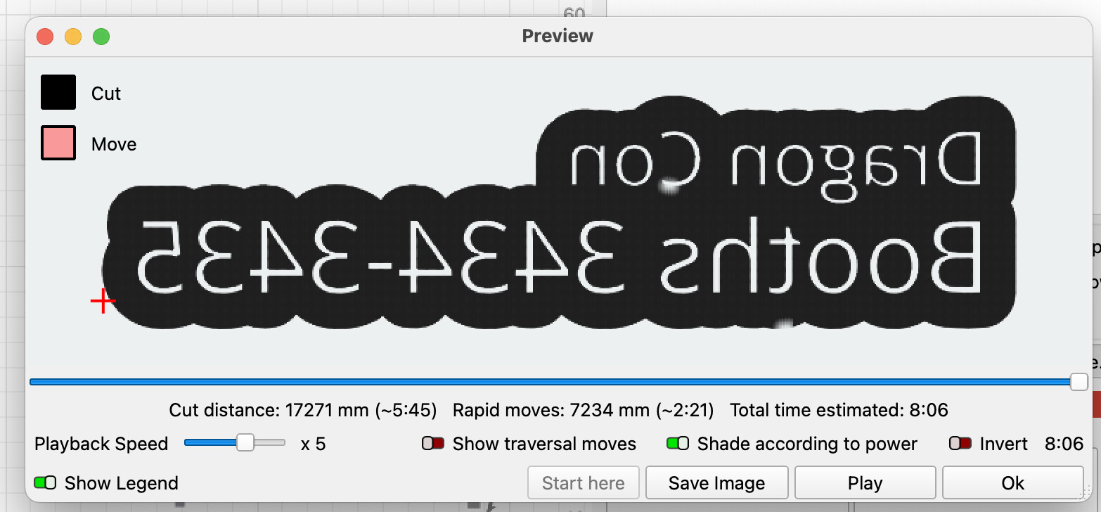
The bad news is that the v2.0.05 and v2.1.01 look the same on my machine.
”Chosen font” revisited: Is it possible that fuzzy look is caused by using the “OPEN SANS” font? I tried some text with Arial, but it still had crisp edges.
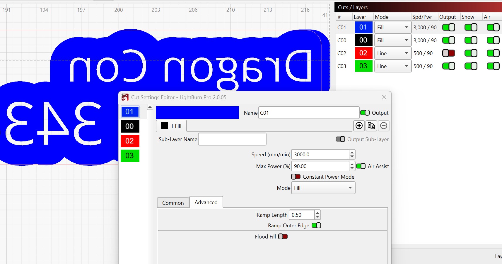
Even if I just preview the outline area, not the text, it shows the edge of the blue area as shaded on 2.0, not on 2.1. So it’s not the fonts. It’s something about ramp and the way it’s being previewed. With ramp off, it’s sharp on both.
With it being sharp on both of my versions, I am afraid I am not much help for you. This appears to be something the Lightburn staff will have to investigate.