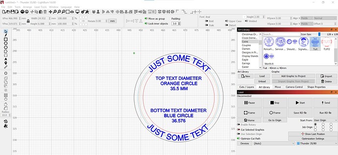
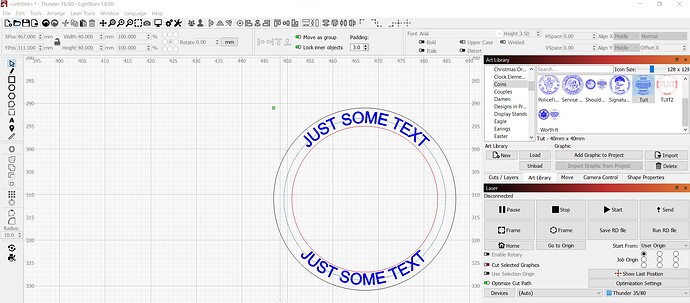
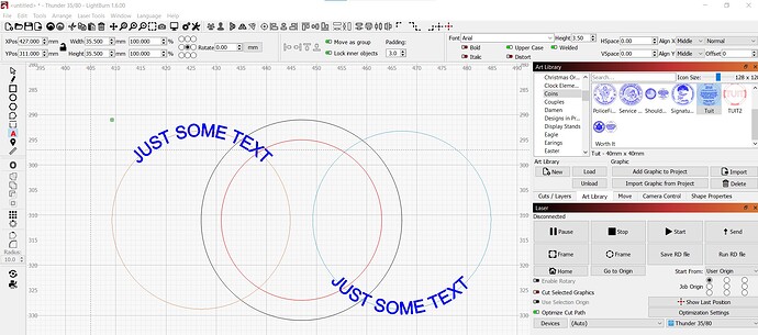
Something I have not ever been able to figure out is when you have 2 sets of text that have been Applied text to path, one on top and one on the bottom, even though everything, text size, alignment, h & v spacing, etc. is the exact same, the bottom circle must be larger in order for it to be centered the same as the top text. In the examples, you can see in (Bottom Picture), the black and red circles are what I want the text to be centered within. In (Middle Picture), the tool layers are the same size, as is the text, yet when everything is centered, the bottom text is closer to the inner line. The blue tool layer must be enlarged, (Top Picture) to be centered within the black and red circles. Why is this? I would think if everything is the same, then they both should line up the same.
I’m thinking it’s because some lowercase letters extend further down than all caps. It’s probably centering on the top of the highest letter (in the font) and the bottom of the lowest.
I agree to Scott, at the E letter you can also see that the line does not go through the exact center of the letter, but at the lower border of the middle dash (I don’t know how to describe it properly in English ![]() )
)
This topic was automatically closed 30 days after the last reply. New replies are no longer allowed.


