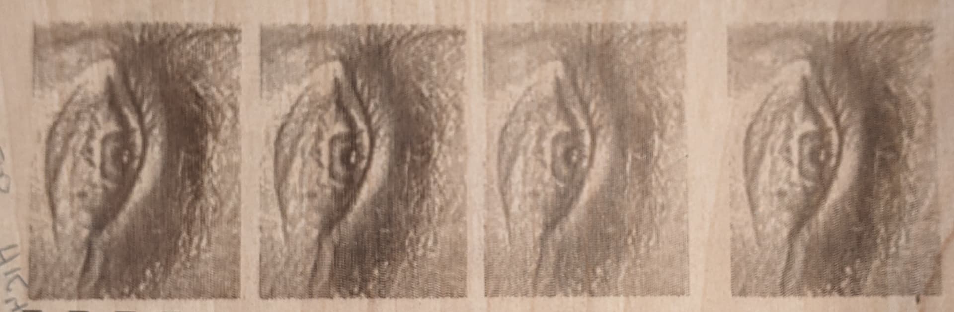
OK. They’re two different machines, and ULS, while I believe their halftone scheme is excellent, ULS images are not going to stand up because the Line Interval is flawed and not readily controllable. We can get like 500, 333, 250, 125 lines/in. I can’t dial it in much at all. And I’ve probably got the backlash set suboptimal on the Jarvis dither, I had limited time hopping between machines and it was the best I could do at the time. Also I was on the X100 which might be doing something different where it appears to commit to repeating the same line twice, I think the PLS660 was one line, but its PC was borked at the time.
For this, I’ve got small text in I think 75%, 50% and 25% grey, and a gradient bar. The case I make is that ULS’s non-random, variable-length-dash burn guarantees a determinate feature thus even a few raster lines makes the letter readable. No one solution is perfect- a Jarvis dither, or any square-pixel solution, while excellent in its own way, cannot represent detail like continuously-variable-width-dash halftoning used by ULS.
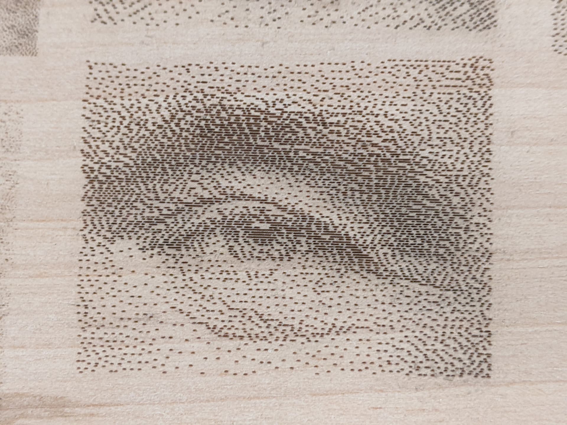
As we create grey text, the lighter the shade, the probability of a pixel being black becomes rare and at some point there are too few pixels to compose a recognizable feature. At a distance of course the pixels visually blend and create a great result. But small features composed of only a few raster lines and/or of narrow width cannot be discerned.
Let me describe it this way. Any pixel has a binary choice to fire a pixel or not. Any square-pixel method has the horizontal pixel resolution the same as the line interval (although there are intermediate concepts of non-square pixels where the horizontal resolution can be greater than the line interval). If you have a feature that is, say, a 45 deg diagonal line in a 5x5 grid of pixels and the line’s stroke is 2 pixels wide, if it is a 100% black line or Threshold is used, you get a recognizable black line, but our goal here is to represent shades too. If the line is 50% or 25% grey, and/or aliasing places the original bitmap’s pixels resampled across the raster lines which turns one black pixel into 2-4 grey-shaded pixels, the occupied pixels only have a probability of firing, and the resulting noise makes the feature indiscernable.
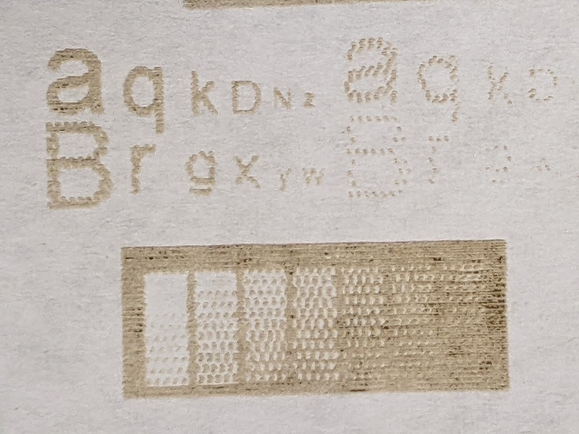
Here’s ULS. We also have a vertical line interval, and an equal horizontal interval of START points, but unlike square-pixel solutions we do not make a binary decision to burn/not burn based on probability or pattern. The element is a dash of continuously variable length, created by varying the on-time from 0% to 100% within a dash element. This means a diagonal line of even 3x3 intervals of 25% gray would likely be recognizable.
The patterning does have a lower threshold, you start with pure white and at some point you either have to burn a dot or not. So very light shades may create a pulse so brief that we don’t get any color change in the target so no feature is created. And its offset-square pattern of start points is apparent, which may or may not be aesthetically desirable. I’m not saying it’s perfect, but it can represent considerably smaller detail for a particular line interval.
Could you still achieve better resolution by using a shorter focus engraving lens with a tighter spot and a tighter line interval? Of course. Or could you reduce the power for the same lens so the spot size is slightly smaller, and increase the line interval? Also true, but not the point. These methods are going to take proportionately much longer machine times to run more lines. The metric is how small a feature can be in terms of raster lines and still be effectively represented. At that, ULS’s variable-length-dash halftone scheme is much higher than any sort of square-pixel random dithering.
The case for nonsquare pixels like this variable-width-dash halftoning is bigger than that. If you do a “deep” burn which actually has depth similar to- or deeper than- the line interval distance, then we have a structural problem. Some people would stop and dismiss me right there as “you’re just doing this raster wrong”, but hear me out. It’s just different.
The prob is the resulting unburned spots will simply burn up and/or break off due to their thinness in certain conditions. The problem conditions can effectively be circumvented within the variable-width-dash-offset pattern, but not others unless they kill the resolution by composing each pixel element out of multiple horizontal lines.
If you have the backlash set correctly and line interval is “correct” for the spot size and does not overlap lines, halftoning makes a more structurally sound feature because it has guaranteed width. If you keep the gray level below 50% black, then one line’s dash burn will not overlap with the offset dash on the next raster line, and structurally that is a very important threshold. If you can meet that criteria, certain effects are possible that just do not work with other methods. Going through a presentation on structural burning, maybe that’s a big thing for another day. But, it’s quite a powerful option to have work down to single-raster-line features.