Hi all,
Is there a way to make the layers color palette more friendly for color blind people ?
Hi @Theozefrench. That does sound like it might be challenging to tell them apart, I know I sometimes struggle with some of the greens and blues. There are tools in LightBurn that can help you find the layers you want.
The layers are listed with numbers as well as colors on both the palette and the cut/layers window.
In the Cut/Layers window, right clicking on a layer will make that layer “flash” on the workspace/edit window. shift/left click will select everything in that layer.
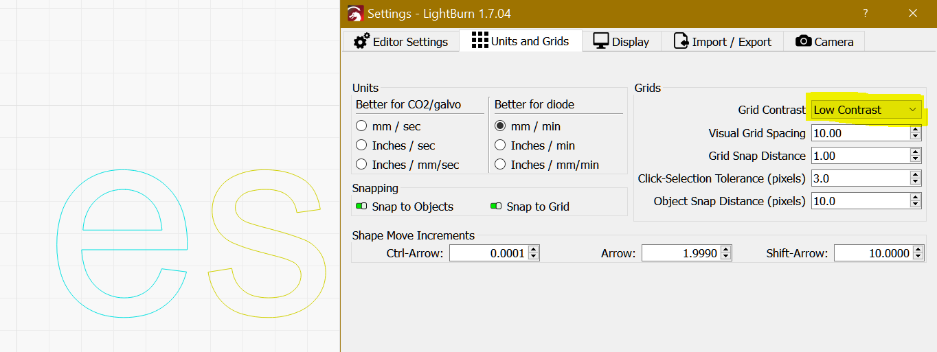
Aside from choosing layers your find easiest to contrast, there isn’t a way to choose the colors yourself for the color palette. We have a detailed explainer for the color palette here:
It is possible to turn off the numbers, if you have no numbers showing on the palette, they can be toggled on via Settings->Display Settings->Show Palette Button Labels
1 Like
Wow! Just added something else to my list of I Did Not Know items.
1 Like
1 Like
While I’m not color-blind, I cannot easily distinguish more than a few of the 30-odd shades.
So I depend on the Material Library to hold the settings I need for whatever material is on the platform, then assign those settings to the few layers I can easily distinguish:
C00= Black = engravingC01= Blue = markingC02= Red = cutting
If a project needs more than three settings, I work my way through shades of similar colors for similar functions, for example C02 / C10 / C15 / C20 for cutting in various materials.
If one project needs more settings than that, I eventually realize I’m trying to be more clever than I can handle, split it into separate files for different materials, and start over with three colors. ![]()
3 Likes
thats a good one! Thanks.
1 Like
This topic was automatically closed 30 days after the last reply. New replies are no longer allowed.