I was using Inkscape before Lightburn and images in the former are a lot brighter and bolder than in Lightburn. I have a large IPS high quality monitor and the images that I draw are so faint in Lightburn my eyes get strained looking at them. Not so Inkscape, Visio, Coreldraw, and almost every other drawing program. Is there a way to increase contrast? The lines eg, red cut lines aren’t even discernible from 4 feet away (I don’t draw that far away, just trying to get an image of what it is like). I went through every menu. Nothing. I tried dark mode and the red lines almost completely disappear. Can Lightburn programmers increase the pixel width or contrast of these lines? Great program and
I love it but this is a really big deficiency. I have screenprints from each app (Lightburn and Inkskape) to show the difference, which is outstanding.
What resolution are you running LightBurn? LightBurn doesn’t do great with high resolution screens without scaling.
If you include specific screenshots might be able to provide more specific feedback.


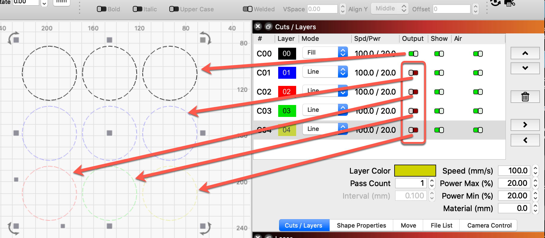
Oh for pete’s sake!! That’s what it was. I just turned off cutting a few days ago because I wanted to only cut the new stuff I had drawn in. It never occurred to me that the parts not selected would be dimmed. (Not something I encountered in other drawing packages). Thanks for this. ( I just spent last half hour trying different display resolutions to see if I could improve the contrast!!)