It could so easily be me, but any idea why the bottom of the date isn’t lasering correctly - on screen it looks perfect, on the preview it shows it won’t laser correctly - and to be fair it does exactly what the preview shows.
albeit, i just figured maybe its too small (although it shouldn’t be) and increasing the line interval to 0.04 solves it - weird because i also have an issue with cuts having a jagged edge - wonder if ive accidentally missed with a setting somewhere.
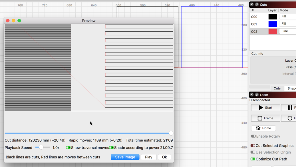
Notice that the bottom of the date is missing due to the interval you have set for that layer. With ‘Fill+Line’ set, you can see the boundary of each object along with the lines of the ‘Fill’. With it set the way you have it, the last line of the fill is above the boundary so it looks cut-off.
Once the interval/gap has been adjusted to the look you want, change the setting back to ‘Fill’ as you had before and you should be set.
yeah i see what you’re saying - weird as even though i’ve lasercut thousands of these, this is the first time i’ve used this font and first time ive had an issue where the scan gap became a probelm.
any idea what would cause this? the usual suspects mirror/lens, belts etc have all been checked - few people suspected it maybe that the laser is firing in ‘PPI mode’ rather than ‘linear’ its a ruida
Do you have an aquarium pump compressor, or a regulated airflow? Those lines can be caused by the piston-style pumps that the machines usually come with.
LightBurn is doing exactly what you asked it to do with these settings. Yes, changing the font can have this result if the font is not the same size as you have not adjusted the gap to accommodate this “taller” font. Look at this example:
2 rectangles (black and blue), each set to ‘Fill’ but with different intervals. Red layer has a single line as a reference to the bottom of each rectangle to show where the Fill ends. Notice that the blue rectangle fill comes up short of the bottom. This is due to the gap between each fill line, and the next line calculated to be drawn in the fill would fall outside the rectangle, thus not drawn.
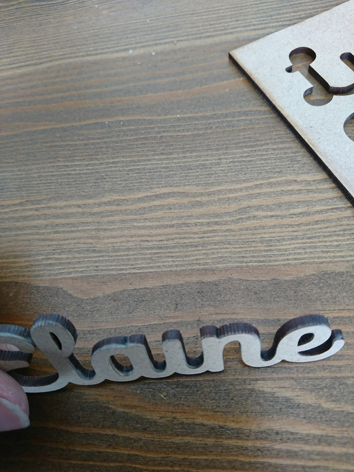
As for your other attached image, I am not sure what you are showing, but the cut looks like there was some bouncing happening during this cut. Is this what you are trying to show?