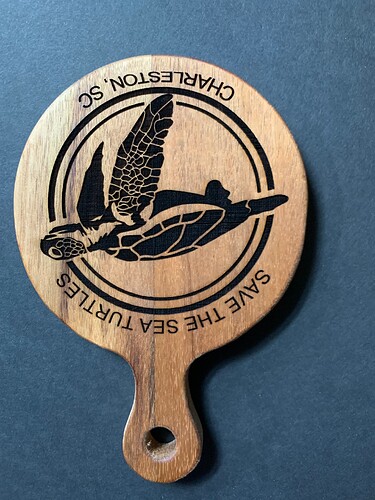
When using curved font the letters at the bottom of the curve are smaller than the remainder of the letters. Have several different projects with different fonts and the same outcome. What is the best way to get the font the same all letters? I am using the Lightburn font program. What is the best setup for curved text? When I used laser GRBL I made my font/wording with my paint program and then just did it all as an image file! New to light burn! Want to master this program because of great reviews. Machine is calibrated. Images come out fine. Just issues when I do curved fonts.
A photograph of what you’re seeing would be helpful to understand the situation.
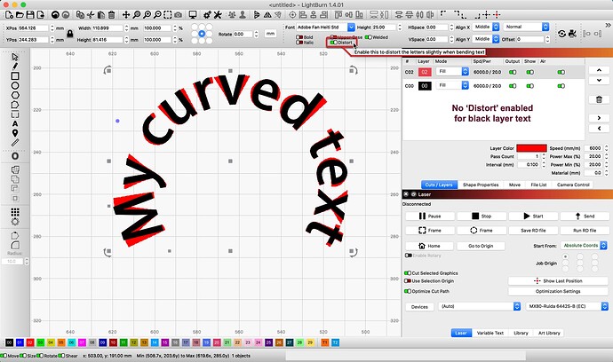
You may be referring to what is known as ‘Distort’ in the Text settings. Below, I share a view of the same text duplicated then placed and aligned directly atop each other. The red layer text has the ‘Distort’ toggle enabled (green), creating this “letters at the bottom of the curve are smaller than the remainder” effect. ![]() To reduce this, keeping the text unchanged when curved, turn ‘Distort’ Off (red).
To reduce this, keeping the text unchanged when curved, turn ‘Distort’ Off (red).
Text & Fonts - LightBurn Software Documentation
When bending text, you can use the “Distort” toggle to choose whether to distort the text as part of the bend, or leave the individual characters unchanged.
What does this look like in ‘Preview’? Please show us a screenshot of that.
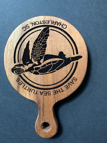
Not what I’m talking about. Attaching picture. Look at the RLEST in Charleston!
Yes, I can see that now. Thank you for updating. This is precisely why I am asking to see this from the ‘Preview’ in LightBurn. ![]() My speculation currently, from this image, it appears to be something that may have bound up the movement of the laser. Might have caused the production to “smooch” (highly technical term, I know, but it is Saturday here) in the area you identify. I was intending to confirm this theory.
My speculation currently, from this image, it appears to be something that may have bound up the movement of the laser. Might have caused the production to “smooch” (highly technical term, I know, but it is Saturday here) in the area you identify. I was intending to confirm this theory. ![]()
If that is the case what do I need to adjust
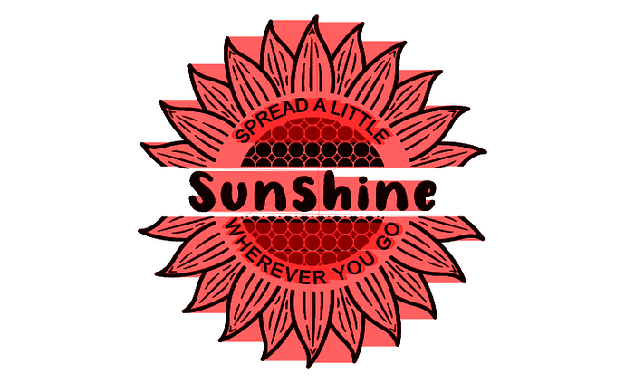
This is the main picture I was trying to do on a small Acasia Paddle 105mm
That’s a completely different design, though. Will be hard to correlate any issues from design to burn when referencing the same design.
Can you at least tell me what smootch is and what possibly to look at?
What are you referring to here?
Are you not able to provide a preview of the same design? Or a burn of the design that you showed the preview for?
In any case, this issue is almost certainly mechanical. Something is preventing the laser from moving as far in the Y direction as required. What’s not clear is if this is something consistent across the bed or just somewhere near the area of the laser where the compressed text was burned.
I’d suggest a mechanical review of the machine to see if you feel any binding at any position along the Y-axis. Then identify the source of the binding and remediate it.
This topic was automatically closed 30 days after the last reply. New replies are no longer allowed.


