I cannot figure out what I am doing wrong. Whenever I bend longer text with the blue dot, (as the top row of text in this example ), my text looks fine on the screen and in the preview but is very distorted when it comes off the machine. Pic to show an example. Left is what I see on screen and right is what I got off the machine. It is much more defined the farther out toward the edges. The first and last letters are really distorted. The short text at the bottom is not distorted.
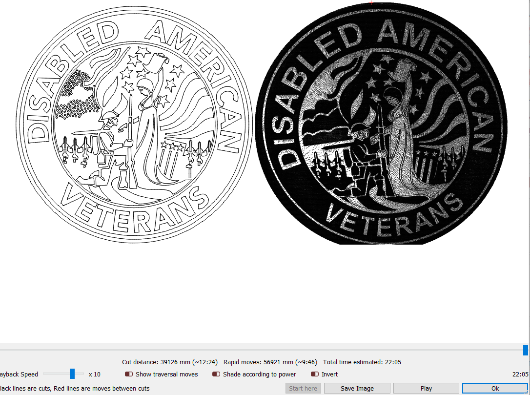
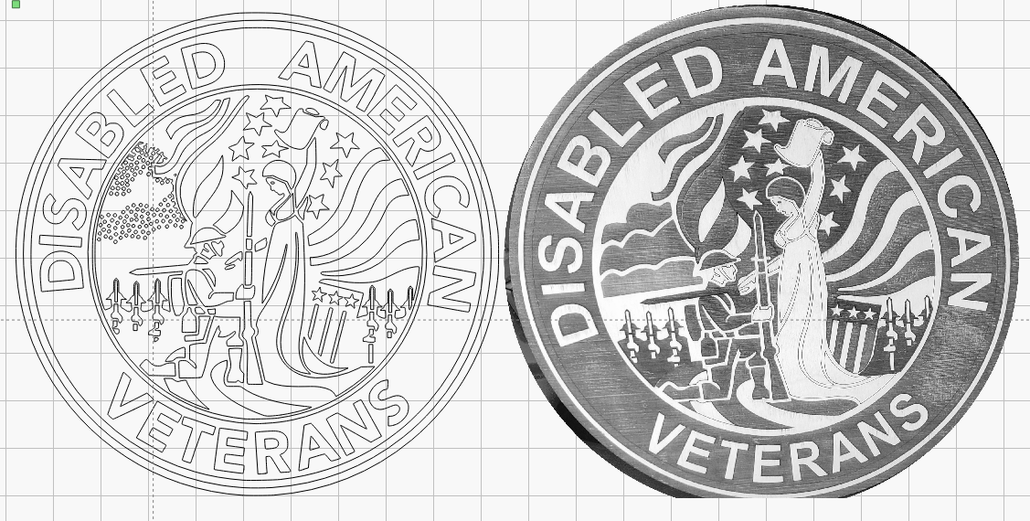
What’s sent to the machine is exactly what’s generated by LightBurn for the preview, so those should match. Text bent with the blue dot does stretch the lettering, though it’s come up often enough that I might make that optional.
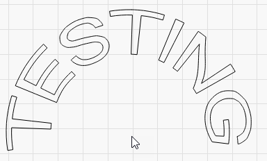
The more extreme the bend, the more extreme the stretch:
This topic was automatically closed 30 days after the last reply. New replies are no longer allowed.