I came across a funny thing today and I just wanted to check if this is normal, or if I did something wrong.
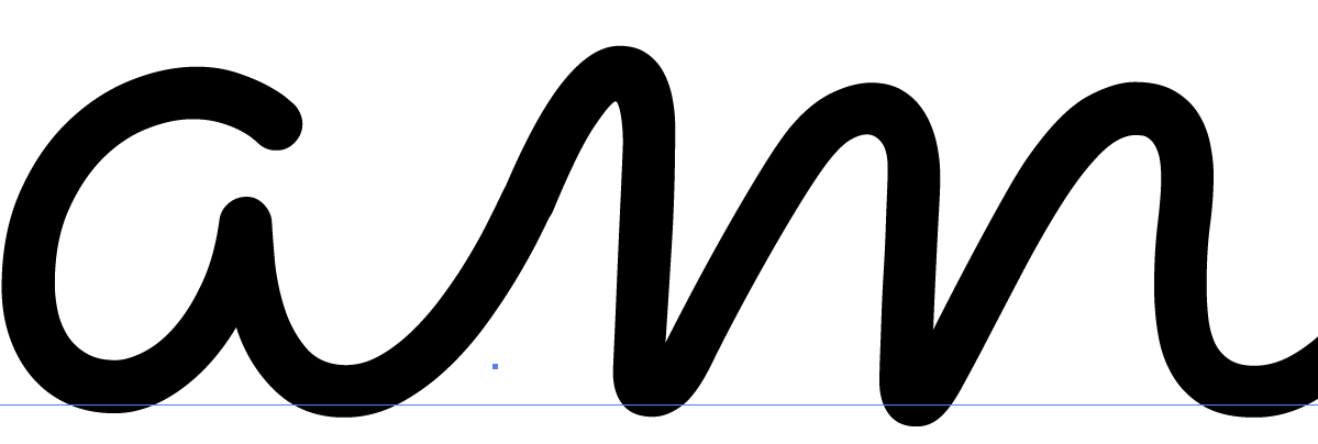
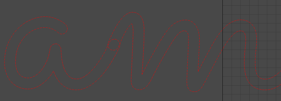
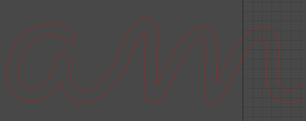
After downloading some new fonts from the internet, I found one which behaved odd. I noticed that in the case of an 'n’or ‘m’ character, lead by e.g. an ‘a’ results in a weird partial overlap. When I check this font in illustrator, it seems fine.
I have seen this with some fonts in the past, but now I would like to find a solution, if possible.
Can you guys help me out? Is it something to do with my settings?
Hmm… that’s odd. Are you using the auto-welding feature or doing this manually?
In either case this may be a kerning bug/artifact. As a workaround, try increasing the horizontal spacing. You might be able to make up for the shifting to it aligns.
I tried the suggested method of altering the horizontal spacing. While this works for fixing this issue (I had to set 0.4), it of course changes the spacing for alle the letters, introducing more problems.
Unfortunately the font loading / kerning is handled by the framework library LightBurn is built on top of, and there’s not much I can do to alter the behavior of it. The library does handle kerning pairs, so this should be working similarly in both apps. Can you tell me the name of the font and where you got it?
I’ve looked, but there’s nothing I can do about it quickly. The platform framework we build LightBurn on is what handles fonts. It’s feasible that the font engine in that framework isn’t kerning exactly the same as Illustrator, but I have no control over that code or how it happens.
At some point we’re going to be writing our own font handling, but that’s not simple and will take a good chunk of time.
I’ve had the exact same issue in Illustrator with many fonts like this. After welding them together I have to go in and delete nodes and make adjustments to smooth things out. I’d say it’s strictly the fault of the font designers who don’t ensure the overlaps fit together precisely.