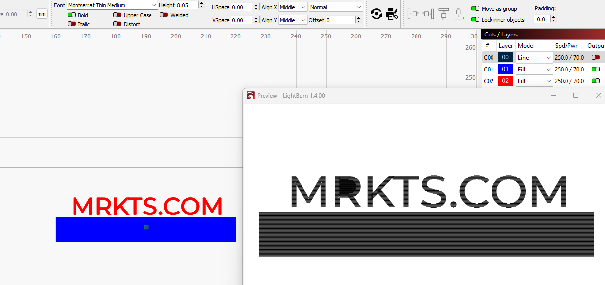
Why does this font show correct on the screen but when I preview it gets all weird? Looking at the R it should not be filled in at the top. The “O” in .COM is fine…
Is there something I can change to fix this? I really need to use the font to match existing branding.
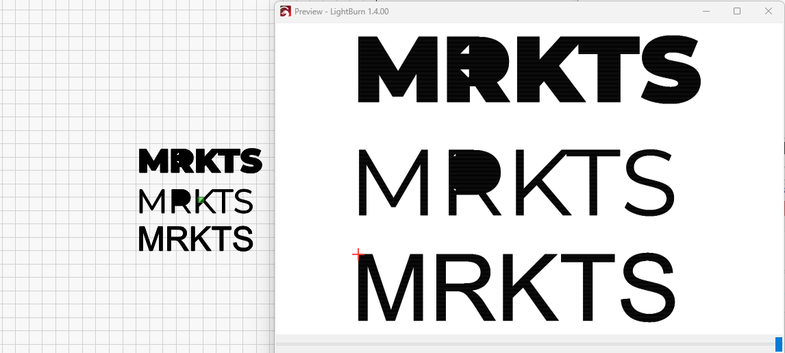
It seems that changing to “Thin Black” then causes some other issues. Such as clipping of the characters, take a look at the “M”.
Not sure what is going on here but none of the Montserrat fonts are working 100%…
Thank you for this post. It would be helpful to review this file, so please post. How was this “text” built? These shapes look like text, yet produce as if they are just shapes, set to fill, so this is why I ask.
Please see attached, I have created a new file but the same issue as mentioned above.
I simply click the text tool and type then change the font to my desired output which is Montserrat. It appears fine for a second but when I click anywhere else it instantly fills in the “R”.
If the text is on “Line” it also looks weird. I have added a regular font “Cambria” to show what I would expect it to look like.
I am not finding this exact font, but did find “Montserrat Thin”. I see that this font has line segments that cross over itself. If the ‘Welded’ is also set, you can see how it changes what is produced. I might search for an alternative which provides this look without the rendering issues.
No idea why the Montserrat fonts are not compatible with Lightburn… For now I will just create in Photoshop, Corel Draw, Microsoft Paint, or Word then move into Lightburn.
Hopefully this can be fixed eventually as I hate to use numerous programs to accomplish something so mundane as creation of text.
I would like to add that this isn’t just a rendering issue but it will appear in the finished product. Doesn’t matter if the font is “Welded” or not.
Again I find it odd that the Montserrat fonts do not play well with Lightburn. These are popular fonts. Not like helvetica but certainly someone else will find this issue again.
LightBurn is not where the issue resides as it’s definitely within the font itself.
If you’re inclined to do so, you may ask the font designer to address the issue of overlaping lines as already stated. Or simply find another font that is close.
Have a look at thee two. They appear to be very similar.
Further to be noted are the other fonts with this issue.
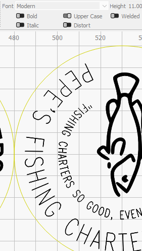
For example the font “Modern”, appears to have the very same issue in Lightburn as seen here. It’s a baked in font comes with Windows 11.
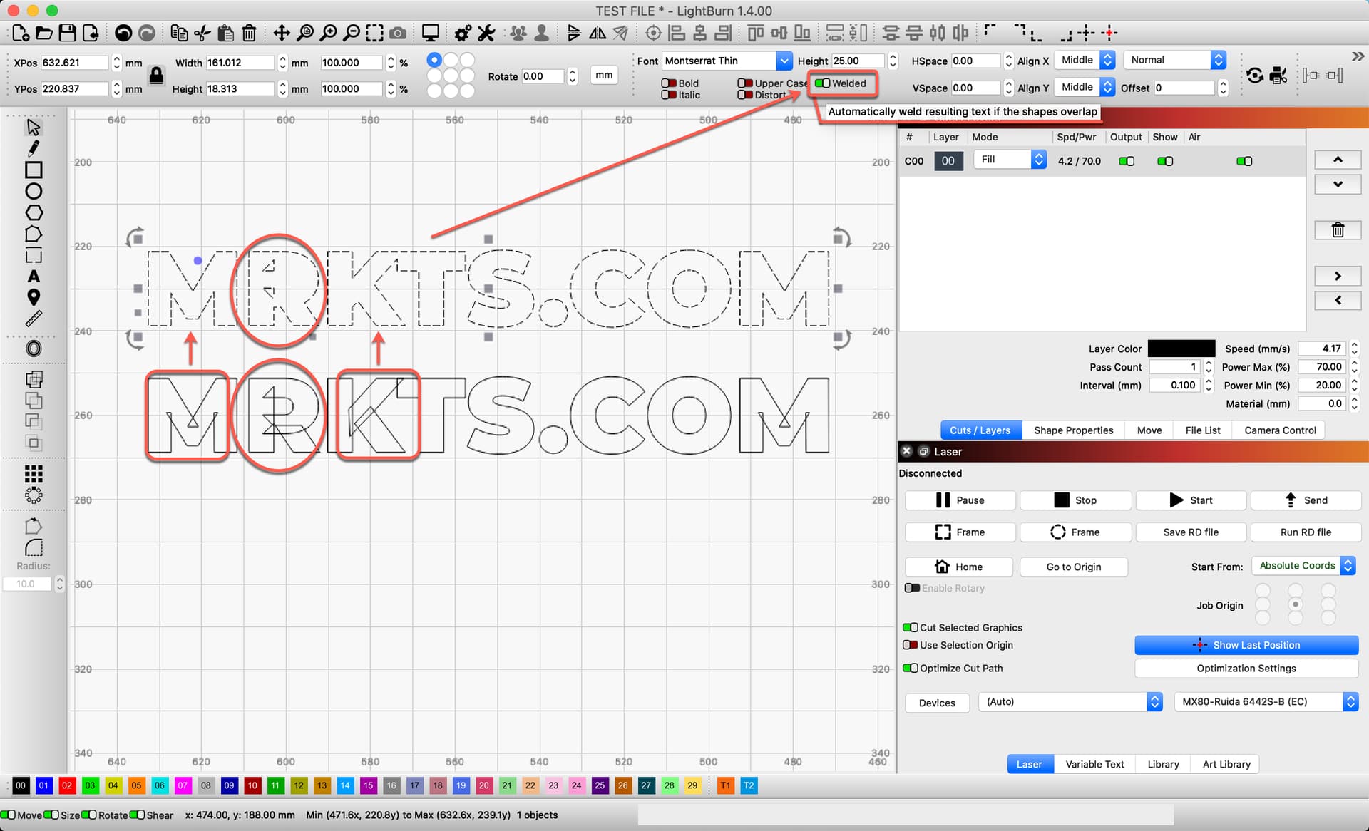
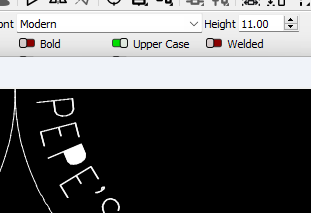
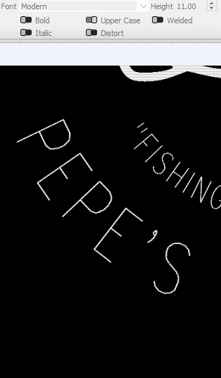
The odd part is the behavior behind this in Lightburn. The reason I say this is that when you have the font as shown “not welded” the workspace shows the font as it should correctly as seen here.
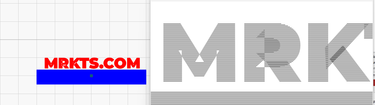
But when doing a preview Lightburn then suggests that the P will actually be welded, same with R.
So my question is why does the workspace reflect it correctly as unwelded but then the preview messes it up? To me this still seems to be a bug rather than blaming the fonts… there are many with this same issue. I just don’t get it…
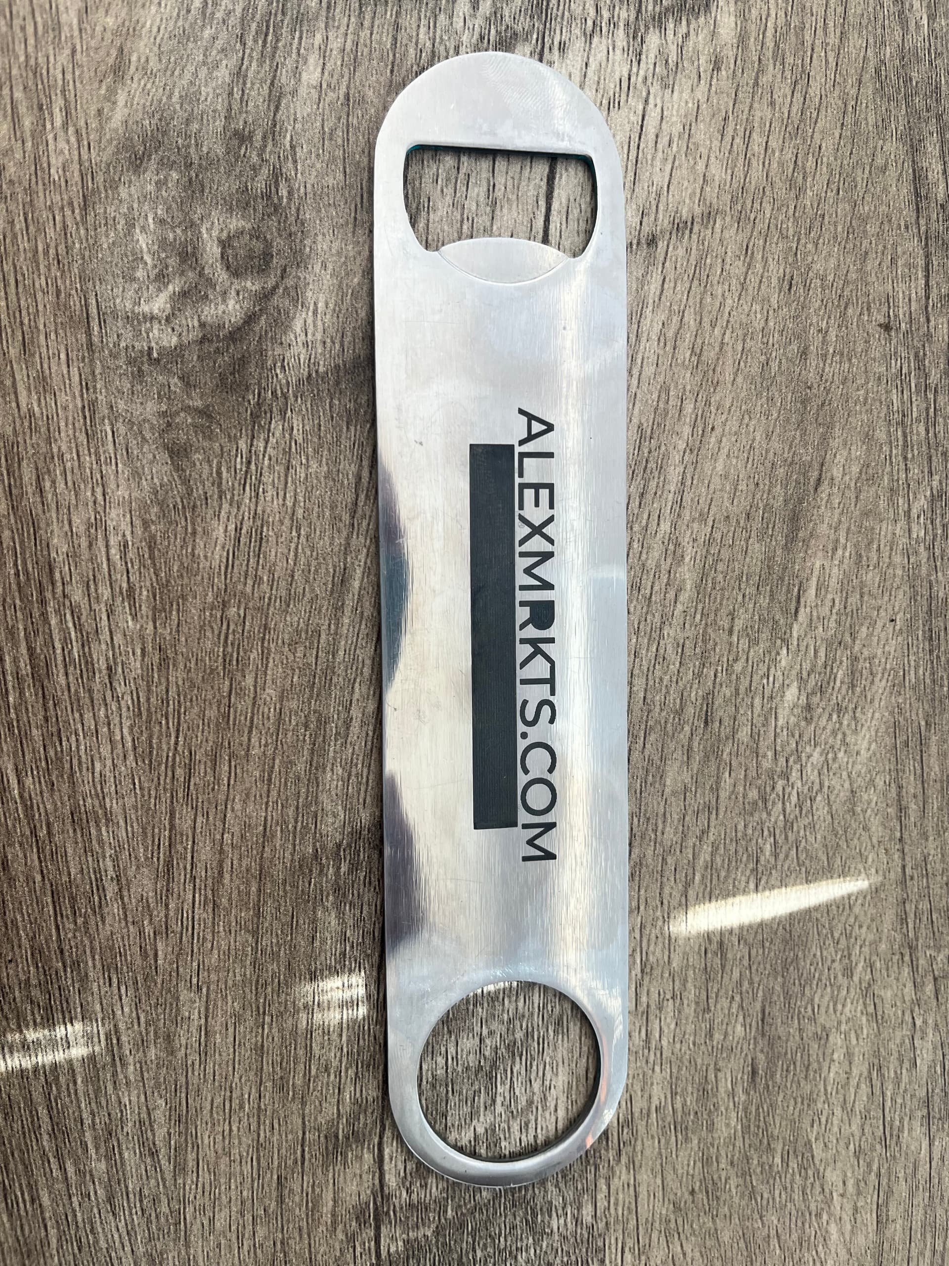
So there wasn’t an issue with the last job “Pepe’s” cork drink coaster coming out like that image above with the odd weld.
So I guess this is now 50/50 if it will print in the job or not… as you can see previously it sometimes gets engraved (see bar key photo above). Other times like my coaster (last post) it does not get engraved just lightburn thinks it might… #shrug
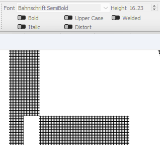
Here’s another font with issues btw…
Bahnschrift SemiBold
Sorry about all this mess, just wanted to chronicle my “welded font issues” with stock windows fonts, and other fonts that are good too!
Yes, you can see how the font is built by its developer. Without welding, the components used to create this look overlap each other, causing the fill to toggle off, then on again. Weld fixes this for this font.
I am not familiar with the “Modern” font. Looked on my latest Windows system along with some googling without luck. As named, I do not find it listed as distributed with Windows. I assume the font has similar overlapping components used to create the font. Weld should resolve, but I can take a closer look if you can assist with the exact file name for this font.