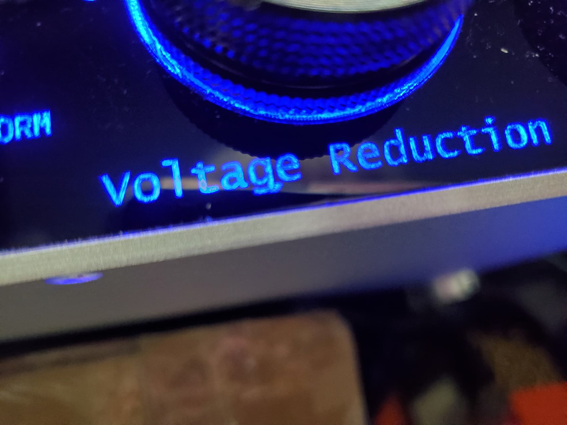
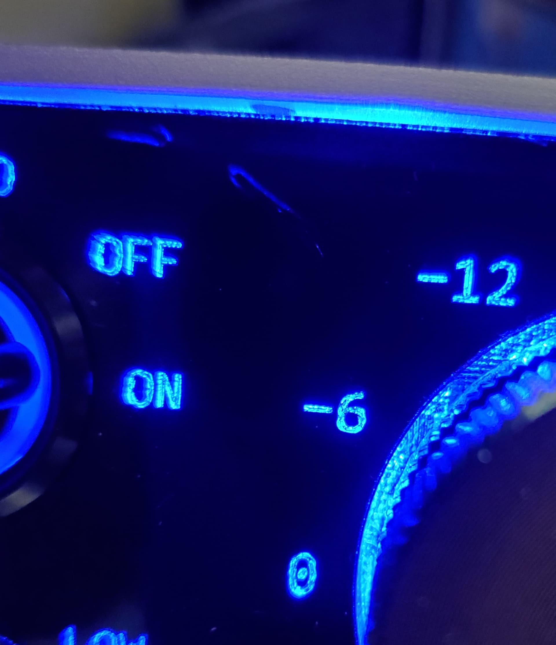
I’m trying to burn/etch small text in 1 mil acrylic. The characters are not imported and are simply created with Lightburn. I am not cutting all of the way through the material, just burning slightly into the backside of the acrylic sheet that I had painted black. The text is set up reversed so that it creates a smooth backlit front panel. However, in the text I can see that the characters are very grainy. If I had to equate it to printing, I would say that it looks like 50 or so DPI. The Lightburn text sizes I am using are 4 and 4.5 so the text is pretty small. How can I increase the resolution or are there any types of tricks to improve the result? Also, if I created the text in, say, Corel and then imported it would the result be improved?
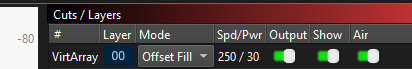
What is the layer set to?
Fill?
Offset fill?
Line?
What speed?
What power?
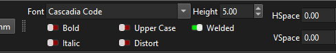
What font?
How many passes?
Not at machine now. Will reply in the AM when I am at the shop. Thx.
That actually doesn’t look too too bad, i’ve done this quite a few times.
I have found that running a couple of passes helps clean it up a little bit
I use a low power so it doesn’t remove too much material at once.
Also swapped to a really short focal length lens 38mm made the smallest dot size possible.
SHX fonts may work better than Windows native fonts.
Try engraving on a test piece without color to avoid it being melted into the engraving.
But the result will always be a little “frosted”, this is the nature of engraving in acrylic and mostly glass.
When engraving acrylic, you melt the surface without it being flame-smoothed/polished as with (correct) cutting.
@JimNM is right with his recommendation of the SHX font, but it can only be used up to a certain font size, unfortunately.
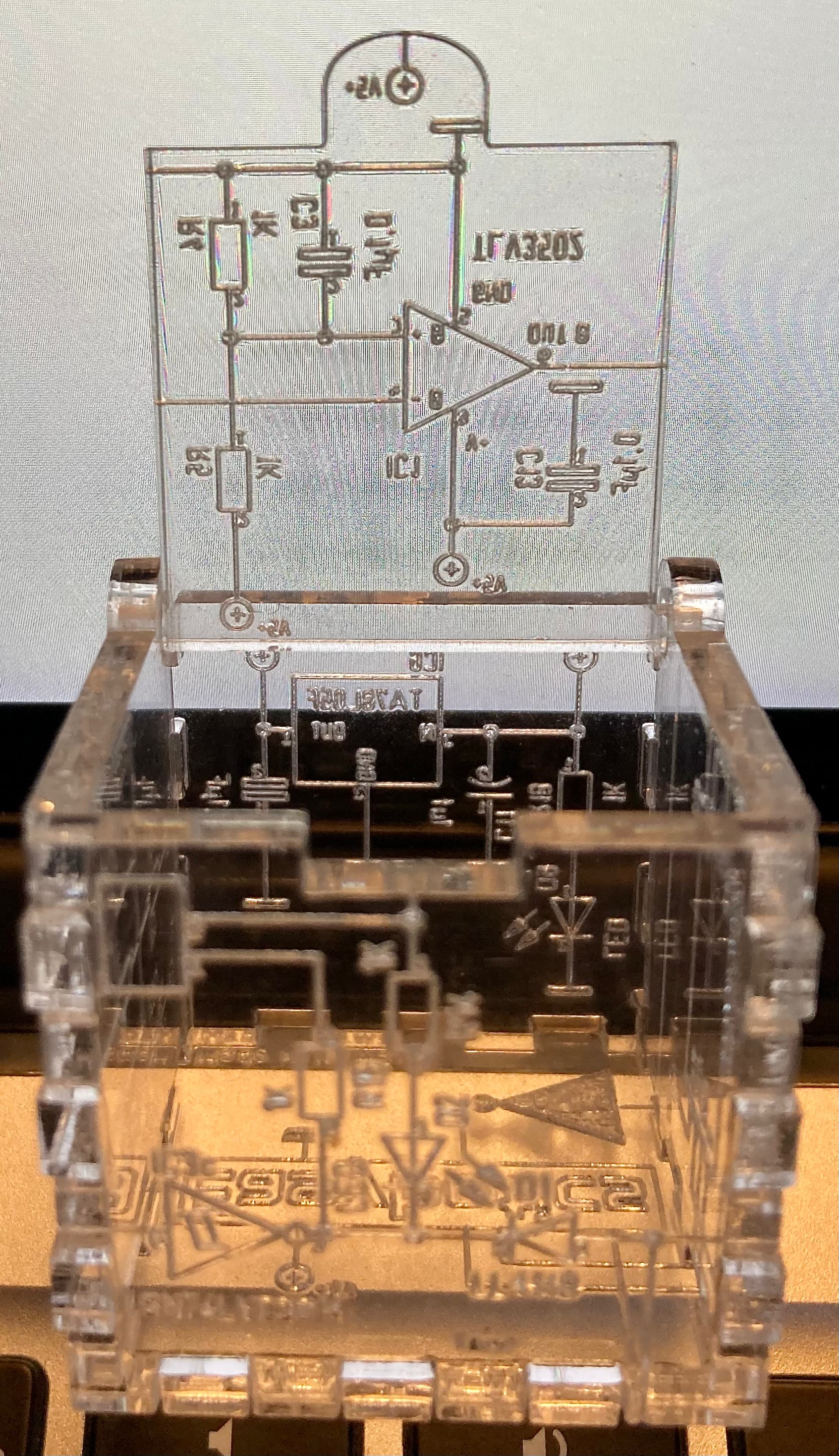
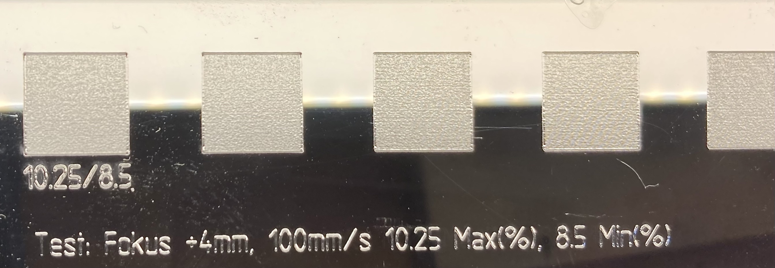
(the small cube is 35x35mm)
![]() …I don’t actually know, but I think it’s probably intended more as a decorative element.
…I don’t actually know, but I think it’s probably intended more as a decorative element.
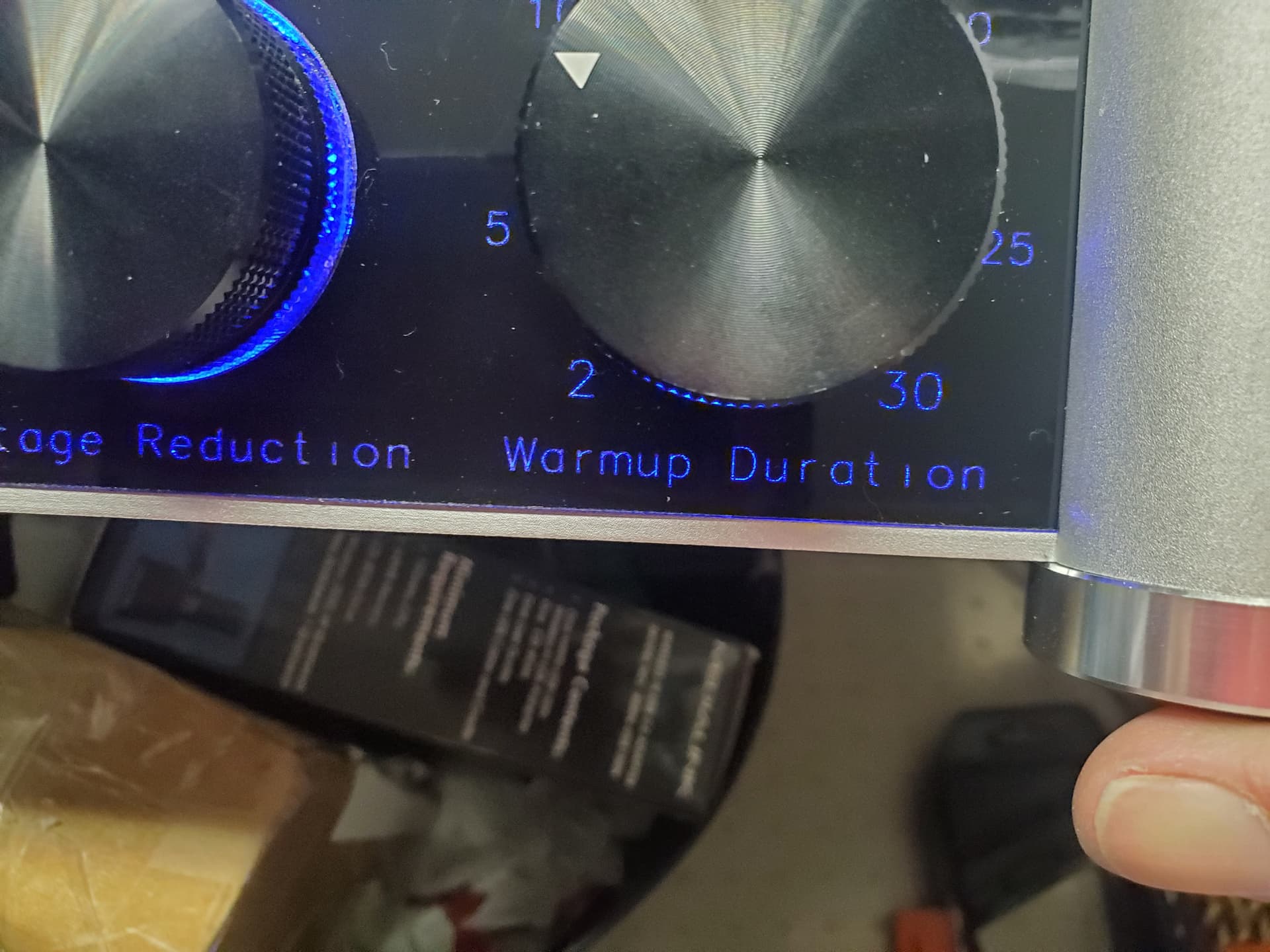
Here are the settings…
This was done with one pass.
I hope this helps.
When I tried multiple passes it seemed to singe the paint which made it become embedded in the acrylic. Did you do multiple passes with paint? If so, what kind of paint did you use?
Yes, my lens is 38mm. I have heard that there is a 25mm lens available and am tempted to try one.
I have done the burn without the paint and got the same result. ): I really don’t mind the frosted look and it helps the characters visibility. However, I don’t like the miniature “dots” in the finish. I need to smooth them out.
I will look into the SHX font although I am not familiar with the term yet.
SHX is a single line (no width) AutoCAD font. It will not work in Windows, but will in Lightburn.
Install them in a folder and then tell Lightburn where they are located. I have a bunch of them, but I have only used the ISO9 one. I burned 1mm readable text in Baltic Birch plywood using it.
Aha! Usually I am a proponent of using offset fill. For this material, it would not be my first choice.
The dwell time (my term, probably not accurate) and continuous burn nature of off set fill may cause depth continuity issues.
If possible on the project, I think SHX and a slight (5-10%?) defocus would bring better results.
Defocus is a brilliant idea! I will work with it along with the SHX fonts that I have now installed. I’ll report back after working with it. Thx.
I had to use offset fill because if I used the standard fill my machine would pull up an old unrelated file that was in the Rudia and run it. I even went as far as formatting the Rudias memory to no avail. I’d love to try the standard fill but can’t. If you are old enough and remember a “stubborn” tonearm on a record player, the ghost file has exactly the same frustration! ![]()
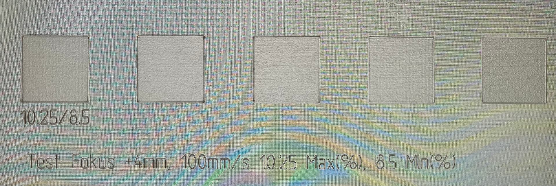
I just did a little test on acrylic, which confirms my “standard” settings for it.
For normal fill engraving I use 100mm/s (200mm/s, depending on object size), 10.25% Max and 8.5% Min Power, Line spacing 0.07 - 0.1 mm and a focus of +4mm
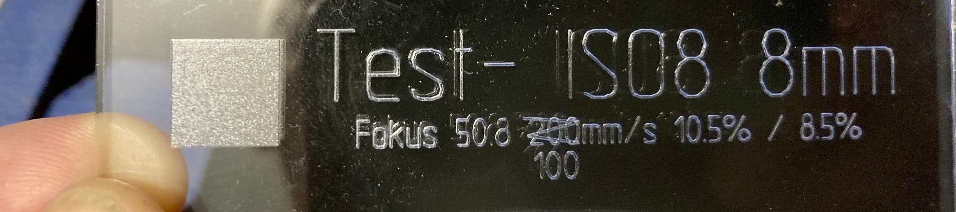
In the middle is made with F 50.8mm , also no defocusing.
Font type SHX
ISO8 is not the best because it is made of too few segments, in my opinion.
But the most important thing, the writing/engraving stands out reasonably nicely and clearly when not using too much energy.
I don’t understand it, if you can’t use normal fill you can’t engrave properly. OffsetFill is used very rarely and only for specific large regular shapes like a ring for example.
I appreciate the efforts and help. I’ll give it a go. Your “Engraving” looks great. I will create a completely new file and hopefully I can get the “Standard” or Normal fill" to run on my machine.
You need to use enough laser to basically evaporate the paint. If the laser is set too low it could just melt the acrylic and paint together. Try a higher speed and a bit more laser. You should see a good puff of smoke when you blast it out. Also use a masking material to protect the paint around it ,painter’s tape works great
I use Duratex. It is a black roll on speaker coating. I thin it with water and spray with HVLP gun.
I’ve also used just regular black spray paint but I don’t like the smell so I tend not to use it. I’ve also used that Fusion branded paint. “Made from plastic to bond to plastic” The Fusion paint is actually quite good… apart from the smell of course.
Your numbers were right on. 100/10.3 was the magic number for me. This proved that it was possible to improve the result. However, when switching to the painted sheet it took much more time and a little more power to get through to the acrylic. The result was nice but the characters were just a little to thin (and I cant seem to burn the dots on the "I"s). Not at all the melty mess as with the TrueType fonts. I am new to SHX and found that I couldn’t set the characters to fill. If I did, they looked like weird WingDing characters. Is there a way to thicken them or do I just need to find a better set of fonts with slightly thicker characters? I was thinking, as someone here mentioned, about offsetting the focus but that seems like it’d be pretty hairy as the material thickness isn’t very uniform. I’m not sure if Lightburn has a “dithering” function which would be a possible way out. Thank you again for your time and effort, they are well appreciated.
Also, What “Program” did you use to create the test swatches and text? I have the test setup from the Boss website but can’t get it to work correctly. It looks like yours is a step up from theirs.. Having something like this would help me out tremendously. I am rather new at laser cutting/engraving and have only been working with it for a few weeks. Thx again. Chris.