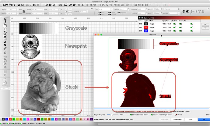
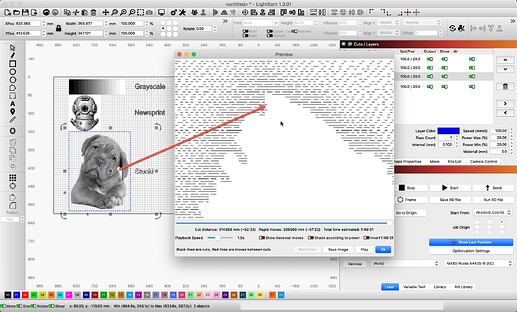
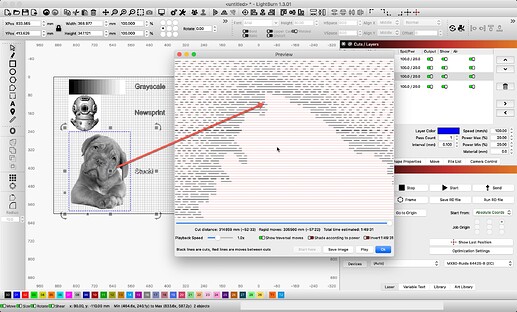
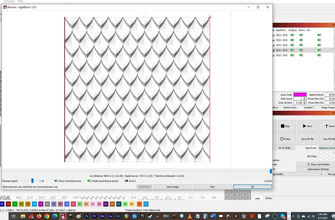
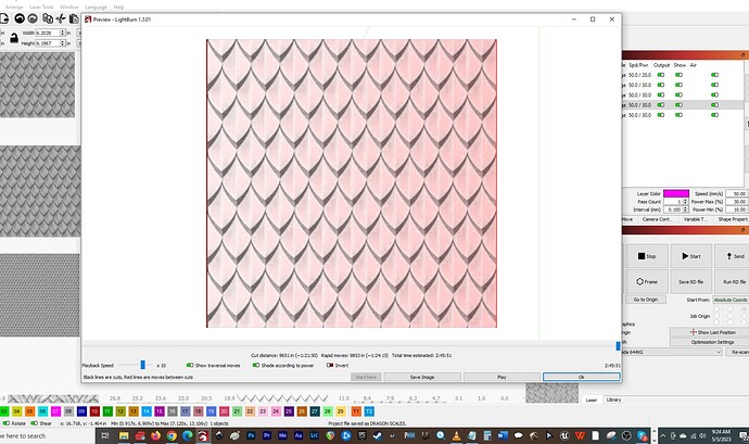
This is a misclassification, let’s start clearing this up first. What you are looking at is not a “dog in grayscale”. It is a black and white image set to ‘Stucki’ as the Image Mode for the layer it is on. (same image as above) The traversal lines for this image mode produces differently, due to the on / off nature of how this image is set to produce. Grayscale works different, and is consistently on, adjusting the power based on the color and the range provided using Min and Max power. There are no traversal lines during a grayscale image production because the laser is not turned off while moving across the art to be produced.
With Stucki, and the remaining dither modes, the laser turns on and off for Black, skipping the “white” parts which you see filled with traversal lines when that switch is on.
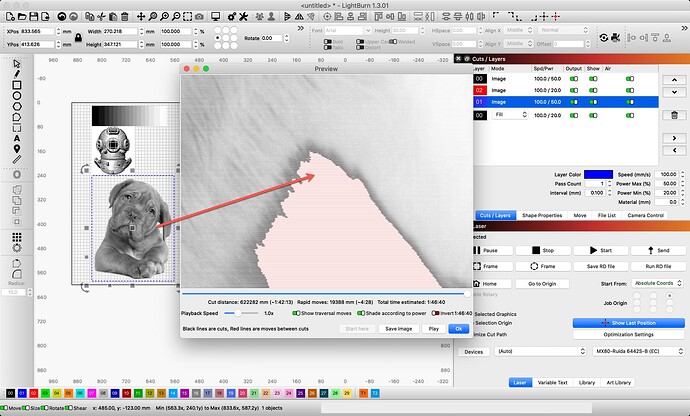
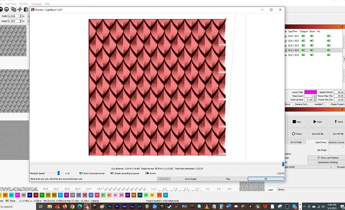
If I zoom in, I hope you will see this a bit clearer.
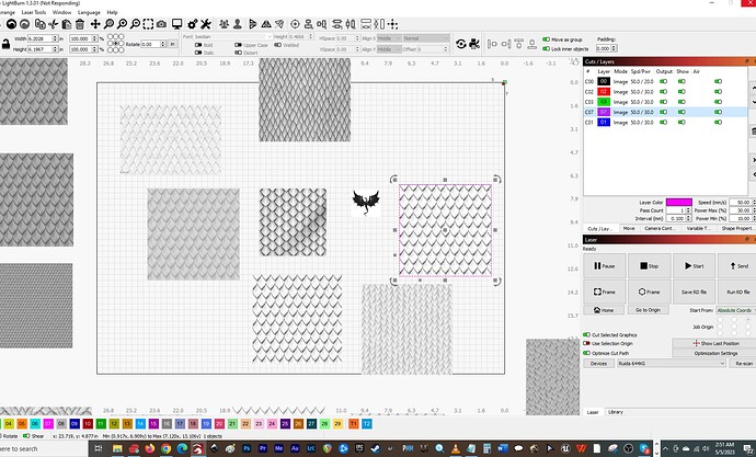
If I set that same Dog to ‘Image Mode’=‘Grayscale’, here is what it looks like in Preview to compare. Note the laser does not produce a series of dashed lines to reproduce this image as it does in ‘Stucki’. It turns on the beam and varies the power as it goes to produce the shading.
I want to get to the point where we both trust each other in this exchange. As mentioned, the Preview has nothing to do with the generated output, apart from displaying what will be sent to the laser. Think of the Preview window as another output device, only it does not have a beam or moving parts, just a display. ![]()
LightBurn strives to provide just that, so we should work from this knowledge going forward. That said, this is lasing, so we have all learned that “consistency” is an interesting word when talking about producing what we are after. I have personal experience using the exact same file, with the same settings on the same material and the same day, not producing consistency. The room temp, the beam temp, the ambient humidity, all have an impact on the consistency of production. There are many variables outside the control of software, regardless of who wrote it. I have adjusted my expectations and consider testing prior to production an extremely valuable time and material saver. Keeping this in mind, LightBurn works very hard to produce reliable and consistent output data.
Something you may already be aware of, but worth repeating, Grayscale Image Mode production using a CO2 laser is one of the most difficult techniques to dial-in. CO2 beams ablates and destroys the fine details found in many heatmap or grayscale images. Especially when using natural fiber materials such as wood. Folks see some very cool, deep engraves and think, “Yeah, I want to do that!”, then find out the challenges to getting it to not look like mush or burnt to a crisp, trying to get the fine detail produced. It can be done, and produce consistently, when managing for these factors.
Really? I don’t have the time. Second, there is zero upside for anyone here to behave in this manner. I would not waste my time nor yours trying to represent something that LightBurn is not? There is no need or value added with these sorts of comments, so please - let’s keep trying to address your direct technical questions about LightBurn and lasing. ![]()
I can not verify at this time. We have not been able to reproduce what you are observing. Not enough known — yet. It is software, so not out of the realm of possibility.
I don’t know what this is? Do you mean it works, but only sporadically? If so, see answer one.
Yes, the LightBurn devs are capable of modifying / adjusting our code. One of the most important things we keep an eye on are bugs and refinements to provide the best possible experience using our products. If we discover or learn of a repeatable bug or an enchantment to help the user get more out of our efforts, we work hard to be responsive and address as soon as possible.
I would like to pause this current discussion, and ask that we start anew. I might review “what am I producing” or “what is the project”, the material choice and the desired result. Then pick the art and method of production. Other than “this is the one I used before”, what is the reason for choosing Grayscale when producing this project? I am suggesting there may be a better, more consistent choice when answering these questions.
Please advise.
