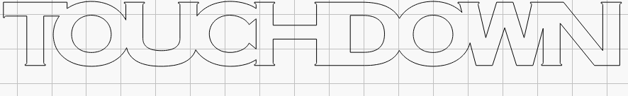
I used horizontal spacing to weld this word together. When I try to create the dividing areas between the H and D letters, it looks odd. Is there a way to correct this? If I reduce the spacing, it separates and doesn’t ‘weld’.
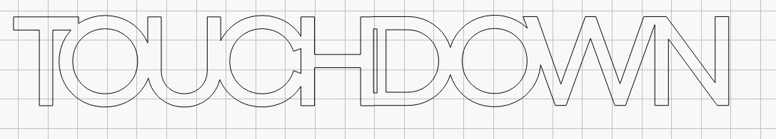
If you only want to change it between the H and D, you can use Edit>Convert to Path on your original text, to switch it from being recognised (on the back end) as text to it being lines/curves. This will mean you can no longer edit the text, but I assume if you’re welding it, that’s what you want anyway.