I’d like to find out how to laser engrave so that the letters are raised when it’s done. So I want to etch all of the material around the letters. Anyone have any suggestions?
Thanks.
I’d like to find out how to laser engrave so that the letters are raised when it’s done. So I want to etch all of the material around the letters. Anyone have any suggestions?
Thanks.
I would make the shape of the material, to engrave in fill mode. If it is a regular shape (rectangle, circle…), convert it to path.
Then type the text and convert it to path too.
Lastly, make a boolean difference between the shape and each shape of letter. Note: for the holes in the letters (like g, o, e…), use the boolean union instead.
It should engrave around the letters.
Setting the Ramp Length should do what you want:
Because you have a Ruida controller, pay attention to the recommendations for the Min and Max power levels. Getting that right will require some experimentation so the Max power removes as much material as you need.
Hi Philippe,
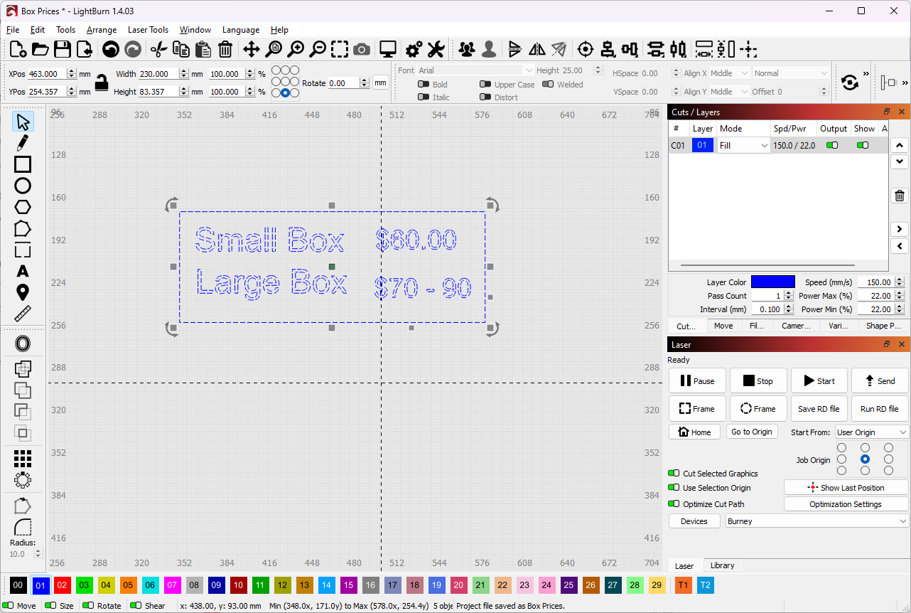
Thank you for the suggestions. Question - what are the steps in the software to make a boolean difference? The letters I want raised are not text. They are actually an image that I traced from a logo with letters in it.
Make sure that all the shapes are closed, so they have an inside and an outside. If Edit → Select Unclosed Shapes doesn’t select anything, you’re good to go.
With the image traced into vectors, then the Ramp Length should put slopes on either side of the closed shapes.
If you’re also trying to engrave a picture along with the letters, you will likely get weird results around the tiny image dots, so you’ll want to separate the picture part from the text part, then wrap a closed shape around the picture to define the edges of the ramp.
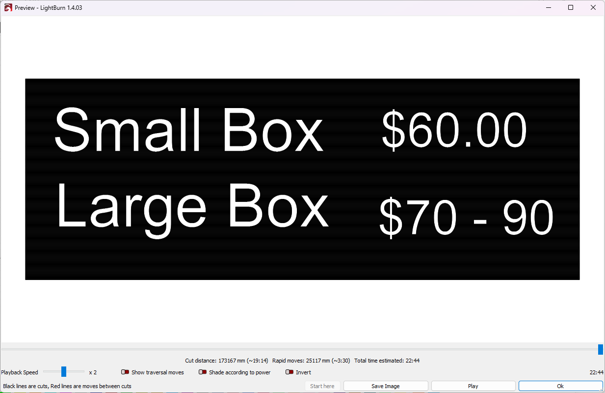
Showing us what’s going on will help: pictures are worth a couple of days of text volleying.
Then you are good to go. It avoids the “convert text to path” step, since you already have paths.
The other answers are good too: you must have closed shapes.
I don’t know about this ramp length setting, I only have a diode laser. Worth exploring too.
I certainly don’t intend to contradict Ed, but I don’t understand how using the ramp affects the engraving “polarity”. Isn’t Ramp just a tapering/beveling edge treatment? Couldn’t the same “raised letter” result be accomplished without using the ramp option? Just enclose the shapes intended to be raised with another closed shape on the same layer. No?
I misunderstood the problem, thinking that “raised” meant “gradually” rather than “abruptly”, without knowing the text was part of an overall picture rather than produced in LightBurn.
Photos always help!
Sounds overly complicated… perhaps I misunderstood. I simply do my letters with the Font tool, I do NOT convert it to a path. Then I surround the letters to be raised with a box using the same fill color. What I get is raised letters…
Philho,
Your suggestions did the trick. Now I just need to adjust my power and speed settings to get the depth right.
Thanks for your help!
If you’re doing a fill/engrave, minimum power is not applicable.
![]()
Oh, I didn’t know LB is smart enough to do such auto-difference between two shapes overlaid with the same fill layer.
My solution is what I would use in a generic vector software to cut text in a shape…
Indeed, your solution is simpler in LB.
You learn every day! That’s what is nice with this forum: I see from the tricks given here that LB has lot of small smart behaviors, that are very convenient.
This topic was automatically closed 30 days after the last reply. New replies are no longer allowed.