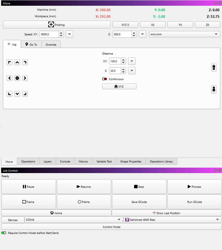
Is this a bug or have you just ruined the jog menu? I really hope it’s a bug as otherwise I absolutly hate it, It’s gone from really useful and functional to basic and not practical!
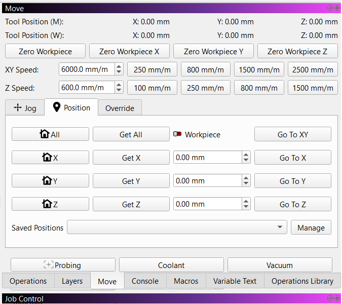
Old - Useful
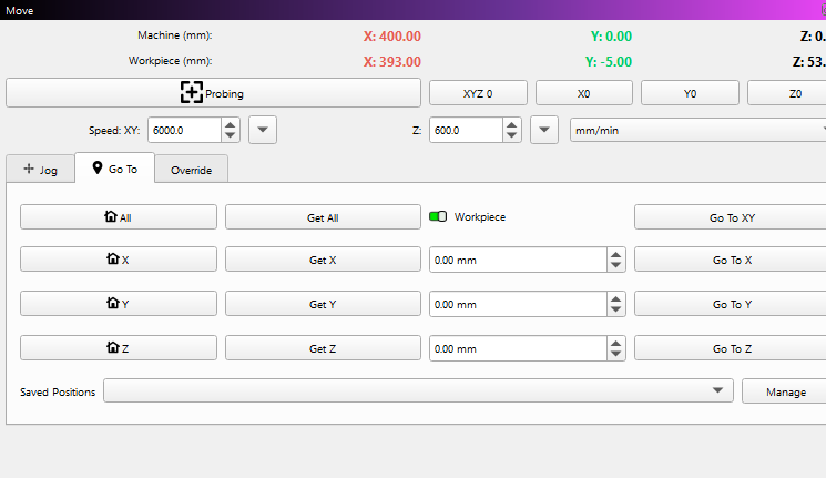
New - ?
Is this a bug or have you just ruined the jog menu? I really hope it’s a bug as otherwise I absolutly hate it, It’s gone from really useful and functional to basic and not practical!
Old - Useful
New - ?
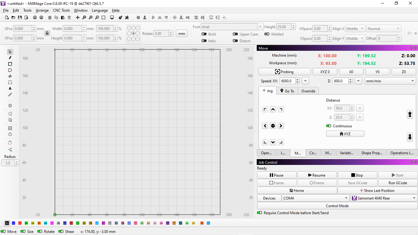
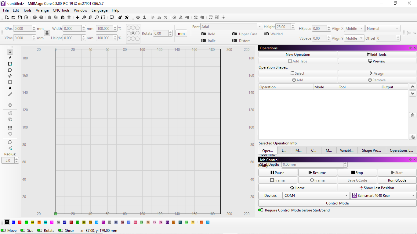
Not a BUG. That was last shown in RC-13 (late December). They also renamed the Position tab to the GoTo tab. For better or worse.
Release Candidates come with a caveat: Nothing is permanent, promised, or guaranteed until the production release goes out. Things can appear and disappear at random.
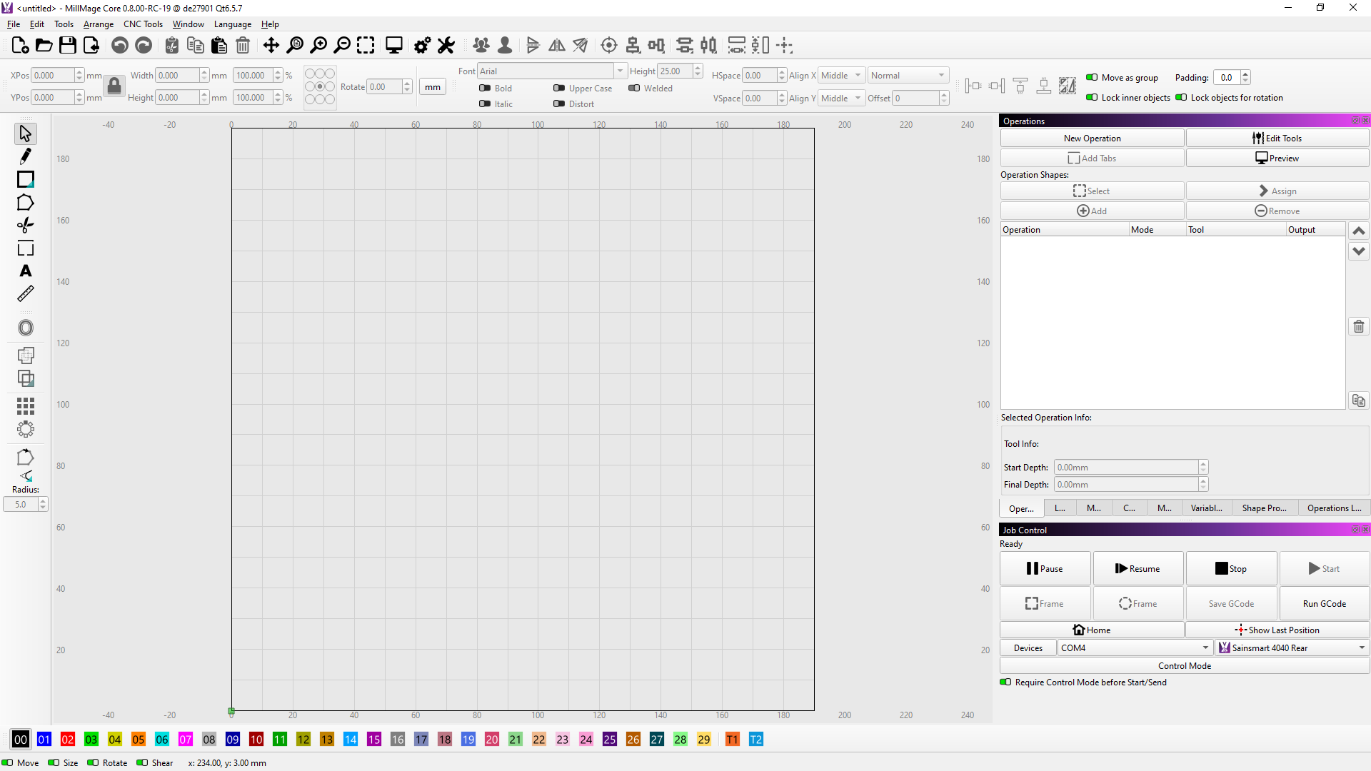
Go To tab is Postion renamed and no difference on that menu I can see.
Goto
Position
The name change though pointless dosen’t bother me but removing fetaures on the Jog menu such as move distance buttons and Spindle control that I do use sometimes is not helpful and kills it. I might consider reinstalling Version 13 at this rate but I will check for other new bugs and the ones I’ve noted down from previous versions to see if they have been resolved.
I agree, it was nice to have. But I had some issues going between continous and increment Jog. I saw a mention of it somewhere by LB and suspect they pulled the code for the Production Release. I got the feeling that it would be worked on for a later update. Nothing official, just my opinion.
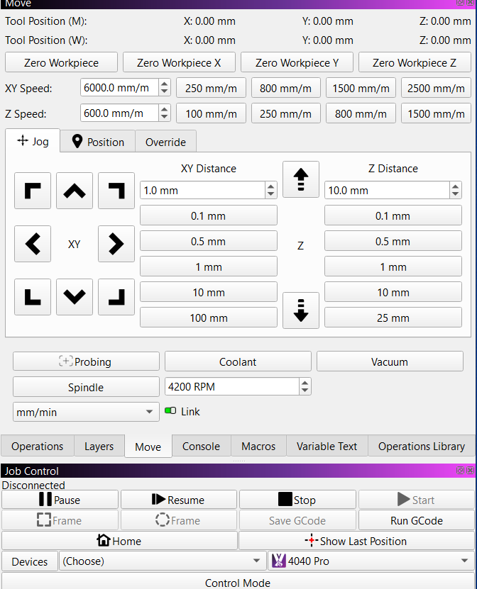
Literally zero functionality was removed from the move panel in the update. All we did was consolidate because the panel was SO large that people with smaller screens couldn’t launch the application properly. It was both very tall (required a 1080p monitor or more for the standard panel layout) but very wide, which severely decreased the design space available.
Some things, like the quick select buttons for different jog speeds and distances were placed under a dropdown, so yes - it’s now two clicks instead of one, but it was all in the interest of freeing up space.
Spindle control has moved into the override tab because those controls are generally only used while a job is running to override state.
Everything is still there. Just more compact.
And yes, it looks like a bunch of wasted space when you have the panel that wide, but that’s how much space we freed up for the design area. You can just shrink that side panel down horizontally and everything will look as intended. It was ONLY the move panel that required that much width.
Thanks for the clarification. That means I need to go back and see if I have Zaxis motion control issues, or just a settings boo–boo.
One thing i have noticed in RC 19 the diagonal arrows no longer work when continuous jog enabled where they did in RC13.
key pad Z movement :
I created a topic couple weeks ago re not being able to control Z with key pad, is this a bug? if not which keys as I cant get it to move at all X and Y move fine with wireless keypad Or keypad on laptop
I just triple checked the code and we have never supported anything other than left, right, up, down for continuous jog on the numpad. No diagonals and no Z. grbl simply doesn’t support diagonals for continuous jog and we have just never supported Z jogging of any kind (discrete or continuous) from the numpad.
You CAN do diagonal if it’s discrete jogging.
Random ,I know you couldn’t do diagonal in continuous in previous RCs on laptop keypad only as I had tried it, but it was def doing it in RC13 , i played around with it for a good 5 min using Bluetooth number pad toggling continuous on and off just to make sure i wasn’t imagining thing. maybe a delay in communication between Bluetooth pad thinking it was still in discrete
If i get a chance ill reload RC13 and see if I can get it to do it again
hence my question
thanks for clafication on Z axis
Hi Adam, thanks for that information, I’ve found the spindle now ![]()
My screen was set to 1920x1080. I’ve adjusted window sizes and settings to make the arrow icons bigger and clearer, so your changes seem less relevant and possibly pointless if I am adjusting this, but I do appreciate the added stop button.
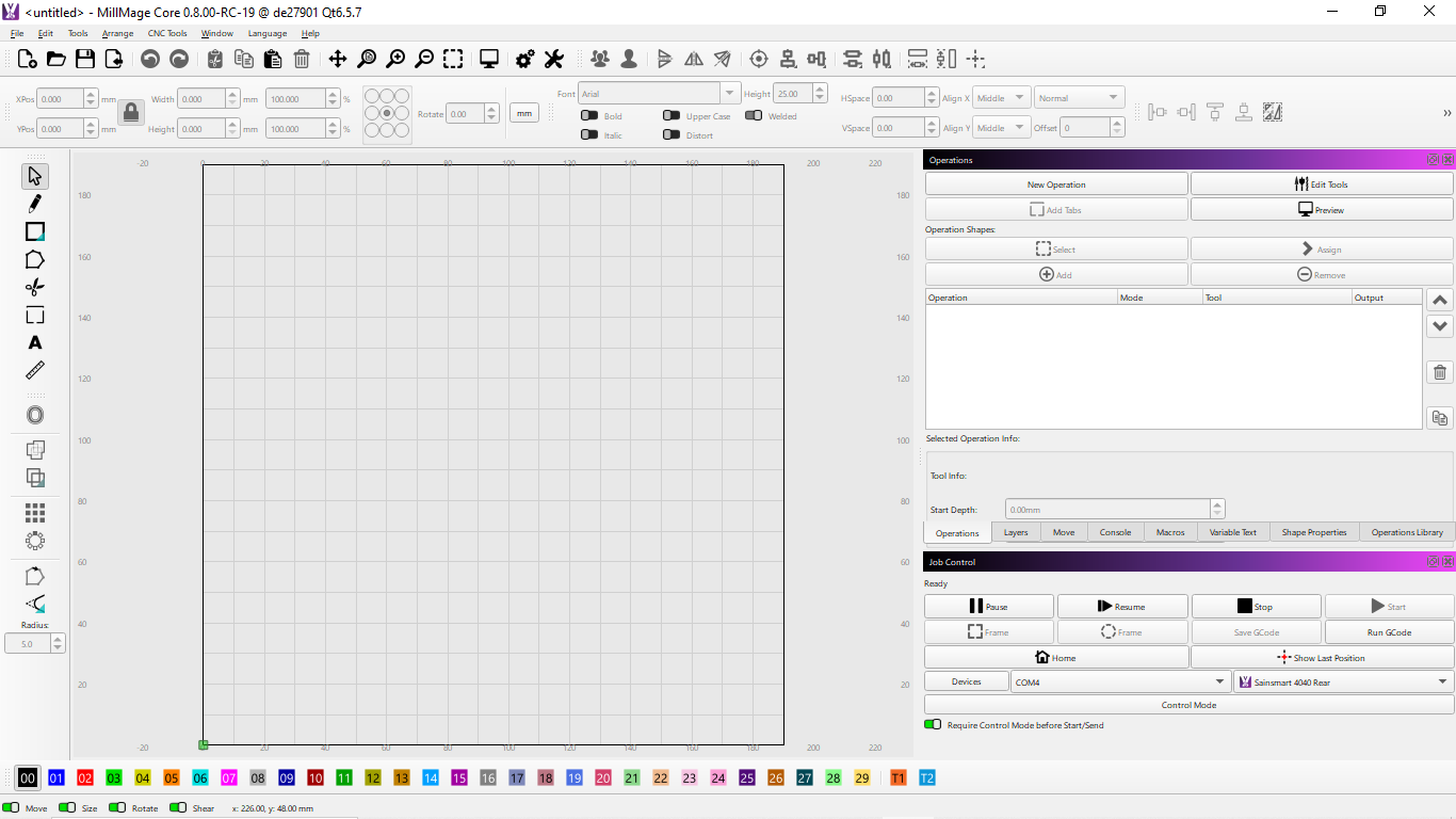
I understand what you are trying to achieve so I then changed to 1366x768 and adjusted icons to suit but then I can’t see the bottom of the operations menu which now overlaps the job control window in this resolution unless I reduce the font size to 8 which beats the object of what you are trying to do as I have now made my text harder to read. I’m working on an old laptop with a 16.4-inch screen and most average machines on the market now will support 1920x1080 by default so not quite sure what resolution size you are aiming for is? I’ve added two pictures showing the move and operations tabs for both resolutions the lower resolution show operations tab overlapping the lower job control window unless I change the font to 8 which makes the text too small in my opinion. I would like to point out that I haven’t increased the font size for the 1920 resolution pictures as I was trying to keep it standard but when using it myself I have increased this and it still does not affect anything else.
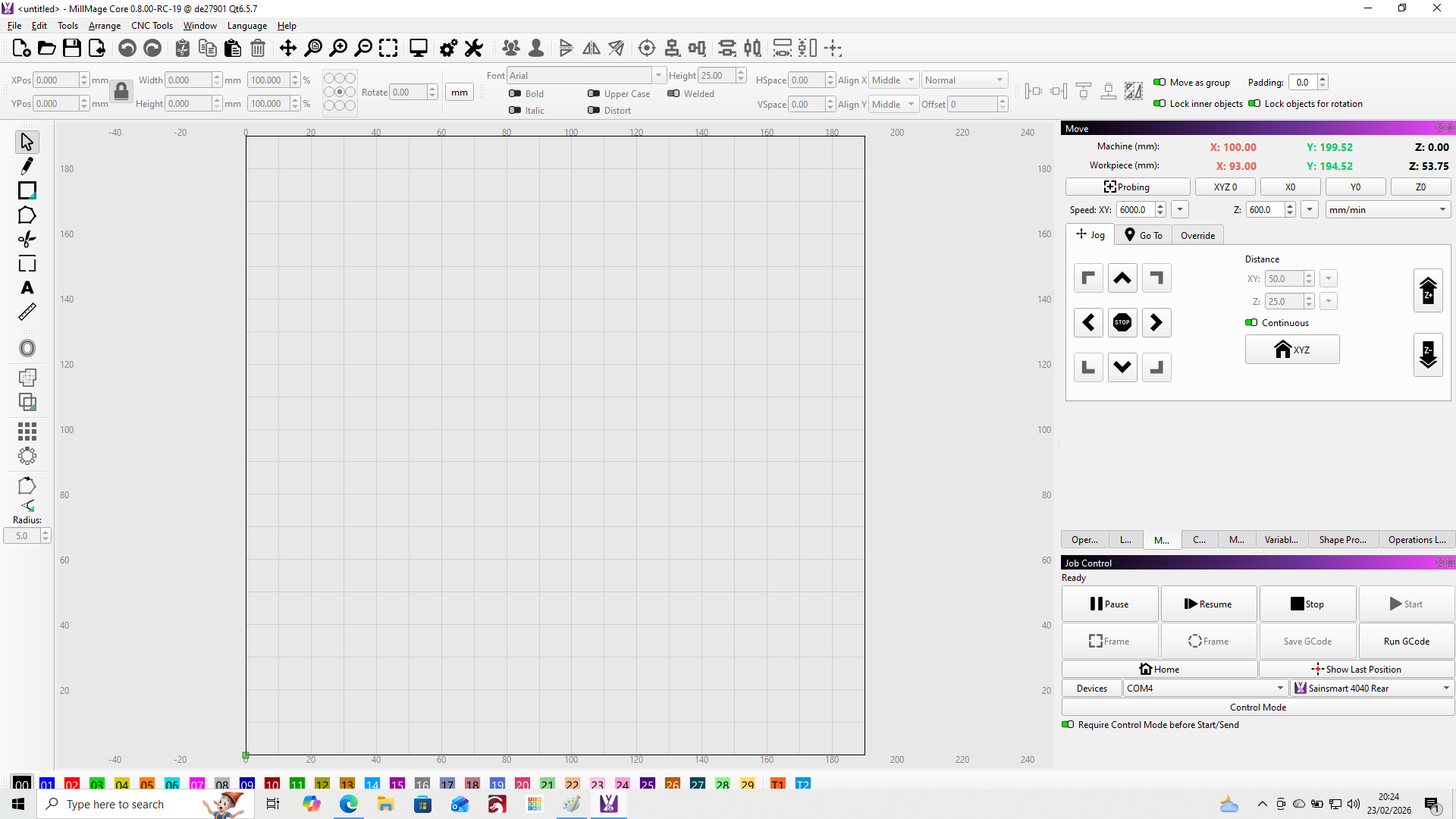
1920x1080 Move Tab
1920x1080 Operations Tab
1366x768 Move Tab
1366x768 Operations Tab
1366x768 Operations Tab with 8 font
For LightBurn we always tried to target 1366x768 as the minimum, but there’s too much in the MillMage UI so 1920x1080 really is the new minimum. As you said, most monitors are that resolution or more - the problem we’ve always had is people grabbing the oldest and cheapest laptop as the “shop computer”. So we’ve been stuck in the past for awhile.
For 1366x768 you can’t have the right side windows dual stacked like you do. They have to all be tabbed on top of each other or there isn’t room - IE, you can’t have a top/bottom window on the right, just one visible at a time. It’s not idea, but it works.
I am on a big monitor and discovered, forced by the 2.0 LB release, that I like the tabs in a row better. I ordered my tabs based on frequency of use. Travel right-left is much less than up-down the screen. Now when it occasionally stacks them, I get upset! ![]()
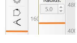
If I may… the width of the MillMage Creation/Modifiers toolbar is about 3 mm wider than in Lightburn.
I suspect it’s just that the “auto-hide” property of the ‘Radius’. Is this somehow a problem?
Not for my monitor. It was just a note that could increase the available workspace.
For those who have 1366x768, every pixel counts.
But it´s the Radius.