Layering on slate coaster

I’m using an Atomstack S20 Pro. I have previously used it on slate coasters which worked well. I used the same settings recently and am having absolutely no luck. I have just upgraded my lightburn to latest license but issues occurred before this.
These were the settings I used for 1000mm X 1000mm coasters: speed-300, power max- 16.50, Intervals- 0.080, air assist on. Pass count-one, Layer colour - Black. dpi- 312. I use Img-R for the photos and import the photo. It also takes over 6 hrs to complete. Unfortunately I have watched too many YouTube videos and have change settings!
![image|498x499]
(upload://vvKUBV3mCKgILwlm9XsN1PwBD8P.jpeg)

Any help would be greatly appreciated!

Hi Carol

First and foremost, I’m no expert with slate..yet! but I’ve been night and day, researching and experimenting for a couple of weeks so I’ll tell you what I think.

Dont do youtube..you’ll find your way quicker by ‘inch by inching it’ toward your expected outcome. But I highly recommend watching lightburn videos on the subject wherever you watch them.

The video above is the business! it’s quite long and a bit technical sounding but if you just watch it and dont worry about memorising or noting every detail you’ll still learn alot.

Gil from lightburn also has a vid on speed/power test where he introduces a dial test as opposed to the usual square type. I wached that..applied exactly what he did and it was a huge learning for me, especially when I changed Engraving Mode and watched the different outcome, and then Speed and Power. Use one of your big slates to create a Go to refrence.

Are you using ‘Passthrough’? I dont, I did twice and didnt like the outcome and now I experiment with ‘Adjust Image’ and understand more and more whats going on.

What is your dot size? Refer to Russ Sadler video above. Give your Pixel/Burn spot some elbow room..Reduce your dpi by percentages til you see the change..again, use a slate to do an image and Copt/Paste the image next to the other > change to a new layer > input all same settings except for the one you want to adjust for experiment > Keep doing that till you get it right.

16.5 Power seems ok but 300 (Sorry, I’m using my phone and cant seem to scroll to your wording to re-read) was that mm/s or mm/min. I have found aprox 18% to 20% gets me in the ball park and I tweek from there. If its a bit faint you can run it again at same settings and see the difference. I also use “less power/more speed” so 2700mm/min is my starting point but today I pushed it to 3000 to save time. I hear 4000mm/min is ok, but risky after that. BUT it all Depends!!

Brightness, Too much/little and Power seem most important.

One of your pics has the same look as one of mine which I hope to re-try very soon. If I can get to it tomorrow I’ll post the before and after and the settings for comparison..but I also have some axeheads to mark, that have to travel soon.

Did you Prep the slate before use?

You listed 312DPI, but your 20w is better suited for 254LPI (same as DPI). A good 10w diode has a small enough dot (0.06mm) to efficiently use 318LPI. The 20w dot is closer to 0.10mm instead. You can’t paint fine lines with a wide paintbrush.

You will also see a substantial reduction in run time too.

@Pete.IRL is 100% correct, YouTube will lead you down the rabbit hole. Use it to get an idea, but not to get an answer. They leave out a lot of detail.

1 Like

Ah..The clue was in the “S20” bit.

So at 0.8x0.1 dot size, 312 is quite a bit too close. 254dpi is spot on but 228dpi worked pretty good today on Brazilian grey slate at 3000mm/min, but just went a bit too far with the power at 25.5% after a re-start to up the power from 18% and brightness up from ‘0’ to ‘7’… resulted in a washout. Should have used the Move window to progressively drop the power back down every centimeter or so til visually acceptable.

Thanks for all that information, I will definitely watch the videos and stay off YouTube! Yes I apply a gloss on top. I believe I used pass through but I noticed when I I was trying to use Stucki the settings automatically changed to dithering. I appreciate all your time, thank you.
Carol

Thanks Mikey, much appreciated.

1 Like

I will check the videos tomorrow and try and have another attempt after that. Thanks again for your advice!

Ok I watched the video, yes it was very interesting.
I changed the settings to: speed- 2700.00mm/min.
Max power: 19%. DPI- 254. I used stucki. No pass through. I think for the first tile I had negative on, it took 40 minutes and came out like a negative photo. So I changed to grayscale using a photo image not changed in ImageR. It was worse. It looked more pale. Where do I find the brightness, is that when using imageR? Is it imported looking like a negative photo or just a photo? Sorry for being so new at this, I see how clever you guys are! I am a retired teacher just trying to have a hobby! I really appreciate your expertise! I am also in Australia so times will differ!
Here are some photos of today’s output!


I was super impressed with the speed! So Thankyou!

Hi Carol

Was just looking for a good previous post for you to have a look at and realised my battery is near flat..so I’ll be quick.

Firstly I’ve never fone tiles.

Check out the Norton technique in the lightburn search.

Try set your speed to 2000mm/min, dpi 220, Dont bother with other software, just pop your image in lightburn and select Negative (for black paint on white tile). And dont bother too much with finding perfect settings just now.

Select Jarvis mode.

Power set to 5%.

Run the job

Observe, But dont move the tile!

Restart the job.

Go to the Move window in Lightburn and Raise power by 5%…Let it run a while and keep raising the power until you see an improvement in appearance.

Work on fine details when you understand Speed and Power…and get focus spot on!!

1 Like

Thanks Pete, I will try that today.

Hi Pete, had several attempts and watched more videos on LightBurn. I will continue to keep tweaking it till perfect or least close to it!


Great Carol! Gradually bringing those dots closer until optimised resolution…and then work on the contrast, brightness etc.

The penny drop for me was after being frustrated by greyscale mode, I switched to Newsprint and suddenly I understood about pixel/dot distribution and the ‘Trick of the eye’ that happens with (Black/White) Dot seperation and False apearance of shading.

I found a LB post about image software while trying to do a deep dive into image reproduction and in a reply to the poster, ‘Oz’ gave an off the cuff estimate of settings for them to try. I thought, How did he know to suggest that..and would it work on this image I’ve been practicing with. “Little chance I thought” but for sure it did work…or at least as Oz stated, its a good starting point, and work from there.

When your close its time to make very small adjustments and one setting at a time which can feel laborious but otherwise its back to wild swings in quality and pot-luck.

I’ll get those settings when on the computer later, and post them.

1 Like

Thanks Peter, that would be much appreciated. Yes I will take my time and I am writing everything down!
Cheers
Carol

1 Like

Carol

The settings are:-

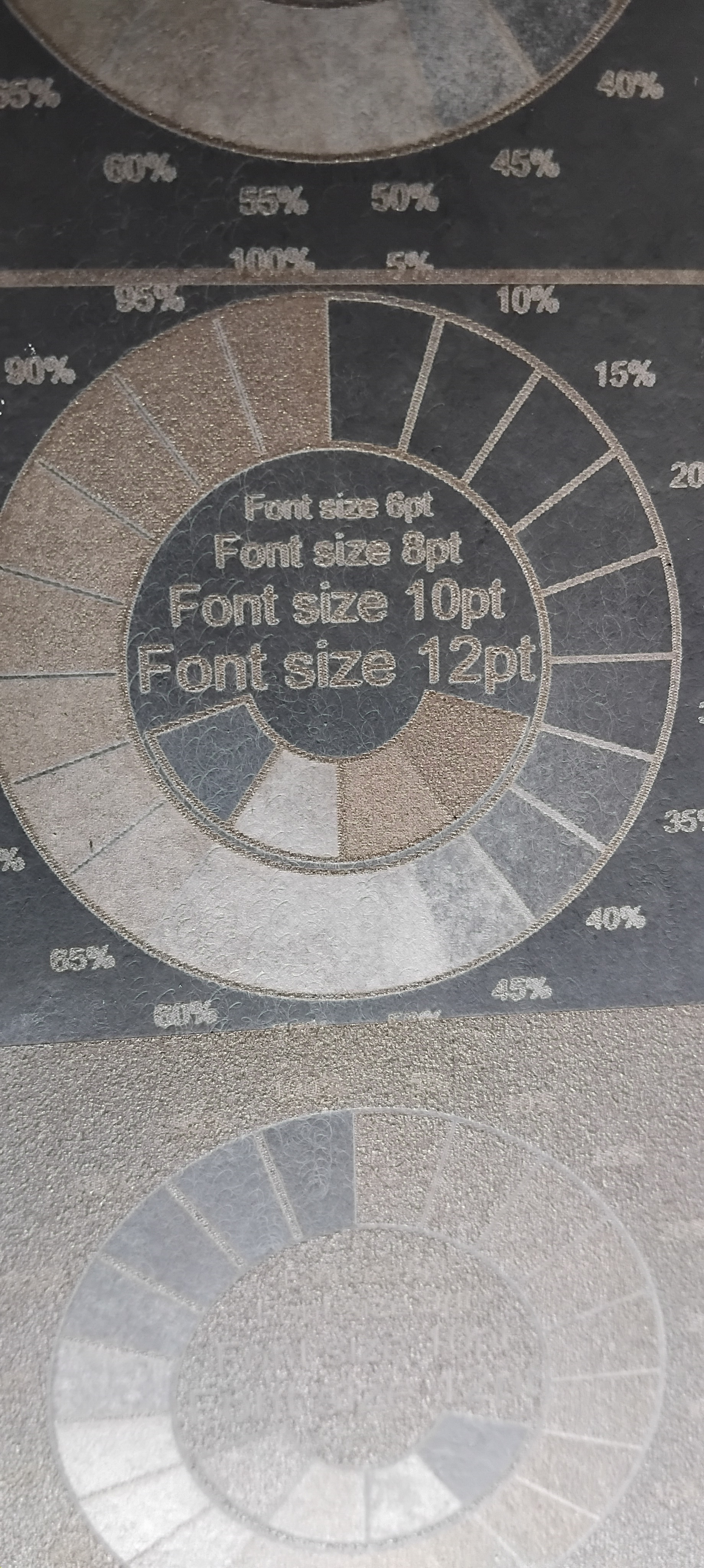
Contrast 5, Brightness -5(minus 5), Gamma 0.8, E-R 5, E-A 200.

I had a little time this afternoon after setting up the axe-head job and thought I’d try an image on slate before hometime. I used the 2wIR1064 (~0.03 dot size) module as thats what I’m doing the other job with.

The image was ran using the settings above and it was a fair enough picture and as Oz said..a good starting point and fine tune from there. And all with Jarvis.

I decided to keep going and ran a second version with all settings the same but I left the Contrast, Brightness, Gamma, E-R, E-A untouched (All at Zero except Gamma which reads 1.000 as default).

Just to mention, I had previously put this image through ‘Gimp’ to set the resolution to 254dpi and scale it and black out a feature I thought didnt belong and I may have adjusted using ‘Curve’ function to adjust brightness and contrast together.

The second version came out a little..tiny bit darker which made some parts look better but others less so. The only thing was that the background in the image is dark so the first image being a bit bright actually stands out slightly better…remembering its on slate..the darker the image, the closer you have to be to appreciate it.

I decided to go again and this time burned the original, unedited in any way and all settings at default. The image was much darker and while it had qualities the other two did not, its not something I would do unless It was specifically asked for.

There is one more version left to try and thats the unedited image with the settings suggested by Oz. I will also swap modules back to the 20w and run the whole lot again. the 2w IR gives amasing results..in comparison, and over the weekend I might burn a large version 280mm x 500mm once I find the best version.

I’m thinking that no picture will engrave all areas at optimum unless specific editing work is carried out on areas that need it due to other areas already being just right, and sometimes suggested settings work because a trusted source helps with confidence in being ‘Nearly there’ and reduces the urge to use radical adjustments because of uncertainty.

I think your note making is also more useful than I have learned to appreciate..as yet.

It looks like the original image (unedited) and with Oz’s settings for Adjust Image as stated above turned out the best overall.

Will try further micro adjustment on those settings, Background removal, and picture lighting and placement.

Thanks Pete, I’ll keep at this weekend! Cheers

More practice with settings! This is 3000 speed, 16.5 power, 240 DPI, Image- Stucki. Pass through not on.

Certainly feeling happier with results.

Hi Carol

If you could crop that photo to just the area from the nose to the forehead you could focus on getting that part right and the rest of the photo would improve with it.but you could have many more attempts at it and save time and materials.

I think the image settings need more work than the machine so if you use that result as your base and raise the brightness a bit and lower the gamma and also the contrast to get more natural tones and shading in the area of the eyes where there is a lot of shadow presently.

It will depend on the original photo quality but I’m assuming its reasonably ok.

Are you setting the Image adjust settings by judging what you see on screen! sometimes a bit more brightness than would appear necessary can work out better, and if you apply too much you’ll know it.

I got some reasonably good results on sat/sunday using Oz’s settings on slate but forgot to photo them and got distracted by trying to set backgrounds on seperate layers and burn to brighten the overall pictue as they are great up close but very dim from a distance.

Back at it tomorrow so I’ll post the pic’s.

Thanks Pete, I will try that! Cheers