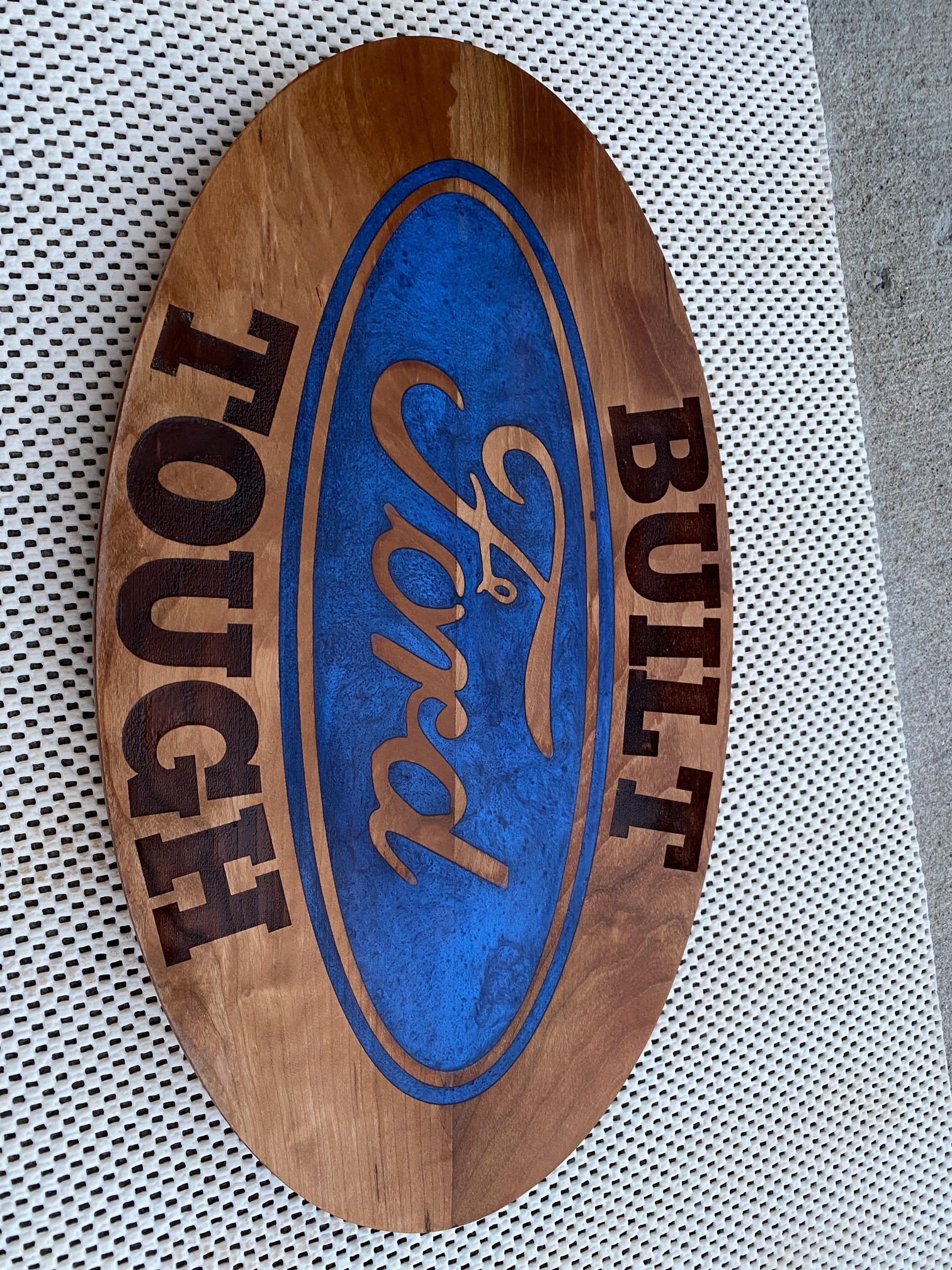
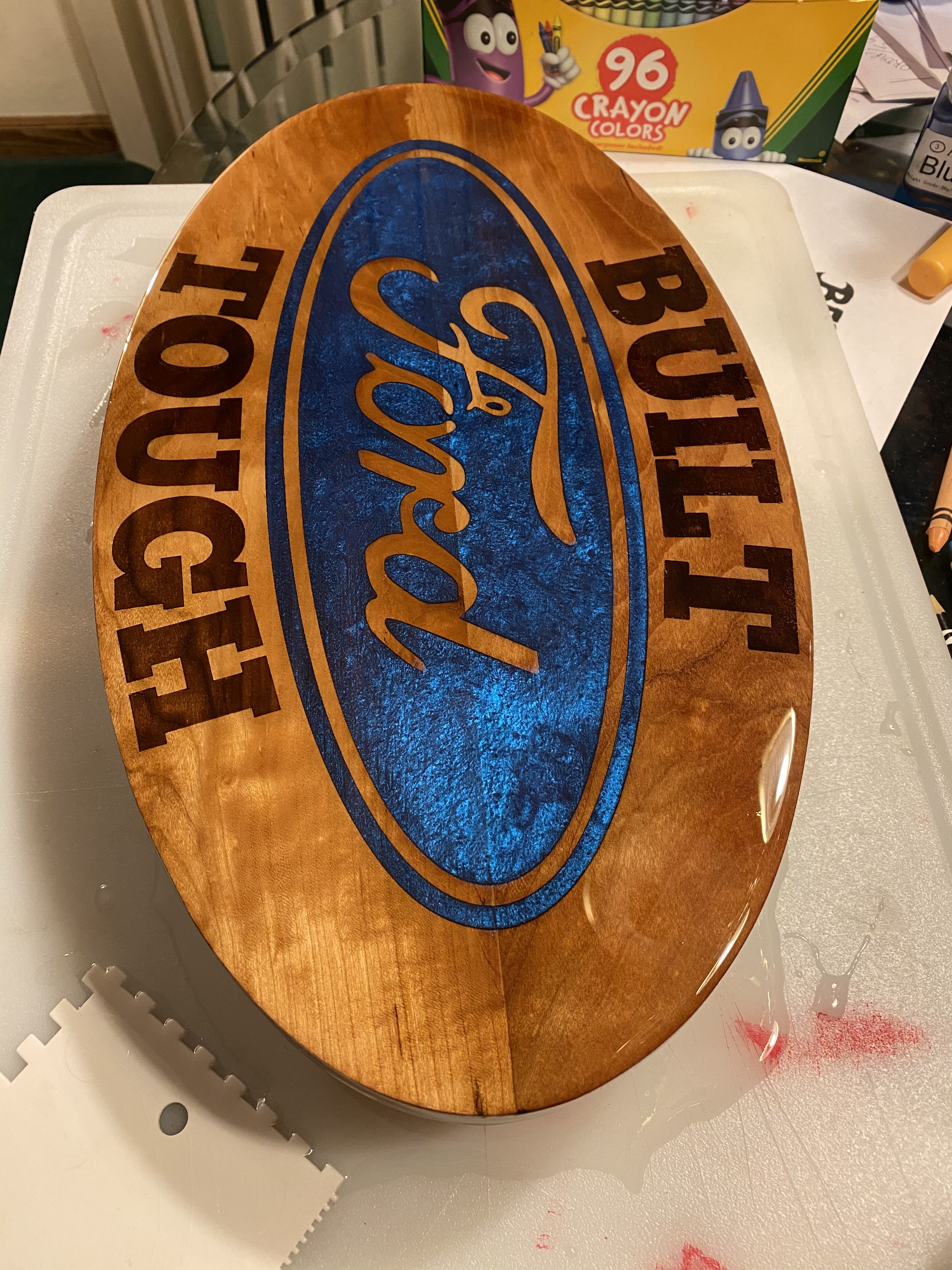
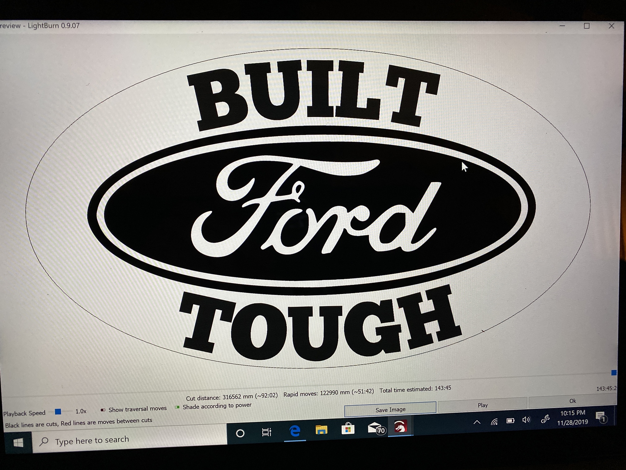
The letters I and L are closer together than all the other letters.
So I actually can see that the top edge of the T is what is being used for the spacing but is there a way to move individual letters closer or farther without effecting the entire word?
You’d have to convert them to paths and move it after you ungroup it. Or put a space in there lol
1 Like
After looking again I think the issue is between the L and the T. The top of the T and the bottom of the L are at the same spacing as the rest of the letters but it would be nice to be able to move the T a little closer to the L without effecting the rest of the word spacing.
I don’t remember for sure but I think I may have tried that and as soon as you try anything on a curved text it reverts back to straight text
Ctrl+Shift+C converts to a path first. That’ll fix the reversion to straight text. But then you can’t edit it any more as a text object.
So do what you just said then Ungroup it then move the individual letters left or right to get them where I want them? Thanks I will have to try that
Upon further inspection, it appears they’re not grouped like I thought. Probably getting confused with Illustrator.
1 Like
It’s likely that what you’re seeing there is just how the font is kerned - Individual fonts control their own spacing. In LightBurn, the top or bottom of the letter will be ‘anchored’ depending on whether you attach the top or bottom to the curve:
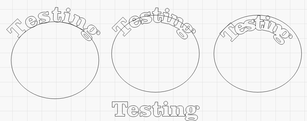
You’ll notice in the non-curved one on the bottom that the space between the i, n, and g is closer than that of the s, t, and i. This is just how this font is designed, but choosing top, middle, or bottom for the vertical alignment affects how the characters are spaced when attaching to a curve.
1 Like
So with that being said is there a way to change the spacing of individual letters within the same word for any given font? Like shifting the T closer to the L without disturbing the rest of the word’s spacing?
Per-letter, there isn’t in LightBurn, no.
1 Like
Ok thanks. I don’t think it’s that big a deal. Someone had pointed it out to me.
VCarve Pro has a feature called “adjust text spacing and curve” that allows the user to click between letters to reduce the gap and shift+click to increase it. That would be a nice feature in the future, but pretty low on the list, I imagine.
1 Like
This topic was automatically closed 30 days after the last reply. New replies are no longer allowed.