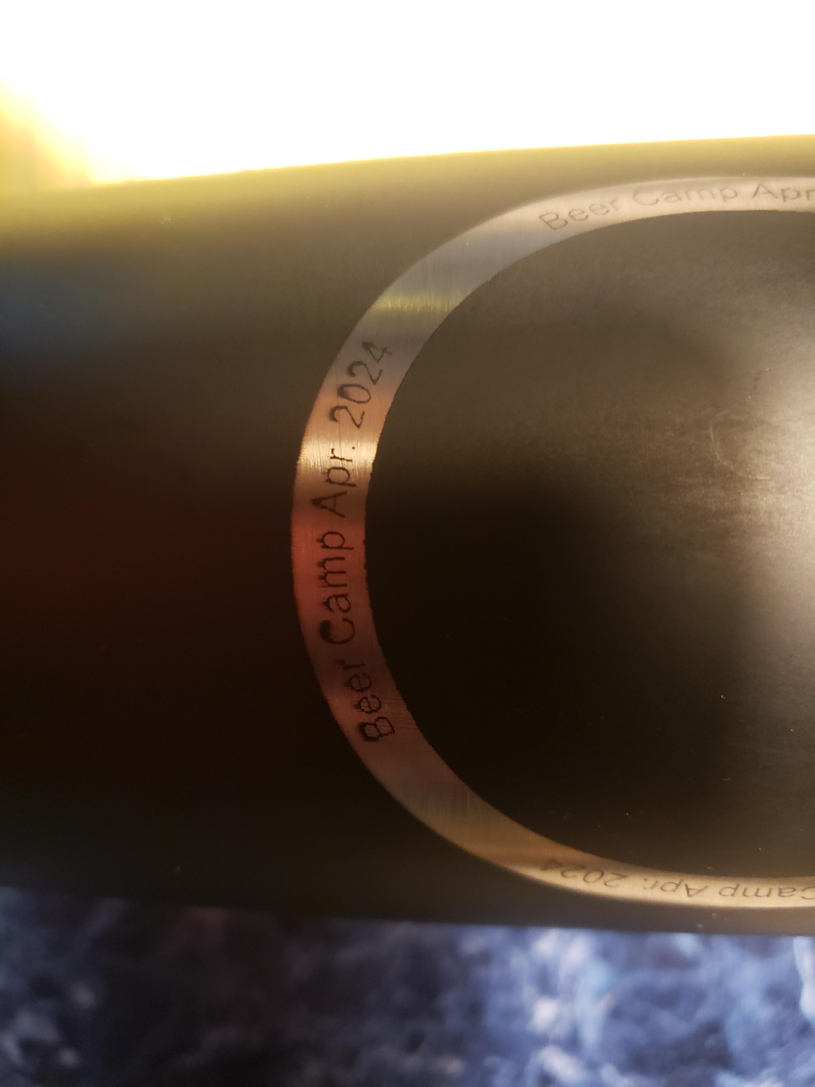
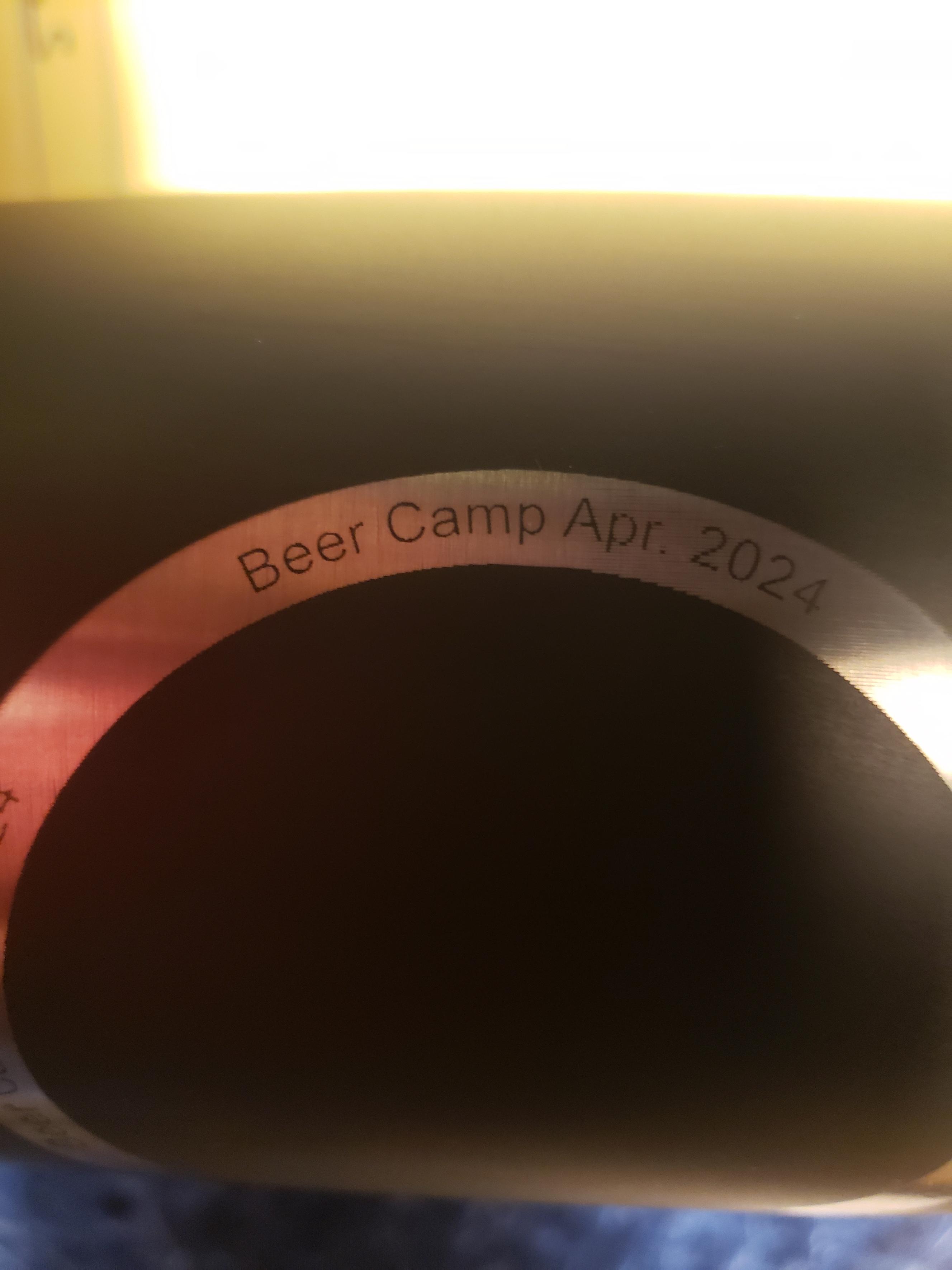
I’m having a issue with text characters that seem to thicken at the top or bottom depending on how it is oriented on a tumbler. In the pictures I have a circle in which I put some text at the top, bottom, left and right inside the circle. The text on the left and right are nice and clear. The text on top has a thickening at the top of the text and the bottom text thickens at the bottom of the text.
I’ve used this design in a different project using a different text but same tumbler, font and size.
Any thoughts?