Can anyone take a look at the two images and tell me what setting makes this kind of difference in the letter. I want the effect in Image A as it looks better than the B effect.
What did I do different? Nothing except update LightBurn which appeared to trash my settings and now I cannot produce the same quality effect.
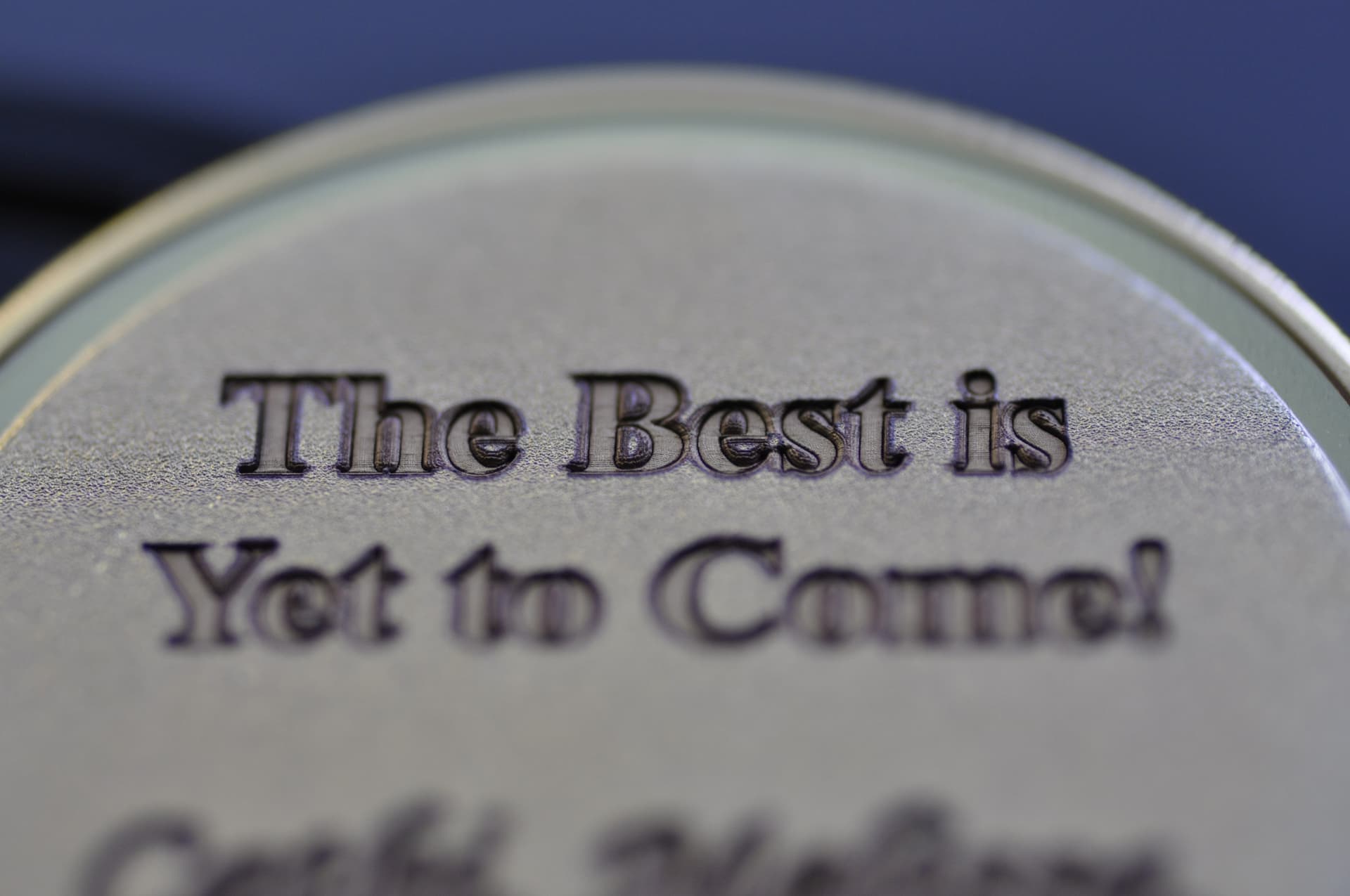
Image A: Desired! Nice crisp edges, notice the bowl shape of the actual letter:

Image B: Not desired. The bottom of the letters are flat and clean, but the ramping on the sides is not visually appealing.
Story: Last year I engraved 25 brass coins for students who graduated from a Nursing Program. I used 3D Slice mode an image that was 300dpi depth map (white background and grey shades to control depth) to make the front and back. I used the settings from the following video from Lightburn:
3D Engraving With LightBurn!
2000mm/s, 90%, 30Khz, 3D Slice, 150 passes
Went great… last year!
1 year later, after 6 updates from Lightburn, I loaded my old project files and ran the same settings and the results were a black, burnt, and excessively deep engraving when last years’ coins would come out bright, clean, and crisp.
Any Ideas? I have adjusted the frequency and power levels to no avail. I also changed the image DPI from 300 to 900 and it is still not working. It just seems to be performing the cuts differently.