When I am engraving, I notice that there are missed lines in the text that have not been engraved, they follow the hatch direction. I also use crosshatch and it is still there. I engrave stainless steel and within all the text there are these silver lines. Any ideas. I used a 0.001 hatch.
A photo would be good… it’s hard to tell without some kind of visual reference.
The hatch is relatively small, I think I use 0.025… could you be covering the same area twice or is it missing the area completely?
Is this a line/fill or image?
![]()
Bigger hatches dont give the depth and colour need in a single pass for a time sensitive process. It looks like it is missing completely. I will try and get a photo later. This is a new laser 100w MOPA. I have used a 30w for 5 years and had it dialled in perfectly but now I have Q pulse and higher frequency range. I am trying to get black text that is engraved rather the annealed, run time is important. Just figuring out the relationship between speed, power pulse and frequency in the one.
Is the 30W based on a q-switch…?
Definitely more range with a MOPA type. I have a jpt/mopa 60W.
I thought it was blackened from annealing, not engraving? You seem to have more time with a fiber than I…
Post some photos when you get a chance…
Was the 30W a Raycus?
What lens are you using?
![]()
Yeah it was a bog standard Raycus. I was using a 63mm lens on the old laser, much better clarity and intensity compared to bigger lenses. I have a 160mm on the new one. I have just hit the sweet spot. Lower speed, hight pulse and lower frequency than I was using. I will post some pics later
Photos are always good, especially as more people start using these.
I’ve got three lenses, F100, F160 and an F420… The shorter the lens the smaller the dot, in trade for depth of field…
I think the smallest lens I can use on this is the F70. With the F100, I feel like I’m crammed in there using it…
![]()
The smaller lenses are great but very little space to work. The pictures are not great as the text is small but you will see the issue. with the right settings the lines are still there but less visible. I just wish I knew the reason.
This is not annealing, the engraving is in the surface and rough, but thats how I need it,
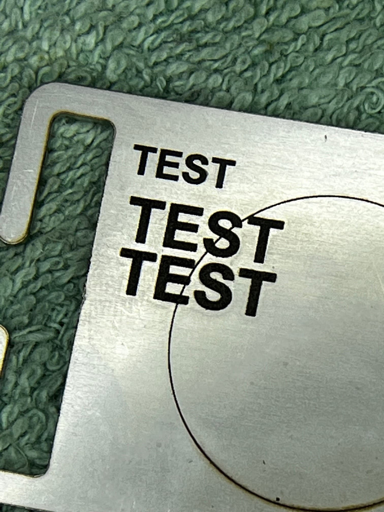
I don’t seem to see the lines in the test photos…
Are you running a 45 degree hatch?
![]()
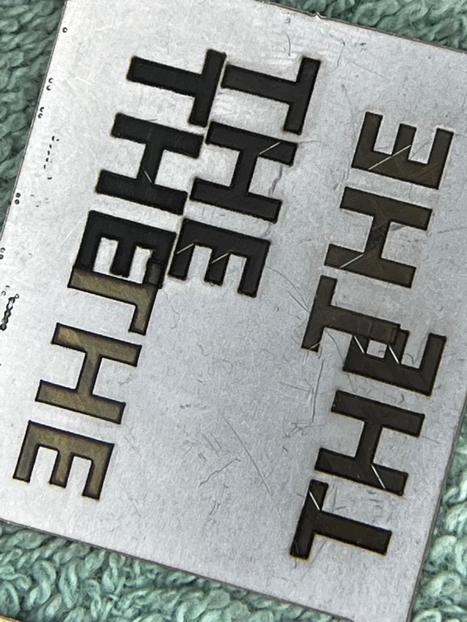
On the picture with THE. Its the 45 degree lines in the text that look like scratches. You will see 2 lines on the E. It shows its not just a random location, its the same location on each burn of the text no matter what setting.
Have you walked this through the preview to see if it thinks these are there?
I agree, same place, looks programmatical…
If you don’t mind dropping the .lbrn2 file here for us to examine. I doubt there’s anything, but it’s always a good idea to check… Might be able to run it on my machine and see if it chokes in the same place…
![]()
The problem is, its not a specific file, its seems to be system wide. I will try other setting hatches etc to try and eliminate
I really don’t know what to suggest… I can try and run it on my machine and see if it’s a configuration issue or something in the artwork, which it doesn’t sound like…
Anything I can do to help, sing out…
What version of the Lightburn are you running?
![]()
Good news, I have found the culprit. Its the flood fill and the way in which shapes are filled. Obviously flood fill have a huge affect on quality. Not a single line now and the text is really good colour. Just need to tweak the power and speed to get the time down a bit, Turning off flood fill increased time by 25%.
Thanks for the help and suggestions.
Great… I never use flood fill, seems I’m always hearing bad things about it.
In all likelihood, I just don’t understand how it works exactly.
Glad you found the issue…
![]()
This topic was automatically closed 30 days after the last reply. New replies are no longer allowed.