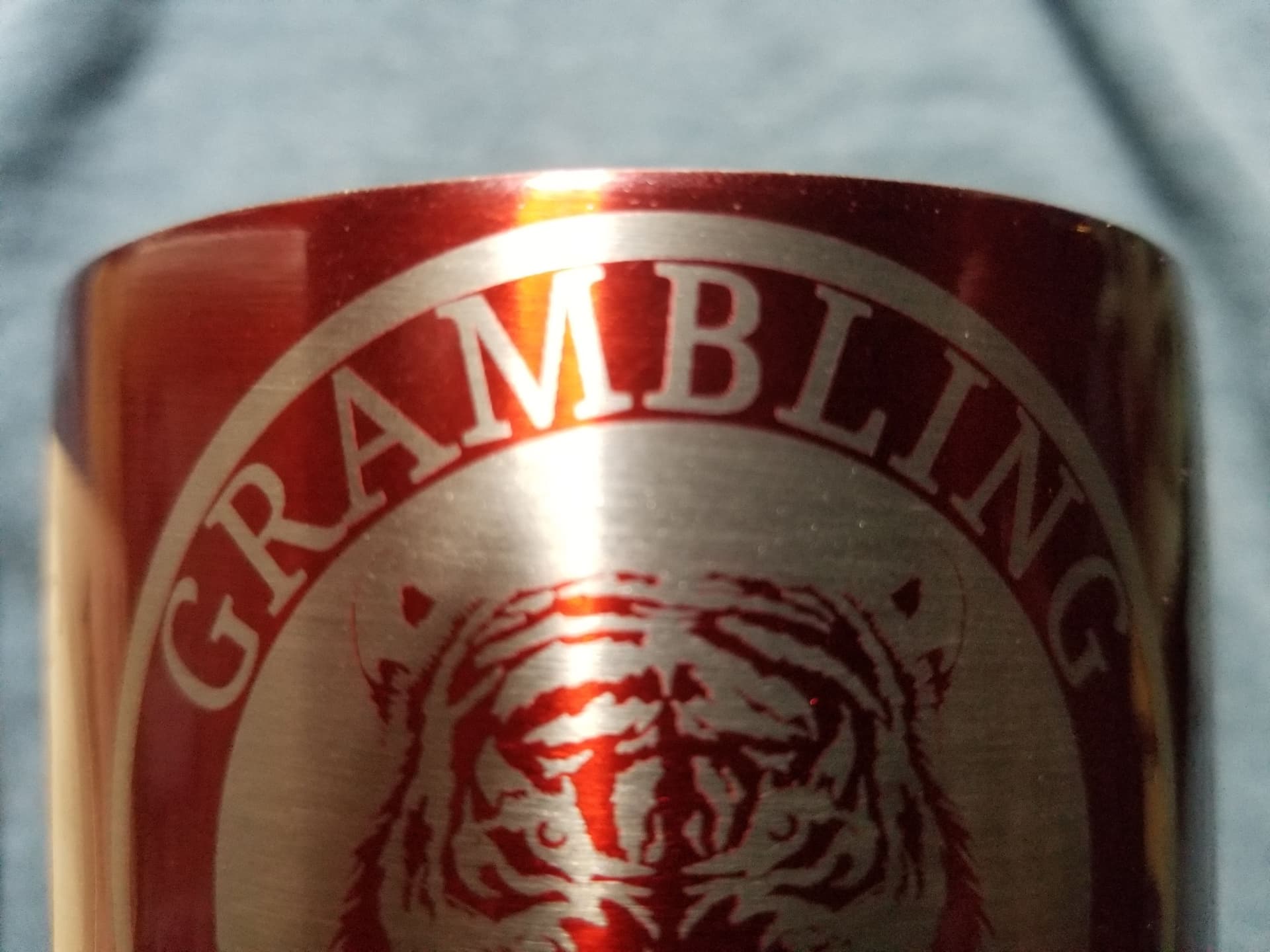
In doing a comparison to decide how to engrave this coated metal koozie, I was surprised at how vastly different the text came out. I simply duplicated the original text and added or removed an offset to the surrounding shape to invert. Nothing was done directly to the text. Any thoughts as to why so different?
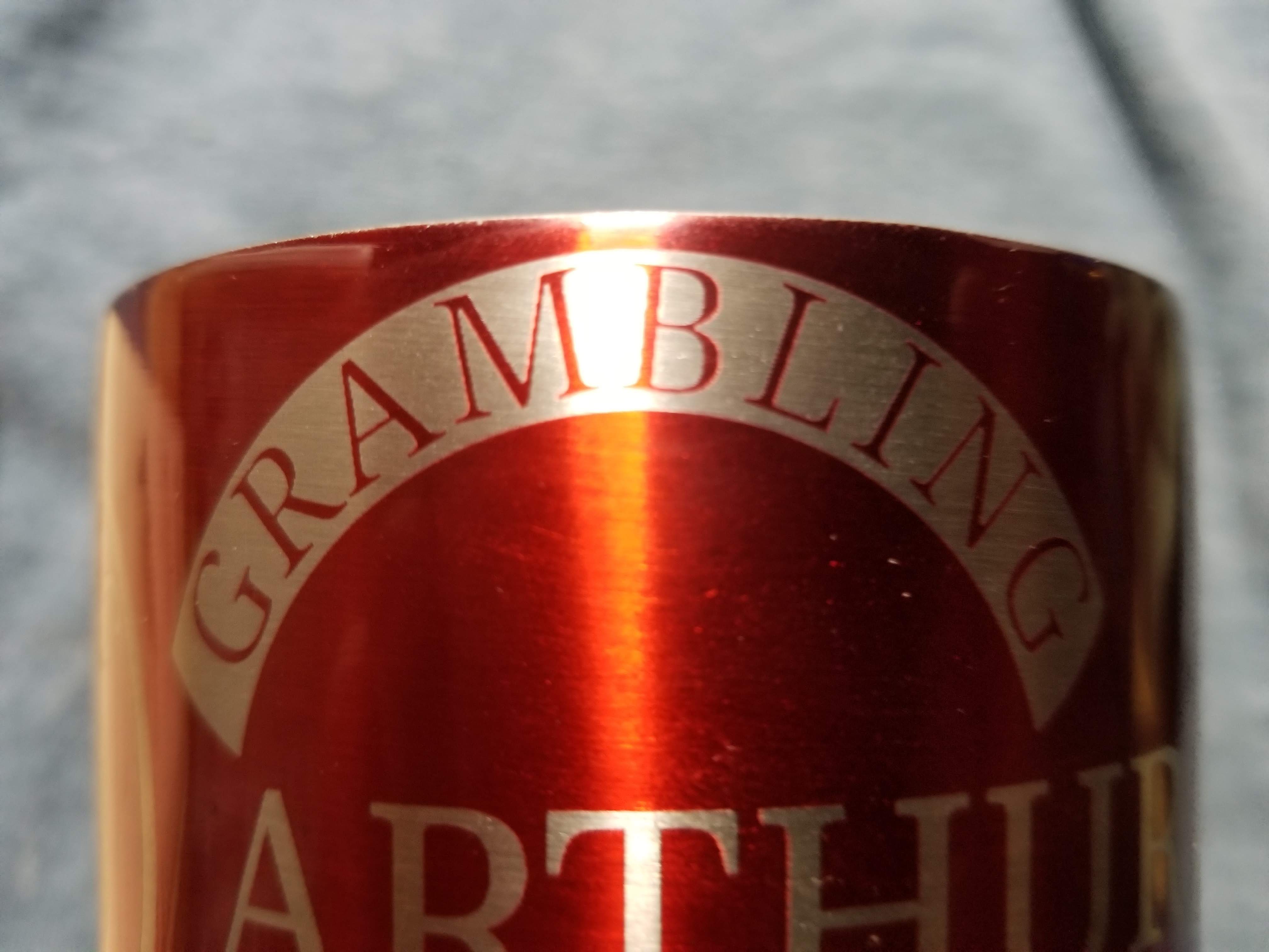
Basically because the beam has width, and that isn’t being accounted for in the engraving. We’re planning to add Kerf Offset to fills as well, so you’d be able to tell LightBurn to inset a little when filling, which would compensate for this.
You might also be slightly out of focus, depending on what kind of laser you’re using for this. A CO2 laser will also “splash” when engraving metal, producing a very diffused reflection that will eat away material around the beam point if you use too much power.
1 Like
Just a thought here. Would it stay the same if you ungrouped and deleted the text and kept the outline?
I think he’s asking “why is it so much thinner when inverted”, not “why did it invert”.
1 Like
I got that, but if the text was gone and the outline kept wouldn’t it look the same size wise and still be inverted?
He’s asking about the text itself. If the text was gone, there’d be no text…
It’s an xTool D1 10W with Geeks at Large Devil1 controller. I guess I should have mentioned that.
Ok, that is the part I missed. I thought it was the text outlined.
But still, if an outline of the same size was added to the text, ungrouped and text deleted wouldn’t that fix it?
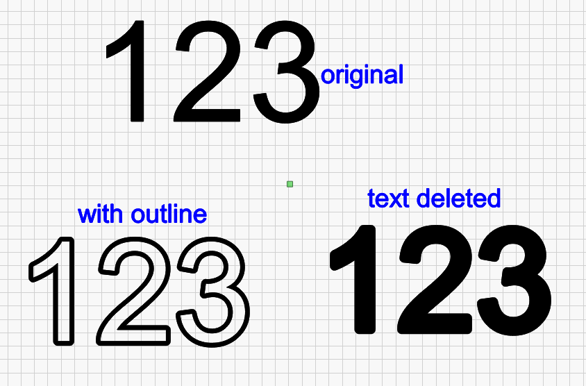
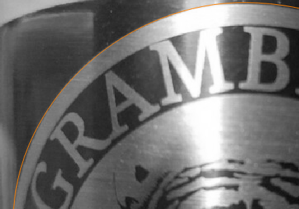
It would, but he’s referring to THIS outline, used to invert it:
You’re right…
I had this understanding as well.
This topic was automatically closed 30 days after the last reply. New replies are no longer allowed.