Hello, please, would it be possible to simplify Alignment Markers, which are engraved during camera setup process? Currently the Alignment Markers looks fancy like this:
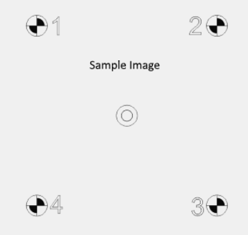
I believe the two central circles are “useless” at all and targets 1, 2, 3 and 4 are too complex with respect to their purpose.
I mean, it takes quite some time to engrave all current objects considering slower laser machines. My suggestion is to get rid of two central circles and in the corners to use just a simple cross-hair with a number. Then the engraving time would take not even a minute also on slower machines.
Thanks a lot for your consideration!
You have not tested whether a simple cross can handle the task ?, as far as the location in relation to the 4 points fits, only reference points need to be set. (I have not tried it myself, it’s just a thought I have)
I believe simple cross is sufficient. If user would need a higher contrast of cross lines, simply increases the laser power.
Maybe I hosed mine…
I printed in on my laser printer not the laser engraver…

Is it wrong to ask for simplifying something unnecessarily complex?
If so, please accept my apology.
JMichael, may be it’s just a misunderstanding. What I meant is that only the calibration pattern is unnecessarily complex, not the approch itself.
Approach is simple and clear. I just do not understand why shall we engrave (resp. fill) eight quadrants, ten circles and four twice lined numbers, since IMHO only four crosses and four single lined numbers are required for calibration? Result of calibration is just picking up four dots, so why shall we waste time with burning something more, since the cross center determines the dot sufficiently?
May be I am professionally deformed, because simplification and cost optimization is my daily bread & butter 
In my case I’d estimate the saving 80-90% of burning time, because my machine is quite slow.
And regarding the material? My friend, I am not so silly to use e.g. 400x400 mm large material. I use only four pieces of scrap, cca 70x70 mm of size, placed just in the corners of calibration pattern 
Cca is “circa”, which in Latin means “approximatelly”
Co je na mé otázce tak nepochopitelného? My question is very very very simple. Is there a way to simplify the calibration pattern? Nothing less, nothing more. Period.
I just can’t understand why did you flagged my last reply. What was inappropriate there?
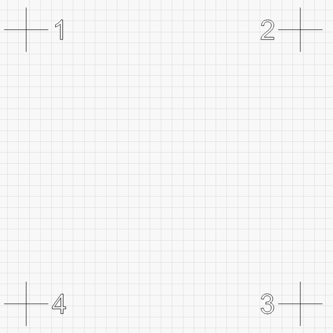
Seems to me that @LSoft is looking to reduce the pattern down to the absolutely minimum required to meet the intended purpose. From an optimization perspective this makes sense. Not sure if optimization is really the goal here for the dev team or if this would be a priority but maybe something for consideration if this process is revisited. I guess what’s left is to understand is if all intended design goals have been accounted for.
From what I can gather these are the required elements:
- 4 numbered alignment marks - the current design could be further streamlined with a single-line font instead of the outline shape.
- alignment mark preferably to which a laser can be easily aligned. Personally I find the roundel shape with 2 dark quadrants harder to align to than a single dot or crosshair design.
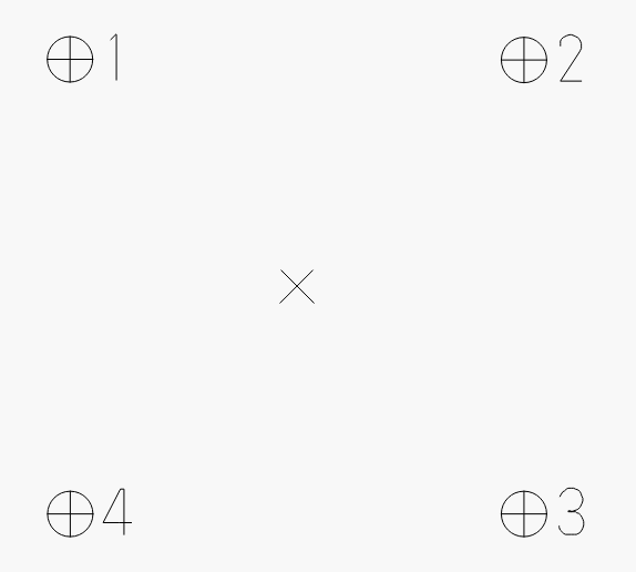
Uncertain elements:
- 2 concentric center circles - I assume this was originally in place to facilitate center alignment but there’s really no practical way to do this during the camera alignment process.
- Current roundel shape - I suspect the dark quadrants are there to increase contrast to make this easier to see. Not sure if this is a required.
This would be my proposal. [EDIT - realized I swapped placement of 3 and 4]
- alignment markers are circled to provide more visual contrast and assurance that the crosshairs are fully and properly drawn
- move to single-line font for optimization
- Center X shape - this is to draw eyes to each corner alignment mark as well as provide alignment assurance if center job alignment was ever offered as an option
berainlb, you hit the point! Thank you!
This is actually what I started with (simple crosshairs), but if the lighting is poor or the contrast is bad, the simple crosshairs don’t show up well. The contrasting filled areas provide a very clear target for the user. This is also why the number labels are drawn twice with an offset.
The patterns were also chosen to provide a bit of a “stress test” - Some machines will engrave correctly, then misalign the target crosshairs. If we only drew crosshairs, there wouldn’t be as much of an indication that there was a problem with your motion tuning. If the laser can’t accurately place the target engraving / lines, using the camera will be extremely frustrating, so this acts as a sort of “pre-filter”.
The center marks were added just to help test alignment when you’re done. If the center is perfect and the four corners are off, it’s a scaling issue. If the center and four corners are off in the same direction, it’s a position issue.
Having said all of that, you can just draw a simple square, 180mm per side, and label the 4 corners. Scale that appropriately and center it, and run that square, then skip the marker engraving step altogether - The key bit is that the four points are 180mm apart prior to scaling.
I’ll look into providing an option for a simplified version, but the existing design was tested and iterated on a dozen or so times before settling on what we have, and there are reasons for why it’s the way it is.
Appreciate the insight. Some of the design elements seemed very deliberate so figured it there was probably something to it.
Had considered the contrast issue. Had not considered the center marks being used for the type of alignment validation you’re describing.
What’s the magic with the 180mm prior to scaling? Can’t get my head around how order of operation is important.
The system needs to know the exact positions of the four vectors so it can calibrate accordingly. The original camera marks that I used were 180mm apart, so if you’re going to draw your own, they need to match. If you apply a scale factor to size the values up to cover a larger machine, you have to enter the scale you used in the camera screen so it knows how much to scale up that 180mm square. No magic - I just need to know the measurements.
Thanks. Got it. Didn’t realize there was a base reference size and a scaling factor.
Having an option of simplified version would be great!!! 
I mean, at least turn off the fill of quadrants (and likely also single-line font for numbers 1 2 3 4)
Thanks a lot LightBurn!
Totally agree! And it’s a prob because it’s using the same speed for raster and then vector.
I have a 1.6m x 1m bed, this is pretty large to put wood in. I just use 4 pieces of printer paper, and it’s hard to adjust for. I just abort the burn after the raster because the vector cross won’t burn correctly over the raster- will cut the paper- and also the numbers are unnecessary and don’t run correctly.
I don’t actually want the raster pattern, I’d prefer vector, but it’s good enough.
You’re better off using wood scraps or cardboard under each corner spot - The laser is les likely to cut through them or blow them out of position.