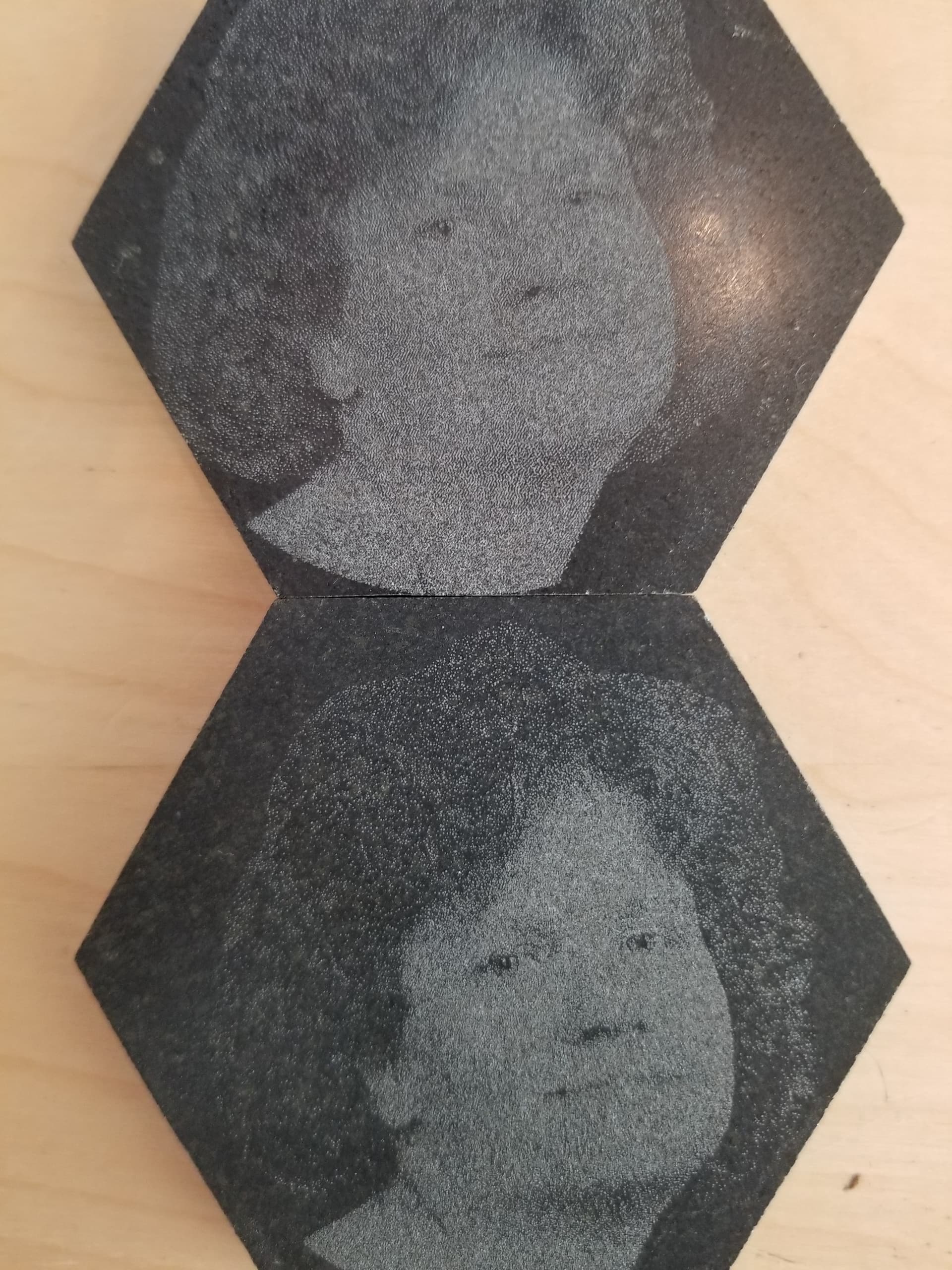
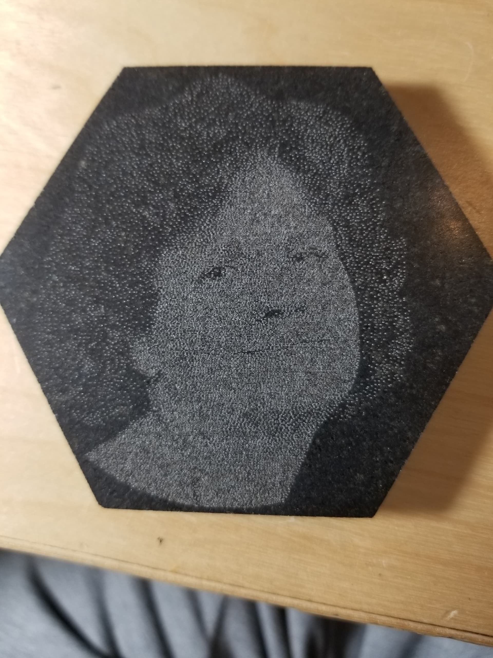
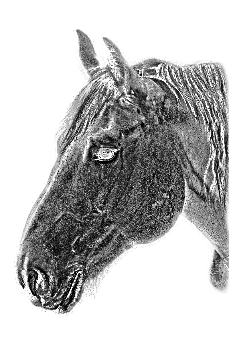
It’s difficult with this stuff, is doesn’t have much of a contrast range and it ‘pots’ with large spots where the laser hits it. Tried 128 dpt, but it looked horrible.
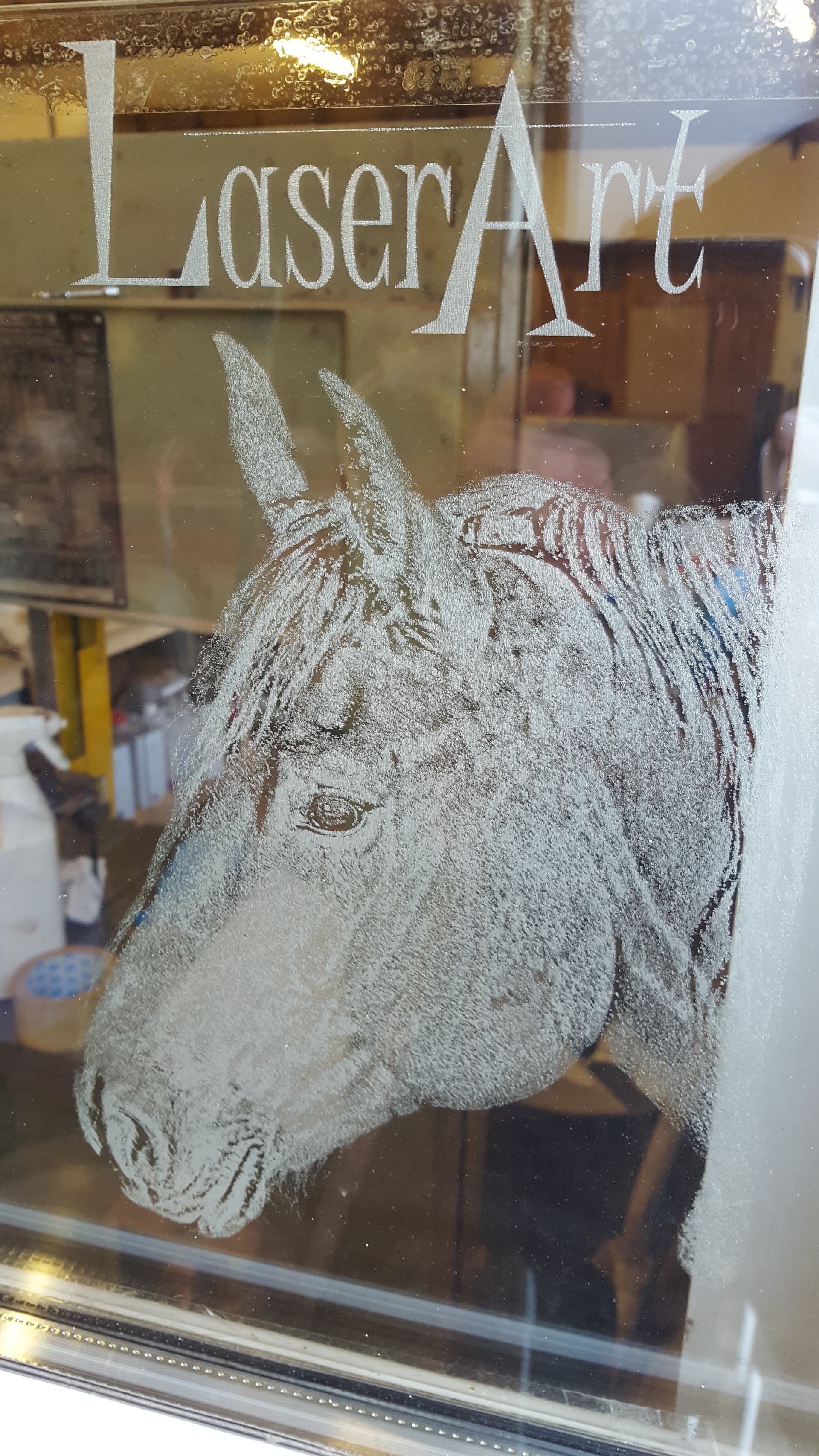
Firstly it looks like you are trying to keep to much detail in the image, the whole face is covered in speckles from laser hits, I would suggest altering the image to high contract black and white using something like photoshop, gimp etc. highlighting the areas of interest in the face, nose, mouth, eyes, chin line etc and removing all the fuzz in between. this will give the image a general more pop effect rather than the flat even tone you have now
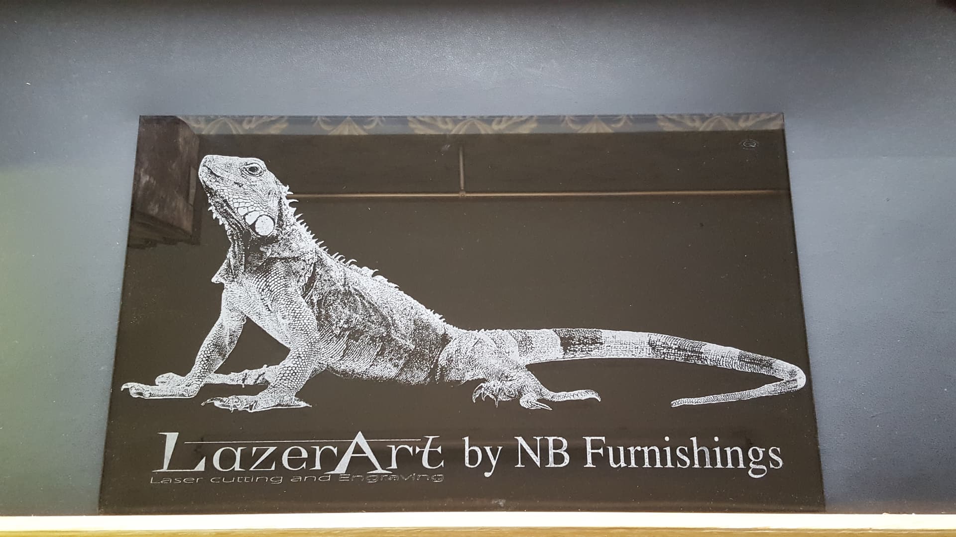
Some examples on Glass to show the higher contrast areas picked out
.
I understand your point, as I’ve done some line drawings that I can see (under magnification) that there is no distinct line when too close.
I do think slate is quite different, as I have some mirrors and tile that I’ve had good luck with. Haven’t worked with glass to nearly the extent you have. I’ve a limited bed area.
I’m hoping to make a memorial on some rough slate for one of my old partners that lost his daughter and would like to get as much detail as possible.
The image has been worked over pretty well in gimp to flatten the contrast. I’m not bad at dodging and burning, did that as a kid when I took up photography.
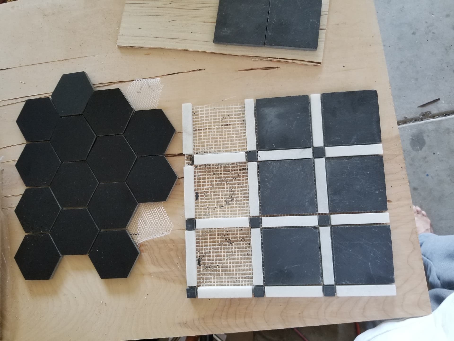
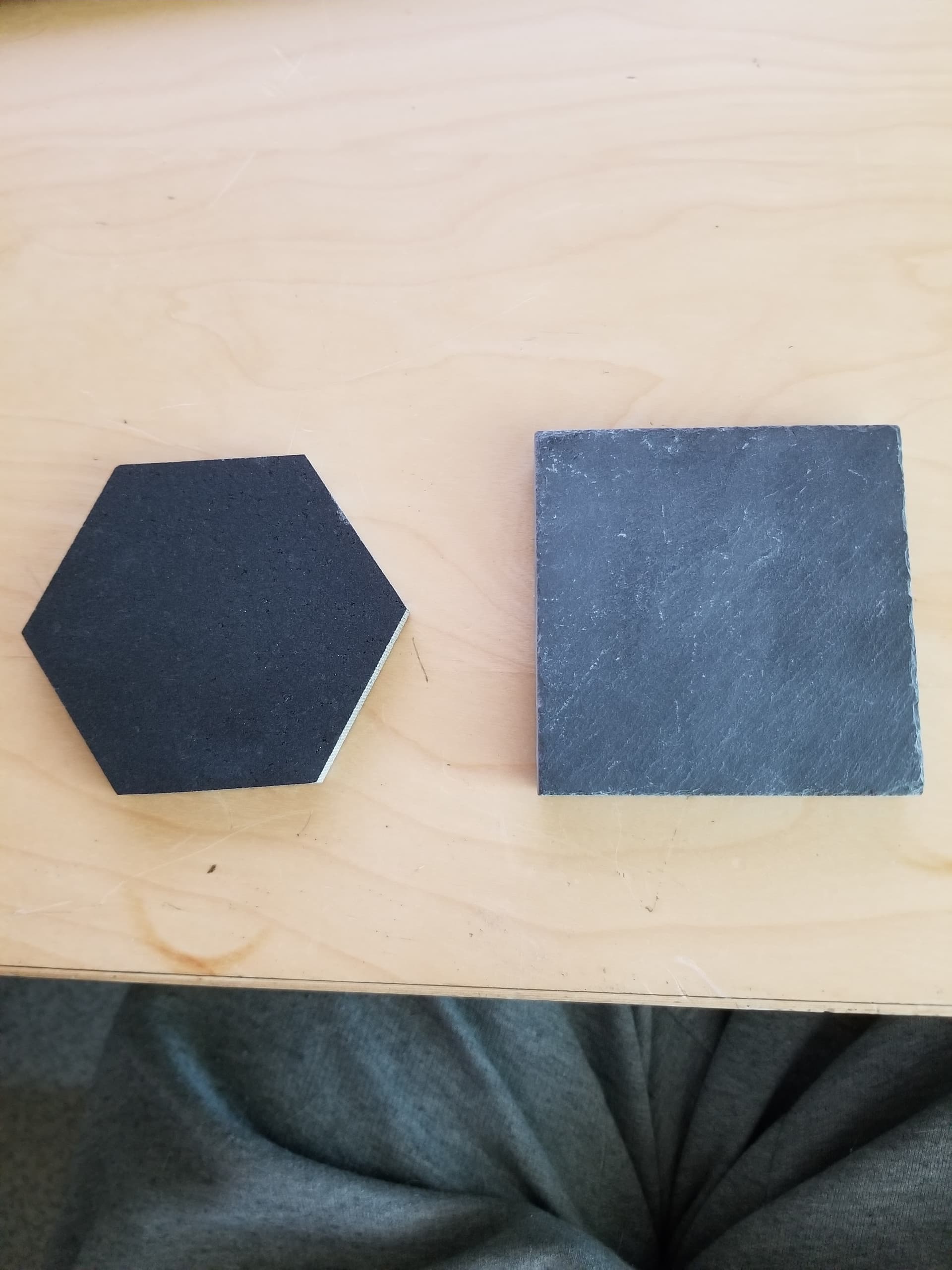
The end product will be on a 12x12 square, so this is rather small for the intended target. I’m too cheap to try this on the expensive stuff
Maybe a softer image.
Thank you very much for your thoughts (and photos). I will take a look at the artwork again.
This just may be a lost cause for the intended purpose.
Take care
After percolating on your response, I will follow your advise and reevaluate the image. I keep thinking in a different mode and you pointed it out… Thanks…