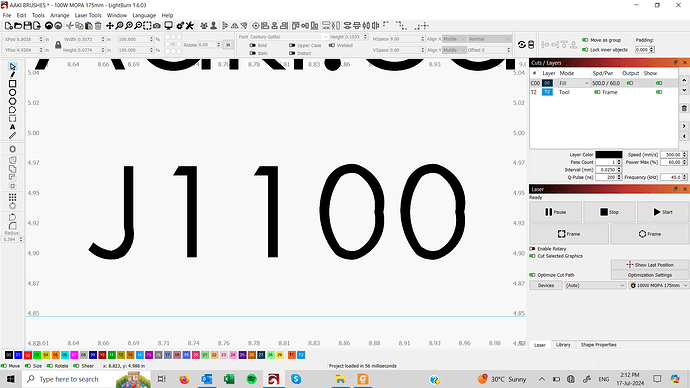
Every time I use small text in Lightburn, it is distorted. I typically enlarge it, convert to a path then resize to small again. The text in the example is 2mm high, (0.074"). I cant imagine this is normal…anyone know why this is happening??
A photo of your results would be greatly appreciated.
![]()
For sure Jack, I’ll try to get a pic soon. It definitely shows up distorted in the preview window as well. Perhaps it will burn properly but I have doubts.
It looks like jank in the machinery fitting the font curves to the screen at sizes near 2 mm. I tried several other fonts with similar results at 2 mm, although at much larger & much smaller scales the jank either vanishes or blends into the letter forms.
However, with a “Bodor 1309 - 100 Watt” laser, I suspect you’re not going to see any engraving irregularities on that scale.
That’s definitely true with some 2.5 mm characters engraved with my 60 W laser:
The edge detail on that Trolase is nowhere near good enough to resolve any of the tiny defects I can see in the digital layout. Might be different on bare acrylic, but probably not enough to matter.
![]()
I have always known about this issue in lightburn. My typical workaround is to convert to path (ctrl shift C) before sizing down.
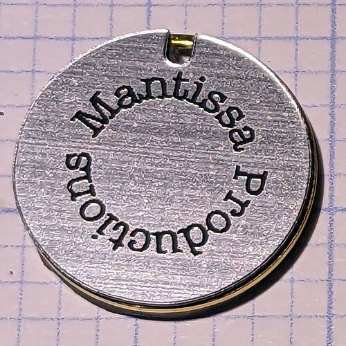
For this application, I was engraving ascending serial numbers on brass parts with my 100watt mopa. It would have taken forever to manually enter, convert and size each number. Thought I’d reach out and see if there was perhaps a setting I was missing.
I ended up doing the parts and you can’t really notice the distortion, maybe because I’m older and my eyes aren’t as good as they once were…lol
That works for me, too! ![]()
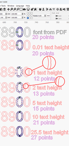
I have asked the dev team for clarification on this. I think the text gets automatically optimised as it gets smaller to speed up rendering and-or path calculations down the line, and the subsequent reduction of nodes (‘points’ in pic below) causes that distortion at tiny sizes.
This example is shown in Arial but some other fonts do seem to fare worse;
So if you are going to convert the text to path and scale that path down for better quality small text, then perhaps convert while the text height is at least 20mm for best results.
Interestingly, if the text height is ridiculously small (like 0.01mm) it seems to fly under the normal optimising process and retain it’s original curve representation, so when converted to path and scaled up it may actually be (for somebody with a microscope), a more accurate representation of the font than the text that was converted at 20mm.
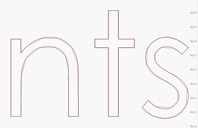
This is not the font or rendering - It’s the welding option, or more specifically, the optimization of the results afterward.
This is my current version of LightBurn, drawing text set to 0.1mm high. The red version of the text has the “welded” flag enabled, and the black version does not:
In order to weld the text, it has to go through a clipping / compositing engine, and doing that requires converting it to line segments first, doing the weld operation, then converting it back. When converted back, we try to reclaim curves, but at this scale it isn’t always possible.
The latest release of LightBurn (1.7) reduces the amount of allowed error in the curve re-fitting, so it should be better than it was, but at the scales involved, it’s unlikely to be visible anyway. The text in the screen shot above is 0.1mm tall, IE, about the height of a single beam spot from a CO2 laser, so the deviation from the original font is now very small.


