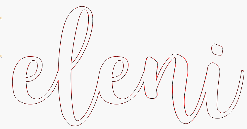
I have a font im using to laser cut out some letters, however its a bit rough at some stages. Ideally I want to run the trace image function around the words, maxing out the smoothness
Is there already a way I could do that? I love to smooth out everything. just makes everything look better
My work around was to type the word in… Word… screen shot, paste and then run trace image. Worked a treat
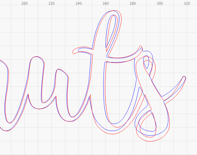
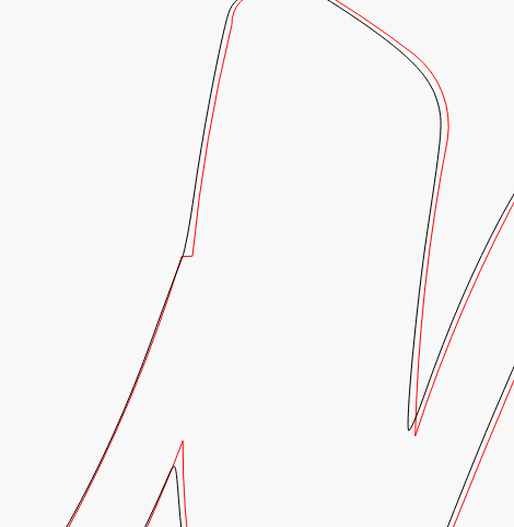
It would depend quite a bit on what size the original was done at. Fonts are complicated beasts, and do all kinds of strange things to make them draw well on pixel-based displays. There’s a process called “hinting” which shifts things around at different display sizes so that vertical and horizontal lines end up on clean pixel boundaries, and LightBurn does not do this hinting.
There are a few other things at play that could affect it this way, so it’s a little odd that they are as different as they are just for that trailing ‘s’, but I’m not terribly surprised.
For the original question, LightBurn has an “Optimize Shapes” function that might help, but I don’t have a smoothing operation yet. It’s something I’ll likely try to do, over the next while.
 !
!