Hi folks new member here.
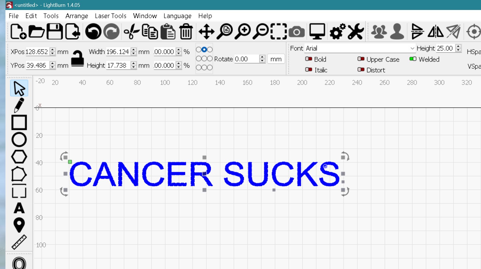
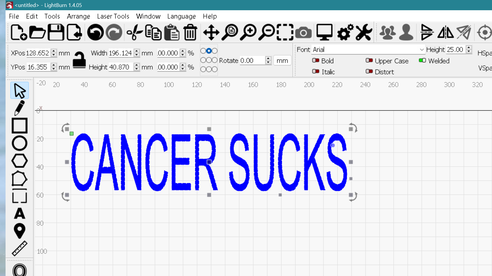
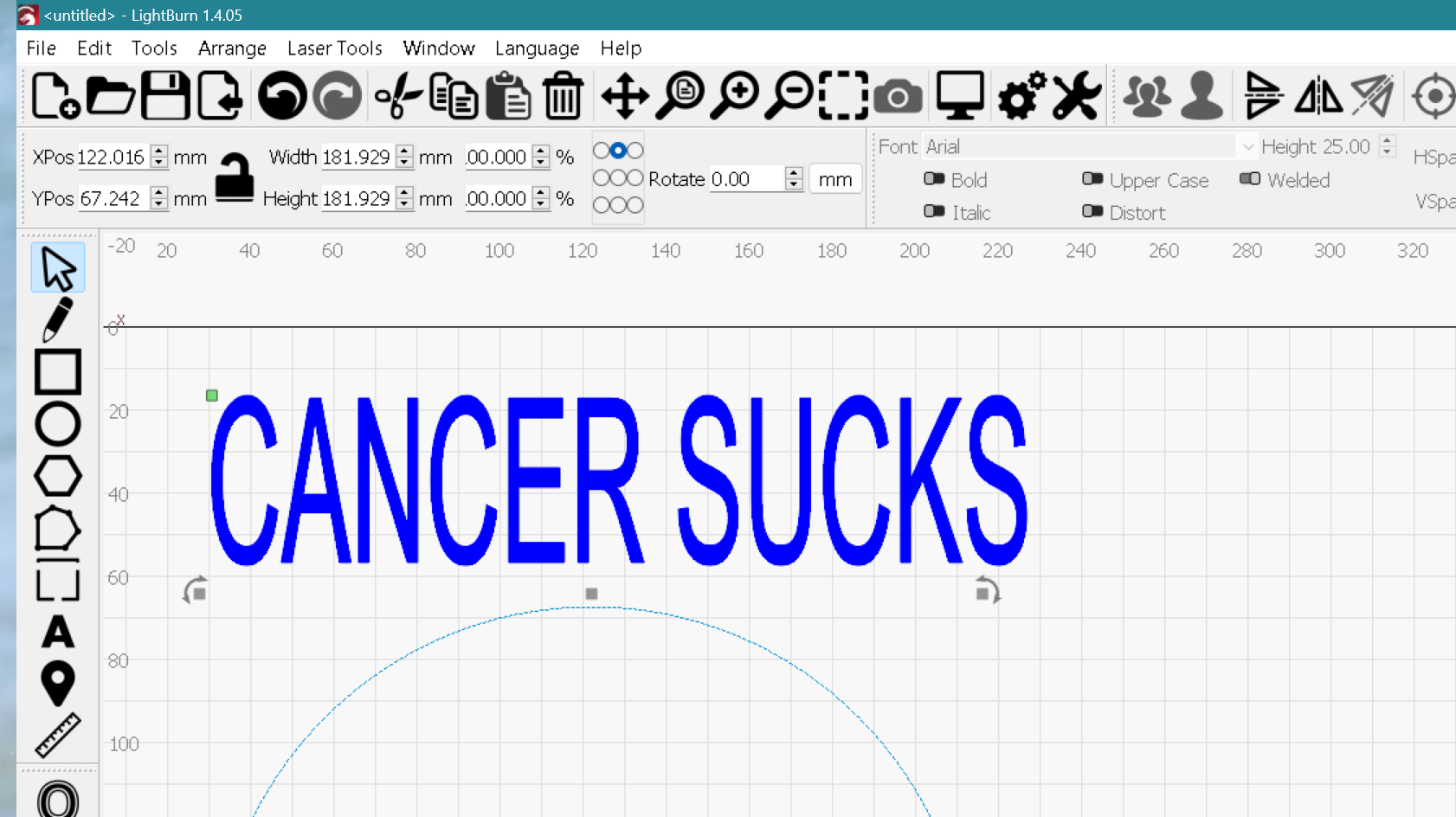
i am just trying to get to grips with Lightburn. If i create some text and then stretch it, when i apply it to a path it resizes to its original size. i did find a post where it said this issue was fixed. Glynn
I might use the ‘Blue Dot’ Bend for Text in this case. ![]()
the path is a wave similar to a horizontal stretched w
I would suggest adjusting the ‘HSpace’ setting for this, and not using the drag-handle scale/resizer for this workflow to produce as you describe.

Thanks Rick it’s not ideal but does work. I like the look of the stretched text rather than spaced! Just a limitation I suppose.
If you no longer need to edit as text, you can ‘stretch’ to the desired visual appeal you are after, then convert the text to paths (select, then right-click to get this option) and things should produce as you’d like. But the text will no longer be “text” objects, so that is a tradeoff to consider.
Thanks for the help Rick. But once you choose to convert the text to path, how would one go about applying that “text” to the path maintaining the desired shape? Cheers
Yes. Share an example of the look you are after, and we might have a few workflows that could work.
You may need to generate these elements using another, external design tool, save, and then import that art into LightBurn for final layout and production.
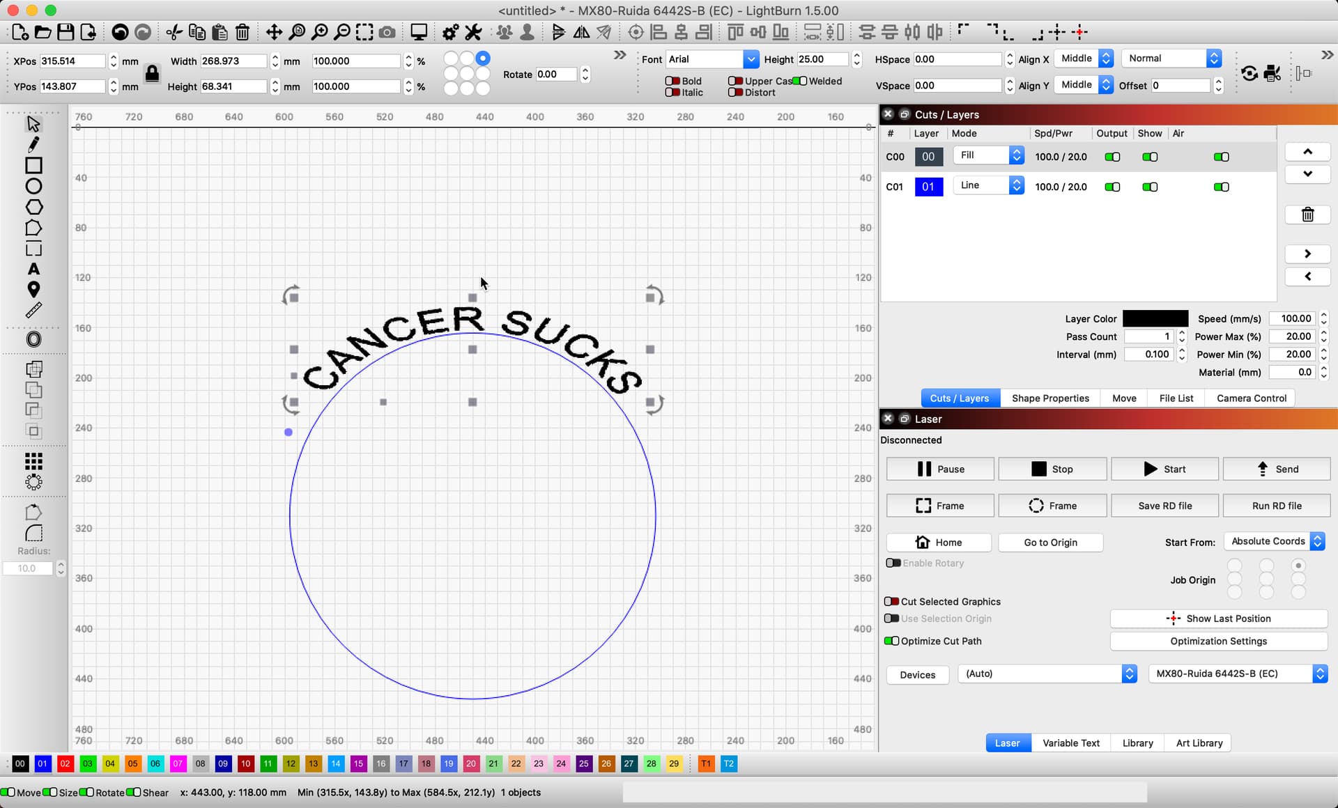
Thanks for the reply Rick. Below is the workflow that I am currently using. As you can see, we type out what we want, then expand the text (in this case vertically), apply to path, and LB resizes it back to the original height. My workaround within LB is, once I have the text formatted the way that I want it, is to convert it to path, and then place each individual letter back onto the path. I’m not using any other software (regularly at least) other than LB so I would be faster doing it this way than trying to learn something else. Thanks again.

Given that workflow, I might suggest using the ‘Blue-Dot’ to bend the text to see if that option is workable for your design needs. The result might look a bit squished, but worth a play to see if you can work with that. ![]()
Thanks Rick, I’ll give that a try. I seem to remember that way distorts the text a bit too much for my liking. Cheers
This might help as well,
New in v1.3
When bending text, you can use the “Distort” toggle to choose whether to distort the text as part of the bend, or leave the individual characters unchanged.
This topic was automatically closed 30 days after the last reply. New replies are no longer allowed.