We make nameplates and information tags for industrial equipment.
The engineers want a specific text size on the plates.
The lasered text size is always smaller than the Lightburn size setting. 1" burns at .75".
It is consistent, .25" will burn at .187"
All shapes will cut/burn at the correct size.
How can I adjust the text size to burn as entered?
Does a 1" square drawn in Lightburn also burn at incorrect size, or is this only a text problem?
Where does the text come from? Do you enter it in Lightburn or is it “imported” from some other program?
Well that’s curious.
When you’re looking at the height of the text on screen are you looking at the height listed in the font height box or the actual size as shown in the Width/Height boxes on the left?
Here’s a screen shot of a 1" square box with text set at a height of 1.00.
But the actual height of the letter is actually only 0.7157" and varies all over the place depending on the chosen font.
The only way that you could burn text at exactly a specific height is to generate the text, select it, then change the height value in the toolbar to match what you want… now, please bare with me. We aren’t just lazy, it’s just that fonts are weird.
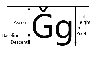
When you select a font size in the font Height input box you are telling the internal font system to render the font with that maximum height. Now, you will probably think that an uppercase letter is representative of the maximum height a font can be, but it’s not. Check out this graphic:
So there’s a couple of things we have to deal with.
Ascenders: Things like accents. What you see above the G in that image. I know, in English we don’t really use those but they still have to be accounted for.
Descenders: Letters that have parts that go below the “line” you are writing on. j,g,q,p etc.
So when we tell a font to be rendered at 1" tall, it’s telling it to make it so that anything that could be written will fit into that height.
Pretty much, your text shape will never be exactly the height as what you specified in the font Height box. And sadly, that’s just how fonts and typography are. Most of the time it doesn’t matter. But if it does for you, get it close with that value and then use the shape size properties to tweak the height - just remember to click on the lock icon to make sure the width changes with it.
When you do that you will actually see the font height value update to show what the new height value for that font is.
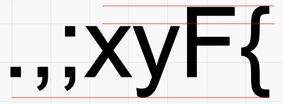
If you told the text to be 1" tall, and typed a decimal point, should that be 1" tall? If you continued typing to include a comma (a little taller than the decimal) now should it be 1"? Now add a semi-colon, an x, y, F, and {, with each character having a different top and bottom.
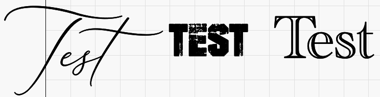
If each character you typed forced the height to the exact height requested, the text would constantly adjust size until you hit a combination of characters that stretched to both extents, which would be really jarring.
Font characters are designed in a bounding square called the ‘EM Square’ and the font height you choose is specifying the height of that square. The font designer can make letters tiny within that square if they want to, and are free to go outside of it too, for things like flourishes.