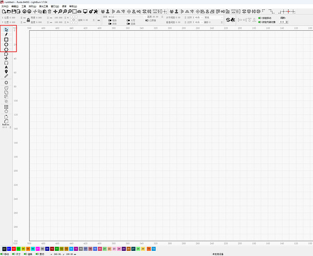
操作界面的工具栏图标,以及导航栏的图标能不能 稍微 分开一点点。
分开一点点后,看上去没有那种密密麻麻的感觉,整个版面从视觉上来说会舒服很多。
现有的图标间距太密集了,稍微拉开一点点,视觉会舒服很多,也不容易点错。
This will be one of those things that we will have 10 opinions about the layout icons should be.
Suggest you address this via Feature request here:
Notebook computers have limited vertical space. I solved the problem by purchasing a 23" monitor.
This topic was automatically closed 30 days after the last reply. New replies are no longer allowed.
