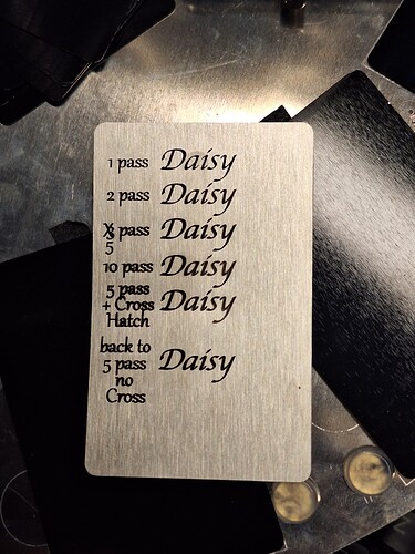
Ideal Jet Black With Depth
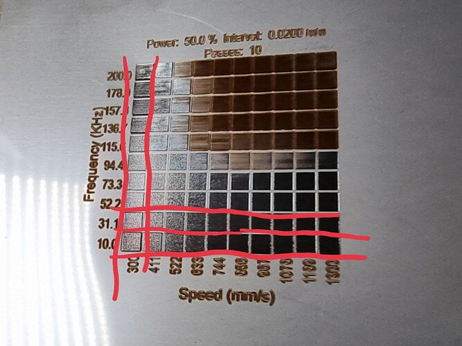
I’m using a 30W ComMarker B4 fiber laser, Lightburn software, and I’m new to laser engraving. I’ve successfully dialed in decent settings for engraving 304 stainless steel on a material test sheet, achieving the ideal jet black color with depth. The settings include 50% power, 300 speed, 15 passes, and an interval of 0.02. Additionally, I found that using a frequency of about 30 kHz produces optimal results. Each row in the grid on the test sheet measures 3x3 mm, and it’s the ideal setting I want to replicate.
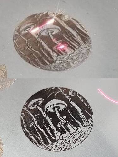
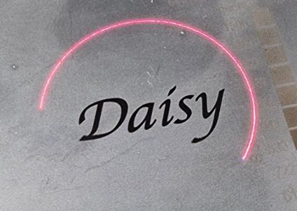
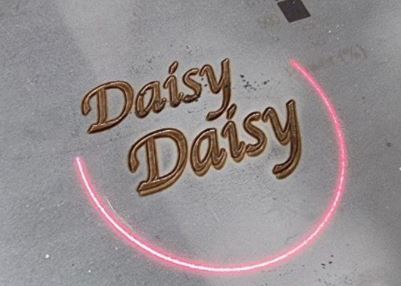
Top Picture: 900 mm/s Speed Brownish Has Depth
Bottom Picture: 1000 mm/s Speed Black No Depth
However, when I apply these settings to a larger image (around 28x28, vector file that I designed), I encounter issues. Despite my efforts to maintain consistency, the color often appears burnt and lacks the desired depth. Adjusting the speed doesn’t always yield satisfactory results; for instance, increasing it to 1000 mm/s creates a black color but lacks depth, while 900 mm/s results in a brownish hue. Furthermore, when engraving adjacent to the image or with larger squares, the outcome varies—sometimes black, sometimes brown, with inconsistent depths. I’m puzzled as to why the image size seems to impact the color and depth on stainless steel.
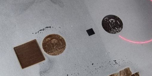
Same Settings Engrave Next to Different Size Square Individually
Upon further investigation, I noticed a peculiar pattern: when I engrave a 3x3 square next to the picture, it turns black, indicating successful engraving. Fill settings is individually. However, when I attempt to engrave a 10x10 square adjacent to the picture, both the square and the picture appear brown and burnt, despite using the same settings.
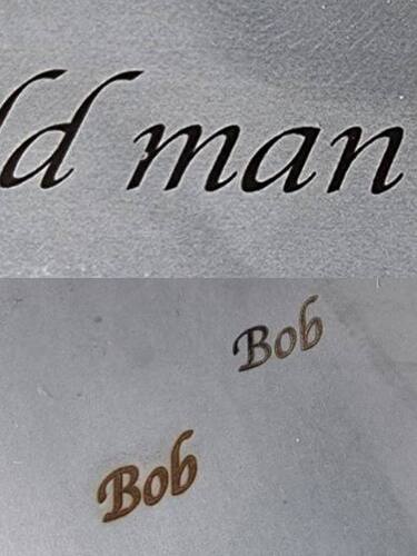
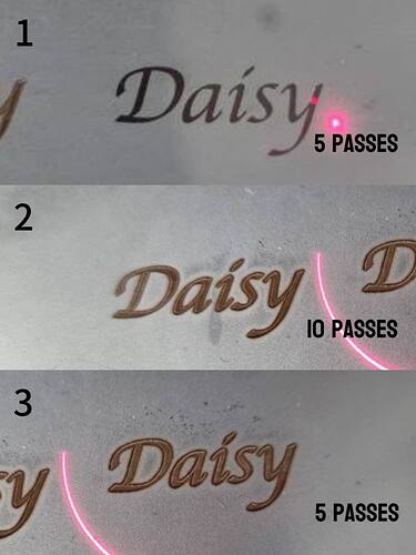
Top Picture: Above 15mm Width Appears to be Black 40% Power 400 mm/s Speed
Bottom Picture: Smaller Size 12mm Same 40% Power 400 mm/s Speed Black, 200 mm/s Speed Brown
Additionally, when engraving text, I’ve found that unless the width exceeds 15mm, it tends to burn, necessitating a power reduction to 40% and adjustments to speed and interval. I typically use a speed of 200mm/s and an interval of 0.04 to achieve satisfactory results. However, when I encounter smaller text, around 12mm in width, it tends to burn even with these adjusted settings. In an attempt to rectify this issue, I increased the speed to 400mm/s, but unfortunately, it resulted in a mixture of brown and black coloration, which is not the desired outcome.
Can anyone provide insights into this inconsistency and suggest a solution to achieve consistent results?
