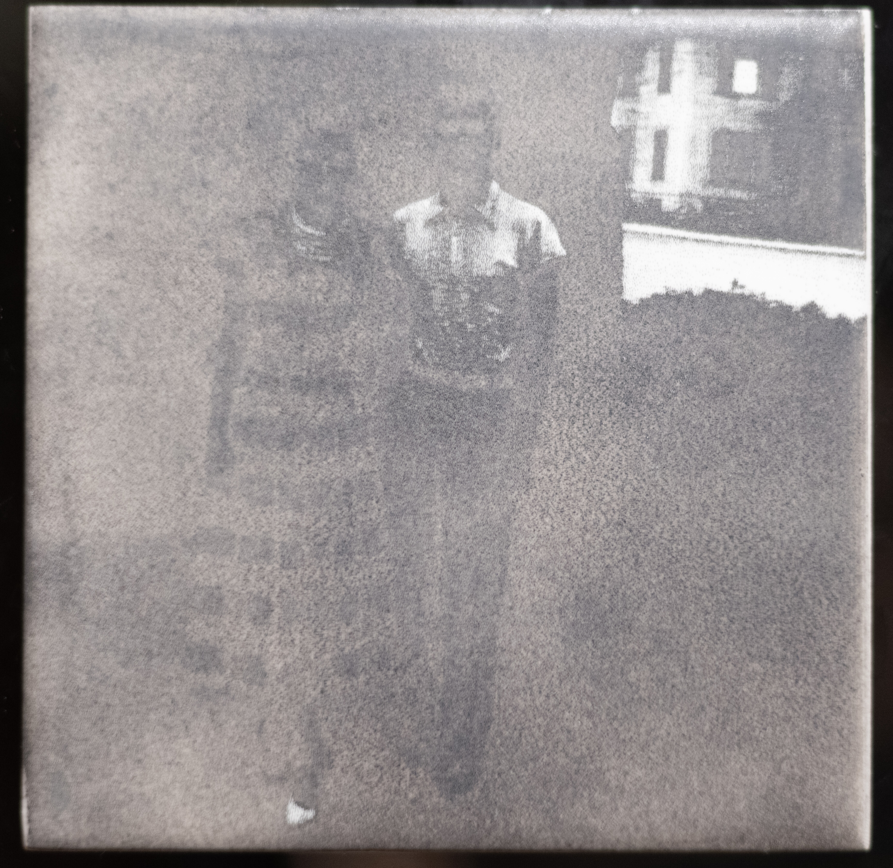
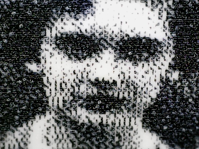
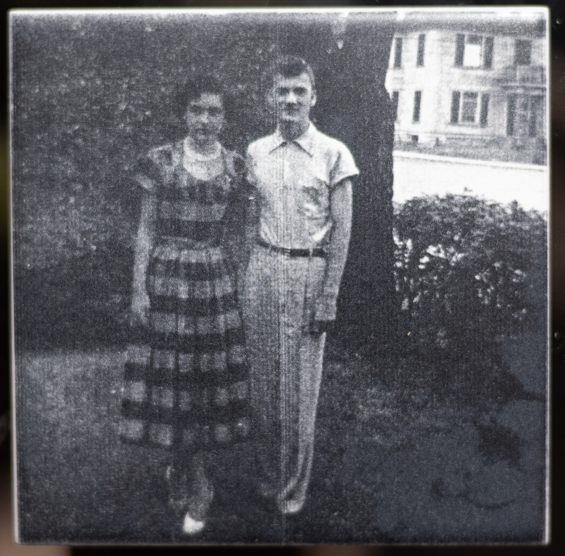
Before:
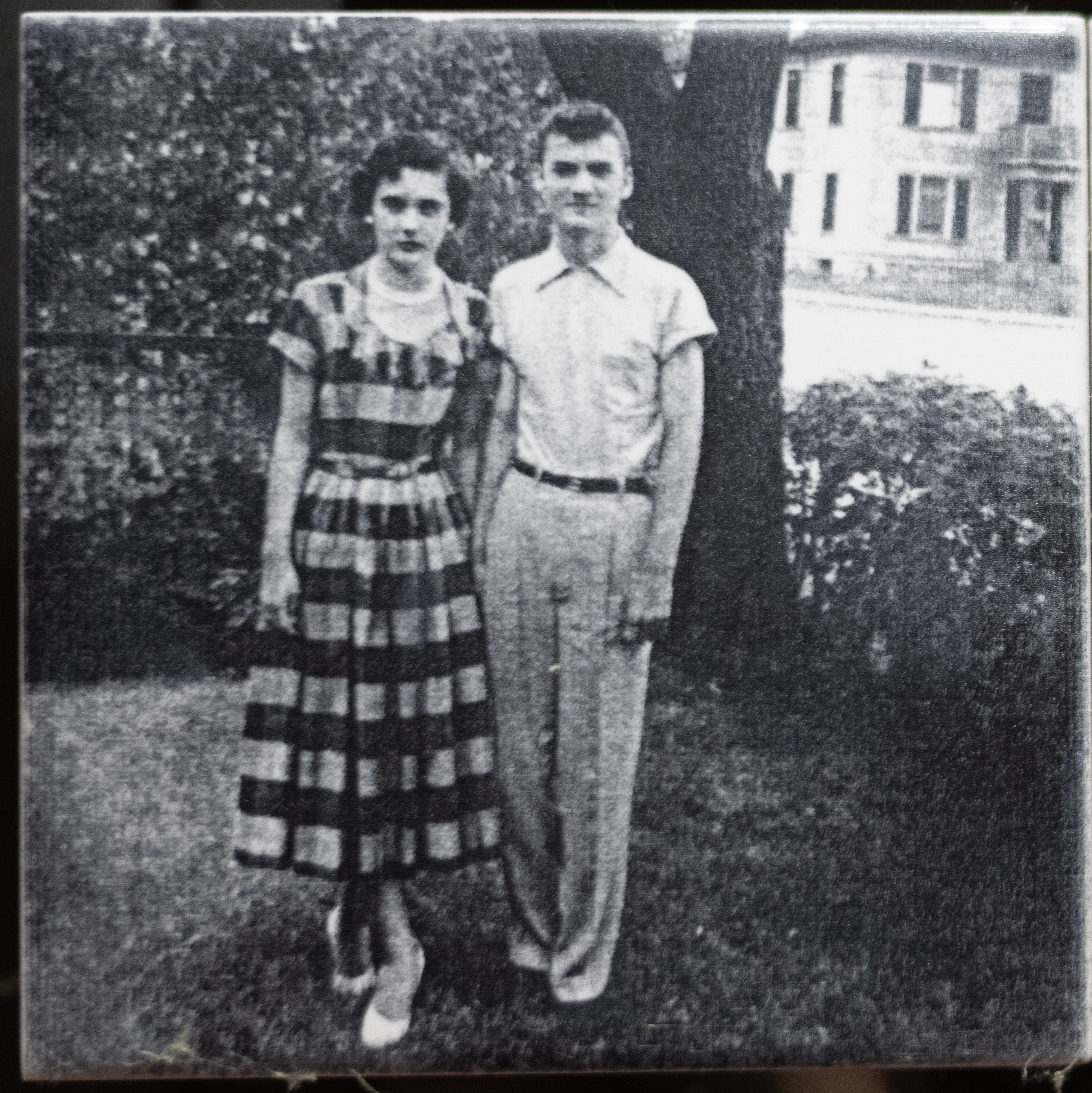
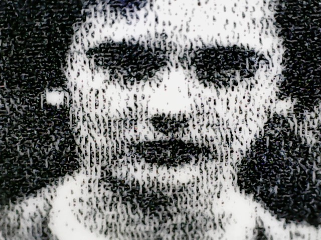
After:
So I ran into some of the same issues as a few others out there are having with areas of the engraved image blocking up and I thought Id give a rundown of my experience. First thing’s first, my setup and materials.
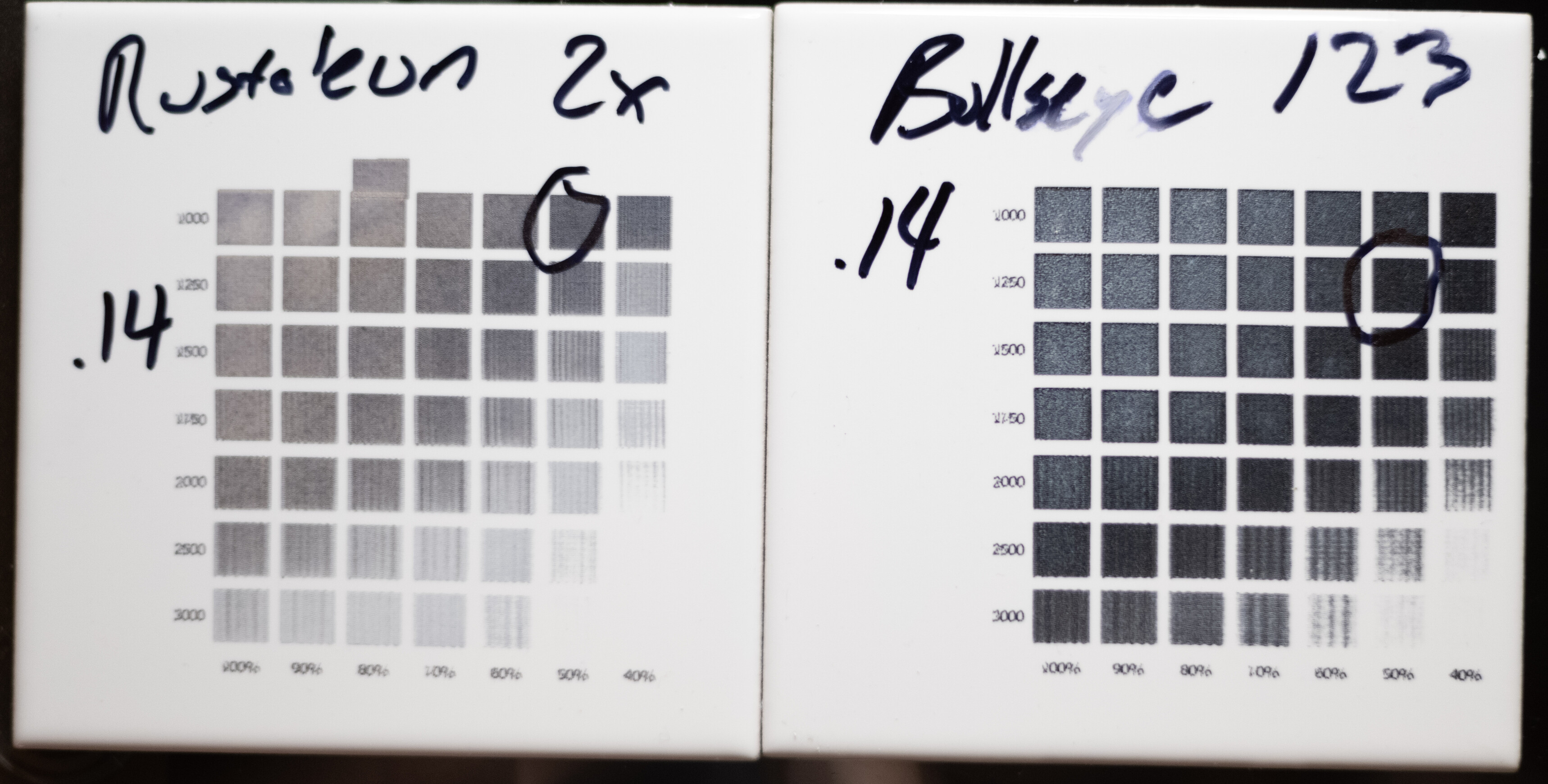
I engrave with an Ortur Laser Master 2 20w laser with a with the stock, friction fit lens and “Ortur” branded module. This is important because the branded module with the friction fit lens utilizes a different lens than the unbranded module with the twist-out lens. According to Ortur, this lens is neither G2 nor G8, but falls closer to G8. By my measurement, the spot produced by this lens is about .2.8-.3mm x .05mm in dimension.
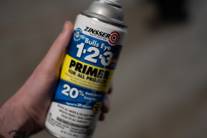
As far as paint goes, I use Bullseye 123 Primer. I’ve seen plenty of people have good luck with Rustoleum 2x though I struggled to get it very dark.
Comparison:
After much troubleshooting, I determined that the cause of blocked up shadows and loss of detail in engraved images stems from a combination of a high range of tones and too high high resolution.
Essentially, in a dithered image, single black points are burned into the tile in clusters of varying density to create the illusion of continuous tone. The more dots in an area, the darker the area appears.
The laser focus point always remains the same size, therefore the dots it creates are uniform in size. At a certain resolution, the dots begin to overlap as they are burned. While this may not be an issue with other types of engraving, in this method it can lead to the burn off of previously burnt areas, resulting in loss of detail and large areas of even tone.
There are two methods to resolve this, each with its own Pro and Con. The first is to lower the resolution. Ideally, you should lower the resolution to the point at which dots do not overlap and therefore cause no overburn. However, that would be an extremely low DPI (in my case, around 85dpi), and would not resolve well to the eye unless viewed from many feet away. A higher DPI will provide better resolution, though cause more overburn the more you increase. I found a good compromise to be 181 DPI, or a line interval of .140.
DPI of 181:

The other option is to decrease the range of tones in your image so that there are less values in the shadows and potentially highlights. This should be done after all other adjustments have been made to your image and you already have a full range of tones. In photoshop, you can limit the output range by using a levels adjustment. At the bottom of the panel, you can use the sliders to set your values. I found that setting my blacks to 40 and whites to about 223 were correct for this image.
Levels Adjustment:
The image on your screen will appear very flat and dull. Not to worry, the resulting burn will not appear like the image in the editor. The condensed range image can then be burnt at 300 DPI.
Condensed Range:
The Pro of using a lower resolution is that theoretically, you can retain a wider range of tone values. The con is that there is a loss of fine detail. I think this might be good solution for large tiles meant to be viewed from further away.
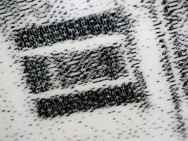
The pro of using a condensed range of tones is that you can use a higher dpi and retain higher detail. The con is that there are less tones in use, so theoretically gradients may be less smooth. I find the difference in tones to be negligible, though see more detail in the image. I think this method is probably best for small tile. See detail comparison below:
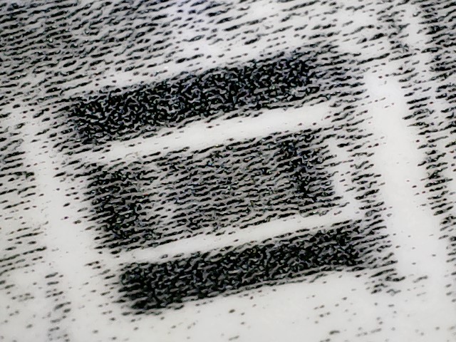
181dpi:
300dpi:
181dpi:
300dpi:
Personally, I think the condensed range method worked better in this case. Ideally, I would have very specific levels values that could be used each time for this method for every laser/paint/tile pairing, though it would require running several tests to determine where the threshold for shadow values lies. If I develop that test, I will post it.
Finally, both of these methods have been tested with Jarvis dither and the Imagr/Pass-thru. I didn’t like my results with Jarvis, the dither pattern was noticeable and whites were dull. In the image below, the right half is Jarvis, the left half is dithered with Imagr.
Let me know how it goes for you!