We need a true Texture mode

I have wanted alternative looks to “Fill”. Instead of just being a depth, I want a brick texture, burlap, stacked stone wall, voronoi,etc.
So you want to use a true repeating graphical texture file, where the left/right and top/bottom seamlessly line up so you can seamlessly repeat a relatively small image over a large area.

LB can do that- but you have to use Grid/Tile to make the image repeat, then Convert to BMP (which makes no sense, but this must be done to fuse it into a single huge image), and it actually has to make a data structure of 12x the size of the original image to do a 4x3 tile of it. This can make everything run really slow and the project file can become huge.

Then you’d make the shapes you want to do as a textured “Fill”, but set the layer to “Lines” with the same layer number as the tiled Image layer, then select both the shapes and massive tiled image and “Apply Mask To Image”. You would definitely send the masked graphics to the laser, you might also the Line layer as a light, low-power surface engraving for emphasis.

And when you create that tile pattern, it’s locked in, you can’t add more if your shapes get wider later. You’d have to delete the layer, re-import the image, tile, and merge again.

This begs the question, how can we do this better? Well, we REALLY don’t need to make that huge, slow Grid/Array of identical copies repeating.

I would say the best way would be to add another Layer type- “Texture”. You’d place one and only one image on it and it will automatically repeat when the job is rendered on screen or sent to the laser. This would require a Texture have a field in Layer Settings that says what type of tiling it was made with- normally the left and right sides line up, but you can also mirror the next copy on the right and then the next copy to its right would be unmirrored. It may or may not also mirror the copy above and below it. All that is already available under Grid/Tile- it just needs to be reformatted as a Layer setting for a Texture layer.

The “Apply Mask To Image” step won’t be used. It would look for a Lines layer of the same number, and automatically use closed shapes on it as a mask. The Lines layer will still be available to engrave from if you want, you can already use Output on/off to do that. Doesn’t need any new Layer setting to specify that.

Texture is an extension of Image, so “Invert”, choice of dithering or grayscale, LI, min/max power for grayscale, all that graphics handling gets reused. Texture is one and only one image, adds new fields for how the texture tiles, and requires a Lines layer of the same number to mask it.

It would be “neat” if Texture Layer DID have an option to fill with a dynamically generated nonrepeating voronoi or other algorithm and not use an Imported bitmap image. White noise would also be an interesting option too, it would look different than regular Fill. These would need at least the scale to be adjustable, and may use other sliders. Not essential, though.

So, you can use different textures for different aspects of the design if you want. A bit tedious but you could make bold text mask for a brick pattern in one spot and make a shape that masks for white noise elsewhere.

I thought of other schemes, like maybe instead of inventing a new “Texture” graphics layer, you’d invent a new “Texture Fill” Layer variant for that same layer of vectors that will be the mask. But then I realized we still need to be able to specify the type of tiling the bitmap uses, and if algorithmic options were available, that would also need a place to specify it. Logically, it seems like that needs to be done on the layer holding the bitmap, thus the decision to invent a new Texture layer that mostly reuses Image Layer.

For the most part, this is a “fancy” way to do a Fill. Either way you’re rastering the same stuff on the machine, this just makes it look much more interesting.

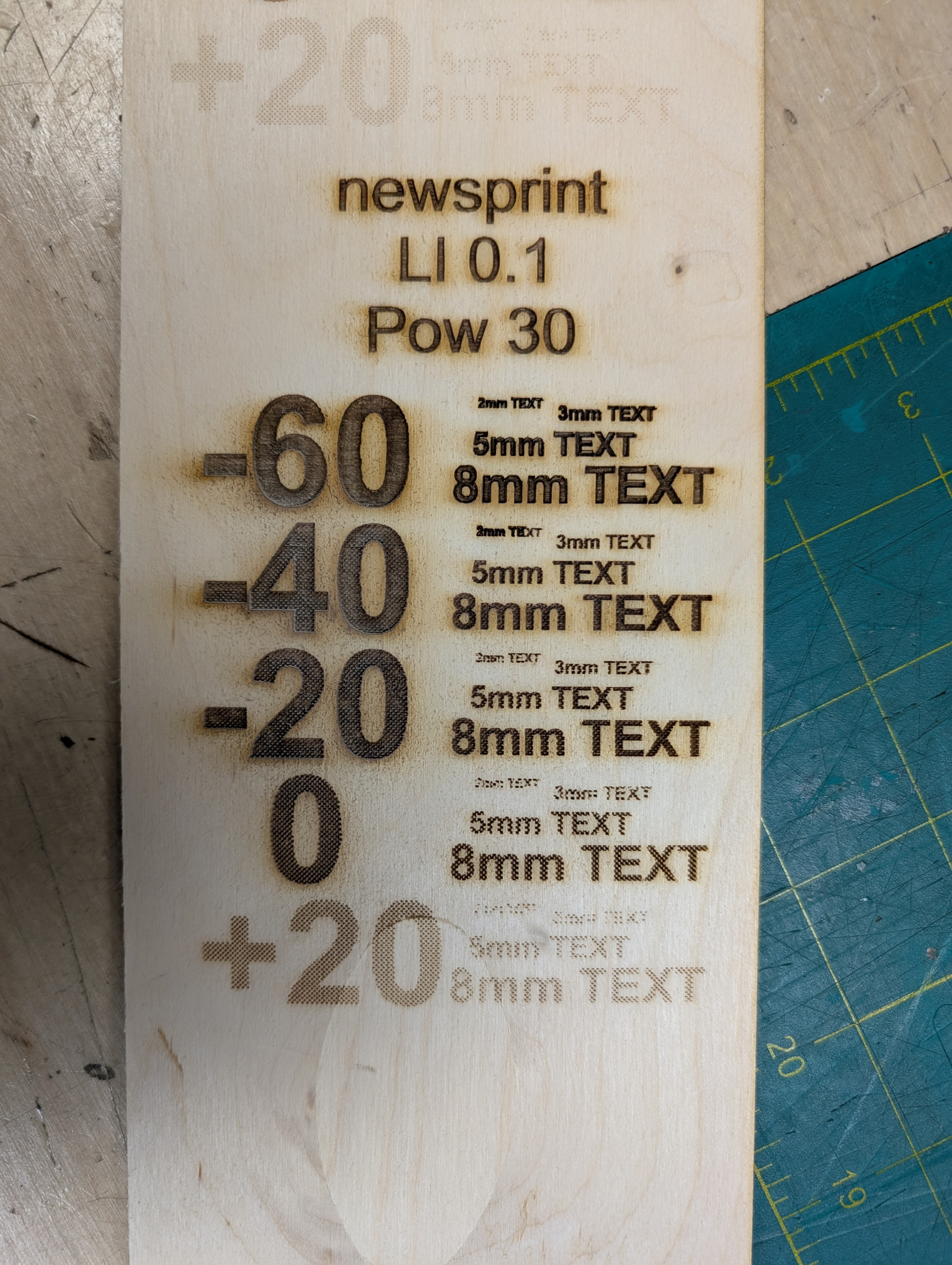
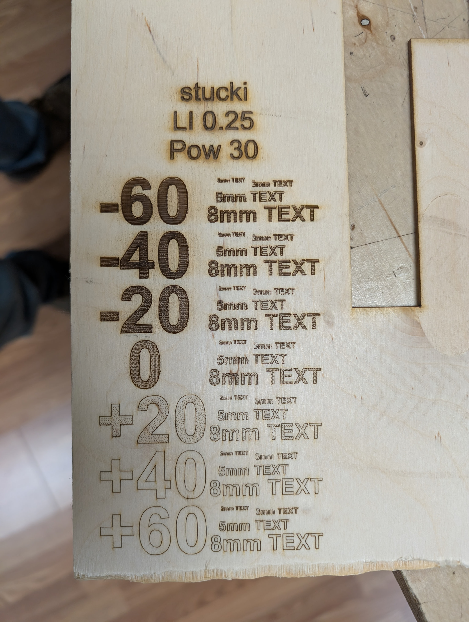
I can say, I help run a makerspace with a large user base and I constantly see people try to make Fill look different. They do the Materials Test to explore different Power/Speed settings but that’s usually a waste of effort. A Fill done at 300mm/sec 100% power vs 100mm/sec 33% power usually cut to the same depth and look about the same shade. So really the only thing you can vary that matters is the depth. OK, also changing to large Line Interval can give it an interesting looking Fill variant too, but it’s not very versatile.

People have been super impressed to see a test piece where I did a “brick texture Fill” and ask how to do it… but then it ends up too complicated and confusing, slows Lightburn to a crawl, and have to delete, rebuild a grid, and fuse the grid into one BMP again when they want to change something.

I do have some doubt though… a lot of people just want a pulldown menu of options and want to easily try each one out and see how it looks. You could put a Brick Texture, Stone Texture, Burlap, etc in the Materials Database with the few things that need to be set already done, but that won’t actually work unless the MD entry can hold the texture you initially imported, and it doesn’t currently work that way.

1 Like

This is very interesting and worthy of a Feature Request.

In the meantime, to reduce the processing load on Lightburn, is to make up a folder with the various patterns in it. Create those files with a regular graphics program, and fairly large. Then you can crop out a smaller segment for resizing and scaling in your project. This will keep from bogging down your PC.

As you know, a Fill is basically an image with all the issues. A possible time savings can be gained by converting the imported image segment to a vector path. With this in mind, if there is a Fill pattern feature added to lightburn, I would prefer those be vectors. This will give greater lattitude when resizing.

With that said, I wonder if the patterns mentioned in the second paragraph can made into SVG and then be selectively be cropped. I may have to do some experimenting. :nerd_face:

keep.in mind this may be a different experience depending on your laser

why? well, you actually want a pretty high resolution texture, actually. it makes a difference.

then tiling it across the whole work area- if you want to do that- for a 300x200 bed is very different than doing that for a 1390 machine. 1300x900 will be 19.5x larger data structure so that is very easy to slow down LB whereas doing the same thing for the smaller machine had no slowdown issue to try to fix

And, not to brag… ok, I lied, I love to brag- we use a 1610 machine, 1600x1000. 36% larger than a 1390.

Image resolution matters. And let’s say you just want to “texture fill” with white noise- essentially static- I don’t know what resolution looks best but the resolution - the scale of the static image, or the size of a black or white pixel - dramatically affects the look. Like I say I don’t know which is the best resolution yet. But you may well be scaling a high resolution texture then tiling and end up slogging everything in LB down with thus absurdly large image that was never anything but static.

But it does mean you have a pretty neat looking alternative to a bland Fill. Endless options, actually

I did some experimenting- and the makerspace laser users in the vicinity were amazed.

This looks better than expected!

In my experience, the Materials Test for fills is almost pointless. For the most part, the appearance is very similar to any burn method with the same power product=power/(speed*line interval).

Start with a reference square.

Beside it, halve the power, but halve the speed too.

Beside that, double the speed, but halve the LI.

These all look basically the same, so you might as well kick power up to 100%, LI to like 0.8-0.5 the spot side and just go lighter or deeper by adjusting speed alone.

I was thinking about the texturing problem and it occurred to me- why not just shoot “static” to the power to fuzz up the bottom?

I ran with the idea and realized I was basically thinking of dithering a gray background, and do “Apply Mask to Image” with filled text or whatever.

I must say, there are plenty of cases where it works EXCEEDINGLY well. It can do a LOT of interesting appearances, generally darker than you’re used to seeing because of the extra surface area, AND they may leave a clean top surface because it’s not actually removing as much wood overall.

There’s a lot of dimensions of control here:

dithering type

The shade of the background to fill with. Note that going from 25% black to 50% black is NOTHING like doubling the power or halving the LI or halving the speed. Going to 100% black would be pointless as it’s no longer dithering, it’s just an ordinary fill again.

speed, power, LI.
LI has dramatic effects on the appearance. If you get it near the scale of the laser’s spot size, you can get the dithering pattern to be prominent and it looks way cooler than regular fills.
Power has surprisingly little effect in many cases. It’s because it drills a series of little holes and more power just makes them deeper, but not much wider or darker.

In these tests I made a rectangle around the text I wanted to texture, change to Fill, do “convert to bitmap” which gets you a 50% gray color on an Image layer. From there I tried different Brightness +/- numbers to try different shades.

Make text, set to Line, and use the same layer number as the Image layer. So you’ll have like a red 02 layer for Image and a red 02 layer for Line.

Select text and bitmap-gray, “Apply Mask To Image”. You will get a much better look if you do a Line engraving around the border. I skipped that in most of these tests due to a time crunch.

Unfortunately there’s an absurd amount of other “gotchas” and trying to make a reusable test pattern kept slowing Lightburn to a crawl (like 30 sec to do any operation…. ANY operation). Threw an Exception fault too.

It’s got some great looks, and people are already asking me about it, but as simple as this seems it is over a dozen processing steps.

1 Like

Very interesting writeup. Thanks for taking the time to document the details.

So I wonder what the best implementation I could ask LB to make would be.

Currently, what I did was kind of an extreme-effort “Stunt”. Seriously, trying to make a test pattern BROKE Lightburn. The pattern was pretty simple actually and there’s just some problematic coding somewhere in LB. It froze and took like 10-30 sec to get a response from ANY click. Ctrl-alt-delete couldn’t even get away from it. And it ended up throwing an Except Error and bombing LB more than once.

All this requires of a new UI feature is an alternate Texture Fill which looks like the Image Layer settings, with one exception- it needs to know a % black you want it to be. 50% is often best but not universally so. 0% would obviously burn nothing, and 100% black would defeat the texture, it would become a constant burn with no dithering, exactly the same as the conventional Fill.

But, I still want to be able to give it a graphical texture (bricks, etc) and have it auto-tile it underneath anything needing to be Filled.

I gotta say, our users are psyched to see this and want this feature ASAP.

If you want to try this, here’s how it goes

  1. Make your graphics. Bolt Arial text 6-12mm high looks great
  2. On a different Layer, make a rectangle around all the text you want texture filled (actually it’s possible to make the rectangle on the same layer as the text, and it will end up creating both an Image and Fill/Line Layer on the same Layer number, but there’s drawbacks to doing it this way). This Layer MUST be FILL not LINES. If you only get the outline of a rectangle on the bitmap, it’s because you used LINES.
  3. Select the rectangle alone, do “Edit→Convert to Bitmap”. This will make a 50% black solid. I’m not sure if DPI resolution matters or not. If it does, sliding it high will be better but may slow down LB. This will create an Image Layer on the same Layer number the rectangle used, alongside that original Lines/Fill layer.
  4. Select all the text or any closed shape graphics. The next step is ONLY going to make that function available if everything you select is ONE object in Lightburn. A line of text is one object even though it’s made of multiple closed shapes. But if you click elsewhere and make another line of text, or anything closed, they are two separate objects, and LB will not allow the next step. To fix this, once you have everything selected, select “Group” and that turns it into one object
  5. Change the original Layer you put your text on from FILL to LINE (required. you can’t fill a Fill. you can only fill Lines. Because that makes sense.
  6. Select both the 50% gray Fill rectangle and the single line object of the original graphics
  7. Use Tools→Apply Mask To Image. If it’s not available, it may be because you have more than one vector object or more than one bitmap object. See the “Group” thing in step 5. Also you may have selected the rectangle that made the raster gray rectangle
  8. Set up the Image Layer settings. Atkinsons/Stucki/Dither/Jarvis don’t look all that different to me. Ordered and Newsprint/Halftone can look a LOT different. The Line Interval creates very large differences in appearances. An LI similar or slightly larger than the spot size- like 0.2mm- often looks good. It can look REALLY good to go slightly over the Line Interval, which makes thin vertical walls that have a lot of surface area to turn surprisingly black. So, large LI does NOT universally mean it looks lighter. Large LI does not look good for thin features, it becomes spotty, but that will look excellent again if you also engrave the original line around it. If you use Halftone, Cells Per Inch and Halftone angle are now changeable options and it does affect the look of the output.
  9. You can select the raster and change it as long as it’s visible. Even if Apply to Mark cut it into 100 pieces, the actual raster is still there as a single object and you can modify it which affects all the pieces. You can do Adjust Image on it to adjust Brightness. Like I say, the original 50% often looks great. About 20%-70% gray is usable. Lighter % gray does NOT mean the final look will be lighter. It can be emphasized by using more power and/or smaller Line Interval.
  10. FINALLY. Select the raster rectangle in Image Layer to burn that. Also, optionally, output the Lines that made it and increase Speed and/or decrease Power so it vector engraves the outline instead of cutting through. This is very helpful IF you used a large LI and/or a lighter shade of grayscale. It may look unreadable without it, and look amazingly good WITH it.

The outlining may take a lot of time, but large LI may save a lot of time too. That varies a lot with scenario. If I raster 6” tall letters “EXIT” 18” wide, a large LI will dramatically cut runtime while making it look better. Vector outlining 4 large letters also won’t take long.

Conversely, if that 6” x 18” piece has 6 lines of 1” tall text across all 18” width, the raster part will take about the same time, but vector outlining will take many times longer to outline each character.

Tuning the acceleration higher on the machine can greatly speed up the vector outlining. Like speeding it up the net runtime by several times over. But on the Ruida, there’s some other fields that control jerk and some other things that may need to be tuned alongside it with appropriate test geometry. Otherwise you get overshoots on corners. That stuff is a whole different topic.