I have developed a process for achieving a realistic black and white photo image onto wood despite the fact that the preview screen does not correlate at all with the results.
Pick a material (In my case, I have used a 3 mm thick plywood available at Joann’s hobby store.)
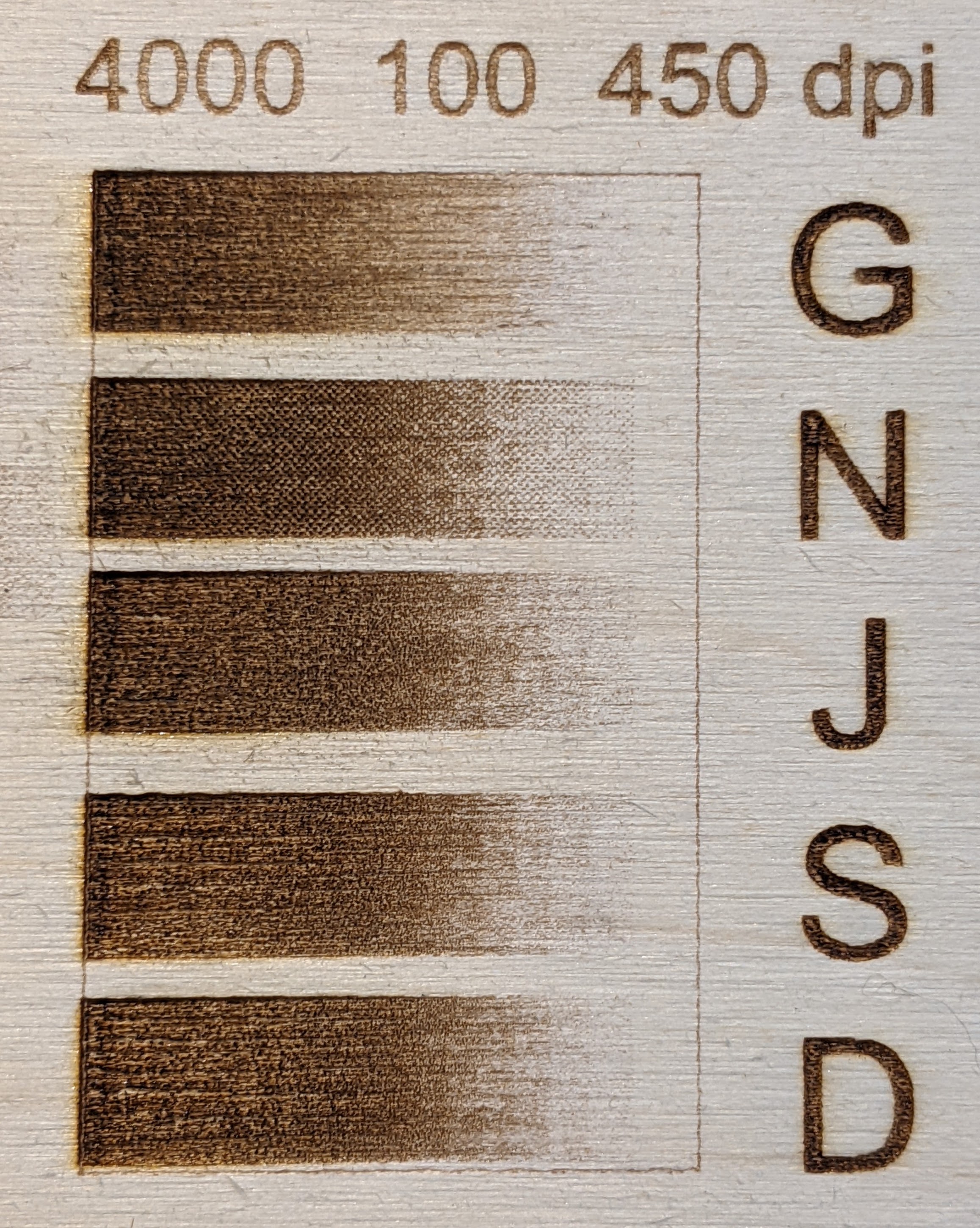
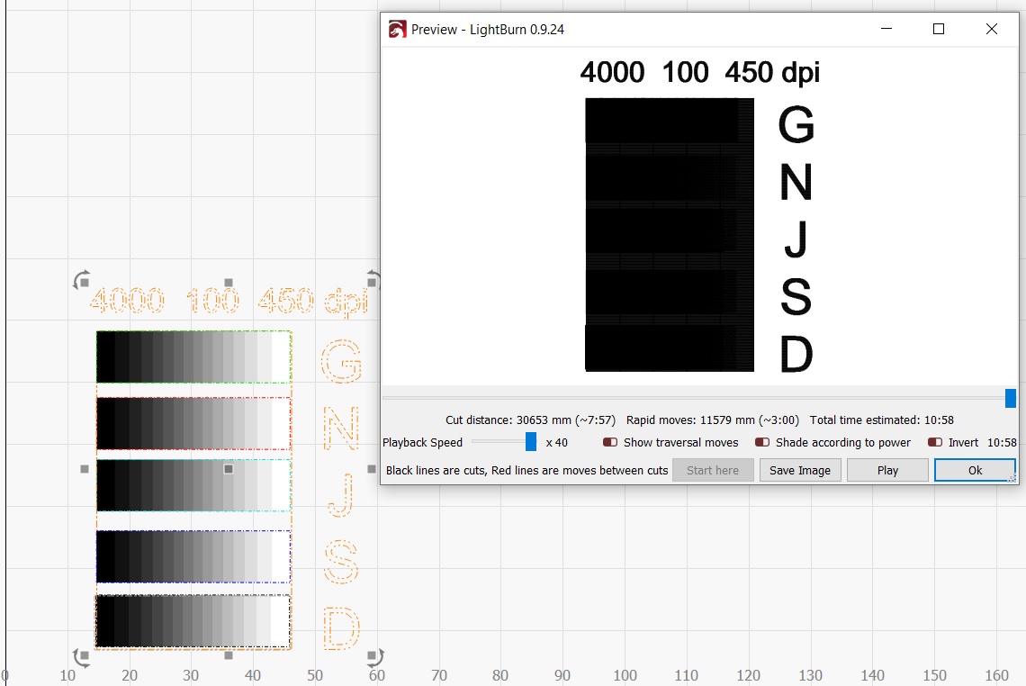
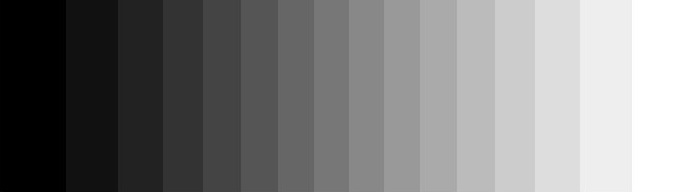
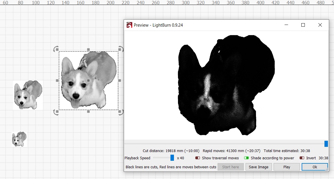
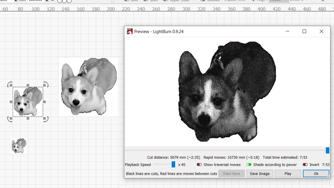
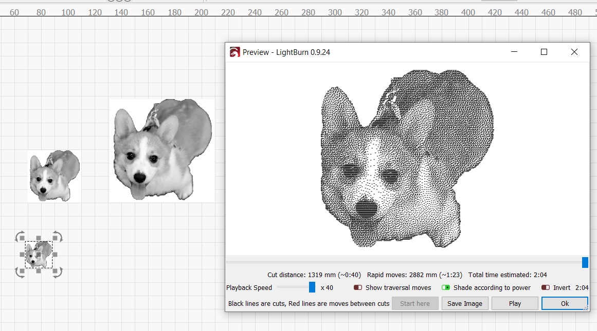
Download a grayscale image and use it to calibrate the laser speed, power, dot density and image type to achieve a look on the wood that closely matches the grayscale image. Try to get the black so it is not burning too dark or deep and the light should blend to no image at all on the opposite end. See sample photo. (NOTE: You cannot trust the preview screen at all. See example photo of what the preview screen showed compared to the results. The preview screen does not provide the same results for different image sizes, despite using the same laser settings for all. See example photo of an image printed at 3 different sizes at the same settings.
Import the image into the Lightburn software. Right click on the image and select “adjust image”
Use the contrast, brightness and gamma adjustments so that the darkest part of the image is black and the whitest is white. I have not come up with a closed form process for doing that yet. Too much brightness or contrast can result in undesirable effects on the screen, so I avoid going too far with any one adjustment.
Using the settings identified with the grayscale image for that material, print your photo image at a smaller scale than the final one but large enough to see any interesting detail. You may have to tweak the photo or the power slightly to get this burn to look good. Once you are satisfied, print at the full size.
I wish the developers could make the preview screen more useful by allowing some sort of calibration with a grayscale image and actual burn. Also, the preview results should NOT change when you change the size of the image to be printed. Yes the dot density may affect the overall appearance somewhat but the same speed, power and density over a square mm of area should be the same regardless of image size.
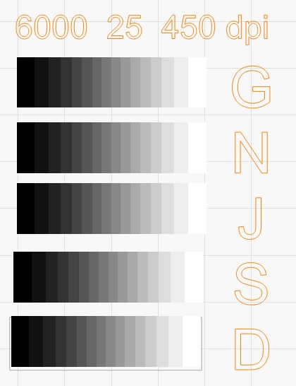
I forgot to say that the GNJSD letters stand for the Grayscale, Newsprint, Jarvis, Stucki and Dither modes of printing an image. You can decide which one looks best for your material, image and laser.
I have uploaded the actual grayscale image used in my process.
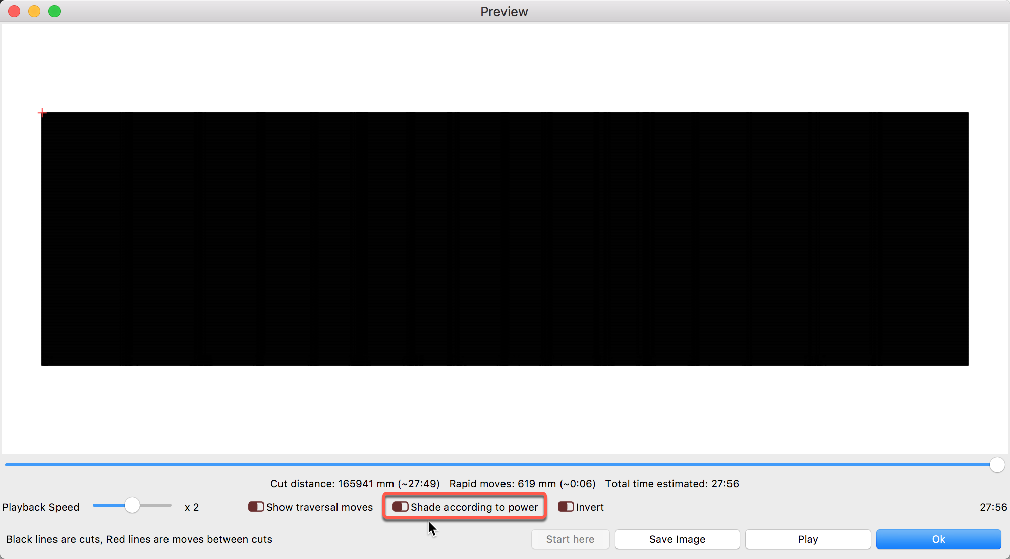
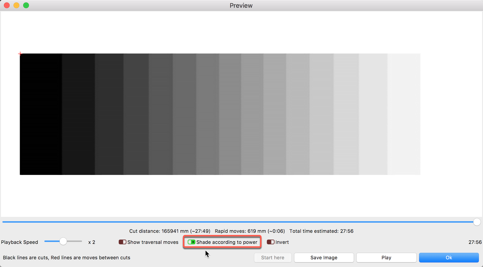
Just an observation James, but the “shade according to power” isn’t checked in the preview window, that might make a difference to what you see, certainly on greyscale. I don’t have suitable image to test the theory.
That is what I thought also but changing to shade to power makes absolutely no difference in the preview image. You should be able to duplicate my results yourself by bringing in an image and try different previews at several image sizes.
I am not sure if I tried to change shade to power to see if the actual print changed. I may have done that in the past, but early on.
I started this with a design of experiments to see what factors really impacted the print, but that got overwhelmed somewhat when I realized how many factors went into the effect of the laser. Besides the obvious speed/power/dots per inch interaction (which is ultimately translated to so many watts per mm), the color of the material, the shade of gray of the actual photo, accuracy of focus, and other variables also impact the results. I decided to start with a plywood that is close to white to begin with and then I used a series of speed and power settings to get even close to the right result, and the photo of the gray scale was my later attempt to see how the different print methods affected the result for the same power/speed/dpi setting.
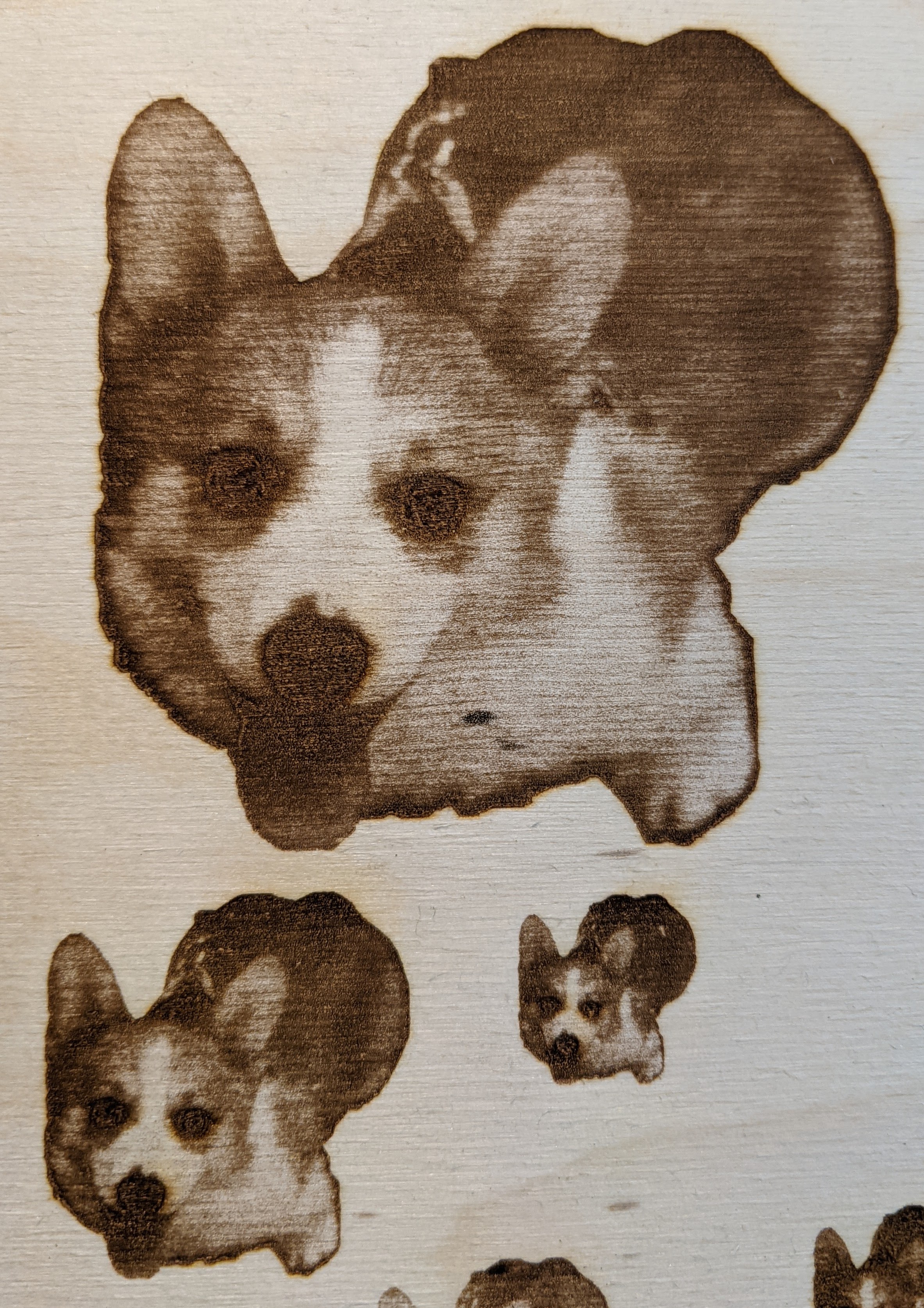
Here is the same pet photo at 3 different sizes with the preview screen shown and shade to power turned on. You can see the image gets darker as the original size gets larger. The actual prints that came from 3 sizes are shown in the earlier photo which shows they are very similar.
The ‘Preview’ is to view the path that the laser will take, but is not a particularly accurate representation of what the actual output from the laser will look like - it’s not trying to simulate the output on the material. It draws all the lines that will be sent to the laser, and because we can’t make the dots on your screen any smaller, they overlap, and it looks black. If you zoom in, you’ll see the details.