Gday there fellow lightburn-ians!
So I am brand spanking new to the world of lasers and laser programs.
Any help with this would be massively appreciated!
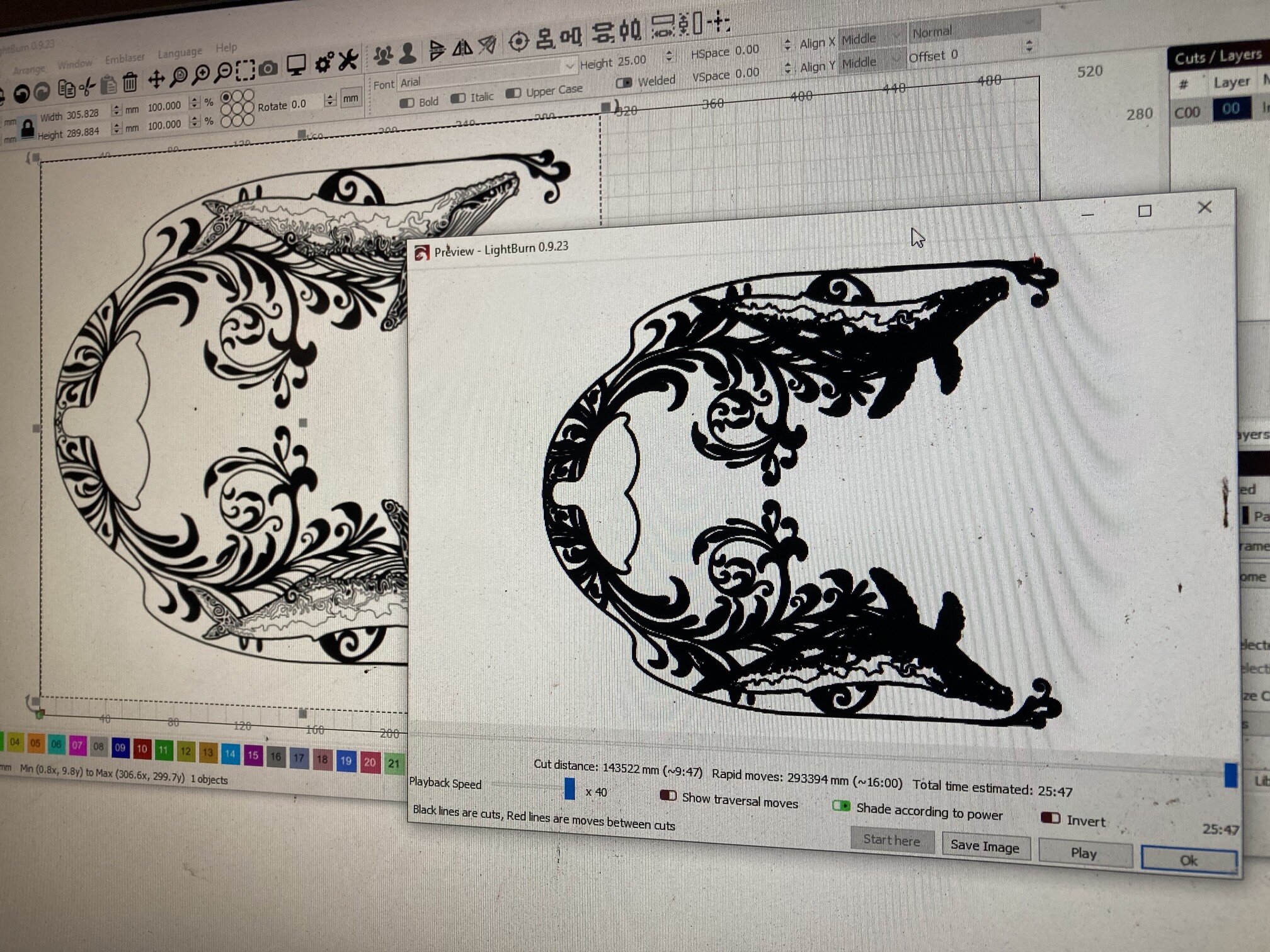
So I have had a few weeks of successful burns onto wood with my own designs using my darkly labs emblaser core,
However for some reason now no matter what image I put into light burn, it seems to turn every line in pictures thicker and more bold.
This shows up in the burn preview before burning as well as the final finish burn.
I don’t know what changed it to do this as I also don’t know how to fix it! Prior to this I had perfect replication of my images.
I will include an picture example of what I mean.
Any help with this would be massively appreciated!
Thanks in advance!
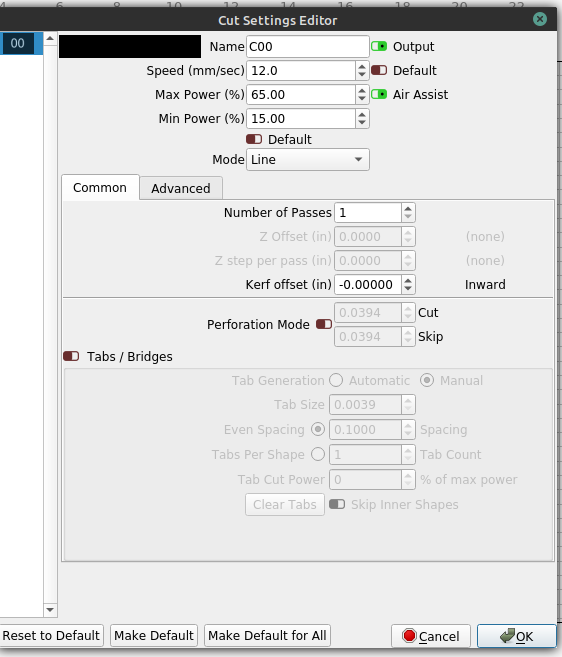
You’ll need to provide more information for others to help you.
Specifically, the cut layer settings. You may have your DPI setting too dense, your speed too low and/or power too high, etc.
1 Like
speed and power settings won’t be reflected in the preview screen
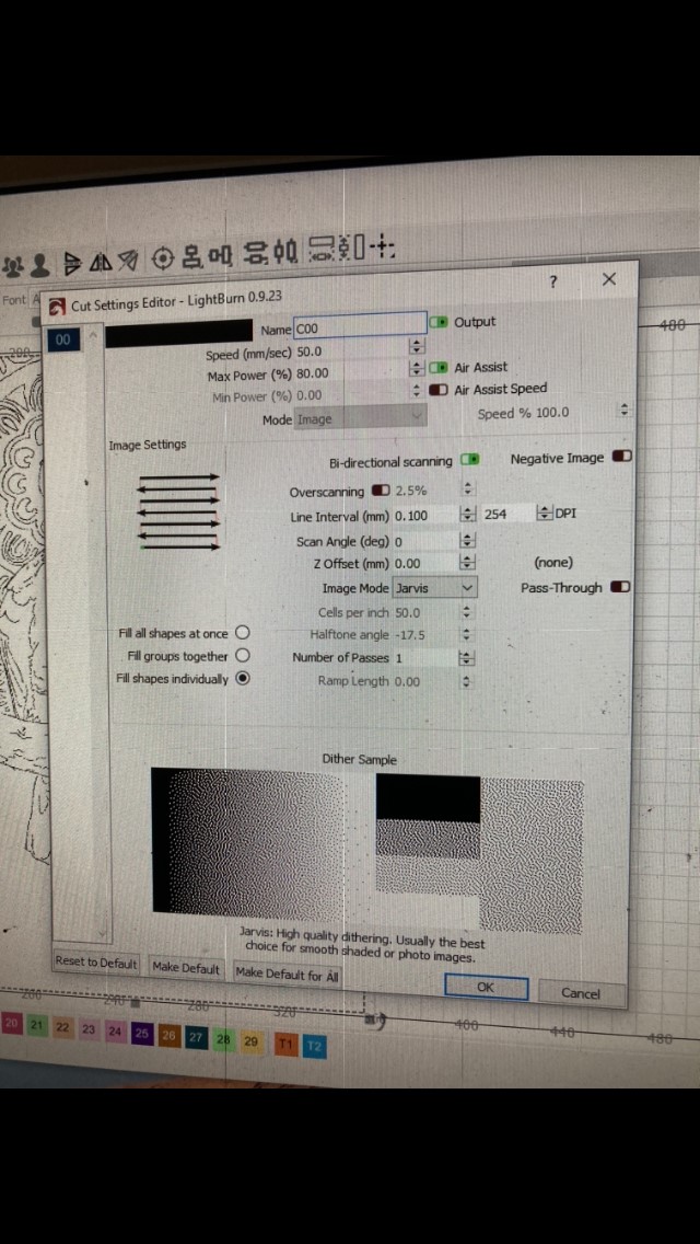
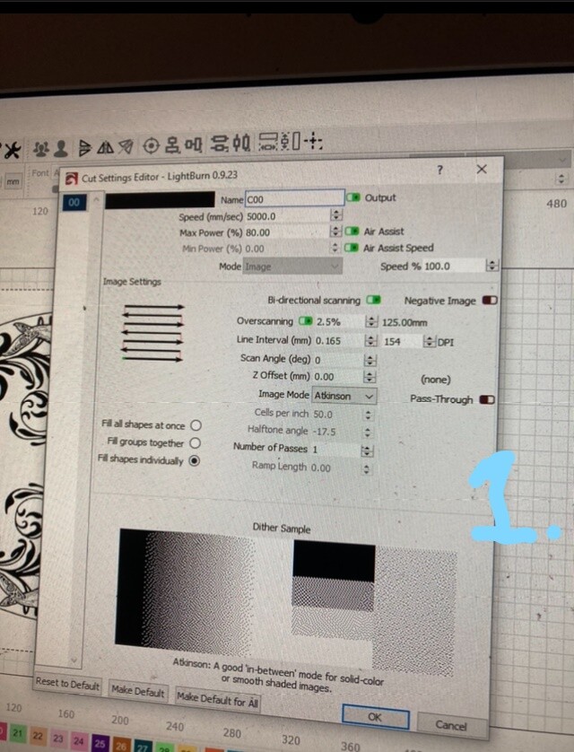
Allrighty so after reading your previous messages about the DPI being high, that definitely looks to be so! i have played around with this and it seems to make a difference. going to burn a sample today and see how it turns out! any other suggestions around this is welcome!
i actually have no idea how this changed so significantly from my previous burns but at least its starting to be understood.
Thanks again!
Haha let the suggestions begin!
okay so i quick update!
Although i have played around with the DPI settings, it still isnt giving me any good results.
So i was curious to see what it would be like on another computer, of which has made things more confusing for me haha!
i have borrowed a friends laptop and installed lightburn. it doesnt appear to have the issue as my own computer does.
So i decided to change my computer to the same specs as the laptop in the “cut settings” and yet this still doesnt change the issue i am having on my computer.
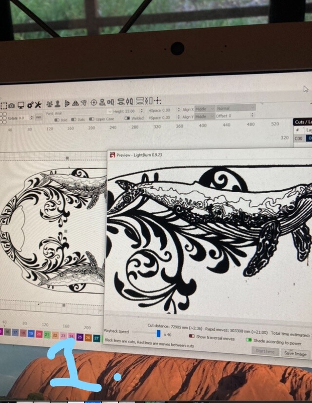
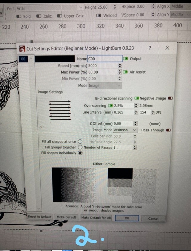
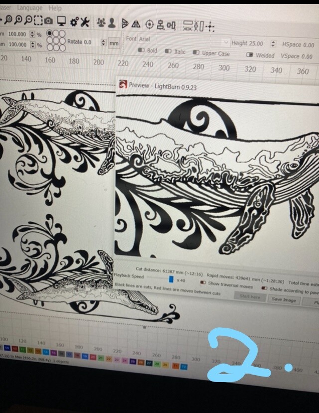
i have taken some pictures of what i am talking about.
I have labelled two pictures of my computer with the “1.” on them.
My friends lap top is the pictures with “2.” on them.
as you will see, there is an obvious difference
Which “problem” it is a preview of what is going to be burned, not how it will look like.
Personally I think you see it “bold” because you have a 300mm image that in the preview shows in 100-150mm.
My guess is that if you zoom in on the preview it shows just as well.
unfortunately this is not the case. zooming in still shows the image lines being over sized and the burning result shows exactly the same
did you try to just burn it?
Enno, I would appreciate technical advice on this matter, and less of a personal opinion of “just burn it”, of which helps me with nothing at all.
There is an issue here of which is the reason as to why I wrote this question in the first place.
I have had very highly detailed burns on my computer prior to this issue, compared to now, of which the detail is now lost due to the issue. There is obviously something technical that needs to be addressed, and is definitely not a “zoom” viewing problem.
More technical advice about the program would be much appreciated
The preview draws every line as a single pixel in width. If you are zoomed out, we can’t make the pixels thinner, so things look darker than they likely will when actually run on your machine, which is why he asked if you had actually tried running the job, or were just going by what the preview shows. The preview is to view the path that the laser will take, but is not a particularly accurate representation of what the actual output from the laser will look like.
But if you burn it you can see if the problem is only visual or if there are some settings mixed up. I mean it, burn and see what the result is.
1 Like
did you save your file and open it onto the other computer?
Off topic, but, Beautiful graphic…
@wildeyedreaming , I see a difference in “1” VS. “2” of screenshots:
- On the ‘bolder’ setup, the slide for ‘shade according to power’ is activated, green, slid right;
- On the second set, ‘shade according to power’ is not selected; this is therefore not an apples to apples comparison, and could explain the disparity.
Additionally, the cut distance in the 2 is different; do you have a layer turned on besides C00 in the bolder one that is making an outline?
Disregard the layer question, I looked higher in the page on a wider screenshot and see you only have the one layer.
There is one place I didn’t see you include. If you right-click the shapes, and then look at Properties, you can look at the shape properties, which is separate from the layer props. Compare on the 2 systems, or tweak those settings.
Additionally, on the Laser panel, look at the Optimization settings (button) and see if you have something changed there.
Lastly, it looks to me like you maybe did a Trace on the original import? That will make an overlay of sorts over your imported image. If you select the object, then hit delete, see if the image is clearer; if you, you may ave traced vectors over the top of your original image, which is creating 2 images, one of which is a vector overlaid on your raster image that you imported.
This is all swag by looking at your pics, hope it helps.
This topic was automatically closed 30 days after the last reply. New replies are no longer allowed.