Yes, the purging cycles use up a lot of ink. The white ink is heavy, and need to be purged even when not using. We printed about 50% on white stock.
1 Like
We typicall use 10%-30%
1 Like


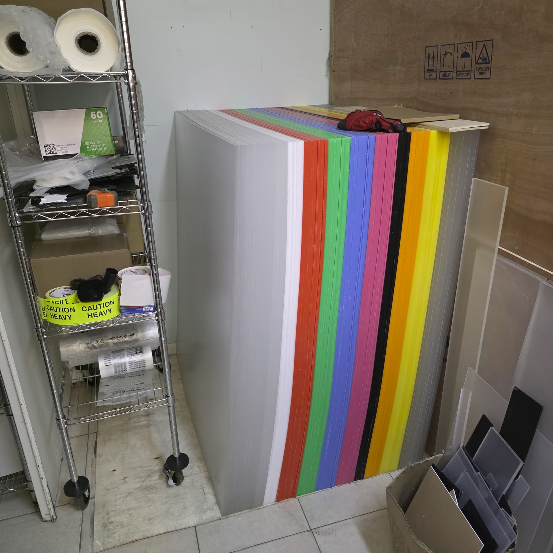
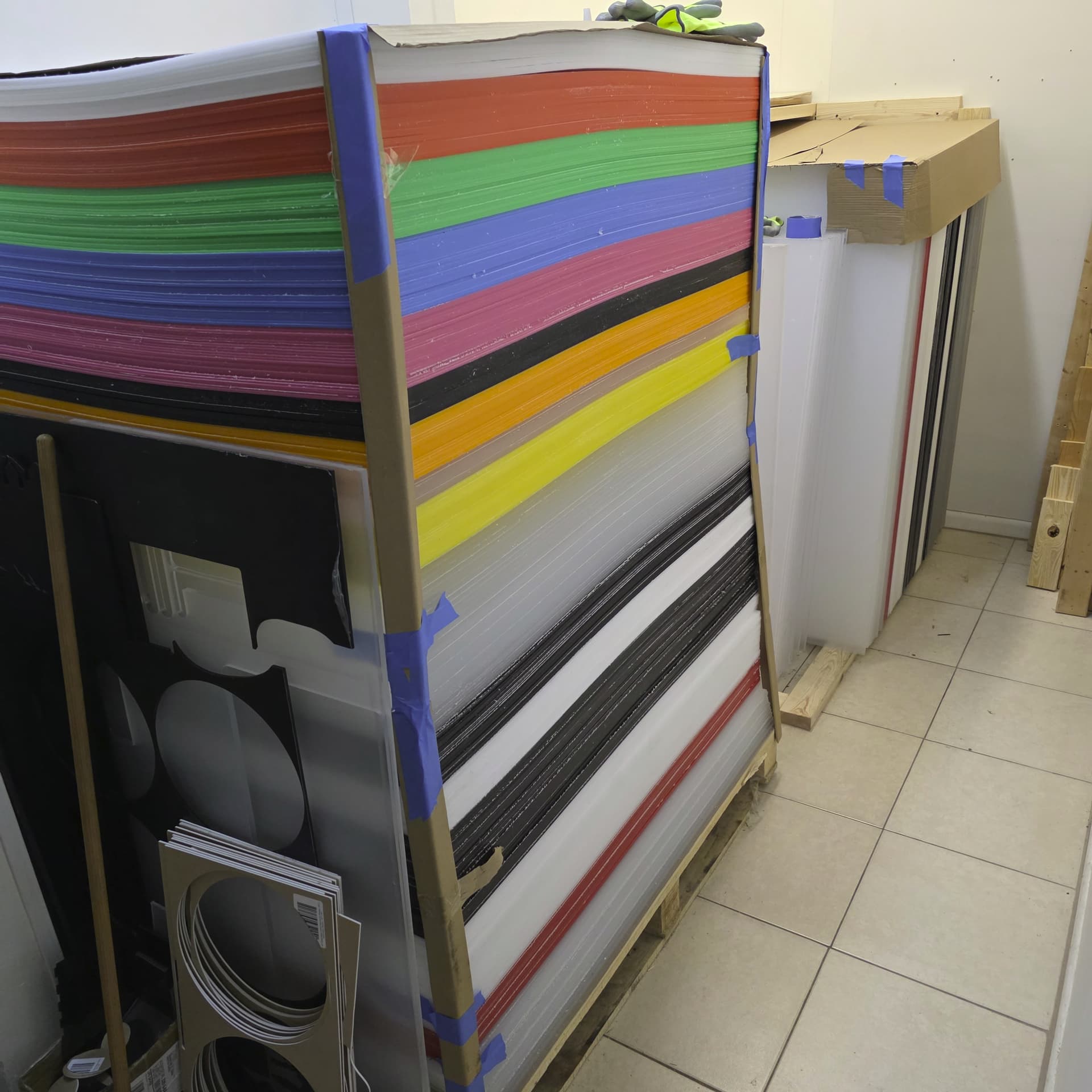
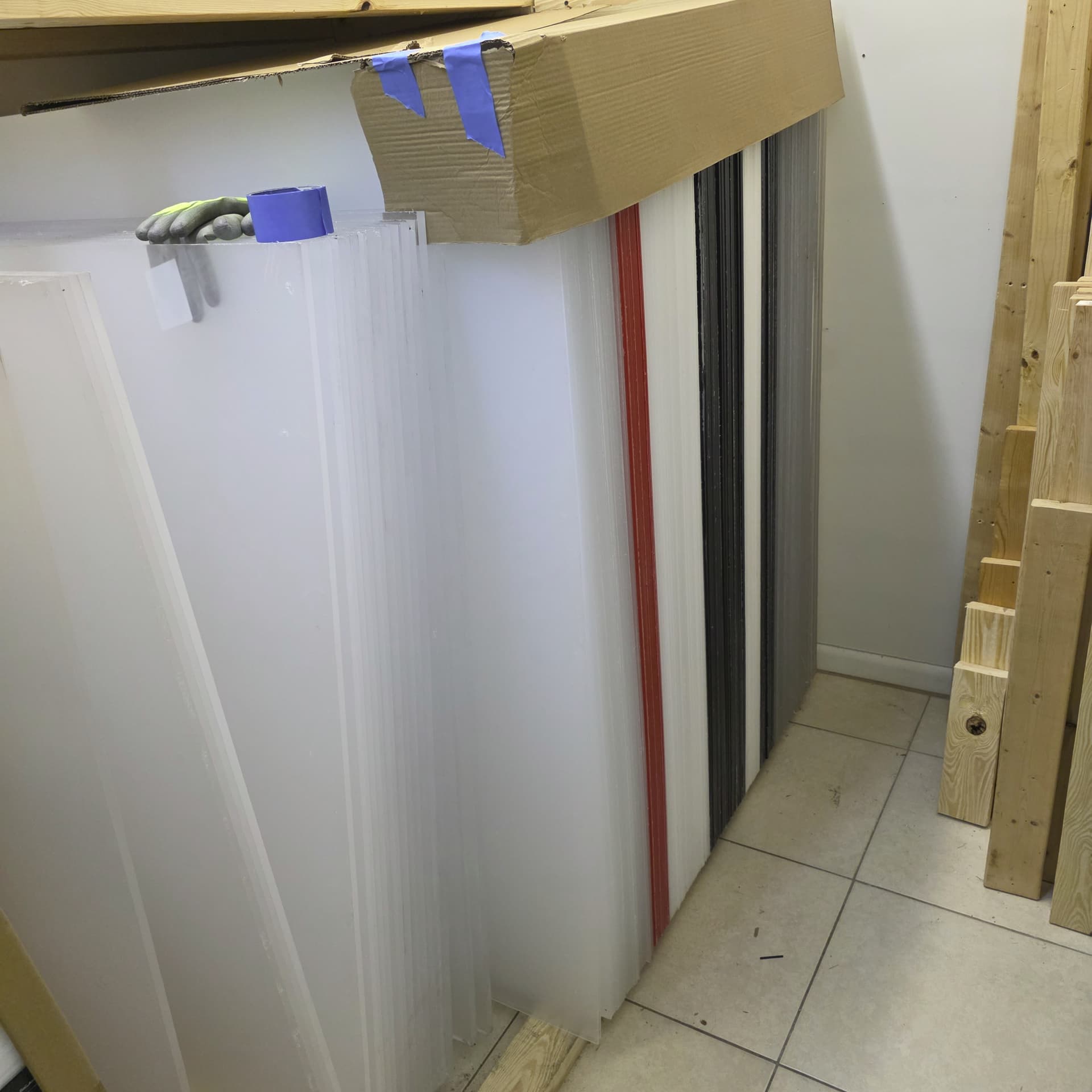
Been busy lateley… but did get the acrylic shipment in 12,000 lbs, 405 sheets
this was and interesting delivery…got it all put up..
sheet size 1220 x 2440 cut in two sizes
4 pallets 1220 x 1070 (48" x 42.1") 1220 x 1370 (48" x 53.9")
had it cut to these sizes so I can fit the 53" piece on our Monport 130W
which has a larger bed size.
8 colors and clear
thickness
1.8 mm
3 mm
5 mm
8 mm
1 Like
George !
290mm x 290mm 3 mm layers 7 layers UVPrinted Colors
Ringo,Paul,John … soon to come !


under glass


3 Likes
Another level chuck!
1 Like


Nice! So, was this a commissioned work or your idea?
I am doing this mostly for fun, but my son is the entrepreneur, so I am
building up inventory and he is gonna open a store to sell all these…’
I am making usually 5-8 pcs of each item I make…
I suspect I will keep busy somewhat ![]()
I am getting a batch of Basswood I ordered, 92cm x92cm so I can start making some
nice larger designs.
The Beatles will look great is a 16" x 16" format…
1 Like


Awesome!..much respect to the both of you.
1 Like

Great use of contrast’s and depth is superb…viewing on my phone but I’d say at 90deg and 4ft+ distance it would still take a while to see the layers and not the imagined photo filter.
1 Like
Right , close up it looks a bit wierd, step back 5 ft and a bit to the side, and it pops out great…
you were 100% correct ![]() …
…
The Prince Of Darkness is watching…!


Chuck
Does it make a significant difference using 2mm as opposed to 3mm in production..and the overall finished effect.
Great question…
the thickness is actually 1.8mm…
and IMO Yes for some designs the 1.8mm looks better for the depth perception..
If the layers are too thick, the design can look wierd, hard to actually see the true picture because the layers and stacked too far apart..
Also the 1.8 gives the 3D viewing more of a 2D aspect. and that is easier to see the design.
Yet on the Beatles, I choose 3mm as I wanted the deeped abstract viewing because the picture had more area, like head, neck, shoulders to give the needed aspect.
In the Ozzy picture the large face and hand looses definition with 3mm as it looks like stacked blocks and only looks best from viewing, >5 feet , which to the eye reduces the depth and makes it a flattened 2D picture and easy see the definiton..
Clear as mud ![]() (grin) hope this helped.
(grin) hope this helped.
1 Like
Debbie brought that question to mind. Ozzy’s lower lip was the first thing to stand out as not 2D…after some time looking though.
H Hogan is the most dramatic and all-round best, I think!
Thanks for showing them.
I have to keep in mind these are abstract art images, so it’s an adjustment over a ‘picture’ ![]()
an acquired art taste !