Just starting out with my engraver and lightburn. Looking to burn plant names on tongue depressors to go into seedling’s pots to help with a plant sale fund raiser.
I need to set 2 lines of text in a specific spot so it lands on the depressors. Is there any tools to help with that? Like a template for printing name tags / address labels that Avery labels offers?
measuring some depressors, the print area is 45mm wide by 13mm tall. Each print area should be 4mm apart vertically and 102mm horizontally.
All the text would be the same in each of the fields for a single burn. Then I envision a search and replace type of way to change the plant name in all the fields to the next type of plant.
Thanks! I found a variable text video after posting. to be clear, all the text on the page will be the same plant name. It runs, I remove the sticks, put new ones on and run a 2nd ‘page’ with all having the same plant name.
The CSV would have the same plant name for x rows (to match the number of depressors on the ‘page’)? then the next x rows would be a different plant, etc.?
On a (low end?) Creality Falcon 5w, each new ‘page’ would be a separate file, right? a gcode file can’t have several pages? And a pause between pages to change the sticks?
Oh yeah, I am using an mini sd card. Not sure if the printer can connect to the PC (and me being me… I was thinking I’d run the laser in my garage because of the smell of burning wood?) But then I thought I could set up a laptop next to it in the garage and remote into the laptop from the warmth of my house : )
You can do this, and even run the laser remotely, but that is basically unsafe. You should never leave the laser unattended while running. A laser is a campfire on steroids and can burn down garages, workshops, and houses.
Thicker not possible unless you defocus, and raise the power.
Darker with more power, but be careful. I did some engraving on tongue depressor sticks and cut through pretty easily. I used ISO9 for mine.
Edit: There are a bunch of TrueType fonts included with Windows (and likely IOS). It may not be necessary to install the SHX fonts. Some are:
Artifakt Element Hair
BVFONT
CDM_NC
CIMPLEX
DIM
exthalf2
FIN
HAND
KXT
There are a bunch more too. If you mouse over the font name to get the hint to pop up, and it has iso in the text, you can be pretty sure it is a single line font.
If that’s the SHX font and the layer is set to Line, then the laser head is following the single line of the font, rather than filling an area.
You can make the line slightly wider by defocusing the beam and slightly darker by increasing the power, although a defocused beam requiring more power for the same darkness. Multiple passes also darken the result but, obviously, increase the job time by the same multiple.
The layer speed is the desired value, but the machine will be incapable of reaching that speed while following the tiny vectors in the letters. As a result, doubling the speed (or halving it, for that matter) will have essentially no effect on the total job time.
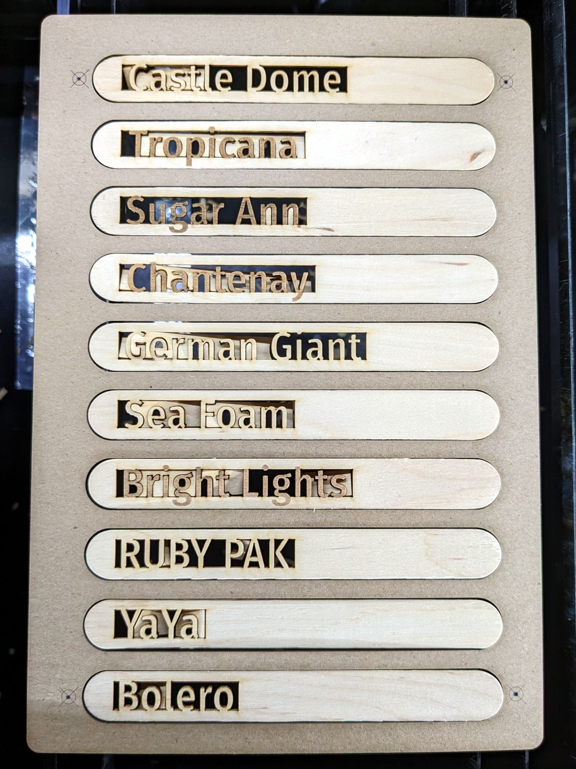
Make a (cardboard / chipboard) fixture covering the machine platform with cutouts for as many sticks as will fit. This fixture held ten markers, because that’s a nice number:
The template matching that fixture guides the text placement:
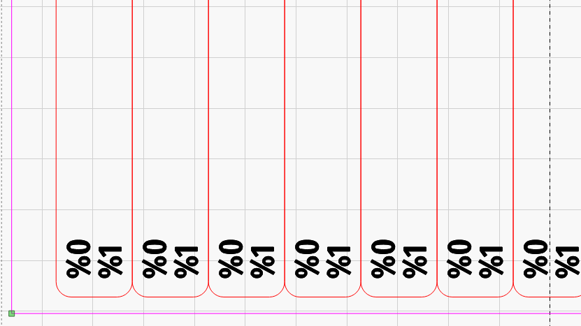
Those involved few enough markers that I did them by hand, but I used a CSV merge for another set:
If you know you’ll need, say, ten markers for each type of plant, use the same CSV Offset in the %0 (or whatever) text field for those ten template locations. Alternatively, just duplicate the line ten times in the CSV file.
Yes, its an SHX font (as as much as I downloaded several different ones, most all look almost identical).
Since I am doing a 2nd pass to get that darkness, I was thinking about the 2nd pass being a tiny bit off from the 1st pass to make it look a little thicker? (yes, at the same power as I have now, each stroke will be lighter than 2 strokes in the exact same place… but was curious if it’s doable to move the 2nd pass a little.
I remember doing a copy / paste of the text box and tried to get the offset that way - overlay them but a small fraction different x & y but i might not have offset enough to be noticable.
I’ve got 6000 of these to do, so I envisioned taping down furring strips to make a frame that I’d line up 4 sticks end to end and about 30 rows of them (gotta get more sticks to try that). So your 10 at a time idea is cute… but not feasible for me.
Also too…I’ve been setting power to 50 or 75%. When I start doing a full ‘page’ of sticks, I wasn’t sure if the laser should be run at 100% - overheat? Or shorten the life of the unit (but yeah, I’ll likely play with the engraver after, but it will see way more down time than actual use so my concerns aren’t warranted? Typically do the lasers just die or get weaker over time (and if the latter, how do you know other than projects aren’t as dark as they used to be?)
The general consensus is to stay 90% or below for longest life.
It would only be thicker in X or Y, but not both. If you need thicker, find a TrueType font (I spotted half a dozen searching for line fonts) that looks almost like a line font but has an outline if you zoom in. Then use the Offset Fill to get the shortest burn time. Bear in mind any extra passes to thicken the lines will add noticibly to the burn time in your 4x30 matrix.
Trick: Put the same text on 2 layers, one Line, the other Fill. Then select both and scroll through the list of fonts. You can then find a skinny TT font to use.
You’ll find the QC for craft sticks is … minimal, so plan on a significant number of sticks with bends / warps / twists preventing them from lining up nicely. The 30th row will definitely be in the wrong place, no matter how tidy you are, which means the fixture should divide them into groups of (say) four rows.
You must duplicate the text onto a second layer and shift it as needed. That should be possible with the same CSV text formatting that duplicates a single line onto two tags. Manually (re)arranging each batch is fraught with peril.
A couple things - looking for those fonts you mention above… I saw them in the list in lightburn. But I wondered if they were from the SHX download or not.
Went into lightburn settings and moved the shx folder location to a folder without any.
2 things - They aren’t in the list anymore (on a win 10 PC). (I DO have the long list of fonts that come preinstalled with windows and others I’ve added. But not those you mention above)
I checked on a different windows 11 PC that I didn’t install lightburn on / recently reinstalled windows on… Not seeing any of the names you mentioned (I checked most).
Looking at the SHX fonts zip file I downloaded… all yours are in there.
You made a point to edit your post to mention them / that they are in windows. Thanks for the extra time!
But… are they really part of the set of native windows fonts?
And you make a point to distinguish them as true type. Would you think there’s advantages to using truetype fonts vs. SHX?
Can’t include inflection in typing… I mean these as questions for me to learn, NOT to be argumentative!!
Offering corrections and being argumentive is not the same thing, usually.
MY BAD !!! You are right. Those fonts are NOT in the standard Windows issue. I fired up my new Win11 laptop and they are not there.
They are also not part of the SHX package. Only SHX fonts are in there. Apparently I downloaded some line fonts from somewhere, then forgot and later installed the SHX ones.
Rather than worry about those in my list, in other words ignore what I wrote, focus on those almost-line fonts that you can print a little bolder:
Bradley Hand ITC
Candara Light
Cascadia Code Extralight
Cascadia Mono Extralight
I verified these are all in the Win11 OEM install. I expect there are more. The .lbrn2 file is attached to illustrate these in both Line and Fill modes.
UPDATE: I did a comparison between ISO8 and Candara Light filled. At 212LPI and no Overscan, the Filled takes about 14x longer. Line mode on both gave the Candara a 3x longer burn. Suggestion: With 6000 of them, stick with an ISO font and defocus.