So I’m back and I’ve watched videos and tried and tried different things but I cannot seem to make this thing turn out how I want I don’t know if I’m misunderstanding or what but I’m trying hard to do this on my own but I think I need some guidance on this
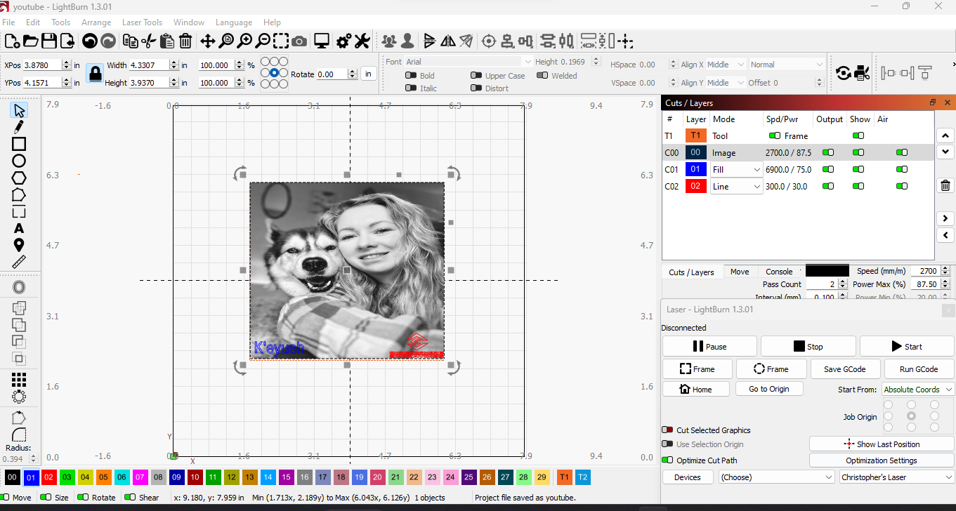
What I’m trying to do is a special surprise project for a popular YouTube channel of her and her husky I’m not sure which picture I’m going to go with yet I just need some input on what I need to do I am trying to use the Norton white tile method on glossy white ceramic tile about 10 cm 11 cm not sure on how the measurements went as I type this im not by my material but I’m sure it’s accurate
I also included the image I’m trying to practice with in the Lightburn file below
The problem I’m continuing to have is figuring out how to even out the white and black to make a decent image any help is greatly appreciated
This is a good video on how dpi and laser spot size is related. It’s a good guide to help you determine what kind of resolution you can expect from different materials…
It explains a lot of issues that come up, along with the dot width adjustments in Lightburn.
Good luck…
@berainlb For some reason I can’t download the .lbrn2 file to my system… keeps showing up with zero bytes.
That’s odd. I just double-checked to see if it was a problem on the forum side but had no issue. Are you possibly saving to a write protected area or out of disk space?
thanks for the video havnt seen this one ill look it over
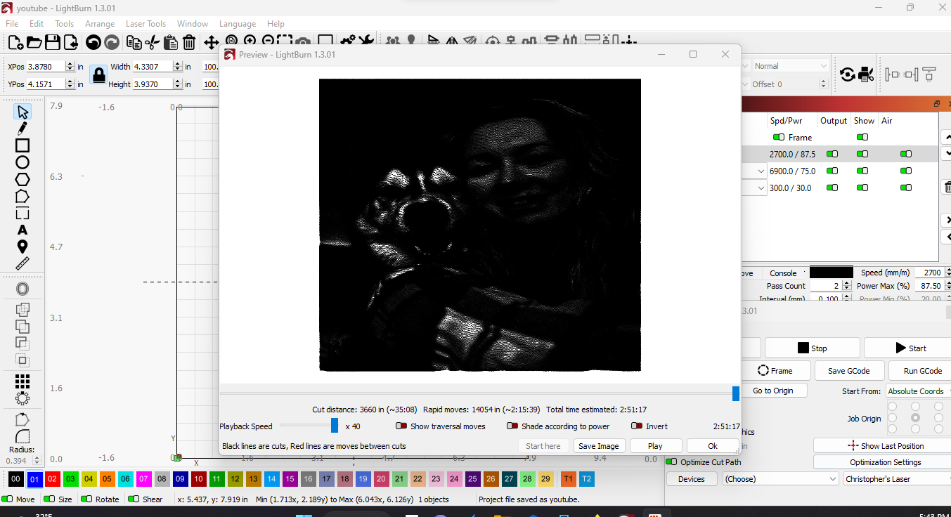
what i’m referring to is this as you see in the image as i load it into the software everything looks normal which i understand that’s not where i’m confused
its when i go to edit the image settings where i don’t quite understand how to get it to properly work so the black isn’t over flowing i guess i also included a screen shot of the preview screen reflecting what i mean by the black over flowing i know i’m missing something with the settings i just can’t seem to tweak it just right
as far as the logos you can see them in the original work area view but when i click preview or try to tweak the settings to make everything to appear decent the logos don’t seem to show as they should
When you say “over flowing” are you referring to the Preview looking very dark? If so, the Preview at that resolution is not a great way to judge the final output because it’s showing you all the movements of the laser that will be required. Zoom into the preview to get a better sense of what laser path is being taken.
Line interval will be essential in not overburning the image. Dot width is the next level to that.
If you zoom in, you can see that the burn is there. But again, the way you have it configured now the two layers will burn on top of one another. I suspect that’s not what you want but it’s not clear what you’re going for here so it may be what you want.
i am understanding what you are saying i just have a few more questions if i may so that i can better understand you said to zoom into it which i have and i see what you stated. but on that if i zoom into it i guess my concern is the dog has black fur in parts of course and I bought black spray paint for the tile my concern is will that cause an issue with the burn its self or will it matter ? i’m assuming not.
as far as the two logos my intent is to have them be etched into the tile just as the image i want to make sure that those will too be displayed in the project as a personal touch if you will
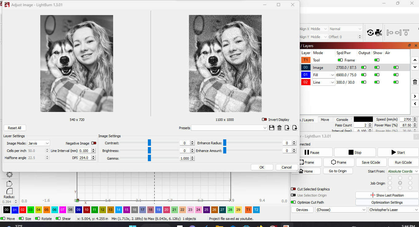
I’m a little confused. I thought you were using the Norton White Tile method. That method relies on the use of typically white paint with Titanium Dioxide which will become dark when burned. This assumes a positive image.
Are you attempting to use black paint and revealing the white underneath? If so, you’d want to invert the image so that you’re burning away the parts of the image that you want remaining white.
It was clear that you wanted it to be a part of the engraving. But what is it supposed to look like? Right now you will have separate complete passes for the image, the name, and the logo. There is no provision to eliminate double burning. Is that what you want?
I have no idea… there’s plenty of disk space and no protection issues… I killed Firefox and restarted it… seems it’s related… didn’t try the original, but did download someone else’s code…
ah OK some one else told me on a different forum that I could use the black paint on a white tile for the Norton white tile method to get the results you described using white paint. (but they told me black) that’s what i was going to go for but. i guess the plan will have to change then. because I only have the black paint so question on inverting the image is that difficult to figure out or is it rather simple because the dog is a husky so it has black and obviously white in it . as far as the logo and the name I just want to make sure they show up on the piece i’m just guessing on the passes not really sure how many i should set. so it’s at two passes sorry for the confusion as i stated i was told the other way around so i appericiate the corrected information
I’ve only ever seen the Titanium Dioxide method as being referred to as The Norton White Tile Method. There are other variations of this. We can ask him on here if it’s important to you.
You can enable the “negate image” in the Cut setting. In terms of other image adjustments you now need to think in reverse if you do that. The more you burn, the “lighter” the image becomes. Note that the image on the workspace will not become negative. It will show negative in Adjust Image and in Preview accordingly.
You may want to practice on some less precious material to see how things engrave. Even as a positive on cardboard or cardstock. This will give you an idea of what you’re dealing with and can adjust accordingly.
It’s possible I may be misunderstanding what was stated. There may be some nuance to what they’re doing. There are techniques using marking paint that will work similarly to Norton Method and may spray on black and leave a similar indelible mark. But regular black paint is not one of those.
In any case it’s a perfectly valid method so I think worth experimenting. I don’t believe this leaves an indelible mark so if you don’t like what you’ve done you could potentially just “erase” the whole thing by using a solvent.
Again, I’d suggest experimenting with this before committing to it.
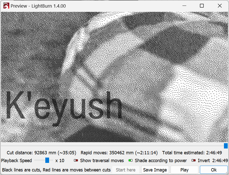
Im not sure if I understand your problem but I just printed most of your picture which is very dotty.
I changed the setting to greyscale and fiddled with min and max power a bit and it came out almost perfect . I have a 10w diode.
Nobody said it so I will… The above video should should be MANDATORY watching for anyone that does images. I watched it and was amazed at how much I was not considering. Excellent video!