Am I missing something, or is there a setting to control the width of the lines that are drawn to make letters? The different fonts have different line widths, and then there’s BOLD to make them thicker. But is there a setting that can draw finer lines? I’m looking to be able (hopefully) to use any font but adjust the thickness of the lines to get crisper etched letters with smaller font sizes.
There is no way to natively adjust font line thickness other than bold. Different fonts have different thickness. A couple options are, use single line fonts or convert the text to a path, then do an inward offset to make it thinner, but it will no longer be editable as text after converting.
That is understandable but unfortunate. So it leaves two questions:
-
Which fonts are single line? I did a search and the ones it identified weren’t actually single line. Do you know which fonts would generate a single line to draw the letter?
-
Does anyone else think this would be a great feature? Maybe something to be considered for a future release? I think it would be useful to be able to use the design of the font but size it’s width to make it appear as drawn by “hand”.
There is a link to a single line font collection in this thread.
I think that’s outside the scope of laser software. That would be better served in an actual graphic software. My opinion.
1 Like
Thanks. I will try those fonts.
Since the Laser Etching software can create a letter outline with two lines around it’s perimeter, I would think that the option to create the letter with only one line that is centered between the two perimeter lines would be exactly within the purview of Laser Etching. IMHO.
Thanks for steering to a viable work-around.
Jon
Lightburn doesn’t have a center line trace function.
I use a program called Cuttle, and they have a “thicken” command for fonts. Works pretty good, and you can cut and paste from Cuttle to LB
edit: @thelmuth is right regarding using actual graphic software, which allows you to set a narrow stroke and no fill. I have used it before when doing what the OP is mainly looking for. When the font is small and the stroke width is narrow, it appears to be a single line when it is scored (line function with less power in LB)
Not exactly, just one line. The attached is ISO9 text (SHX font) and the black layer is the original text, converted to Path. The red layer is using the Offset Shapes tool with a 2mm offset. Maybe messing with this will get you where you want to go.
By the way, on Baltic Birch using a 10w laser, I engraved legible text using ISO9 at 1mm height.
ISO9 Text.lbrn2 (23.0 KB)
1 Like
Thanks! That gives me something to work with. I’m trying to get to smaller print on tags and nameplates. I think this will help.
When you say small, how small? ![]() If you provide units, we may be able to provide additional suggestions to assist you in producing what you’d like.
If you provide units, we may be able to provide additional suggestions to assist you in producing what you’d like.
For more on setting up to use SHX style fonts, the following is worth review:
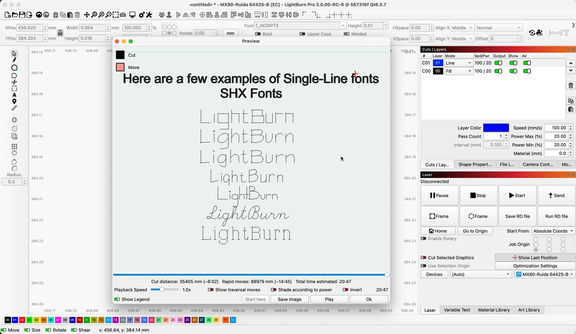
Here I show a few SHX fonts I have installed on my setup.
1 Like
I’m trying to get down to readable 3mm size text. I’ll be experimenting with the shx fonts, trying to learn more about how the algorithms work
These characters from an SHX font are 1.5 mm tall in acrylic polycarbonate:

That’s using Dot Mode, which isn’t available on GRBL controllers. The results depend on the material and you may be able to finesse the speed and power to get something close to that.
2 Likes
I don’t have dot mode but I’ve been able to tweak the parameters to get legible at just under 3mm. I think I can get where I want to be on metal.
Thanks everyone for the input and suggestions!!
1 Like
This topic was automatically closed 30 days after the last reply. New replies are no longer allowed.