I have been reading and searching here for an answer. I found a couple of references, but when I tried what was suggested, I could not get the right solution (How do I invert (negate) a vector engraving?).
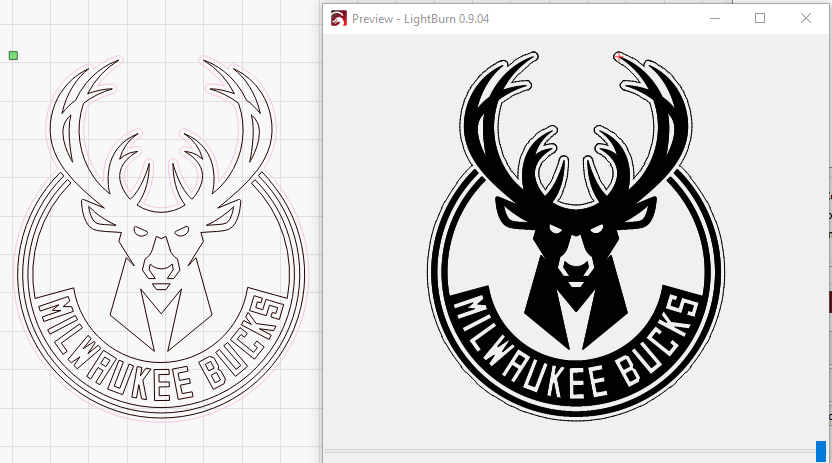
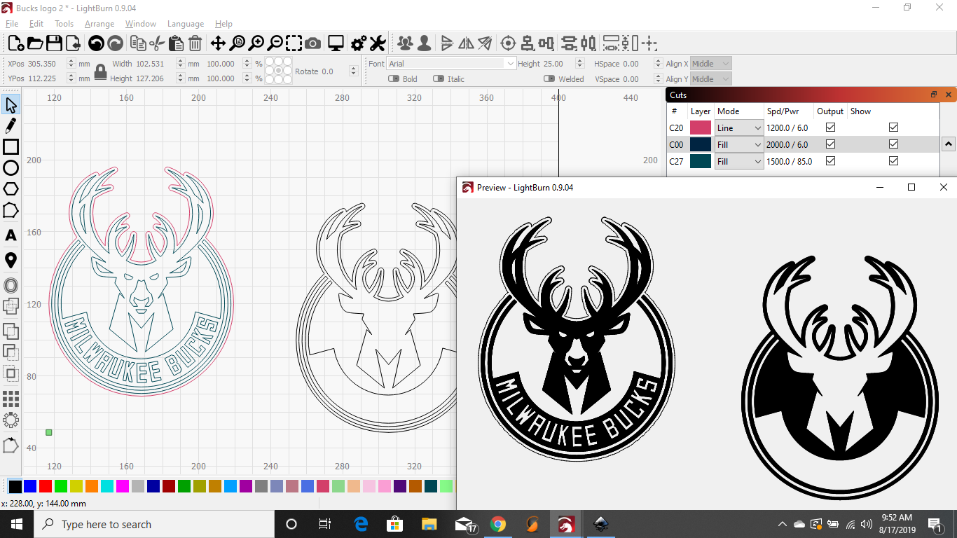
I am trying to burn a logo (Milwaukee Bucks). If you look at an image from the net, the head should be filled, with the exception of the eyes, nose and mouth. The words (Milwaukee Bucks) should also be “negative”.
It contains an SVG which imports directly into LightBurn. I selected it, un-grouped, selected all shapes except the outer most line, and clicked the black palette entry at the bottom of the display to make them all the same layer, and set the layer to fill. This is the result in the workspace, and in the LightBurn preview:
@LightBurn Thank you SO much! I was trying to separate the “negative” parts. As long as you are willing to help, is there a way to add a lighter fill to the background behind the deer?
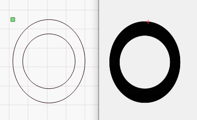
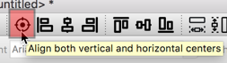
Depending on where you mean, yes - LightBurn works with defined border areas for filling. If you want to fill an O, it has an inner and outer circle with define the borders to be filled:
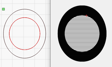
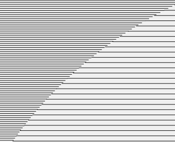
If you want to fill the inside with a lighter fill, you’d need to define that border likely by duplicating it and putting the copy on another distinct layer, and set the options for that. Here, I’ve duplicated the interior curve, and put the copy on the red layer, which I’ve set to fill, but with a much larger interval to exaggerate the effect:
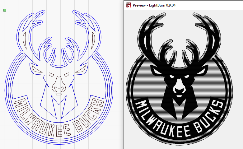
For the bucks design, you’d need to duplicate the whole design, put it onto a new layer (color), and remove some of the interior details, possibly doing additional editing to get the fill into only the areas you want. I’ve done a poor man’s version here. The first image is showing the original, and the new ‘negative fill’ version to the right:
For anything truly shaded like this, it might be better to take the original as an image file, like a PNG, JPG, etc, and use the image dithering tools in LightBurn to do the shading, as it’s probably simpler to get the effect you want with “paint” in something like PhotoShop, but it is quite possible with vectors too.
Your image does not show the results when placing the two “over each other” as Oz suggested above. Using the ‘Arrange’ → ‘Align’ → ‘Align Centers’ option helps with the alignment process
Also doesn’t look like the ‘Line Interval’ has been changed either. The one Oz shows has a significantly different gap, providing a nice visual contrast.
I got different shading in the preview / design by increasing the interval for the 2nd fill, as Rick says, like this:
The preview will show different shades if you use Power Scaling within the same layer, or grayscale for an image, but I don’t shade everything based on its power level, because it’s inaccurate - going 2x faster at 2x the power puts the same amount of power down on the material (or close), and it’s not possible to produce a scale that works for all the layers in a cut that isn’t visually confusing at least half the time.