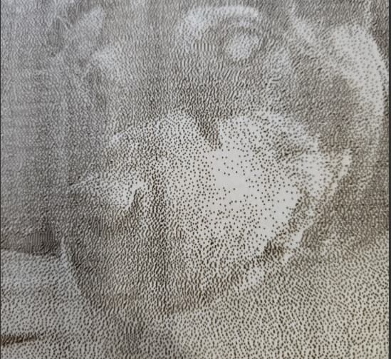
When engraving pictures it is only doing a bunch of dots and not lines, I have spent MANY Hours reading, watching videos and a lot of money on material that has been wasted, Can someone please just explain what I’m doing wrong?? I only have 1 layer, the picture is good quality Im using Image Mode. still its just dots and dots and dots.
Make sense?
![]()
So I shouldnt use grayscale for pictures? I did try one in grey scale and it just came out all super dark and coulnt see anything.
Sure you can, but it’s much more difficult to dial in. Remember that a photo has an infinite grayscale range, a piece of burnt wood does not.
If the wood starts to change color at 40% power, then is burnt at 60% power, your complete grayscale has to exist between those two values. So it’s severely compressed and nonlinear.
That’s why most of us use a dither of some type, much like a newspaper.
![]()
2 Likes
Third posting of this question.
I have had the most success with Grayscale, contrary to what works best for most users. You just have to test and practice until you find something that works for you.
1 Like
Almost all of the image modes use some kind of dithering technique, which means you will always get dots.
So you’re not doing anything wrong.
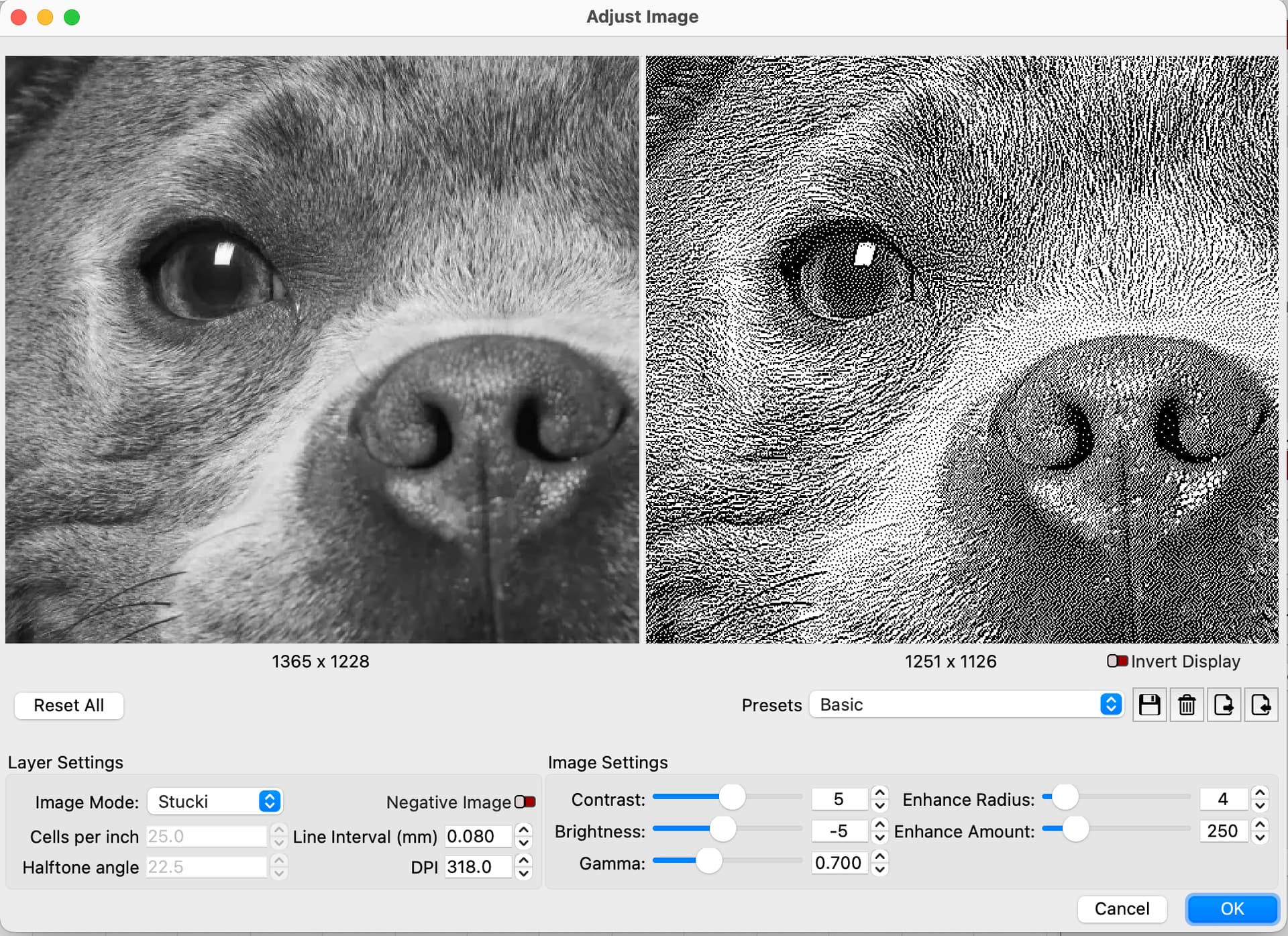
Try different image modes for various dither effects, use the ‘Adjust Image’ tool to get a preview of what the dither will look like, the ‘Basic’ preset is a good place to start:
Grayscale image mode is not a dither, but definitely worth experimenting with.
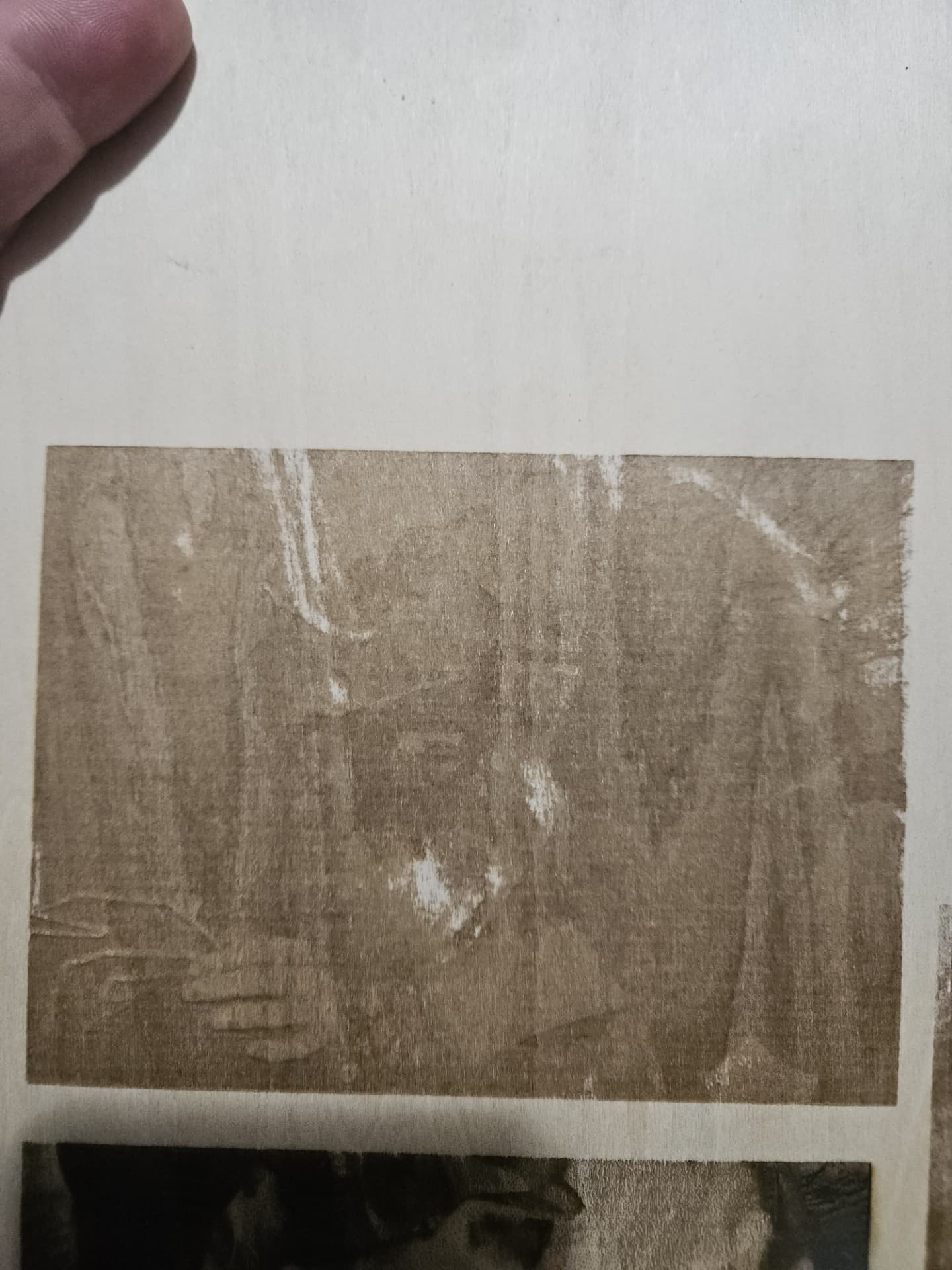
If you get stuck with settings, post a picture - but this time include something in the picture for scale (e.g pen, ruler, coin, playing card…or a banana!), and/or upload here your .lbrn2 project file, explain what the material is, and somebody will surely help.
4 Likes
And the resolution has a lot to do with it too. If you choose dither and 100 dpi it will be dotty.
1 Like
Please follow your topic in one thread and not in multiple questions/posts, it is counterproductive and drives away people who want to help, thank you.
1 Like
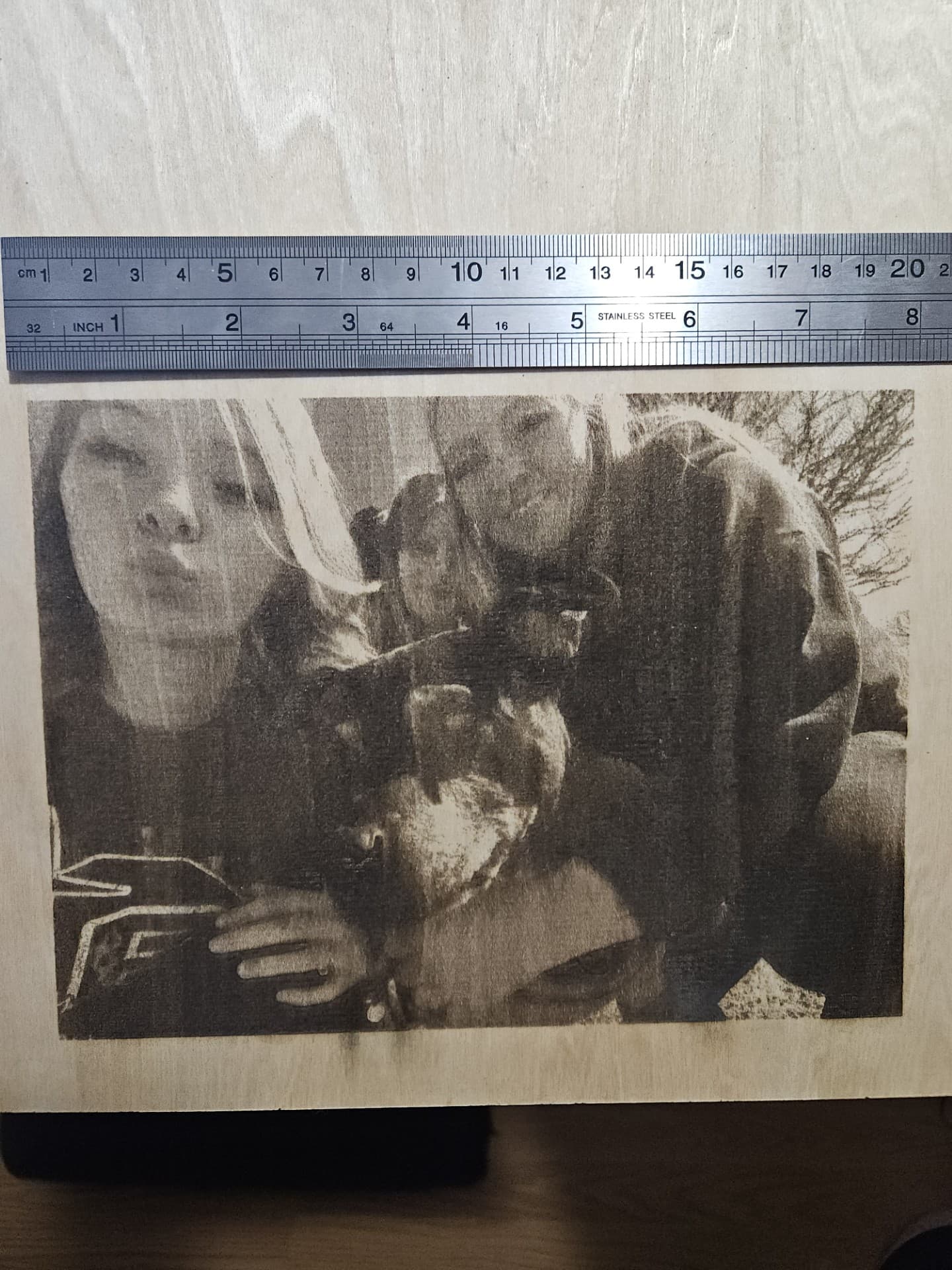
This is what the preview looks like using greyscale, Looks great but when I engrave it the whole picture is black and you can barley see the image. I attached the file I am trying to do.
G Family 1.lbrn2 (829.1 KB)

This is the best one I have done out of all of them but its dark in spots and you can see the lines. 8"x6" on wood
What is the best setting you have found using greyscale? I have tried adjusting but it keeps coming out the same when I engrave it. Wonder if I am adjusting the pic wrong.
You have been warned about interval by more than one person, but you seem to ignore it. Looking at your project file, it appears you are attempting to do a 300+ dpi on the wood… I think it’s highly unlikely you will get that kind of resolution on wood.
The amount of detail or dpi (interval) is dependent on the tool you use and the material.
The tool may have a better ability for detail than the material.
Take some large values… you have a 1" laser beam… that gives you the ability to do 1 dpi. If the laser beam marks or damages a 2" area per pass, then your dpi is limited by the material to 1/2 that of the laser beam or spot.
Wood isn’t very good at grayscale or the ability to maintain a high degree of detail. I’d suggest you watch one of the Laser Everything videos on picking the correct interval or dpi. This is important no matter what you are using the laser for, it will need some kind of dpi or interval.
Although done on a fiber, the technique is applicable to any laser using any material.

Good luck
![]()
Not ignoring anything, I’ve already watch multiple videos on DPI but I have not seen this one. I will watch it, Thanks for your help.
No problem, when I saw little discussion about interval, I was suspicious.
Hang in there, photos are the most difficult, to say, the very least.
![]()
What I have found is that there is no best setting. The image properties is what determines the best settings. Every one is different. That is why everyone says images are the most difficult to do.
Those guys that show the amazing images do not mention the result might be after 5-10 tries, or more. If you do a lot of them, you will get a feel for where to start with your adjustments. Here patience is not a virtue, it is mandatory. ![]()
3 Likes
Try 256 dpi or lower,
Not sure why this is for me.
10w 》318dpi
20w 》 254dpi
40w 》 200dpi
These are what I use for Baltic Birch plywood and most other materials.
P.S. DPI and LPI are basically the same thing. Interval is the reciprocal of these.
1 Like
There is only 256 shades of grey, so as i understand it doesent help to set dpi higher than that. Well maybe i’m wrong ![]()
I do not want to be the one to tell you this, but that is not the same thing.
1 Like
This topic was automatically closed 30 days after the last reply. New replies are no longer allowed.