Did you mean the LPI (lines per inch)? The laser dot width is fixed in the laser module and only focus can change it.
Dot width correction, I use 0.04 with the 20w.
It very much depends on the tone separation between your chosen power values.
The human eye sees more tonal difference in darks than highlights (we’re tuned to watch out for things deep in the undergrowth…that are watching out for us).
The difference in perceptability will not be linear across the power scale. If you stretch the dark tone curve you get more tones in darks. Midtones are mixed and can lead to muddy and bright tone variance are least perceptible, so a short variance works better.
That’s why some recommend the traditional ‘S’ Curve.
Ps. With the 8 layer poster and tone-mapping on one of the cars, I also got a very similar Histogram to the original lion that engraved with good tone seperation. I’ll try to upload it when I have time.
Jay,
Awesome! Thank you! I appreciate your generosity sharing images! I too am eager to see how that dark and stormy scene looks on metal.
I never thought about dot size until Pete mentioned it. Then I remembered reading about in the docs. I only appares in Grayscale cuts/layers. Not the LPI, but it is there. See the docs and it will explain it all.
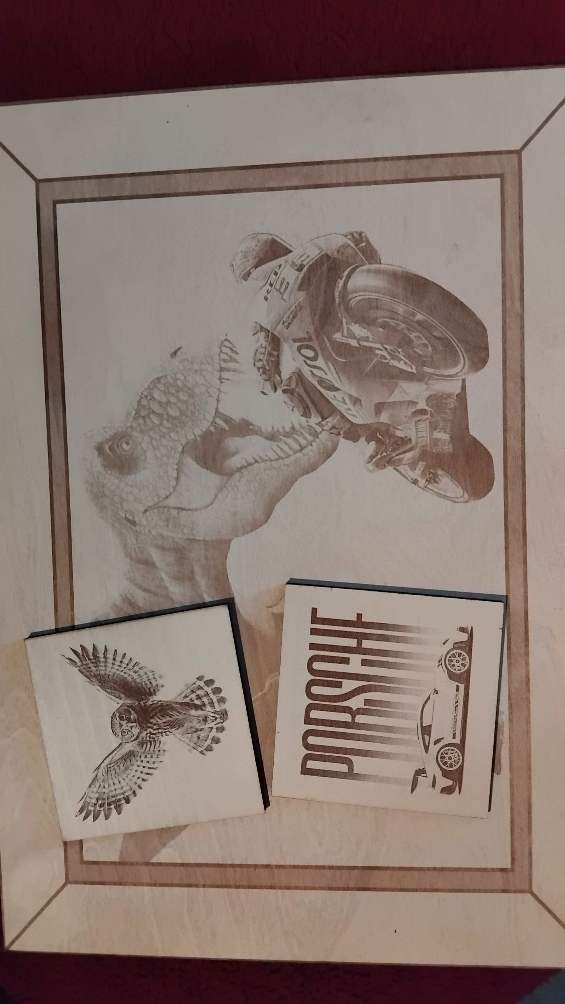
Lightly sprayed white on birch ply and lightly engraved dinosaur, the coasters were done at approx 20%/3000mm/m
2 Likes
They look really nice, the big picture could use a little more power..
Well it’s an odd one, had no idea what to do so I just put the bike on screen and decided to follow the surrealism of the big slate with two bikes on racing track, but one bike visibly leaving the frame (all unrelated images) and thought not to follow through with the usual. I noticed the Dino was also in motion and could be made to be in contest with the bike…and willing to play dirty.
I purposely engraved the Dino lightly as a solid engraved was too obvious and wouldn’t play with the eye, so the bike is quite visible but occupies the smaller area while the Dino is ghostly but fills the larger area…keeps the attention for just that bit longer and departing with a ?
Also the framing came out with a nice hint of gold reflectance…common when engraving on white acrylic.
1 Like
Dot Width Correction: Got it. It modifies the firing time of the laser.
Yep, surprised me. In the back of my mind I knew it was possible, but never pursued it.
I made an interesting (but obvious) realization. My fault when for 16 bit grayscale. I assumed all of the would actually be 16 levels of gray, in reality it is 16 levels of gray in an rgb world.
I have so many images I don’t know which is which.
This is supposed to be the true 8 bit indexed file.
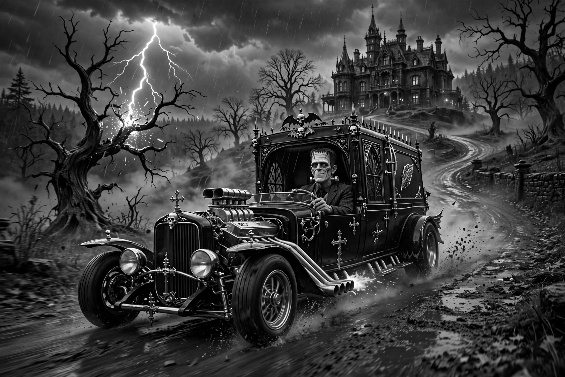
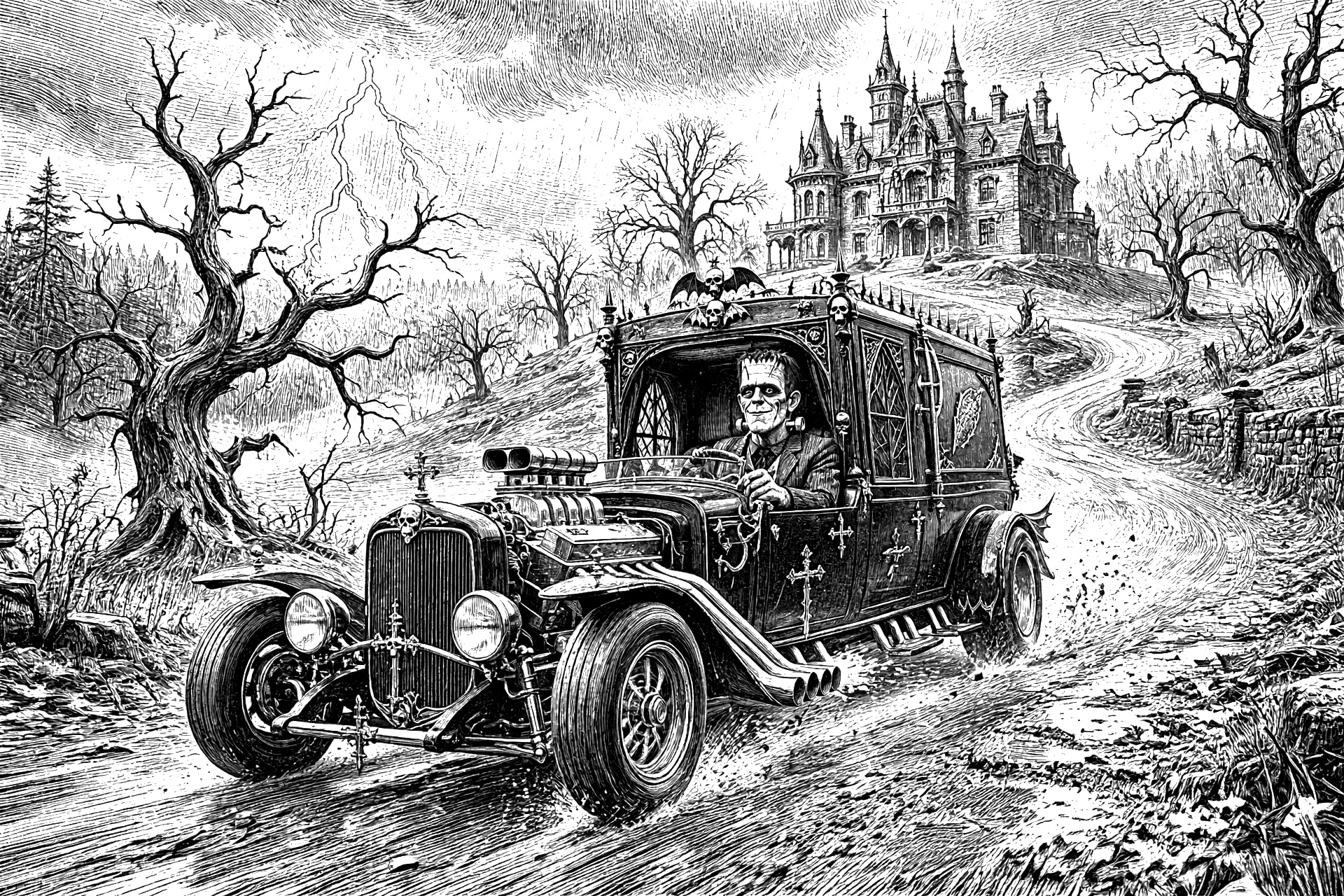
Then I ran 2 scripts with a minor change.
KEEP: Keep the exact positions, scale, and pose of all foreground subjects Do not move, remove, or add foreground objects.
Redraw everything in [vintage STYLE]. highly detailed black-and-white woodcut engraving / vintage ink illustration, but on a paper white background, with dense cross-hatching, fine line work, and engraved texture but in 16 shades of gray
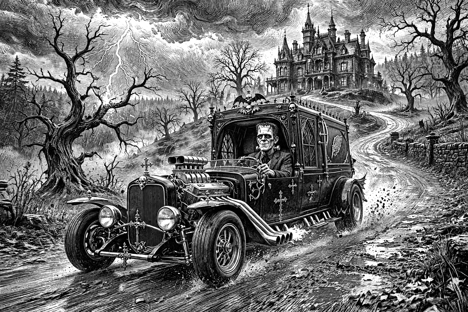
Same script but with a reference to Ansel Adam’s style
KEEP: Keep the exact positions, scale, and pose of all subjects Do not move, remove, or add objects.
Redraw everything in the style of ansel Adam’s . highly detailed black-and-white woodcut engraving / vintage ink illustration, with dense cross-hatching, fine line work, and engraved texture with a paper white background. I like this one, the one above is ok, but looses the mood.
I’ll be adding to this post when I can take a couple of pictures.
I need 2 things better lighting that my kitchen light and iPad flash, and a way to make the contrast.
I don’t want to burn divots in the board. I’m going to give the borax treatment and see if that makes a difference. This image is the 8 bit top image with my adjust image settings applied, no scripts or other enhancement. All LightBurn. The data is there it just needs to be black and gray. I’ll try white paint if the borax doesn’t work. I even have some titanium white used for tiles. I have to wait until th weather is better, because spraying requires outdoors.
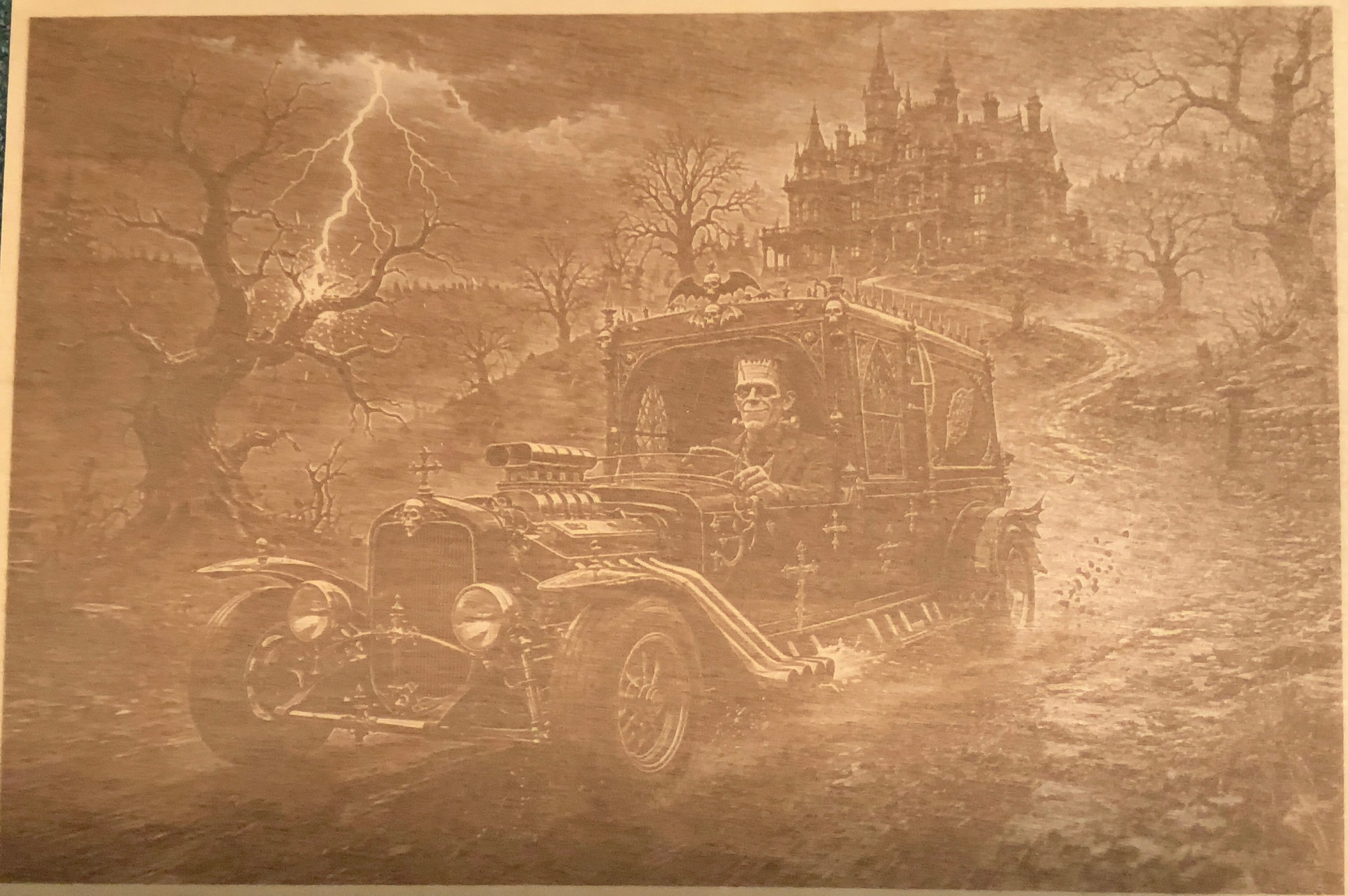
The data is there, now all the experimentation goes to making blacks black while leaving whites white.
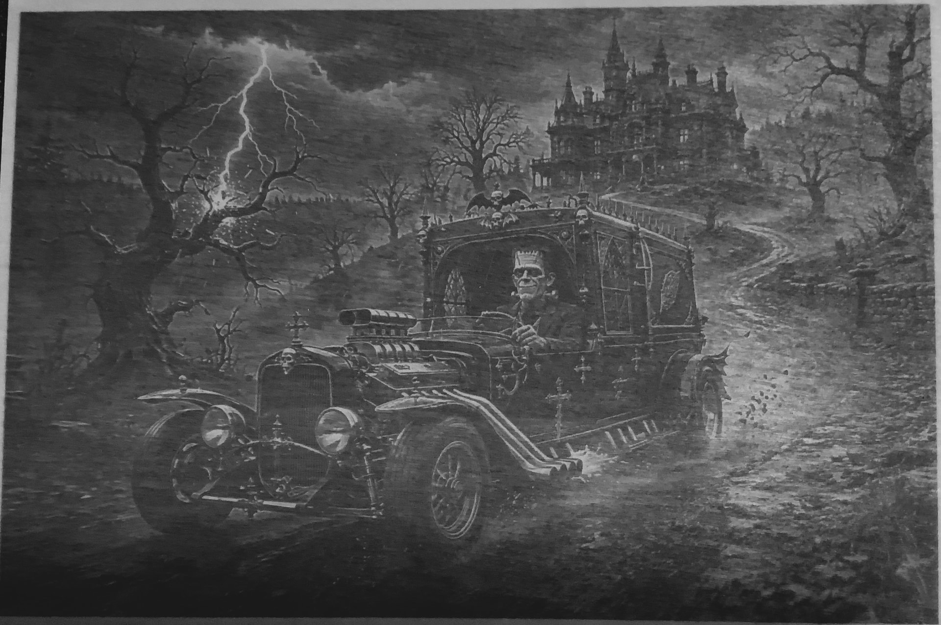
2 Likes
I think this hilights the issue rather well. If we observe the frame of the lasered image, the lightning hitting the tree branch, the headlights of the car and the radiator grill.
The brightest part of the screen image that are important for detail/contrast are the lightning then the headlights and then the vertical brighter lines in the radiator grill.
The brightest possible tone (lightning) can be no brighter than the base material itself. Therfore, all tones darker than that in the screen version get relegated to a tone below Tan (wood colour). This means the greys shift closer to black while black remains black…Detail lost in the radiator grill.
Basically it removes a whole level of contrast from our palette, highlights get clipped and the same from the other end of the spectrum (blacks get crushed).
Now our 16 Tone contrast is reduced considerably and we get a muddy/washed out result with all the potential detail there but not enough contrast between them for perceptive separation.
The radiator grill shows this most clearly.
The less Moody image above with the White background gives us that extra level of contrast, but remember our material is Tan not White.
For the blacks and greys, we must burn the darkest without char, so all greys must be perceptualy brighter than black and perceptualy separated from each other. Then you are left with a narrow choice of midtones.
So as Misken stated earlier regarding slate engraving (or in associated post) ‘We can expect approx 5 tones’ So white/Tan is the base colour, Black ‘0’ is our darkest…That leaves us 4 tones that must be perceptualy separated for viewing quality on material…not the screen.
This is where the Swatches become useful for colour (value) swapping in Gimp etc or Line tracing/ node dragging to remove/delete grey pixels that border other grayish pixels or dark pixels for high contrast…like around the radiator, so the apparently bright vertical lines become the brightest possible for contrast..Which is the Base colour.
It’s the same for slate, but in Negative.
While a nice screen image gives good (backlit) tone separation, the optimal result on material comes from material and image mode that offers tone range suited to picture size, placement, lighting conditions and viewing distance.
Better lighting, but still not the best. Camera lighting does make a big difference. In low light you don’t see all the detail. Borax or white paint may mak a difference. I am concerned about what happens with the mid-tones. The paint should improve contrast. We shall see, because I haven’t tried this before. I may have to either adjust the LPI or dot size.???
I had done my color lion, and then the monument
Everything uses the same settings.
In brighter light things do look better.
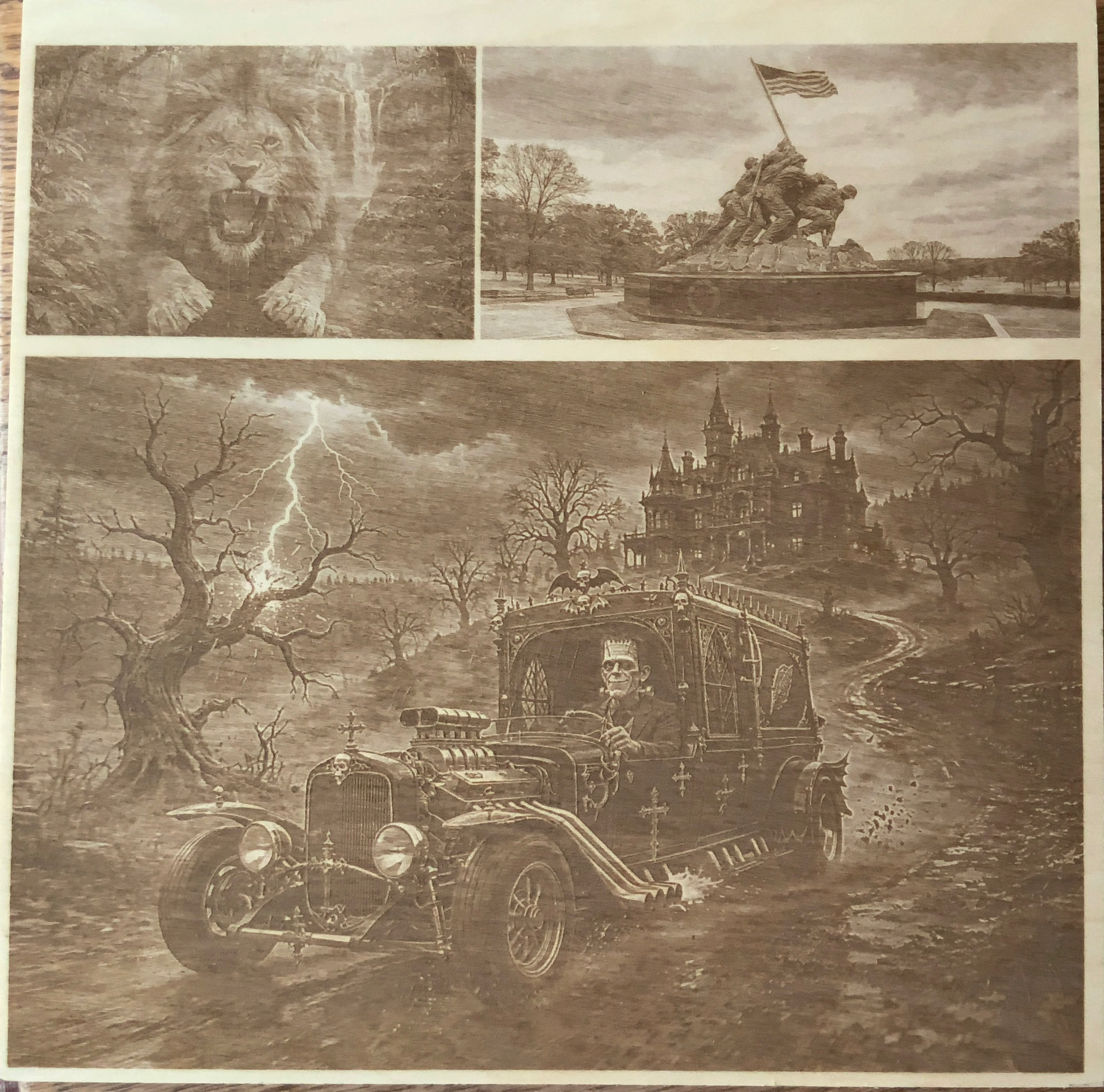
1 Like
The car image looks good in that light and so does the monument, the grain is pretty obvious in the lion image though, which is odd seeing as the settings were same for all.
This is the original workspace before adding my settings.
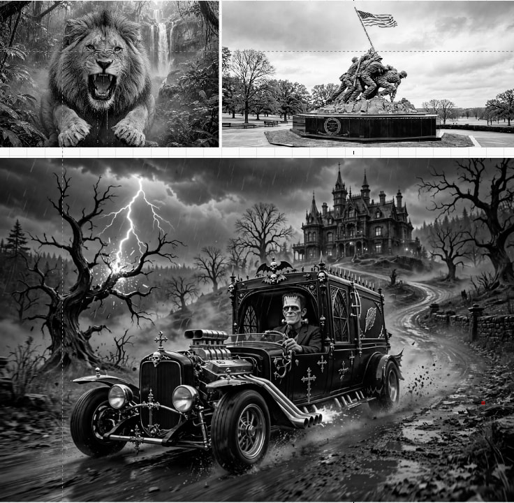
then after my settings applied.
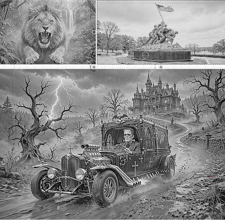
i wanted to see if i had a generic setting that i could use for any image i had Meta creat of convert to 16 levels of gray.
i did discover that when i asked for an 8 bit 16 levels of gray, meta actually created an 8 bit rib 16 level gray image, which is different than a true 8bit 16. levels of gray (black) channel image.
2 different outcomes. i don’t know how LB handles them
the lion was the color image.
all i all i think my experiment would work.
This is the outcome on Baltic birch.
That’s quite funny, that it took you literally concerning the 16 greys (happy accident maybe). It’s a good image even though it’s different.
So, I suppose if you wanted to, you could instruct the Ai to keep that palette or darken or brighten it globally or in specific areas.
Trying Meta to do specific area adjustments is an exercise in insanity.
I went down that rabbit hole on the monument when you mentioned the face of a soldier looked strange (way back to the very first conversations. I won’t do that again. Global adjustments, or general instructions like add clouds, etc. will work.
Here’s my “one weird trick” for adjusting gamma:
Once you burn an image, go into Adjust Image and look at Preview. Slide Gamma until the original image looks just like the image you actually got. That’s the matching result gamma. Then adjust Gamma as the reciprocal of the matching gamma to compensate the other way.
e.g Preview matches result when you set Gamma =2.2.
Use Gamma=1/2.2=0.455 and try again.
This should make the result look just like your original, gamma-wise. If brightness/contrast/min power are the actual probs, those need to be fixed. Trying to fix a problem that is not gamma by changing gamma generally confounds the problem.
1 Like
This post about spectrum reminds me of my challenges with lack of contrast in the titanium palette. I agree about not having try white or true black clipping/crushing the contrast. I wonder if there’s a way to bleach the wood to get closer to white.
I charred leather trying to get it darker, and I found I could pull the char off without smudging using wide masking tape. I don’t know what a laser purist would think of what I did. 
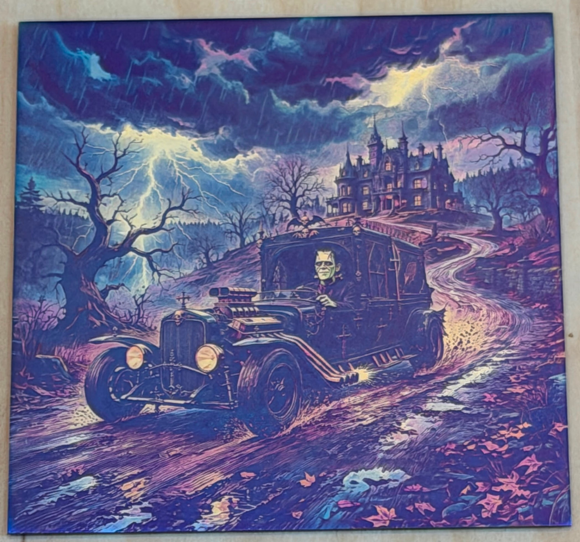
Here’s the halloween image on titanium. I think it looks slightly better in real life (gotta find a way to get better photos). The grandkids liked it.  Thank you again for sharing!
Danny,
I’m going to have to try that. It is weird, but it kind of makes sense.
Thanks for the tip.