Mark,
The only problem with bleaching the wood might be that it is crappy thin veneer plywood and bleaching wood might delaminate it it. That stuff is really strong not like the household bleach.
I’m surprised the borax method doesn’t delaminate it.
The color pallet in the original fit really well with the colors you could render on metal.
The sky is really cool. I like the multicolor clouds.
That titanium piece is awesome. I am glad you did it, because at least there is 1 good result so far.
I would post that on the finished creations, not just here. I don’t know what I expected to see, but it turned out way better, and I think others should see it, especially because of the holiday.
It’s pumpkin chunkin’ time.
That is a very effective result. How many colours in the palette? It’s also fantastic that it will stand up to UV etc so there is no further treatment needed.
The colours are complimentary and have subtle but excellent contrast which preserves the mood of the picture. The midtones don’t get lost, and the brightest create a boundary between darker areas.
I ask about the palette size because there is some detail that is gone in areas but the overall impact means you don’t need to much detail…it’s got eye-candy. Very reminiscent of cartoon magazine images.
Hi Danny
Interesting comment on gamma and preview screen. In the last few months of reading comments by people using photo image software the use of gamma adjustment cropped up often enough to seem important, but on the other hand, Ai mostly seems to mention contrast adjustment.
As you say, It’s what you start out with that determines the amount of work needed.
Jay,
Thank you for your positive feedback! I was surprised how well the titanium palette fit that design. I’ll happily post it on finished creations. I’m not sure about protocol on these forums. Should that be in my original thread or a new thread?
I mostly use solid hardwood for my woodworking. It doesn’t delaminate, but it might warp depending on how wet the bleaching process is. Woodworker’s tape holding it to something rigid might help prevent warping, and thicker stock will also be less likely to warp.
Pete,
Here’s the palette. What details did you notice are gone? I have some separator tricks that might be able to recover those. It’s not a lot of dunks, although there are three large area ablations that took 18 minutes each. In the table below, “predicted” is the percentage of that color that ends up in the final result. I used green as the base (highest voltage) color because I liked having green on the monster’s face, but it doesn’t show much green in the result and is an extra dunk, so I might leave it out next time and let the face be slightly less green.
Colors (high V → low) pre-distort predicted ablated
green 91V (base) 5.0% 1.5% -
pink 62V 13.4% 7.7% 56.5%
yellow 53V 3.3% 2.6% 12.0%
silver 40.5V 9.4% 10.1% 15.3%
blue 23V 18.1% 13.5% 53.4%
brown 13V 50.8% 64.6% 50.8%
Which ever thread you think fits. If you can handle more than one then start a new one. If you don’t want to keep it in your current thread.
Either one should probably mention Ai image generation.
I looked at you thread, and got lost. I do understand the process, but it is way over my head, but really cool.
Mark
Most notably, details in the tree trunk that’s being struck by lightning, and the car radiator grill. Didn’t need to inspect much more than that to kinda prove my theory that posterization is not a problem if the image is impactful. That point may well be proven by your having to ask where I spotted the detail missing…in other words, your attention was taken by the overall impact of the picture.
Would you count green as part of the palette for your technique and should it be counted as part of the palette if lasered in other ways with other materials.
Ps, can you tell me what the %'s are indicating.
Pete,
Yup! Now I see the loss of details in the tree. Thank you! I’ll see if I can tinker with settings to get some of them back. The radiator does have the vertical stripes on metal, but the contrast on them is very low, and they got lost in the photo.
Green is definitely in the palette. In this piece, it was the first color, so the entire sheet was green when I started ablating. Each ablation removes some of what is already on the metal, so most if not all other colors consumed areas that were green. In this piece, nearly all green was consumed. But where green should be was calculated just like all the other colors. In general, the highest voltage color (called the base) is treated like green was in this one. If I remove green from the separation, then pink wiill be the base color, and there won’t be any ablation for pink.
Percentages are all area percentage on metal:
Pre-distort is what the layers said would end up on metal if there were on dot-gain.
Predicted is after calculating dot gain (bloom).
Ablated is how much of that color gets ablated. For higher voltage colors, that is generally larger than the pre-distort percentage. For brown, it’s larger because of dot gain.
Glad the detail loss was there to see the effect and hope your attempt at detail recovery works well. I got the infrared camera working today and think it could be 590nm or around 720nm. Not the effect I was expecting or if it will be any more beneficial than colours with polarising lense converted to b/w imsge for tone separation, but we’ll see.
I saw on your website, there was a use for your software that was for other materials and you also mentioned having done leather. How would you suggest the software be used for layering other materials…would it achieve something novel and does it involve a special process.
I’m intrigued by your infrared camera idea and interested to hear about how that goes. I used to have a Sony digital camera (DSC-F707) that had a “shoot in IR” feature.
The heart of my system is the separator script. One way to think about it is that it converts images into mosaics using a fixed set of tile colors with known hues and brightnesses. It dithers (blends) the tiles together to simulate colors that aren’t present on the tiles. So using red and white tiles, it can mix them to simulate pink without having pink tiles.
I think the tiles could be anything. In the proofs the separator generates, the tiles are colored dots in the proof image file which I can turn into colored dots on paper in my printer. On titanium, they are anodized dots. They could be bathroom tiles, legos, painted bottle caps, squares of cloth, anything with colors that can be arranged into a mosaic per the separator’s output. In my case with 508 DPI, I cram a lot of “tiles” onto the 100mm square sheet, and I “arrange” them using the laser to ablate the spots where each color should go in the mosaic doing voltage/color as a group of dots so I can anodize that color all at once.
I could imagine generating paint by numbers templates from the script. Naturally, those would be much lower resolution.
Much more interesting is the idea of using a laser to colors the “tiles” (dots) directly. I think this is akin to what Povilas does. In the case of the separator, the PNG files (or whatever format makes sense to drive a laser to directly color the metal) would control the settings to use at each dot to get that dot’s color.
I’m not sure how to define novel. I suppose a giant mosaic made from legos would be novel, but it would be expensive and impractical.
I don’t know if it would be novel, but I wonder if we input hues for the plain wood and for the engraved part and then did a two hue separation what that would look like. I think this would be like strictly black and white half tone. I would be surprised if it could compete with well-tuned PNG or SVG engraving, but it might be interesting to try. Things get much more interesting if we can add more hues. Anodized aluminum might offer three hues: the anodized color, bare metal (engraving just enough to remove the anodized layer like I do when I ablate the titanium), and oxidized metal (much hotter engraving to generate the oxide). Choosing an anodized color that contrasts with both bare metal and the oxide would allow dithering between the three. Stainless steel or titanium offer the possibility of many hues like Povilas has demonstrated.
The separator would need accurate hue and brightness values. From that and a source image, it can produce the mosaic. AI and I could probably make a script to adapt the separator output into whatever format the laser needs. I’m making xcs files for my F1 that are all ready to go.
Let me know if you would like me to separate an image into two or three colors. It wouldn’t be hard to make a quick 1 bit PNG file (wood is the base and the one layer is the dots to fire to engrave). There would be no power variation, so I don’t think that would compete with an 8 or 16 bit PNG. I’m more interested in the “three colors dithered on anodized aluminum” idea and might try that myself. I don’t know the engraving world well at all. Might that be considered novel?
Sorry to ramble so much. I like thinking about stuff like this!
Take a look at this link:
It may not relate exactly to what your doing but you may find some interesting points. The ‘standing wave in oxide’ I mentioned earlier is from this conversation.
I’m beginning to think the materials and equipment are only half the story, the other half is creativity, execution and presentation. I’m worried about the IR camera as there seems to be a defect in the few pictures I took. There are vertical lines in the images that I fear may come from sensor damage. That’s strange because it came from a respected source.
Other than that I’m not sure if the images will be any more effective for engraving than b/w conversion and using a Colour Polarizing Filter on the nikon d610 to lower the palette and separating the remaining tones for effective contrast, and for you, it’s also about contrasting defined areas of color/tone and…finding and matching power levels and exposure time to achieve a mix of RGB.
Everything I can tell from everyone’s processes boils down to one major image issue.
CONTRAST is the culprit . Separation of tones.
In Photoshop the is a function find edges, you could even expand that selection, and then you could sharpen, or reduce the brightness the heck out of them. That would almost make it simulate black or white (limited tones). That would make the definition between tone transitions.
LB does that when it does a trace image,. Too bad that you can’t merge the two. I have an idea of what I could do, but I don’t think it would produce good results. It would try to fool the eye, maybe maybe not.
I finally got a chance to do some lasering today and had to make it quick. I cropped the car images from both sides and decided to do the 8 layer posterized with some adjustments in LB as the original just seemed a bit dark.
I repeated that but increased the sharpness, brought gamma to just below 1, and increased contrast a touch.
I had to do the original (top right) un-posterized but did sharpen, contrast.
These are definitely presentable. The posterizing works but is not all together necessary…just a matter of preference really.
They are on resurfaced slate with black added, and while it does add contrast I’d like to see it on raw slate as I’m not sure it needed the black to create the stark contrast, the grey of the slate may have been enough…again, maybe just individual preference.
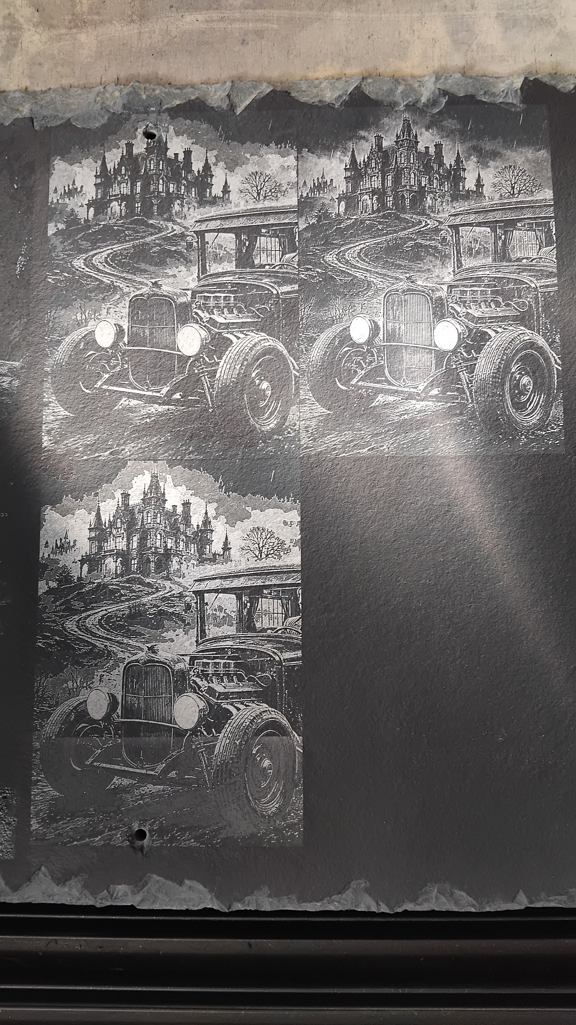
160mm tall with a slight bit of sunglasses on the tile.
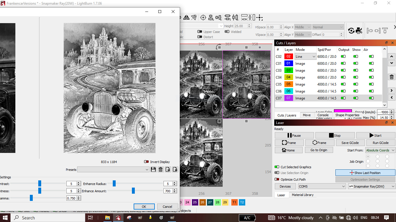
Upper right looks best overall.
I made a discovery today.
The resolution issue in Adjust Image not showing the actual resolution.
Goto the Gears Icon Display and change it to 72 and not 96(Inscape)
Now at least I know what things are supposed to be.
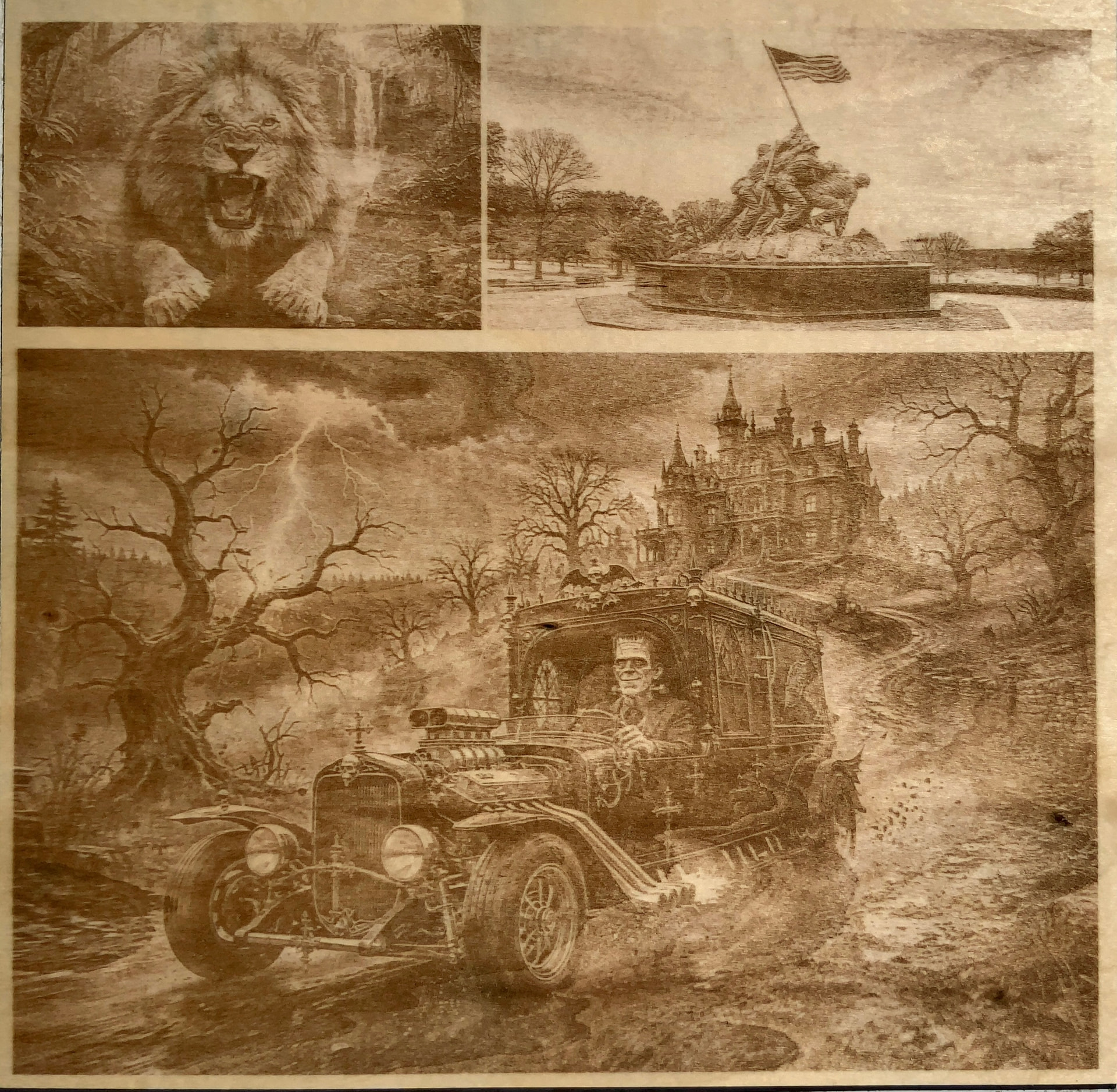
I also am engraving that page with the Lion, Monument, and Munster on Basswood, no 16 levels raw image and my settings. Therein lies most of my Issues. I need a totally different setup for Baltic Birch.
Image to come.
Thank you for the link to diffraction grating! I love the effect! I asked Gemini what combining anodizing and diffraction grating would look like, and the response was quite enthusiastic.
Gemini’s response (3.1 KB)
I think it would also be possible to anodize and apply diffraction grating alternately like I do to make full color dithered mosaic images on titanium. The MOPA lasers that can do the diffraction grating are expensive or I’d be figuring out how to buy one ASAP. Plus I have a mechanical engraver (diamond tip) that I bought and haven’t assembled that I want to try too. So many fun things to try!
I made a test array to try directly coloring titanium with my F1 which I will run soon.
I’m sorry your IR camera isn’t working well!
I went out with the camera yesterday evening and got some shots in reasonably good sunshine and some an hour later nearer sundown and the sunlight ones appear OK, while the later ones again showed lines on image (this time they were horizontal). So it’s a light level minimum or camera settings issue…but apparently the camera is OK.
As to the quality effect I was after, I may have to hunt around for that (learn what’s what) as it appears not much different to the d610 full frame dslr, which I’ll try with the CPL lenses ASAP.
You could reopen that topic if you think the poster could help with any details you need. Do you think the MOPA is essential…Can the defraction work on a larger scale!
Gemini gave a good synopsis and that’s all quite exciting. Could you possibly modify your existing lenses to further refine the dot, Misken may be able to inform you further.

I would think not. I.R. is also called “night vision”, so that is where it should really shine (no pun intended).
I worked out some ideal settings with ai assistance…resulted in Black screen, whereas my own guesstimating wasn’t to bad.
I persevere with the Bold experimentations
1 Like
I did achieve what I set out to do. My biggest problem was, I originally calibrated everything for Basswood, and then stupidly switched to Baltic birch and using the same settings. I need to do the same calibration process for Baltic birch. I even got the mist around the lion. Too bad the wood grain gets in the way.
Taken in bright sunlight.