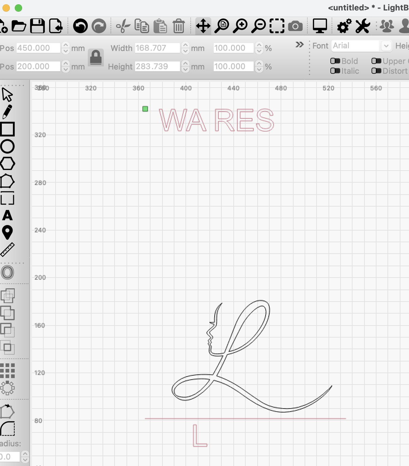
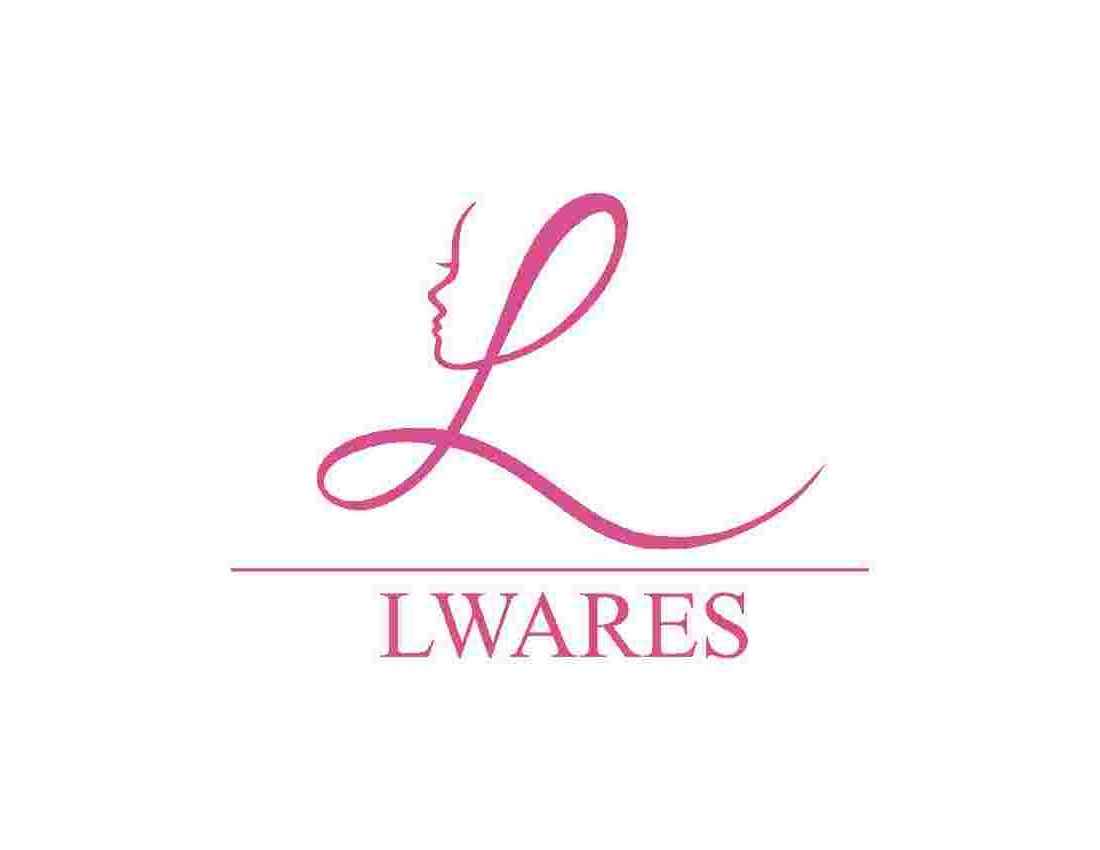
My wife owns this logo, we only have it in png and jpeg. I can not get a good straight-line conversion from this image with LB Adjust and Trace. Any suggestion on how I should approach this?

Nice!! It’s better than my results.
What steps am I missing to not get at least this result?
I zoom in. Fade the image and slowly adjust till I get best results. I being a perfectionist always spend time node editing. Also, if you know the font you can remove and replace it with original font. You can draw a rectangle and replace the line in the center.
I do not know the font.
Are you hand-sketching the image?
Just using trace.

As DSkall said, it’s about 50/50 playing with the various trace settings and node editing. I generally reat trace as a rough starting point for anything important.
That font doesn’t look special. There are likely a dozen serif fonts “close enough” if not exact. I’d just find one and replace that. Remember, you can convert text to path and correct minor problems like kerning or proportion.
The line is also simple. Replace that.
Get a trace of the L/face that’s fairly close and then spend several hours rebuilding/repairing any anomalies. Treat it as a training module. You’ll be pretty well versed in both trace and node edit when done.
I tend to delete the vast majority of the nodes for curves and insert new ones for sharp corners. Once you get this one perfect
Thank you both for your kind help, I appreciate it very much.
In trace the image I am adjusting is very small, how can you see the nodes to adjust?

Image trace and nodes are two different processes.
1 Like
Assuming that the PNG is a cleaner file, I’d suggest working from that. In either case, I’d suggest you work from the highest resolution image that you have.
Having said, that, if your wife owns the logo, is she able to get the original vector for this from the designer?
I found L is my new best friend in node edit.
The font is STIXgeneral regular. You can download it from here …
If your wife knows the designer of her logo you should contact them to get the original to save a lot of work trying to recreate the whole thing.
2 Likes
While I don’t disagree on the principle due to alleged ownership (designer may have retained rights), I still feel the learning opportunity here is even more valuable…
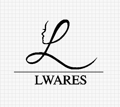
While I use the trace function in Lightburn quite often, for a simple image like this I find it much quicker to use an illustration app (I use Affinity Designer) - took about 10 minutes. Export the result as an svg file and import it into Lightburn. In this case, Lightburn struggles with the font, but as I had Stix I just put the text in with Lightburn.

Lwares.lbrn2 (42.2 KB)
If you want the Affinity file let me know - I can email it.
1 Like
Newlands that is very nice, smooth.
Beside the text at the bottom, is the “L” the original or is it a replacement too.
All the ‘LWARES’ text in the Lightburn file was typed in Lightburn. That way it stays as editable text, whereas if it is part of the svg file its just a vector object (and in any case Lightburn really made a mess of it on importing!).