Hi everyone! I’m hoping someone can help as I’m at my wits end with this project lol.
I have a Gweike G2 Pro 50W laser and I am attempting to make a memorial coin for a family friend who passed away this year. I’m running the latest version of Lightburn on Windows.
The issue is that it’s a flat BW image (converted from the image attached to grayscale) and I’m trying to get a decent deep engrave. I’ve tried AI answers, videos, and everything else but most talk about using a depth map. I generated one but because it is AI it ends up not looking like him at lol. I worked witht he manufacturer and they had me change some dotting settings and try but that did not help and they pretty much said there’s nothing they can do. So here I am. I’ve attached the original image plus what the coin looks like hoping a new set of eyes can get this to where I’d be ok giving it to the family.
Thank you!

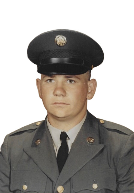
You’ll likely need to do the negative option on the layer as it looks inverted.
Grayscale is very difficult unless you’re using 3d slice and only when it’s a proper depth map graphic.
I think you’ll find most of us use some type of dither as a grayscale is very difficult to get right. The image range has to be within the limited range of what the coin can produce.
If you hunt around the finished creations area, there are lots of examples. Again the issue is likely you want depth, but where is the depth? How deep do you want it? Anything posted by @Bulldog would be worth your time. He has multiple machines, so ensure you’re comparing apples to apples.
There is software out there that may help you, but it’s using the guesstimate option as there are lots of variables and a standard file doesn’t give you enough information to make a 3d sliced map.
I generally don’t do photos on coins, but I do on stainless steel, where the first layer produces a white background, then I can use a dithered method to do the work.
Hang in there until others have a chance to post their view.
You might give us an idea of what settings you’re using along with lens length. I assume it’s a q-switched type of fiber?

Hi Jack, thanks for the reply. I guess my post was a bit empty all around, sorry, I hadn’t had coffee yet lol.
I’ve cycled through Jarvis, Stuki and Greyscale with varying settings and none seem to want to just get it on the coin right. It’s either faint or holographic.
I tried the settings Gweike recommends in the manual, Google AI suggestions and a few tinkering on my own. The biggest issue is definitely the holo looking coin (like the one above).
I’ve tried all the AI depthmap sites (even bought credits for multiple attempts) and they really do just mess it up. We want it to actually look like him and not Random Soldier #8732 haha.
My current attempt has me doing 3 layers. The results aren’t great.
I’ve attached the lightburn settings and the end result (I just ran this).
I’ve attached an image of the lense too!

I’ll look at the finished creations section and see if there’s anything that helps.
Thanks again!


I don’t see what both layers are doing. Both seem to have the same settings and I can’t see enough of the panel to see which layer I’m looking at in the first screenshot of the two.
I think I’d move the image a bit to more of the image is visible and uses up more of the material.
Likely need to disable invert image on the layer. You don’t want a black face and the tie is black, so it comes out white.
I think there’s too much contrast for you do duplicate it as is.
I moved it a bit, the outside is 40mm. I think using more of your image would be wise.

I’m actually going to put text in that area on the left. I’ve just been trying to get the image right first before diving in on the final design.
I’ve been using invert image and you can see some of the details fine but for some reason the engraving comes out light and holographic looking.
I’m currently trying to do a fill behind all that with the trace tool but lightburn keeps crashing 
I also have the Gweike G2 Pro, but the 30W version with the 150mm lens.
I made this memorial plaquette out of brass, and got decent results using these settings
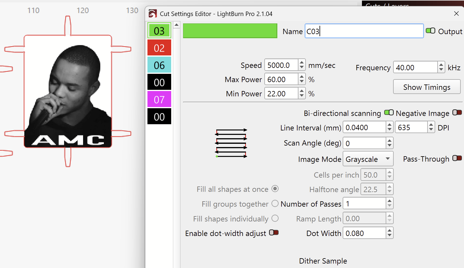

For the best contrast in an image on brass, you want to use Grayscale.
It took me a while to dial in the Min- and Max Power, but it’s definitely doable.
“Min Power” what’s being used for White pixels, and Max Power is used for true black pixels.
Lightburn should never crash, and it should be reported to the staff. Suggest you put it all in and work on it as a complete unit.
Your 50 Watts is more powerful, but the larger 210mm lens has less power density. So, my settings are probably still a good starting point. (Maybe slightly increase the Line Interval, because you have a larger spot size with your lens)
That looks awesome! So yeah, it can be done lol Grayscale worked?? I’ll have to give it a try next.


The darkest parts of the image (the hat) could be darker. You can get some pretty good blacks on brass.
It looks like you could go higher on the Max Power.
Or: Leave Min, and Max power and slow down the speed to 4000mm/s.
This will result in the white parts also leaving a light marking, which will remove the shiny parts on the cheeks and the shirt. That part makes it look a bit unnatural.
The focus height is very important.
If you’re using these two dots for focus, I recommend performing a focus test by ear, as explained on this docs page:
Then, check whether the two dots actually coincide at this height.
Yeah I had to do that with the manufacturer. I align the dots then listen and adjust accordingly. I’ve started measuring too but I still use the sound to know when it’s right.
I’m running another test run using 2 layers, one set to 45 and the other to 90 using slightly different settings. I’ll post back once it’s done!
I doubt that using multiple Grayscale layers will improve anything, if that’s what you meat.
Not sure what you mean with 45 and 90. power? scanning angle?
Anyways, I’ll look forward to see your results and screenshots of the settings 


I did the 2 layers with varying angles because I noticed lines in the image preview. This is what was suggested to remove those.
I stand corrected!
That last result looks great already!
Do you mean the scanning lines when zooming in on the Preview?

Your Line Interval at 0.025 is already quite small, possibly larger than the actual spot size of the laser with the 210mm lens. (I recommend doing an Interval Test if you want to know for sure)
If you can see the lines in the engraving, you could lower the Interval.
Note, that if the lines are overlapping, you also increase the power density, which will change the color of the oxydation.
I still believe, that the goal should be to do Grayscale engravings with only one pass, but your results prove otherwise. 
Maybe, @NicholasL has some additional tips?