In my opinion Lighburn’s font management is its weak point, because in all other aspects it is excellent in my opinion.
Why do I say this?
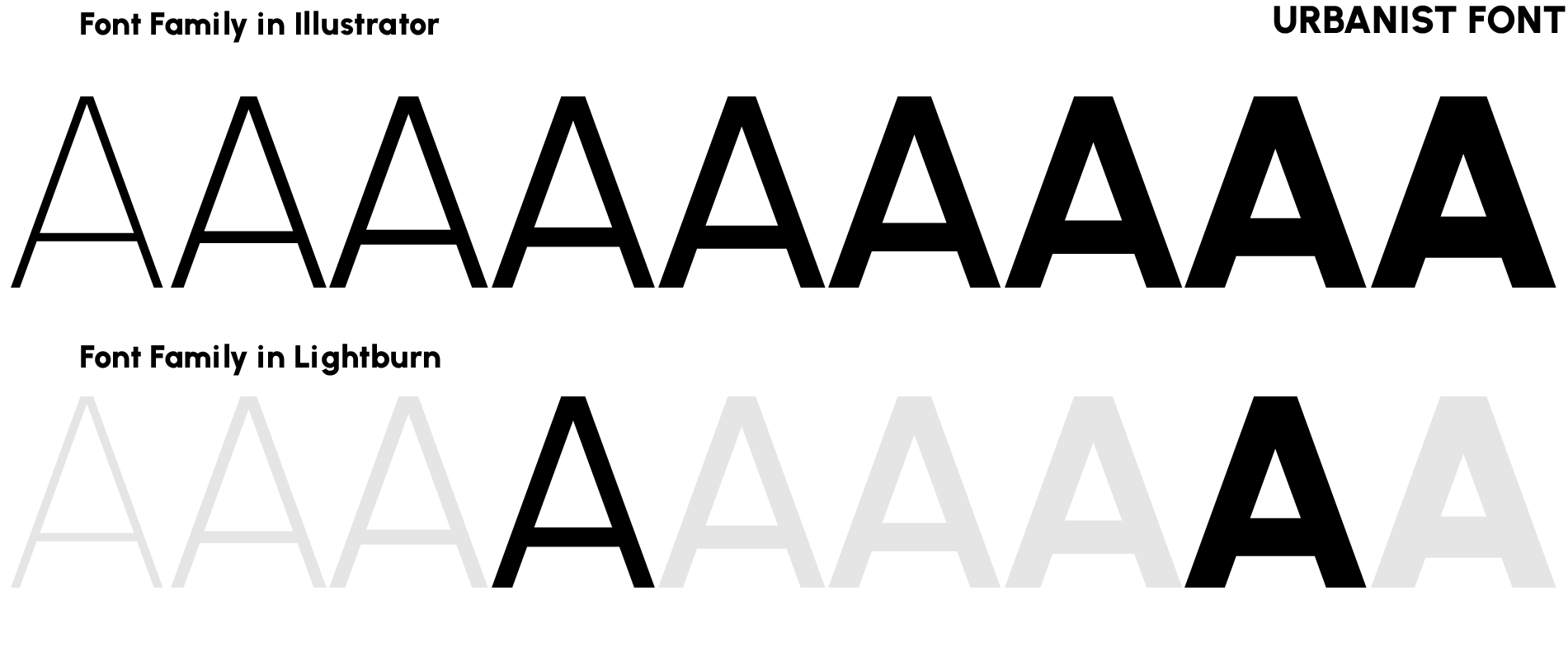
You can’t use full font families: I’m a designer and have a big investment in professional fonts which come in many weight and style variations. Not being able to use fonts to their full potential and only in two versions (normal and bold) is a big shortcoming, I have to go between Illustrator and Lightburn all the time.
The font search is not friendly: I think the entire font search section should be redesigned, it is not enough to have a list, typing the name should appear a drop-down box with the fonts that match the search, and their preview , not like now that it looks like a select html field.
The most used fonts, or the fonts used in the document, should appear first in the list. It is very likely that they are what you are looking for - There is a recent fonts option already implemented
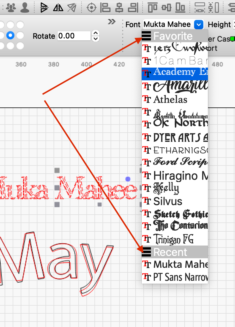
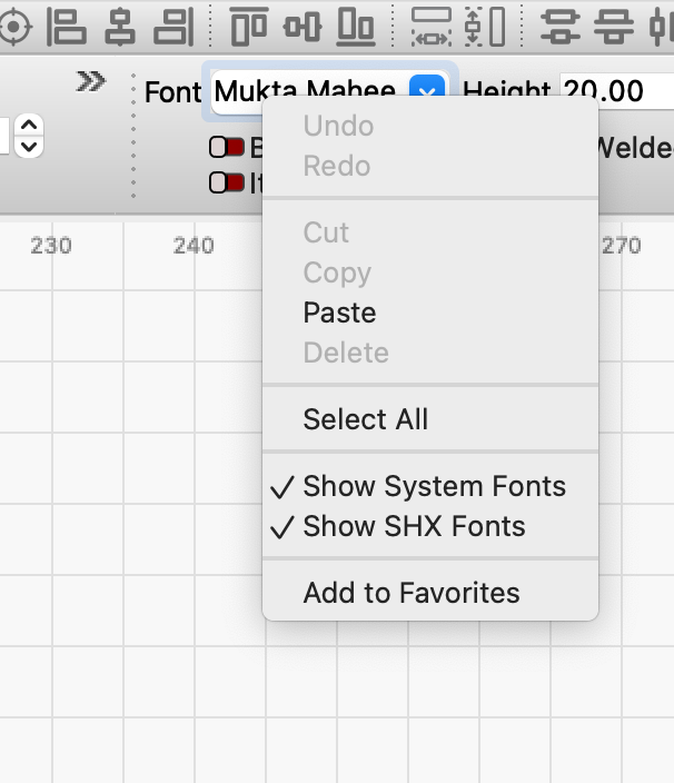
They should be able to favorite fonts for frequent use. - This option is already implemented
When you select a text and go to the font list, it doesn’t always open with the selected font visible, sometimes it goes up again and starts with the alphabetical list from A. This is a bug.
Great! Thank you! There are a lot of points there, i think the more neccesary is whole font family, the other ones are for speeding the process and a better experience using the software.
bernd, thank you for pointing that out. I found “Recent” and “All Fonts” but I couldn’t find “Favorites” in the drop-down box. I looked for something in prefs or settings but came up empty. Is there a secret handshake involved or am I just not looking hard enough?
The word from the Dev team is that the unavailability of Font Families is a limitation of our selected cross-platform development tool Qt5. We are moving to Qt6 but we haven’t set a definitive date yet.
Thanks for posting this. Upvoted. I have cringed more than once at the task of scrolling thru my thousands of fonts trying to find “the one”. I often only know a rough style and can’t remember the various font names, so I do use and like Gimp’s tag function.
There’s a nice little free program called Nexusfont that you can view or print out a sample of all the fonts loaded on your computer. Much easier that scrolling through a million fonts in lightburn.
Thank you for bringing this to our attention. I downloaded both the user guide and the application, after being warned six ways to Sunday not to (well, warned that it could be detrimental to my Windows PC if I did). I was warned again when I installed it, but it is working well. I need to spend a few minutes reading the guide and I’ll be set. Again, thanks for the tip, it looks very useful.
I have been kicking around installing a font manager for quite some time but haven’t felt truly compelled to adjust to a new workflow. No real harm in trying, but it’s gonna have wait for few months until I get out of prep mode for the show/convention season.
I had been considering Font base, but didn’t know about Nexus. Will have to look into it. I do t think I have enough knowledge or need to justify a full blown paid app.
Its a safe program and easy to use. Just run the program and it will display all of your installed fonts with samples on the screen. You could also print out the file but its HUGE, something like 100 pages if you have lots of fonts installed. I usually just scroll through on the screen. Its nice when you sell something and someone wants a specific type of font. Instead of going back and forth back and forth you can just print the list as a PDF file and send it to them.
You can do something similar in windows. Just search for “Font”. Then select the program called “View Installed Fonts”. It will display samples of all the fonts on your computer. But its not as nice as Nexusfont and no way to print out samples that i know of.
Just an FYI. A selected font may look a little different in different programs. Example selecting a font in Microsoft Word may look a little different if you select the same font in Lightburn.
When you install a new font in windows make sure you Right Click and select install for all users. Otherwise the font may show up in windows but not in Lightburn
Thanks for the heads up. I noticed that the SHX fonts I’ve installed don’t show up in nexusfont (as well as a few others), but do show up in LightBurn, so I’ll need to get that sorted out.
Windows tends to be overly protective, I assumed that if you were posting it to the Lightburn community it was safe. Now I can get on with the business of adding the other fonts.
SHX is obsolete and niche. If memory serves, it was originally a pen plotter font. I don’t know of any place that still has a working pen plotter (not that that means anything). Wouldn’t surprise me a bit if Nexus doesn’t support them. Fortunately, there aren’t really that many. I have a couple dozen and only consider maybe 1/4 of them worth using. Of course, YMMV.
The nice part of SHX fonts, is they are comprised of straight lines. At least the ones I am familiar with. There are no arcs to facet when LB outputs them, so the data stream going to the laser is smaller.
 - “Get me a sandwich”