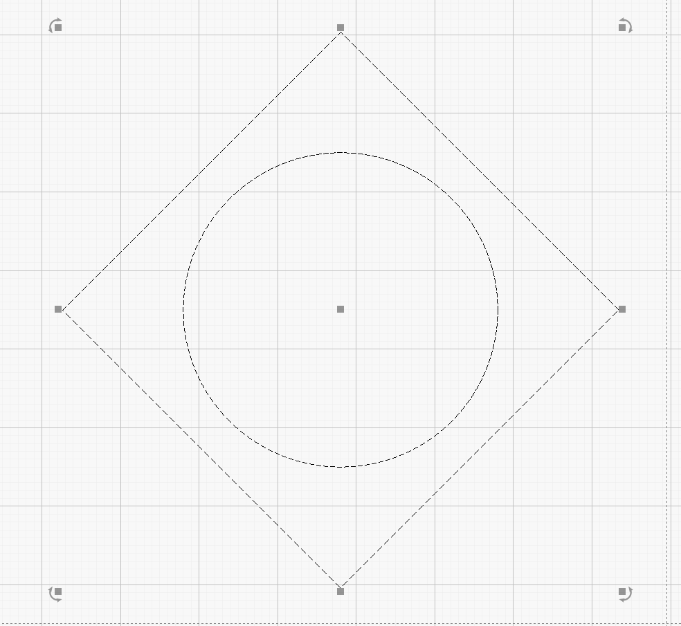
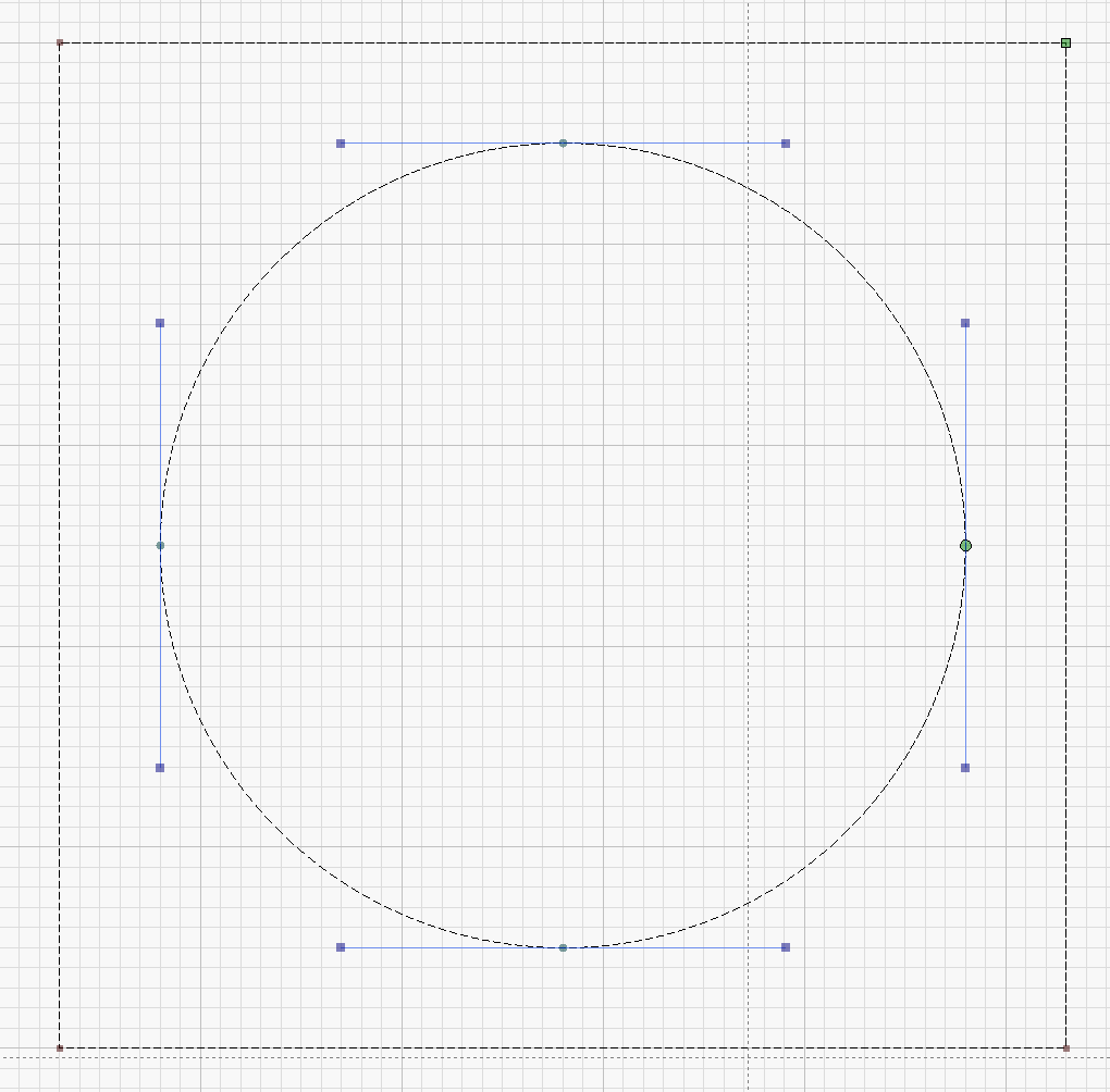
Just installed Ubuntu 20.x on an old HP elite 8000 which i got for free. installation was a breeze and lightburn, so far, looks to be working great. my question is all about screen resolutions.
My primary Win10/64 machine is connected to a 32 inch screen with a native resolution of 2560x1440 px whereas the other Linux machine is connected to a 20inch monitor with a native resolution of 1680x1050 and i really like the way dots and dashes looks on the lower resolution / smaller size screen. much easier to distinguish between line types. not so on my 3K resolution screen. Is there a setting to make these patterns a bit bigger on a higher resolution screen?
I run 4K monitors on my Win 10/ Linux machine. In Windows, how do you have your displays set up? In the display options there is a setting for scale and layout. I have mine set for 150% which is the default for a 4K display and things looks fine. There are also some knobs if you right click on the application icon and select properties, go to the compatibility tab and select change high DPI settings. there are some things there you can play with.
Hi Joel,
This changes fonts size but not lightburn’s dots and dashes size. i would have liked a setting for changing only dots and dashes. This helps distinguishing between groups and un grouped shapes but more importantly for me is to find and fix lines continuation during editing nodes and such by observing the flow of the dashes along the entire path. it is much easier to see these patterns in a diagonal lines but with an horizontal lines it is very hard. draw a circle and notice how hard(er) it is to notice the dashes on it’s north south east and west corners than on the rest of the circle due to the sizes of the dashes which are more compressed there. on my 32/3K screen this artifact is very noticeable.
Or, It’s time for me to go for more powerful reading glasses.
Dashs and Dots.txt (3.9 MB) (Change extension to .mp4 or just play with VLC as-is)
Note in the video how hard it is to see in this simple example the places where the lines are broken and flow in different directions.
OK, I see. For me, I see them fine on my 4K and in your video. Not sure what to do in your case.
I wish the quality was as seen in this video. in lightburn the size of the pattern is much smaller and stays the same regardless how much you’re zoomed in and/or out.
I have lowered the grid contrast to “low” and that helps. it’s not a perfect solution but makes it easier to work like this.
Glad you found a somewhat working solution
I can add a setting to increase the size of the pattern, but I might just tie it to the tool button slider, assuming that if you scale those up, you’re probably on a screen that needs it, and we’d scale up the pattern too… I’ll have to think about it a little. I don’t want to overwhelm everyone with every conceivable option.
My icons size is set to ‘large’. tying features indeed reduces options and features but can also introduce, in extreme cases, undesired results.
This topic was automatically closed 30 days after the last reply. New replies are no longer allowed.

