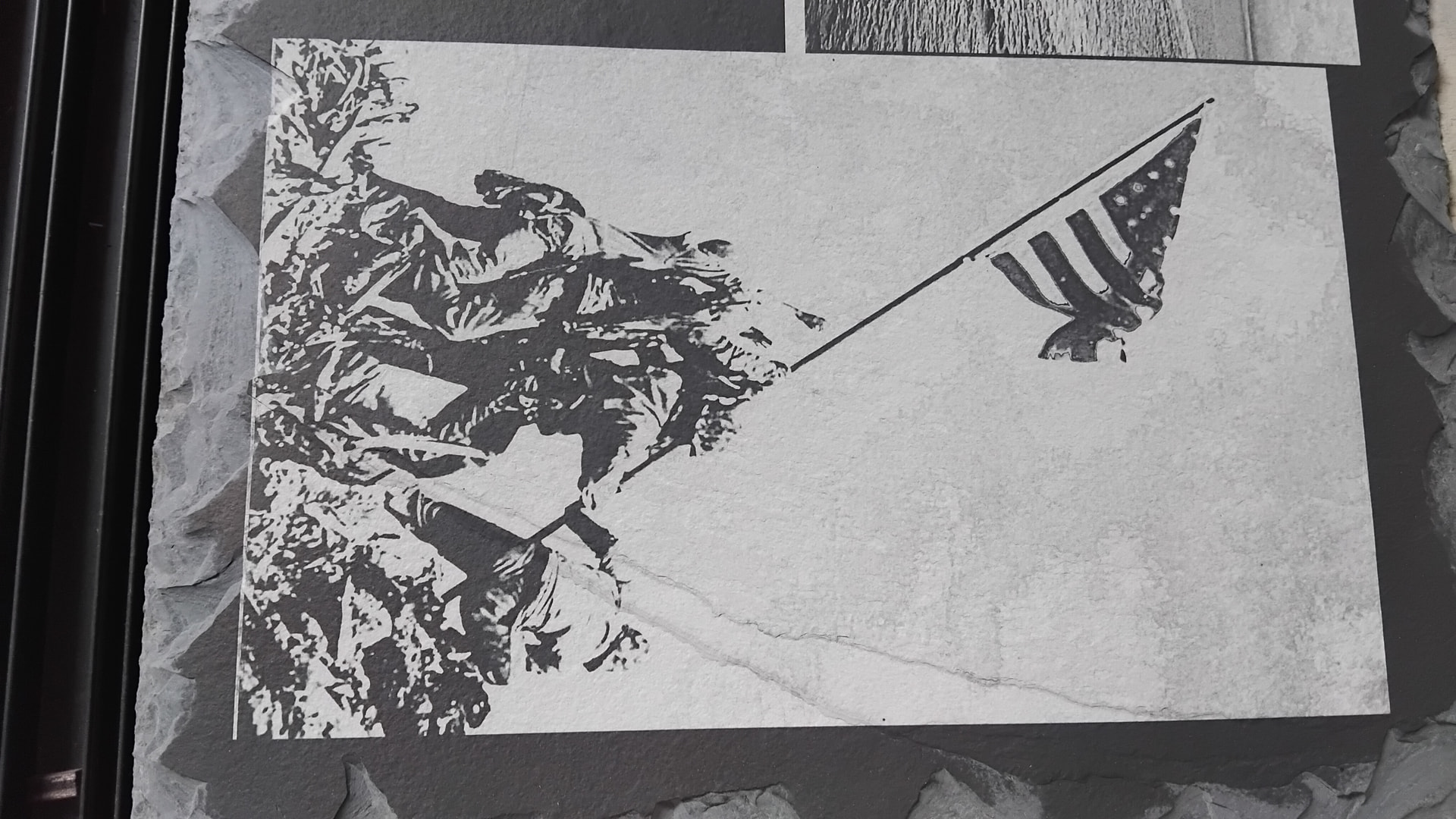
At this point I don’t know what it was working with. Meta keep screwing me up.
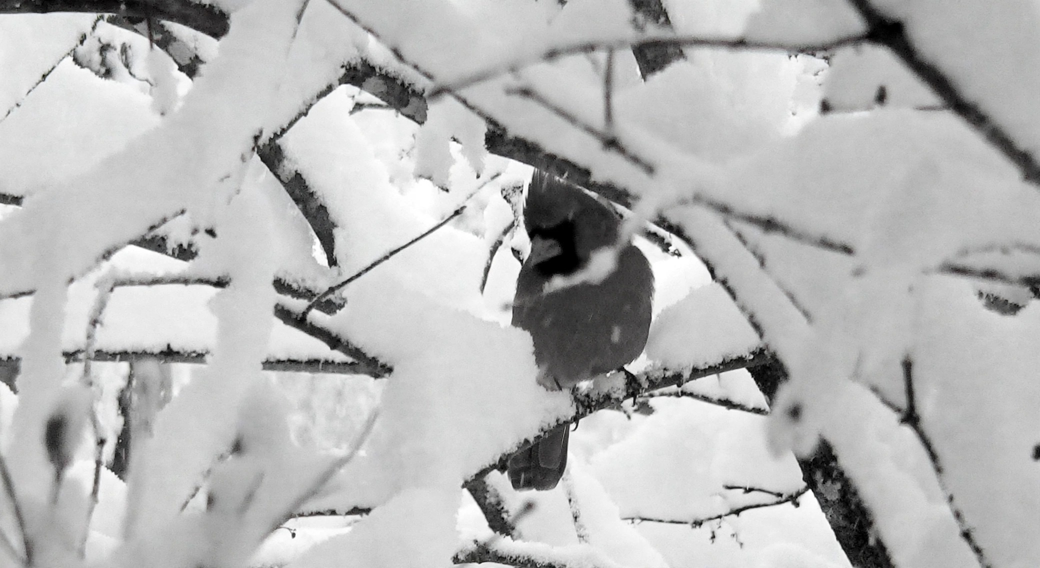
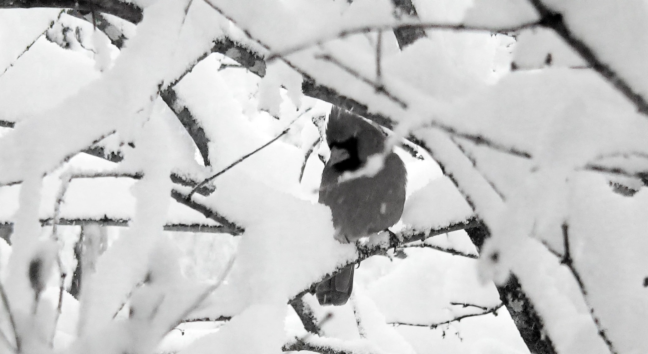
Supposedly it was the grayscale image.
I can’t seem to be able to create that effect on a different image. It may have to do with the file size. Th lake photo is 2MB and the Iwo image is only 650KB. I’ll look into that later.
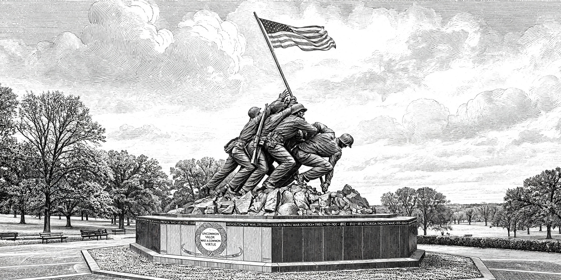
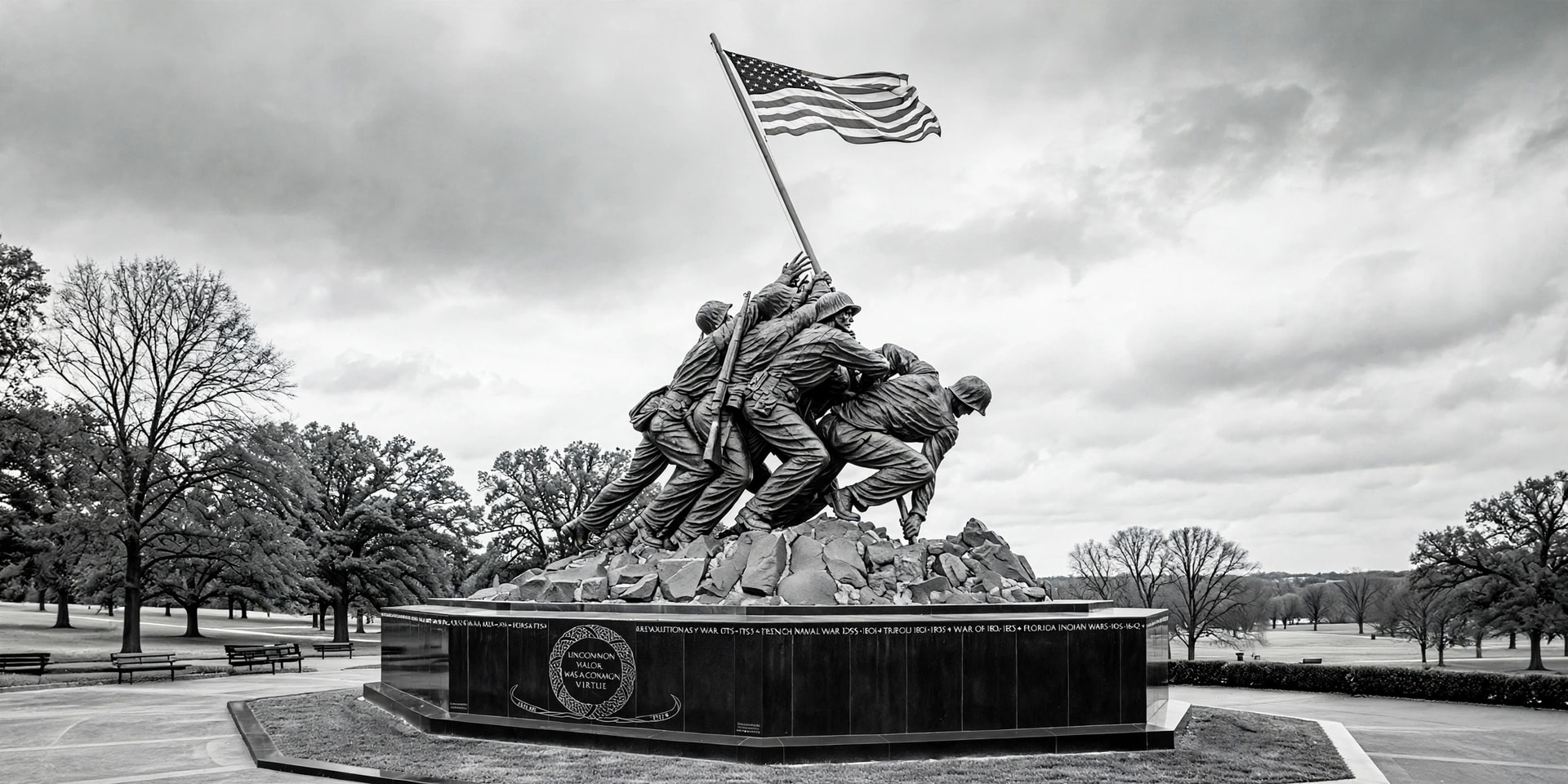
On a different note. I tried it on IWO image and I managed to get this. This is the original image we started with.
This is what I told meta to do to create this. Maybe this will work on future images. Who knows.
Turn this photo into a detailed black and white engraving illustration like the lake image I shared - intricate pen and ink, cross-hatching and stippling, woodcut / etching style, fine linework, no gray, only black lines on white
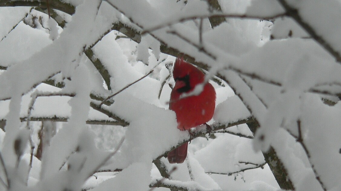
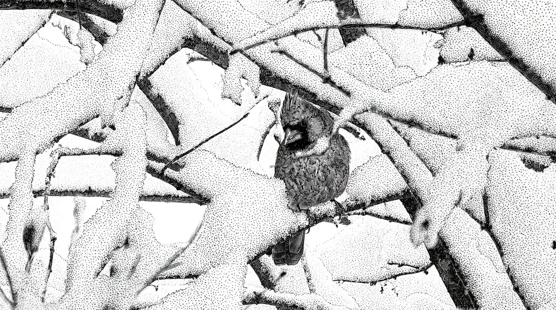
I don’t know what metat is doing to the grayscale images. The first grayscale image below uploaded and adjusted and converted to grayscale. Then created the line art.
Second image was increased to maximum resolution (but file is smaller in kb but same size in pixels). Then created second line art. Bot using the same script.
Turn this photo into a detailed black and white engraving illustration like the lake image I shared - intricate pen and ink, cross-hatching and stippling, woodcut / etching style, fine linework, no gray, only black lines on white.
I would have expected the second grayscale image to be a bigger file not smaller. Go figure.
It may have to do with the files meta works with. It uses WEBP files. That is probably the issue. I have to have every thing converted to .jpg or .png format in order to post it here.
I removed the reference to the ship for this image
Turn this photo into a detailed black and white engraving illustration - intricate pen and ink, cross-hatching and stippling, woodcut / etching style, fine linework, no gray, only black lines on white
Turn this photo into a detailed black and white engraving illustration like the lake image I shared - intricate pen and ink, cross-hatching and stippling, woodcut / etching style, fine linework, no gray, only black lines on white to the ship.
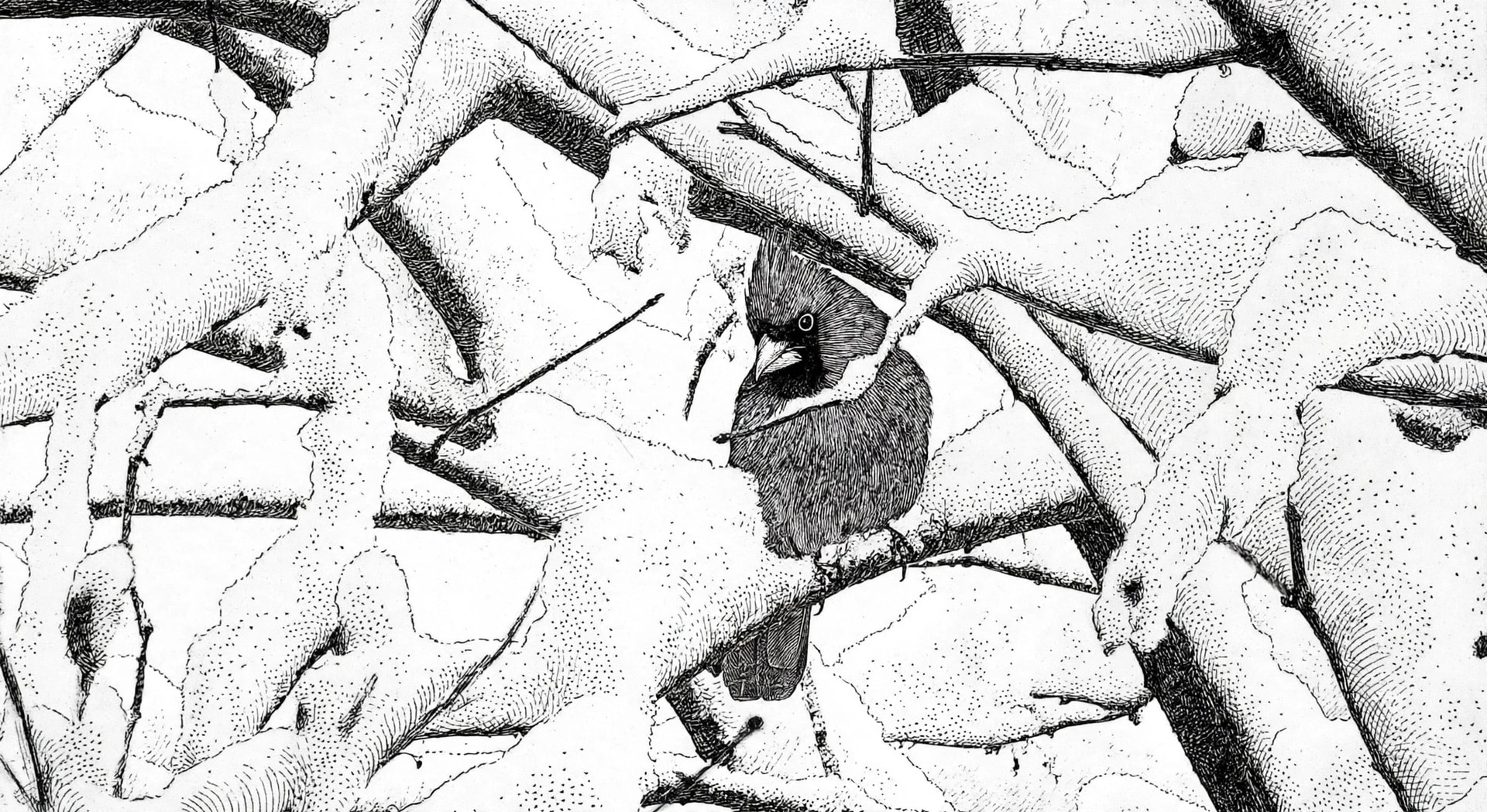
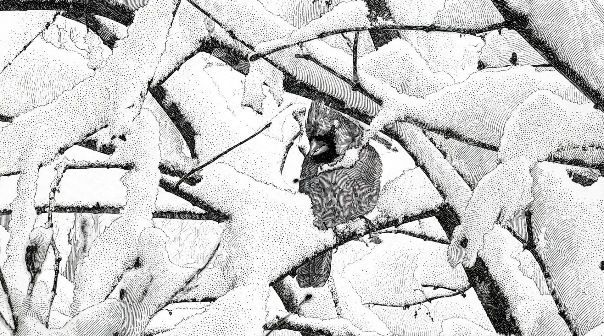
Note the difference in the dark area, way more detail.
Notice how in the bottom line drawing, the bird has a seed in its beak..Not in the one above. Also probably darker means more data, or some compression maybe.
I like the lower image, because of the extra detail. So I have 2 new different scripts to use. Both images were created from the same image. See the small difference in the scripts. There are a lot of differences between the 2 images.
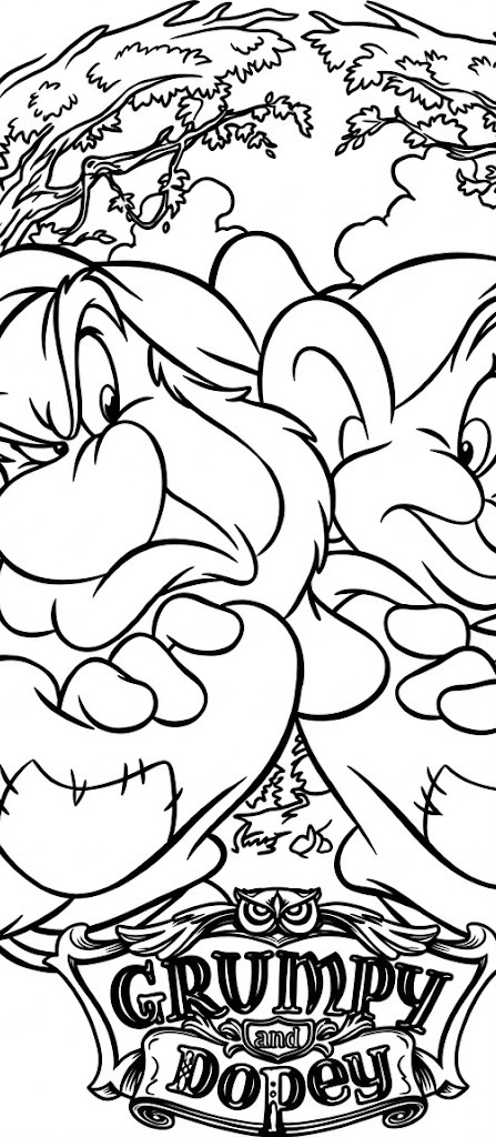
I would put the whole image up, but they are actually from a line drawing of Grumpy/Dopey Disney image. Frankly I don’t want others downloading it. Personal use thing.
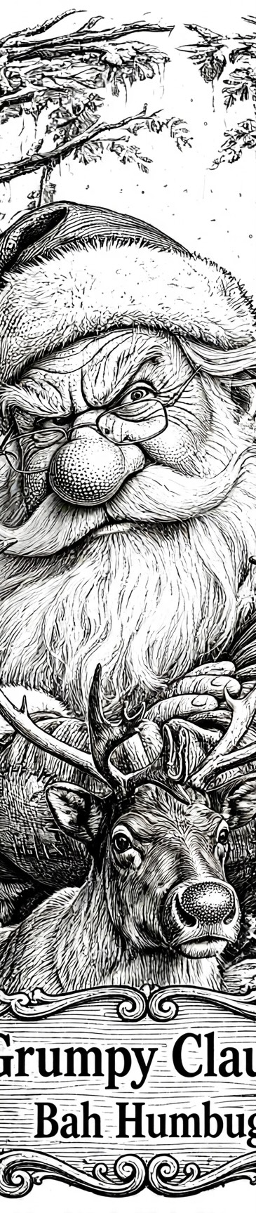
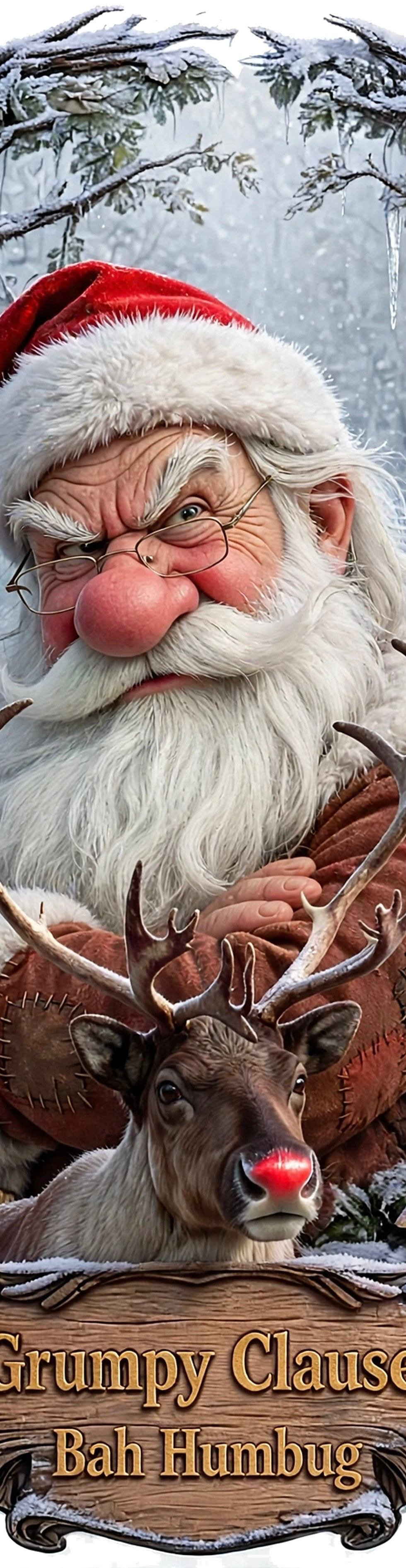
I cheated and got meta to do some really cool stuff and then I had it convert to color and I own 2 really cool T-shirts now. I then told meta to make it a Grumpy Clause (this image) and winter scene. That image will appear on a sweatshirt.
Did you instruct it to use the more photo type image of the deer rather than follow through with the cartoon theme, the contrast works pretty well. The switch to a wood style banner/plaque is a good choice also..it’s got an all in seasonal and warmth about it, bit like a bud advert.
I’ve been reading Ansels zone system and intrigued by 2.2 gamma in crt and digital screens and processing. I like their theory and approach to settings.
I also lost a few hours of work on the Iwo monument as gimp crashed, so I went back to your Ai version and started re doing that clown face pixel by pixel..just for practice.
The funny thing about the grumpy and dopey line art.
I asked meta to make a real life grayscale image.
Then drop dopey and center grumpy. It added an owl instead of a deer.
The told it to make it color, and crop it back to a wreath surrounding him. I made shirts with that image.
Then I asked it to make a winter theme and change the text into Grumpy Clause and Bah Humbug. And change the owl into the deer. Originally the deer got change into Bambi, and the I told it to make an adult deer.
This pretty much all Ai doing its thing. This will be on a sweat shirt in a couple of months.
Bummer about the crash. That is one really nice feature in LB.
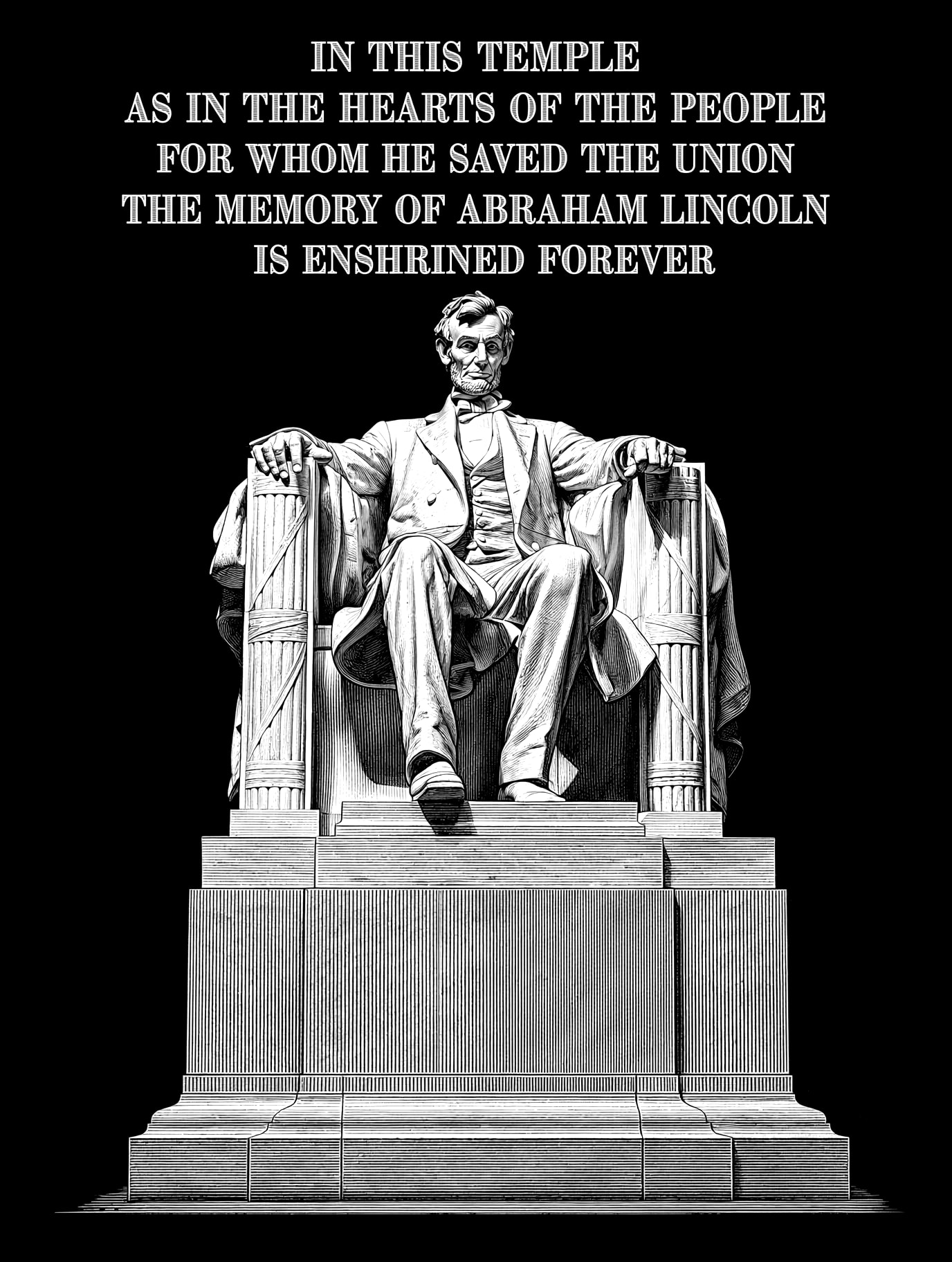
Have fun cleaning up the original, but look at the last image (above the cardinal images) of the monument. I think you will find it just right.
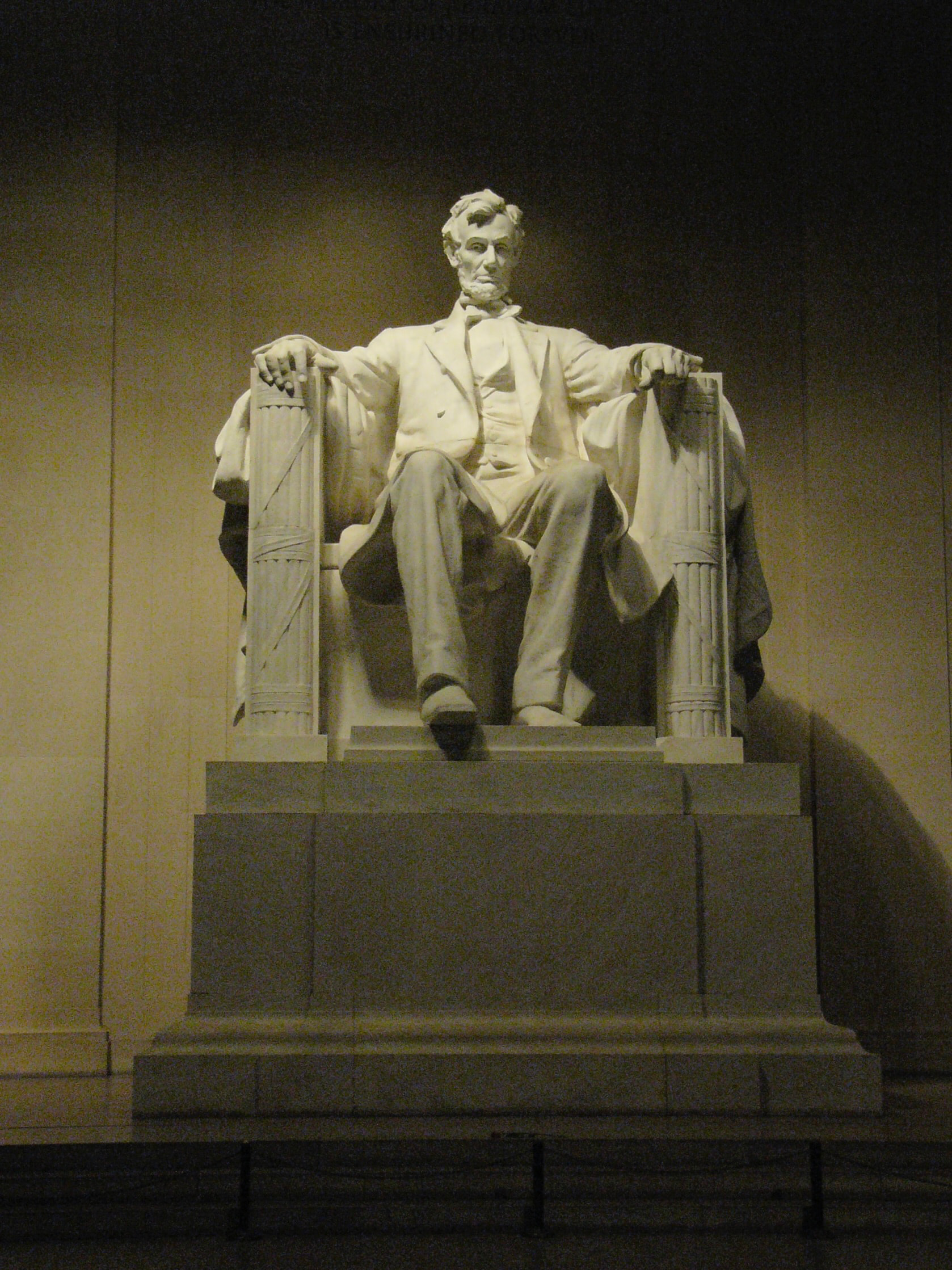
That Lincoln pic must be one of the best photos I have seen as yet and in fairness I’m beginning to think the ai may be better used to “provide the score but not the music”.
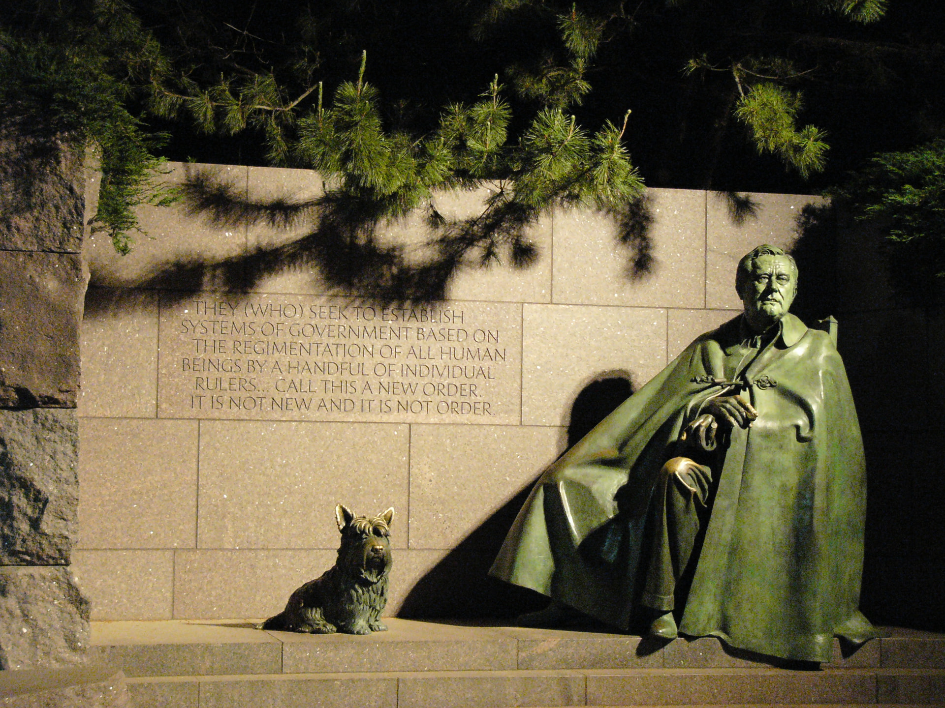
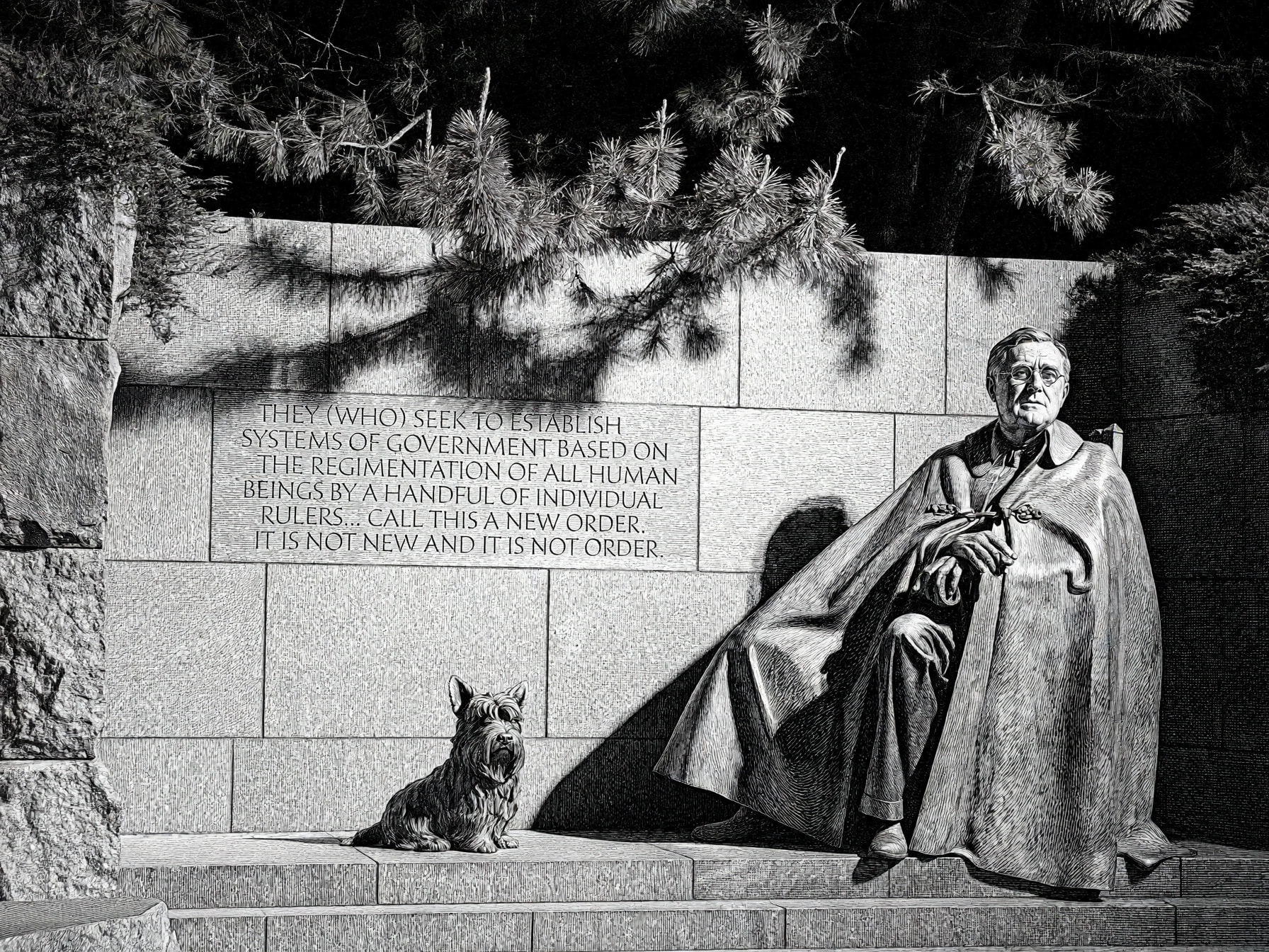
Some things work great and some not so much. A lot of hit and miss. I think FDR turned out well. Even the shadows from hi glassed showed up
Interesting thing. Both shot were lit from a flash attached to the camera. The Lincoln shot, I probably didn’t change the distance setting on the flash or I was too far away and that is why it is not well lit.
Both images have a yellowish cast to them as well. Maybe that has something to do with the results.
I’m wondering if a low exposed image converts better using my script. The reason being, I’m telling it to create a high res high contrast image. If there isn’t any highlights in the image, Ai stretches the grayscale range out and then uses that to create the high contrast. That means that the highest highlight becomes the white end, and the lowest tone becomes the black.
The stone work at left hand side (FDR) is really great and the ai image is well balanced throughout. The Lincoln photo is excellent, the shadows are just right. The brighter tones could be a bit difficult but well worth working with I’m sure.
Did the flash get gobbled up by the distance and area…happy accident I’d call it.
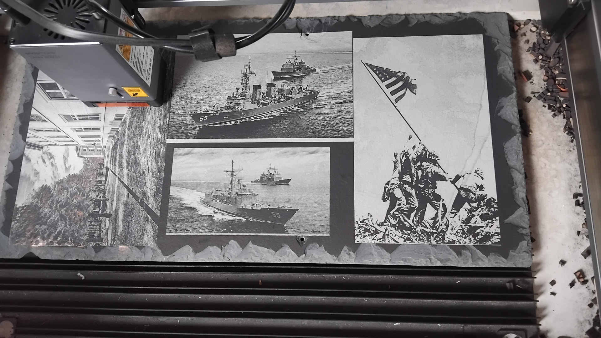
Here’s the Iwo (Original) image of last week. I finally got to the workshop today out of necessity to roat coffee. It’s a bit two-tone but pleasant in its own way.
Referring back to the Lincoln photo and as you described ‘Low exposure’ of the shot and the algorithms treatment of it. The darker tones are all great and there is plenty of laserable contrast there. The brighter tones up to the white point may have been stretched a lot more.
I opened it in nikon’s NX studio because gimp was giving me a hard time. I found the lighter tones very patchy and couldn’t do anything about it…maybe because it’s jpeg nor raw. Software can be mysterious!
I got a serious lesson in pro photography yesterday. My buddy rick is a blacksmith and he was asked by this lady if she could get some shots of his forge’ings for part of a photography course she’s doing.
He showed me some of them on his phone and Maaaan..have I got a lot to learn. Turns out it’s a university course she’s doing…not the weekend warrior thing I thought it was.
But I did find a comprehensible Raw processing editor program called Rapidraw. I’d recommend it to anyone that has found darktable, Rawtherapy etc etc a bit heavy.
Although, garbage in/garbage out!!
Did you do an astral conversion to your cam for doing telescopy on the night sky.
“Petri FTX, 50MM, F1.8, Freshnell focus, I am trying to sell. I bought it originally for my 8” telescope".
The full spectrum conversion is about 200 more than the camera cost me, probably better off waiting and go for the canon D5 with 56mp…plenty there for the 2wIR, rather than going cheaper for the (IR only) conversion on the Nikon 42mp.